
How to Capture User Input Using Blazor Forms

Summarize with AI:
Save time and keystrokes with Blazor’s comprehensive form components.
If you’re building web applications, you’re likely going to need to capture information from your users. One (still) common way to do that is to use a form. But how do you use forms in Blazor, and what changes when you switch between Blazor’s various render modes?
Here’s a quick-start guide to form handling in Blazor (plus, stick around until the end for a neat way to get your form up and running faster, with less boilerplate).
A Simple Form
First, let’s start with the fundamentals. Here’s a basic HTML form, where someone can enter their email address.
@page "/Newsletter"

<h3>Newsletter Signup</h3>

<form method="post">
    <label for="email" class="form-label">Email:</label>
    <input type="text" name="email" id="email"/>
    <button type="submit">Submit</button>
</form>

@code {

}
Right now, this is a standard HTML form, albeit declared inside a Razor component.
If you’re using Blazor’s static server-side rendering render mode, you can declare a form like this and capture the data when the form is submitted.
But if you submit the form, you’ll get an error.
A valid antiforgery token was not provided with the request. Add an antiforgery token, or disable antiforgery validation for this endpoint.
So what gives?
Here’s what happens when this form is submitted:
- A POST request is made by the browser.
- This request is made to the current URL for the page (unless we specify otherwise). In this case, it’s
<your-app>/Newsletter. - The server picks up the POST request and forwards it to Blazor (ASP.NET).
- Blazor/ASP.NET throws the above error about anti-forgery tokens.
Anti-forgery Tokens Help Protect You from Bad Actors
ASP.NET uses anti-forgery tokens to help protect your app. Without them, a malicious actor could easily send dodgy data to this /newsletter page, via POST requests.
To counter this, when you declare a form in your Razor component you can include an anti-forgery token. This token is generated on the server when your component renders, and is then included in the resulting markup.
When the form is subsequently submitted, ASP.NET (running on the server) checks the provided token is legit and allows the request through if so.
We can wire up this token using Blazor’s <AntiforgeryToken /> component:
<form method="post">
    <label for="email" class="form-label">Email:</label>
    <input type="text" name="email" id="email"/>
    <button type="submit">Submit</button>

    <AntiforgeryToken />
</form>
If you run this in the browser and inspect the source code, you’ll see the generated token included as a hidden field.
<form method="post" action="/newsletter">
    <label for="email" class="form-label">Email:</label>
    <input type="text" name="email" id="email">
    <button type="submit">Submit</button>

    <input type="hidden" name="__RequestVerificationToken" value="CfDJ8GblH5ZtkwJHinTfwL5hSdkZOv0g0xvTgr7JwOxofF2PQRVB1ORm8rhTM-MhtjNn_Ob9WZ6U01VU0a734QCLT5L-klOpNbm1ON6A2t2BuZ8R1WYHDgCfzoY0k7TKlYOBkxcUNLechsHYNC0UEvv1QVU"></form>
This token will be included in the data that’s posted to your server when a user submits this form.
Anti-forgery token in place, you might expect this form to spring into life, but try submitting it at this point and you’ll get a new error.
The POST request does not specify which form is being submitted. To fix this, ensure
<form>elements have a @formname attribute with any unique value, or pass a FormName parameter if using<EditForm>.
Your Form Needs a Name
This time, the request has made it past .NET’s checks (it has a valid anti-forgery token), so ASP.NET will try to figure out where to send the incoming request.
For this to work, you need to give your form a name.
<form method="post" @formname="newsletter-signup">
    <label for="email" class="form-label">Email:</label>
    <input type="text" name="email" id="email"/>
    <button type="submit">Submit</button>

    <AntiforgeryToken />
</form>
Note that we’ve used the @formname directive to give our form a unique name. This name is then rendered in the resulting HTML as a value for the _handler hidden field.
<form method="post" action="/newsletter">
    <input type="hidden" name="_handler" value="newsletter-signup">

    <!-- rest of form -->
</form>
ASP.NET, when it handles the request, will use this name to locate your component (checking for a component with a form with that name).
Success! Now when you submit this form, .NET will send the data to your component but …
Nothing happens.
Because we’ve missed one final step. We need to write the code to handle the submitted form data.
We can use the @onsubmit directive to indicate which method should handle the posted form data.
<form method="post" @formname="newsletter-signup" @onsubmit="EmailSubmitted">
    <!-- rest of form -->
</form>
Then implement the handler itself.
@code {

    [SupplyParameterFromForm]
    public string Email { get; set; }

    public void EmailSubmitted()
    {
        Console.WriteLine(Email);
    }

}
Here, we’ve declared a property to capture the Email address from the submitted form data, and the EmailSubmittedmethod that will be invoked when a submission comes in.
The [SupplyParameterFromForm] ensures the Email property will be populated with the value the user entered in the form.
With that, our form is alive!
Enter an email address, submit the form and you’ll see the email address logged in the Output window of your IDE (or terminal, depending on how you launched your app locally).
Right now, when the form is submitted the email address (entered by the user) will be cleared form the text input field.
We can preserve that value by binding the value of the text input to the Email property we declared in that last step.
<form method="post" @formname="newsletter-signup" @onsubmit="EmailSubmitted">
    <label for="email" class="form-label">Email:</label>

    <!-- use model binding to bind the value of this input to @Email -->
    <input type="text" name="email" id="email" value="@Email"/>

    <!-- rest of form -->
</form>
Here we’ve bound value for our text input to the Email property in our component.
Now, when the form is submitted, the text input will continue to show the entered email address.
Reduce the Boilerplate with EditForm
Plain HTML forms like this work just fine with Blazor static SSR, but what if you want to cut down on some of the boilerplate and get better compile-time safety for your form?
For that, Blazor has a dedicated form component called EditForm.
Here’s how we can declare the same form using EditForm.
@page "/Newsletter/EditForm"
@using BlazorDemoApp.Data

<h3>Newsletter Signup</h3>

<EditForm method="post" Model="NewsletterForm" FormName="newsletter-signup" OnValidSubmit="EmailSubmitted" >
    <label for="email" class="form-label">Email:</label>
    <InputText id="email" @bind-Value="NewsletterForm.Email"/>
    <button type="submit">Submit</button>
</EditForm>
A lot of this is the same (or very similar) to our plain HTML form.
But notice we haven’t needed to add the <AntiforgeryToken /> component, as EditForm includes this automatically.
We’re able to use the Model property to point to the underlying data model for our form.
Here’s how we’ve set that up for this component.
@code {

    [SupplyParameterFromForm]
    public NewsletterForm NewsletterForm { get; set; } = new();

    public void EmailSubmitted()
    {
        Console.WriteLine(NewsletterForm.Email);
    }

}
Here we’ve a NewsletterForm property which is instantiated to an empty object when the component first mounts.
The NewsletterForm model itself looks like this:
public class NewsletterForm
{
    public string Email { get; set; }
}
Back in the form, in place of the input element, we’ve declared an instance of Blazor’s InputText component.
<InputText id="email" @bind-Value="NewsletterForm.Email"/>
Which we’re able to bind to a specific property on the model (Email in this case).
Because we’re using static server-side rendering as the render mode, we still need that [SupplyParameterFromForm] attribute we saw earlier if we want our NewsletterForm property to be populated with the submitted form data.
This form works very similarly to our plain HTML form, but there are some advantages.
If we try to map an input to a non-existent property on the model, we’ll get a compile error (rather than having to wait until runtime for the problem to become evident).
We also get to avoid relying on magic strings for things like the name of the text input.
Switching Render Modes
With EditForm, we can now easily switch render modes.
The above form will work exactly the same with the render mode set to InteractiveServer, InteractiveWebAssembly or InteractiveAuto.
In those cases, you can drop the [SupplyParameterFromForm] as it isn’t needed.
Validate Incoming Data
Of course, you can’t always rely on users to enter valid data for your forms. Blazor has built-in support for form validation.
The easiest option out of the gate is to use DataAnnotations. (You can also use other libraries such as Fluent Validation.)
We can indicate when a field in our underlying model is required (and/or specify other validation criteria, for example that a number has to fall within a certain range).
using System.ComponentModel.DataAnnotations;

namespace BlazorDemoApp.Data;

public class NewsletterForm
{
    [Required]
    public string Email { get; set; }
}
Then bring the DataAnnotationsValidator in to capture any issues when the form is submitted.
<EditForm method="post" Model="NewsletterForm" FormName="newsletter-signup" OnValidSubmit="EmailSubmitted">
    <DataAnnotationsValidator />
    <label for="email" class="form-label">Email:</label>
    <InputText id="email" @bind-Value="NewsletterForm.Email"/>
    <button type="submit">Submit</button>
    <ValidationSummary />
</EditForm>
With this, the Email input will be highlighted red if we omit an email address when we submit the form. We’ll also see an error message displayed at the bottom of the form.
If we had multiple inputs, and several of them failed validation, ValidationSummary will show a summary of those validation errors.
Break Down Large Forms into Smaller Components
Sometimes you may find yourself asking for the same information twice from a user.
Take an online store checkout form for example. If users have different shipping and delivery addresses, you may well want to capture the same information for both (street, city, etc.).
You can create one component for the relevant address form fields, and use that in multiple places in your form.
First, here’s a model we might use for a checkout form.
public record PlaceOrderCommand
{
    public Address BillingAddress { get; set; } = new();
    public Address ShippingAddress { get; set; } = new();
    public List<OrderItem> Items { get; set; } = new();

    public class Address
    {
        [Required]
        public string Name { get; set; }
        public string AddressLine1 { get; set; }
        public string AddressLine2 { get; set; }
        public string City { get; set; }

        [Required]
        public string PostCode { get; set; }
    }

    public class OrderItem
    {
        public string SKU { get; set; }
        public int Quantity { get; set; }
    }
}
Notice the two address fields, BillingAddress and ShippingAddress.
We can define a separate component for capturing address details.
@using BlazorDemoApp.Shared.Checkout
@inherits Editor<PlaceOrderCommand.Address>

<div>
    <label>Name</label>
    <InputText @bind-Value="Value.Name"/>
</div>
<div>
    <label>Address 1</label>
    <InputText @bind-Value="Value.AddressLine1"/>
</div>
<div>
    <label>Address 2</label>
    <InputText @bind-Value="Value.AddressLine2"/>
</div>
<div>
    <label>City</label>
    <InputText @bind-Value="Value.City"/>
</div>
<div>
    <label>Post Code</label>
    <InputText @bind-Value="Value.PostCode"/>
</div>
Note how this component inherits Editor<PlaceOrderCommand.Address>.
We can reference this component in our main checkout form (multiple times, for multiple address fields).
<EditForm Model="Command" method="post" OnValidSubmit="SubmitOrder" FormName="checkout">
    <DataAnnotationsValidator/>

    <h4>Bill To:</h4>
    <AddressEntry @bind-Value="Command.BillingAddress"/>

    <h4>Ship To:</h4>
    <AddressEntry @bind-Value="Command.ShippingAddress"/>

    <button type="submit">Place Order</button>
    <ValidationSummary/>
</EditForm>
This is a handy way to avoid duplication in your form, especially when capturing the exact same information multiple times.
Boost Your Forms with Third-Party Form Components
Finally, while the EditForm is a key component in Blazor, and will handle most scenarios, you might find yourself wanting to spin up forms without having to write so much boilerplate code.
In the earlier examples, we had to declare labels for our inputs, as well as the inputs themselves.
To control the appearance of the form, we would need to write CSS or use built-in classes in CSS frameworks like Blazor to make each field appear as we want.
Third-party form components cut a lot of this time/effort.
For example, here’s a version of the newsletter signup form (with a few extra fields) built using the Blazor Form component from Progress Telerik.
Notice we’ve ditched the label elements, preferring Telerik’s FormItem component instead (which will automatically render a label for each input).
Here’s how this form renders in the browser.
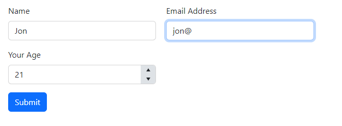
With this approach, the correct types of input fields are rendered automatically, based on the underlying model.
For example, the model in this case has an int property for Age, so we get a number input for that field.
We can arrange the form into multiple columns (as here) and easily switch the form’s orientation (vertical or horizontal).
Combine the form with Telerik Blazor MediaQuery, and the form becomes responsive (without having to manually configure CSS to make it look right on mobile).
If you’re building an application with lots of forms, this is a solid way to get a battle-tested form up and running quickly.
In Summary
Forms are vital for many web applications.
If you need to add forms to your web app you can start with simple HTML forms (for Blazor static SSR apps), but for better support in Blazor’s render modes and to reduce boiilerplate code, you can turn to Blazor’s built-in form components, such as EditForm.
Finally, if you’re building lots of forms, third-party form components such as the one included in Progress Telerik UI for Blazor can save you time (and keystrokes) by cutting down on boilerplate, and save you writing lots of CSS to get your forms to look right in the browser. Try it free for 30 days.

Jon Hilton
Jon spends his days building applications using Microsoft technologies (plus, whisper it quietly, a little bit of JavaScript) and his spare time helping developers level up their skills and knowledge via his blog, courses and books. He's especially passionate about enabling developers to build better web applications by mastering the tools available to them. Follow him on Twitter here.
Related Posts
Comments
All articles
Topics
Web MobileMobile
Desktop
Design
Productivity
People
