Create a Cute Animal UI in .NET MAUI with Telerik UI Controls

Summarize with AI:
Using a fun design, we’ll build an application user interface for learning animals in .NET MAUI. Progress Telerik UI for .NET MAUI will make it easy!
This confession is probably not too surprising if you have been visiting the Telerik blog for a while: I love discovering beautiful designs and recreating them in .NET MAUI! There’s no better way to learn, improve and sharpen development skills than by building interfaces.
For this project, we’ll replicate a lovely animal UI inspired by a design I found on Dribbble. The app consists of two screens: an animal list screen and a detail screen where users can explore more information about each animal.
So grab your favorite beverage ☕, open Visual Studio or Visual Studio Code, and let’s bring this design to life with .NET MAUI!
How Will the Explanation Work?
So you can understand everything 100%, I’ll explain how the process will work:
➖Visual diagram: Before we start, you’ll see a diagram with a screenshot of the design we want to achieve. This design will be divided into blocks, each identified with a name and a color. Each one will be explained individually.
➖Code explanation per block: In addition to the written explanation, each screen includes a set of blocks with the code snippets you need to implement and achieve the final result.
➖Step-by-step visual progress: Each explanation will have its corresponding screenshot, so you can see the progress as we build the UI.
⚠️ For this design, we took inspiration from an original Dribbble UI, but made some adaptations and adjustments to align it with the goals of this article.
🔧 Environment Setup
You’ll learn how to take advantage of some of the powerful Telerik UI for .NET MAUI components in this post. If you don’t have the .NET MAUI library installed yet, visit the quick start page, which explains step-by-step how to install Telerik UI for .NET MAUI, download the license key, configure the Telerik package source and install the Telerik MCP server (if needed).
Breaking Down the Design
To make this easier to follow, I’ve divided the design into clear blocks. We’ll build each part one at a time, in the order you see below.
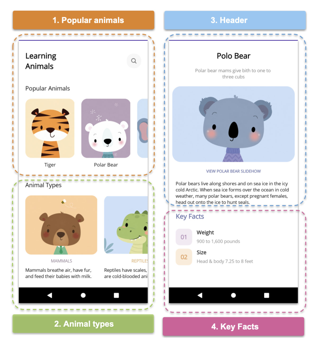
1. Popular Animals
Both the first and second sections belong to the main screen of our application. So, before we start creating the individual UI elements, let’s create a page called LearningAnimals.xaml, which will contain Blocks 1 and 2.
<Grid ColumnDefinitions="*,Auto"
    RowDefinitions="Auto,Auto,Auto,Auto,Auto"
    Margin="20,30"
    VerticalOptions="Fill">

<!-- Add blocks one and two here -->

</Grid>
Now we’re ready to build the first section!
Inside this Grid, we’ll start adding each of its elements along with the corresponding code snippets.
Learning Animals Label & Search Button
There are two important details worth highlighting in this section:
➖ For the title, let’s use this symbols combination . This allows us to create a line break in the text without needing to create a Label for each word.
➖ To create the circular search button, we simply set the same value for both the HeightRequest and WidthRequest properties, and then set the CornerRadius to half of that value.
<Label Grid.Column="0" Grid.Row="0"
Text="Learning Animals"
HorizontalOptions="Start"
FontSize="23"
FontAttributes="Bold"/>
<Button Grid.Column="0" Grid.Row="0"
HeightRequest="40"
WidthRequest="40"
CornerRadius="20"
ImageSource="searchicon"
BackgroundColor="#f7f7f7"
HorizontalOptions="End" />
Popular Animal Title and List
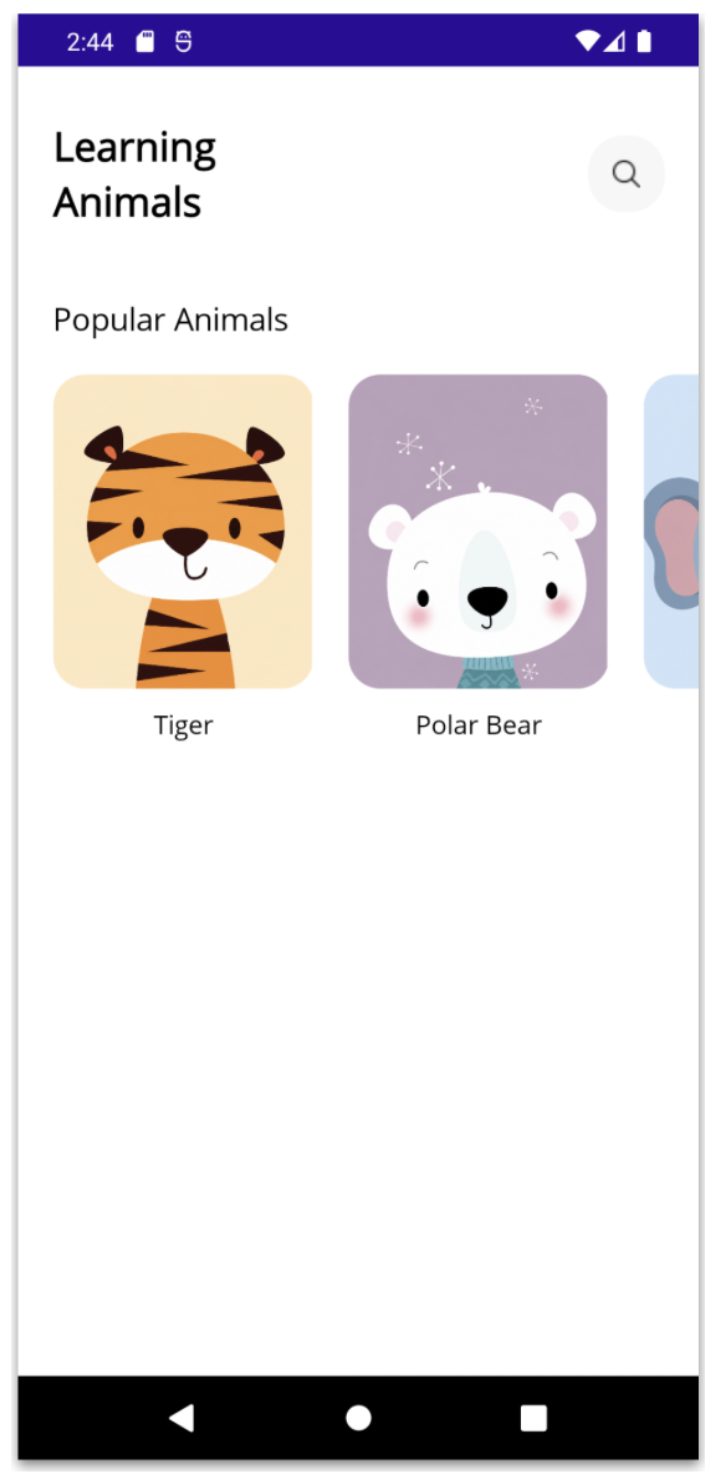
Next, we need to add a horizontal list of popular animals. Each item in the list will display an image and the animal’s name. To accomplish this, we’ll use Progress Telerik UI for .NET MAUI CollectionView, one of my favorite Telerik controls. 🙈
To keep this example simple, let’s first create a model and populate it with some mock data so our CollectionView has content to display.
1. Create a model for the popular animals:
class PopularAnimal
{
    public string ImageSource { get; set; }
    public string Name { get; set; }
}
2. Add some mock data to populate the list:
animalTypes = new ObservableCollection<Models.AnimalTypes>
{
  new AnimalTypes { ImageSource = "mammals.png", LabelColor = Color.FromArgb("#88748a"), Name = "MAMMALS", Description = "Mammals breathe air, have fur, and feed their babies with milk." },

  new AnimalTypes { ImageSource = "reptiles.png", LabelColor = Color.FromArgb("#db9d4c"), Name = "REPTILES", Description = "Reptiles have scales, lay eggs, and are cold-blooded animals. " }
};
3. Set the data as the BindingContext of your LearningAnimals.xaml.cs:
BindingContext = new ViewModels.LearningAnimalsViewModel();4. Finally, add the Telerik namespace to your XAML:
xmlns:telerik="http://schemas.telerik.com/2022/xaml/maui"
And the title with the CollectionView:
<Label Grid.Column="0" Grid.Row="1"
    Text="Popular Animals"
    Margin="0,40,0,0"
    HorizontalOptions="Start"
    FontSize="18" />

<telerik:RadCollectionView
    Grid.Column="0" Grid.Row="2"
    Margin="0,20,-20,0"
    ItemsSource="{Binding popularAnimals}"
    HorizontalScrollBarVisibility="Never"
    SelectionMode="None"
    HeightRequest="210">

<telerik:RadCollectionView.ItemsLayout>
<telerik:CollectionViewLinearLayout Orientation="Horizontal" ItemSpacing="20" />

</telerik:RadCollectionView.ItemsLayout>
    <telerik:RadCollectionView.ItemViewStyle>
	    <Style TargetType="telerik:RadCollectionViewItemView">
		    <Setter Property="BackgroundColor" Value="Transparent" />
		    <Setter Property="BorderColor" Value="Transparent" />
	    </Style>
    </telerik:RadCollectionView.ItemViewStyle>
<telerik:RadCollectionView.ItemTemplate>
    <DataTemplate>
	    <VerticalStackLayout>
		    <telerik:RadBorder CornerRadius="18"
		    HeightRequest="180"
		    WidthRequest="150">
		    <Image Source="{Binding ImageSource}"
		    Aspect="AspectFill" />
		    </telerik:RadBorder>

		    <Label Text="{Binding Name}"
		    HorizontalOptions="Center"
		    Margin="0,10"
		    FontSize="15" />
	    </VerticalStackLayout>
    </DataTemplate>
</telerik:RadCollectionView.ItemTemplate>
</telerik:RadCollectionView>
⚠️ Did you notice the rounded corners on the images? Oh yeah! We achieved that effect using Telerik UI for .NET MAUI RadBorder! 🤓🤓 Since you’ve already completed the Telerik setup when adding the CollectionView, no additional configuration is required. Simply add the RadBorder to your code! Highly recommended!
And you’ll get a result like this:
2. Animal Types
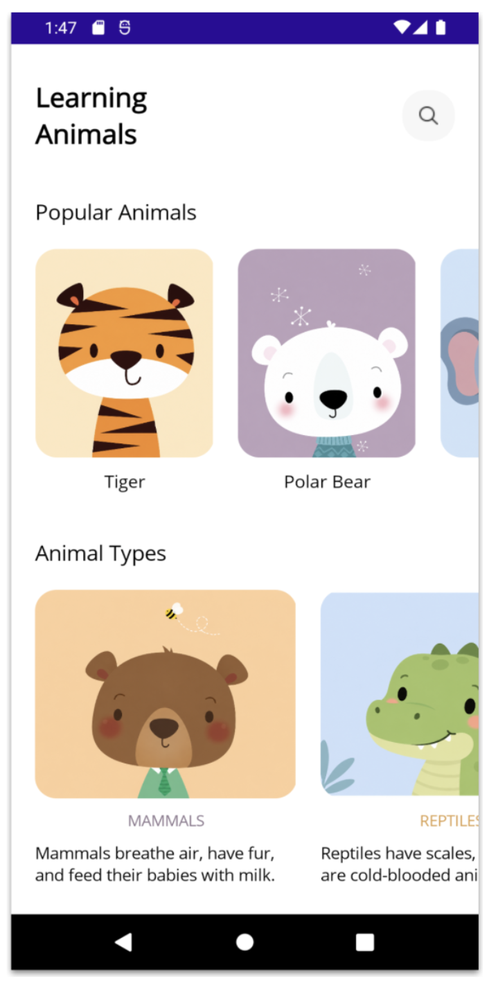
Yeah! We’re already moving on to the second section! 🤩 This section is very similar to the first one because it also includes a title and a list. And of course, we’ll use Telerik CollectionView again!
For this step, please follow the same approach explained in the previous section to create and add some mock data. Then, in your XAML, implement the UI as follows:
<Label Grid.Column="0" Grid.Row="3"
    Text="Animal Types"
    Margin="0,40,0,0"
    HorizontalOptions="Start"
    FontSize="18" />

<telerik:RadCollectionView
    Grid.Column="0" Grid.Row="4"
    Margin="0,20,-20,0"
    ItemsSource="{Binding animalTypes}"
    HorizontalScrollBarVisibility="Never"
    SelectionMode="None"
    HeightRequest="270">
<telerik:RadCollectionView.ItemsLayout>
<telerik:CollectionViewLinearLayout Orientation="Horizontal" ItemSpacing="20" />

</telerik:RadCollectionView.ItemsLayout>
<telerik:RadCollectionView.ItemViewStyle>
    <Style TargetType="telerik:RadCollectionViewItemView">
	    <Setter Property="BackgroundColor" Value="Transparent" />
	    <Setter Property="BorderColor" Value="Transparent" />
   </Style>
</telerik:RadCollectionView.ItemViewStyle>

<telerik:RadCollectionView.ItemTemplate>
    <DataTemplate>
    <VerticalStackLayout>

	    <telerik:RadBorder CornerRadius="18"
	    HeightRequest="180"
	    WidthRequest="220">
	    <Image Source="{Binding ImageSource}"
	    Aspect="AspectFill" />
	    </telerik:RadBorder>

	    <Label Text="{Binding Name}"
	    TextColor="{Binding LabelColor}"
	    HorizontalOptions="Center"
	    Margin="0,10"
	    FontSize="13" />

	    <Label Text="{Binding Description}"
	    MaxLines="2"
	    HorizontalOptions="Center"
	    WidthRequest="220"
	    FontSize="14" />

    </VerticalStackLayout>
    </DataTemplate>
</telerik:RadCollectionView.ItemTemplate>
</telerik:RadCollectionView>
And you’ll get a result like this:
3. Header
For this third section, we need to create a new screen. I’ll call this page LearningAnimalsDetails.xaml. Its main layout will also be a Grid, this time with eight rows.
<Grid RowDefinitions="Auto,Auto,Auto,Auto,Auto,Auto,Auto,Auto"
    Margin="10,30"
    RowSpacing="20"
    VerticalOptions="Fill">

<!-- Add blocks three and four here -->

</Grid>
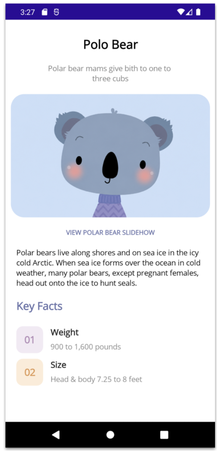
Inside this Grid, you can add the elements explained in this section and the next one, starting with the animal’s name and short description:
<Label Grid.Row="0"
Text="Polo Bear"
HorizontalOptions="Center"
FontSize="23"
FontAttributes="Bold"/>
<Label Grid.Row="1"
Text="Polar bear mams give bith to one to three cubs"
HorizontalTextAlignment="Center"
TextColor="Gray"
FontSize="14" />
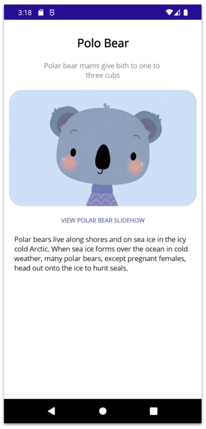
Now let’s continue with the main photo, the image description and the animal description:
<telerik:RadBorder
    Grid.Row="2"
    CornerRadius="25"
    HeightRequest="230">
    <Image Source="bluebear.png" Aspect="AspectFill"/>
    </telerik:RadBorder>

<Label Grid.Row="3"
    Text="VIEW POLAR BEAR SLIDEHOW"
    HorizontalTextAlignment="Center"
    TextColor="#6771a8"
    FontSize="12"
    FontAttributes="Bold"/>

<Label Grid.Row="4"
    Margin="10,0"
    HorizontalOptions="Start"
    Text="Polar bears live along shores and on sea ice in the icy cold Arctic. When sea ice forms over the ocean in cold weather, many polar bears, except pregnant females, head out onto the ice to hunt seals."/>
And you’ll get a result like this:
4. Key Facts
We’ve reached our final section! 🎉 This one displays a list of Key Facts, and yes, we’ll be using Telerik CollectionView once again! Each item in the list is composed of three elements: a number, a title, and a short description.
To build this section, follow the same approach we used in the previous CollectionView examples: create a model, populate it with some mock data, and bind it to your page. Then, implement the CollectionView in your XAML as shown below:
<Label Grid.Row="5"
    Text="Key Facts"
    Margin="10,0"
    TextColor="#6771a8"
    FontSize="20"
    HorizontalTextAlignment="Start"
    FontAttributes="Bold"/>

<telerik:RadCollectionView
    Grid.Row="6"
    Margin="10,0"
    ItemsSource="{Binding animalFacts}"
    HorizontalScrollBarVisibility="Never"
    SelectionMode="None"
    HeightRequest="270">

    <telerik:RadCollectionView.ItemViewStyle>
		    <Style TargetType="telerik:RadCollectionViewItemView">
			    <Setter Property="BackgroundColor" Value="Transparent" />
			    <Setter Property="BorderColor" Value="Transparent" />
		    </Style>
	    </telerik:RadCollectionView.ItemViewStyle>
    <telerik:RadCollectionView.ItemTemplate>
    <DataTemplate>

    <Grid Grid.Row="6"
	    Margin="0,5"
	    ColumnDefinitions="50,*"
	    RowDefinitions="Auto,Auto"
	    ColumnSpacing="14"
	    RowSpacing="4">

    <Border Grid.Column="0"
	    Grid.Row="0"
	    Grid.RowSpan="2"
	    WidthRequest="50"
	    HeightRequest="50"
	    BackgroundColor="{Binding BadgeBackgroundColor}"
	    StrokeThickness="0"
	    StrokeShape="RoundRectangle 12"
	    VerticalOptions="Center">

    <Label Text="{Binding Number}"
	    FontSize="18"
	    FontAttributes="Bold"
	    TextColor="{Binding BadgeTextColor}"
	    HorizontalOptions="Center"
	    VerticalOptions="Center"/>
	    </Border>

    <Label Grid.Column="1"
	    Grid.Row="0"
	    Text="{Binding Title}"
	    FontSize="16"
	    TextColor="#1F1F1F"
	    FontAttributes="Bold"/>

    <Label Grid.Column="1"
	    Grid.Row="1"
	    Text="{Binding Description}"
	    FontSize="14".
	    TextColor="#8A8A8A"/>
    </Grid>

    </DataTemplate>
</telerik:RadCollectionView.ItemTemplate>
</telerik:RadCollectionView>
And you’ll get a result like this:
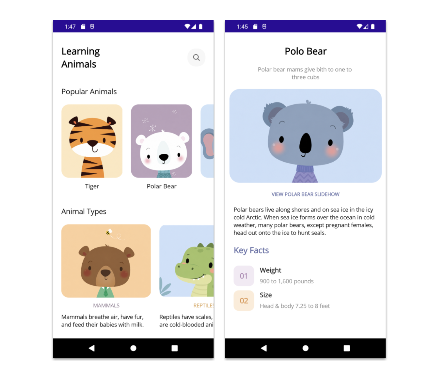
And that’s it, we’re all done! 🎉 Below, you can see the final result of both screens.
Conclusion
And that’s all! I hope this article helps you recreate beautiful UIs in .NET MAUI! 😎
In this article, we built an animal UI while exploring layouts with Grid, rounded elements with Telerik’s RadBorder, and dynamic lists with Telerik UI for .NET MAUI CollectionView.
These are simple but powerful techniques that you can easily reuse in your own projects to create modern and engaging user experiences. 💚
See you in the next article! 🙋♀️🚀
Try Telerik UI for .NET MAUI
Remember, Telerik UI for .NET MAUI comes with a free 30-day trial.

Leomaris Reyes
Leomaris Reyes is a software engineer from the Dominican Republic specializing in mobile development. She is a 7-time Microsoft MVP and actively builds mobile applications while sharing practical knowledge through technical articles and developer-focused content.
Through her work, she explains programming concepts, developer tools and real-world development practices to help developers grow in their careers.
You can follow her on Instagram and TikTok at @leomarisreyes.dev, read her articles on AskXammy, and connect with her on LinkedIn, where she shares tutorials, insights and resources for developers.
Related Posts
Comments
All articles
Topics
Web MobileMobile
Desktop
Design
Productivity
People