Bootstrap 4 and Angular: A Beginner’s Guide to Customizing a Theme

Summarize with AI:
In this tutorial, learn how to quickly build and style new universal themes for your Angular apps using Bootstrap 4, as well as Saas and Kendo UI.
If you have created new Angular projects from the Angular CLI, you’ll know they come with a bare-bones UI layout. No UI framework or guidance is provided out-of-the-box. In this article, we'll look at how to add Bootstrap 4 in a new Angular project and style the application using Sass.
We'll install Bootstrap 4 using npm, wire up Bootstrap and highlight the differences between a CSS and Sass (.scss) configuration. We'll also install Kendo UI for Angular’s Bootstrap 4 theme and integrate our custom theme.
For details on what's new in Bootstrap 4, see the article What’s New and What’s Changed in Bootstrap 4 for an excellent overview.
ng new and Pre-processing
First, let's start with a new Angular project. If you haven't tried the Angular CLI tool yet, you may need to install it. The setup requires just a simple npm command, we’ll use the “-g” parameter to install the tool globally Note: This works on Mac, Windows, and Linux.
npm install -g @angular/cli
Once the Angular CLI is installed, it's time to create a new app. Creating a new app is as simple as running the ng new command, however there's a very important option here that needs to be highlighted. The ng new command supports CSS pre-processor integration and my recommendation is to take advantage by using Sass (.scss). Supporting Sass in your project gives you additional flexibility since any valid CSS is also valid Sass—this means you can use each interchangeably. Even if you're not familiar with Sass, it won't get in your way, and it can be used as little or as much as needed. Additionally, Sass leaves room for Bootstrap customization that is not otherwise available with CSS through Sass variables. Adding Sass is as simple as specifying the option from the CLI.
ng new <project name> --style=scss
cd scss-project
Installing and Wiring-up Bootstrap 4
There are quite a few methods for installing and setting up Bootstrap. Often the process changes from one platform to another, so for the scope of this article we'll focus on setting up Bootstrap with Angular using the Angular CLI.
The Sass Bits
Now that we have a new Angular project, we'll need to install Bootstrap 4. We'll use npm to load the dependencies. If you only intend to use the Bootstrap grid layout without its UI components, you can exclude the jquery@1.9.1 popper.js@^1.12.3 dependencies as these are mainly used with Bootstrap's UI components.
npm install bootstrap@4.0.0-beta.2 jquery@1.9.1 popper.js@^1.12.3
With Bootstrap installed, we'll need to reference it in the project. When we installed Bootstrap the package brought with it all of Bootstrap's CSS, Sass source code, and JavaScript files. Since we have a Sass-enabled project, we'll be making use of the
Bootstrap source code (.scss). Using Sass will allow us to utilize built-in variables used for customization of the Bootstrap framework and theme. We'll be referencing the source code located in ~bootstrap/scss/.
In the Angular project open styles.scss and add a reference the bootstrap.scss file. Note: With Sass, the file extension isn't necessary when declaring a reference.
Alternatively, .scss files can be added in the angular-cli.json styles array. However, it's common practice to structure Sass using a single entry point, or manifest-like file. In this example, the styles.scss file will be used to reference
all of our Sass imports, giving us a single point of configuration for Sass.
/* using Sass */
@import "~bootstrap/scss/bootstrap";
The js Bits
At this point Bootstrap is ready to use—unless you're interested in Bootstrap's UI components, in which case you'll need to reference Bootstrap's JavaScript dependencies. Let's add those to the project. Pay close attention to the paths for each module, as using the wrong path will cause the application to work improperly.
.angular-cli.json

  "scripts": [
    "../node_modules/jquery/jquery.min.js",
    "../node_modules/popper.js/dist/umd/popper.min.js",
    "../node_modules/bootstrap/dist/js/bootstrap.min.js"
  ],
Simple Customization
Bootstrap's Sass code is located in /node_modules/bootstrap/scss/, and it’s here you'll find all of the settings for the Bootstrap framework in the file _variables.scss. Digging through _variables we can see
all of the values that can be used to customize the theme and behavior of Bootstrap. We'll focus on customizing the color variables found under // Color system at the top of the file. It's important to note that the _variables file should not be changed directly as it can and will be overwritten during future updates or installs. Instead, each variable is marked with a Sass !default keyword. The !default keyword can be considered the opposite of !important. This allows us to override the setting easily in our own code external to the _variables file.
//
// Color system
//

...
$blue: #007bff !default;

...
$primary: $blue !default;

...
$theme-colors: () !default;
Before we begin customizing our Bootstrap theme, let's add some code so we can see our changes take effect. In the main app component template, app.component.html, we'll add some HTML to render a Bootstrap badge, card and button. For the
button, we'll set the class to btn btn-primary, which will give the button the primary theme color. The badge will use the badge badge-secondary class, thus giving it the secondary theme color. By default, the
primary color is blue #007bff and secondary is gray #868e96.
<!-- app.component.html -->
<div class="container">
  <div class="row">
    <div class="col-4">
      <div class="card" style="width: 20rem;">
        <div class="card-body">
          <h4 class="card-title">Card title</h4>
          <p class="card-text">Some quick example text ...</p>
          <a href="#" class="btn btn-primary">Go somewhere</a>
        </div>
      </div>
    </div>
    <div class="col-8">
      <h1>Example heading
        <span class="badge badge-secondary">New</span>
      </h1>
    </div>
  </div>
</div>
The markup should render in the browser with a blue button and gray badge as seen below.

Let's customize the theme using Sass variables so that every instance of the "primary" and "secondary" colors is changed throughout the theme. To do this we'll override the theme map variable.
We'll start by adding a new custom variables file to our project. Add a new folder named scss then add a new file to the folder named _myTheme.scss. The underscore in the file name identifies it as a "partial", a file that should
be imported. In _myTheme, we'll add a theme map called $theme-colors(). The $theme-colors will override the default variables, allowing us to customize the "primary", "secondary", and other theme colors. In addition,
completely custom theme colors can be defined here.
For this example, we'll use a purple tone for "primary" and a teal tone for "secondary". Adding the key/values "primary": rgb(132, 50, 155) and "secondary": rgb(2, 188, 235) to the theme map will override all instances of these
colors in Bootstrap.
//_myTheme.scss

$theme-colors: (
    "primary": #84329b,
    "secondary": #02bceb
);
The custom variables are now defined but have yet to be added into our style sheet. We'll need to import _myTheme into our main Sass file styles.scss to complete the customization. In styles.scss we'll use an @import
statement to bring in _myTheme. The import must be placed above the line importing Bootstrap to take effect. When using import, it's not necessary to include underscores—just as with .scss extensions, these are implied by the compiler.
//styles.scss
@import "scss/myTheme";
@import "~bootstrap/scss/bootstrap";
Once the import is in place, the CSS will recompile with the new values. The markup should render in the browser with our new theme colors as seen below.

Kendo UI for Angular Customization
Now that we have a custom Bootstrap theme, let's expand the UI capabilities of our application by adding the Kendo UI for Angular component library. When adding new components to our application, we would like them to integrate seamlessly into the design. Thankfully Kendo UI for Angular has the ability to match the style of the existing Bootstrap components, and it can also bridge the themes together. In addition, Progress ThemeBuilder, a graphical theme builder, provides an intuitive interface for creating custom themes.
To begin, we'll add the Kendo UI Bootstrap theme which applies to all Kendo UI components. The Kendo UI Bootstrap theme is installed using the same process as before with npm and then importing it into the styles.scss file.
First the theme is installed.
npm install --save @progress/kendo-theme-bootstrap
Next, the all.scss file is imported into styles.scss. We'll use the @import statement just as before, insuring that the imports are in the correct order. Custom variables should come first, followed by the Kendo UI theme, then
finally Bootstrap.
/* using scss */
@import "scss/myTheme";
@import "~@progress/kendo-theme-bootstrap/scss/all";
@import "~bootstrap/scss/bootstrap";
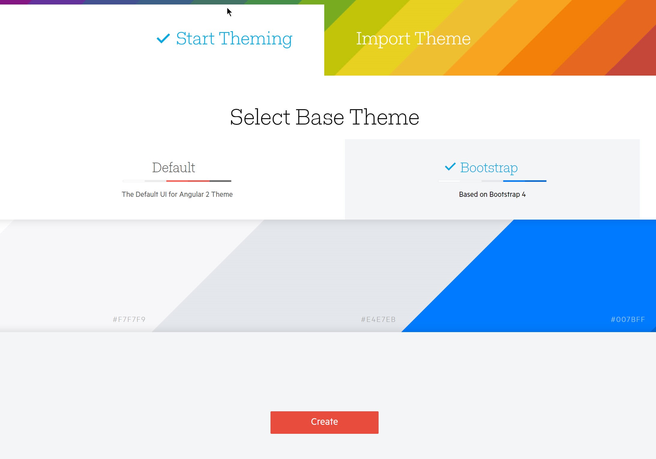
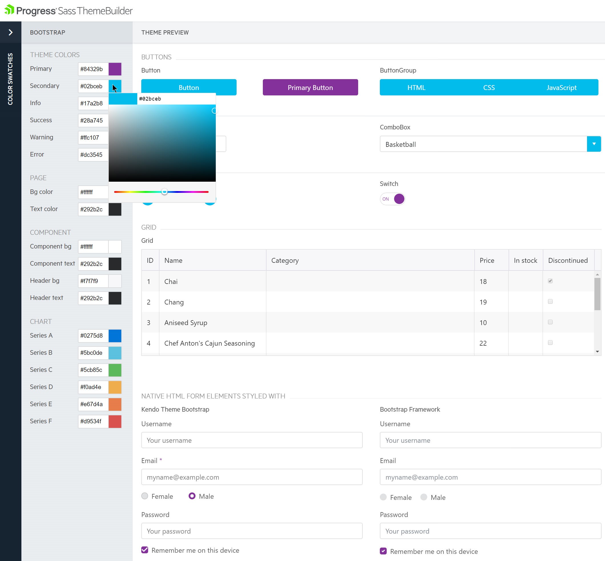
We'll customize the theme using the Progress Sass ThemeBuilder. The ThemeBuilder provides an interactive experience for creating custom themes. Simply navigate to http://themebuilder.telerik.com/ and choose the Bootstrap 4 starting theme.

Use the color pickers to fine-tune the color scheme.

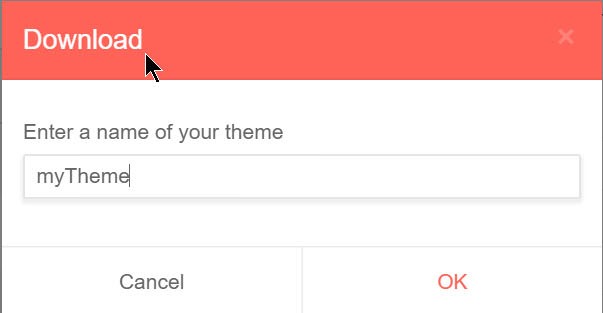
Once the colors have been chosen, we'll download the zipped theme files which contain our settings as Sass code in variables.scss.


To apply the theme to our project, simply copy the code from variables.scss to /scss/myTheme or add the file directly to the project and revise the myTheme import statement.
With the theme values added to our application, we might expect to additional steps to map the Kendo UI theme variables to Bootstrap. However, since we're already using the Kendo UI Bootstrap theme, this mapping is included for us. With the Kendo UI Bootstrap theme all components in the app, including Bootstrap components, share a single style and settings.
$base-theme:Bootstrap;
$skin-name:brand2018;
$accent: #84329b;
$secondary: #02bceb;
...
$series-f: #d9534f;

// Automatically mapped to Bootstrap
// $theme-colors: (
//     "primary": $accent:,
//     "secondary": $secondary
//   );
After saving the new theme, we can add any components from the Kendo UI for Angular library. The added components will receive the theme colors in myTheme without further customization. For installation instructions for each Kendo UI component,
refer to the component's documentation page.
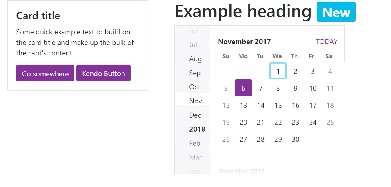
In this example, the button and calendar components are installed and rendered in the browser. The buttons, badge, and calendar all render with a unified color scheme.

Conclusion
Installing and setting up Bootstrap with Angular is a relatively simple task once you understand the process. Using Sass enables us to quickly theme our application by leveraging Bootstrap's variable system. Using Kendo UI for Angular expands the UIs available to us, while the addition of the Kendo UI Bootstrap theme enables us to leverage Sass and create a unified theme across all of the components in our application.
If the examples above make sense for your next Angular application, then consider taking Kendo UI for Angular for a spin. The Kendo UI for Angular free trial is right here waiting for you.

Ed Charbeneau
Ed
