Binding Kendo UI Chart and Editable Kendo UI Grid to the Same Data

Summarize with AI:
In this tutorial, learn how to populate a Kendo UI Chart with data bound to a Kendo UI Grid, and add new capabilities to your apps.
Combining some of the most used widgets from the Kendo UI suite is a common requirement, and the possible integrations and requirements are endless. Maybe it's rendering a Kendo UI Chart within a cell of each row for displaying a collection from the data item; populating external Chart with the data from the selected row in the Grid or from the grouped data, using the aggregates for a specific field; creating multiple series from each data item or from different columns.
As technical support officers, we are often challenged with real-life scenarios for integrating multiple widgets from the Kendo UI suite. There are always some great ideas coming from the developers using the widgets in ways that none of us considered as a use-case (like using the selected/hovered series in the Chart for filtering the Grid). Like everything else in the developers’ world, there is no product that could do everything out-of-the-box, and with every new client there is a new requirement that will require customization. This applies for integrating Chart with Grid as well.
Visualizing Grid Data in Chart
In this blog post I will focus on two different use-cases for visualizing Grid data in the Kendo UI Chart:
- Creating series from every data item on the current page
- Populating the Chart from grouped data in the Grid, using the group aggregates
It should be mentioned that due to the difference in how both widgets are handling the data, it is highly recommended to create the Chart dynamically, based on the Grid data and the requirement, and to always re-initialize the Chart when needed (by using its setOptions method). This approach gives us the freedom and flexibility to easily manipulate and configure the data.
Now, let's start with the implementation. For both examples, we will be using the following starting point:
<!DOCTYPE html><html><head> <style>html { font-size: 14px; font-family: Arial, Helvetica, sans-serif; }</style> <title></title> <link rel="stylesheet" href="https://kendo.cdn.telerik.com/2017.3.913/styles/kendo.bootstrap-v4.min.css" /> <script src="https://kendo.cdn.telerik.com/2017.3.913/js/jquery.min.js"></script> <script src="https://kendo.cdn.telerik.com/2017.3.913/js/kendo.all.min.js"></script></head><body> <div id="example"> <div id="grid"></div> <div id="chart"></div> </div> <script> //TODO </script> </body></html>
Chart Series from Data Items in Editable Grid

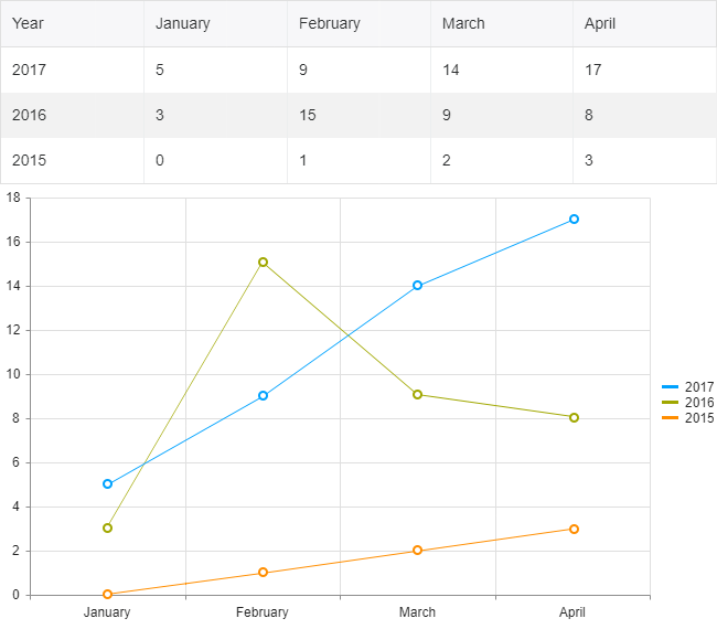
Imagine that we have the following data structure:
{year: 2017, January: 5, February: 9, …},{year: 2016, January: 3, February: 15, …}Such data could be easily visualized in Kendo UI Line Chart, where the series will be created for each year and the months will be used for categories.
Once we know which field from the data items will be used in the series of the Chart, we can initialize the widgets. We will be using dummy data for the example and the records will contain information for a few months only (for brevity):
<script> //We will be using a few months for brevity var months = ["January", "February", "March", "April"]; $("#chart").kendoChart({ seriesDefaults: { type: "line" }, categoryAxis: { categories: months, //Each month(column) is added as a category } }); //Initializing the Grid $("#grid").kendoGrid({ dataSource: { data: getDummyData(), schema:{ model:{ id: "Year", fields: { "Year" :{ editable: false}, "January" :{ type: "number"}, "February" :{ type: "number"}, "March" :{ type: "number"}, "April" :{ type: "number"} } } } }, editable: true }) function getDummyData(){ var data = [ {Year: 2017, January: 5, February: 9, March: 14, April: 17}, {Year: 2016, January: 3, February: 15, March: 9, April: 8}, {Year: 2015, January: 0, February: 1, March: 2, April: 3} ]; return data; }</script>The above will render and populate the Grid with the data, but the Chart will be empty. Since our Grid will be editable, we need to ensure that the Chart will be updated after each change in the dataSource. The perfect event for updating the Chart data in this way is the “change” event of the dataSource:
$("#grid").kendoGrid({ dataSource: { change: function(e){ //The Chart will be updated on each change of the DataSource updateChart(e.sender); },…And here is where the magic begins. Within the updateChart function, where we'll update the Chart, we will retrieve each dataItem from the current view of the Grid's dataSource and we will create all series based on the updated data. The series will contain a data collection with the values from each month, and the Chart will use the “categories” from the “categoryAxis” array to match the values accordingly. When we create the new series with the new data, we can modify the options of the Chart and call its setOptions method for re-initializing the widget:
function updateChart(dataSource){ var dataItems = dataSource.view(); var chartSeries = []; var chartData = []; dataItems.forEach(function(item){ var data = []; months.forEach(function(month){ //Each month's value is added to the data collection data.push(item[month]); }) chartSeries.push({ data: data, //we will be using the Year from the dataItem as the name name: item.Year }) }) var chart = $("#chart").data("kendoChart"); var options = chart.options; options.series = chartSeries; //setting the series with the new data to the options chart.setOptions(options); //re-initializing the Chart}Try Out the Code
The entire code of the example can be tested in the following dojo:
Chart Series from Grouped Grid Data

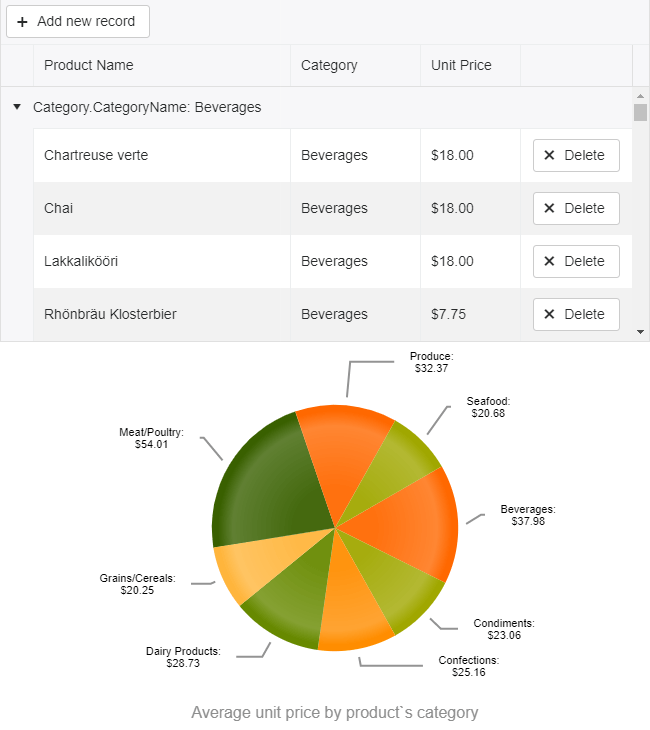
For this example, we will bind the Grid to products collection and will group the data by the product's category. We will configure the average aggregate for the unit price and will have an average for each category as a result. The grouped data and the aggregates will then be used to populate a Pie Chart.
Due to the custom editor for the Category field and the aggregates, the configuration of the Grid will be fairly complex:
<!DOCTYPE html><html><head> <base href="http://demos.telerik.com/kendo-ui/grid/editing-custom"> <style>html { font-size: 14px; font-family: Arial, Helvetica, sans-serif; }</style> <title></title> <link rel="stylesheet" href="https://kendo.cdn.telerik.com/2017.3.913/styles/kendo.bootstrap-v4.min.css" /> <script src="https://kendo.cdn.telerik.com/2017.3.913/js/jquery.min.js"></script> <script src="https://kendo.cdn.telerik.com/2017.3.913/js/kendo.all.min.js"></script> </head><body> <script src="../content/shared/js/products.js"></script> <div id="example"> <div id="grid"></div> <div id="chart"></div> <script> $(document).ready(function () { var dataSource = new kendo.data.DataSource({ pageSize: 20, data: products, autoSync: true, group: [ {field: "Category.CategoryName", aggregates: [ { field: "UnitPrice", aggregate: "average"} ]} ], aggregates:[ { field: "UnitPrice", aggregate: "average" } ], schema: { model: { id: "ProductID", fields: { ProductID: { editable: false, nullable: true }, ProductName: { validation: { required: true } }, Category: { defaultValue: { CategoryID: 1, CategoryName: "Beverages"} }, UnitPrice: { type: "number", validation: { required: true, min: 1} } } } } }); $("#grid").kendoGrid({ dataSource: dataSource, pageable: true, height: 550, toolbar: ["create"], columns: [ { field:"ProductName",title:"Product Name" }, { field: "Category", title: "Category", width: "180px", editor: categoryDropDownEditor, template: "#=Category.CategoryName#"}, { field: "UnitPrice", title:"Unit Price", format: "{0:c}", width: "130px",groupFooterTemplate: "Average #=kendo.toString(average, 'n2')#", aggregates: ["average"] }, { command: "destroy", title: " ", width: "150px" }], editable: true }); }); function categoryDropDownEditor(container, options) { $('<input required name="' + options.field + '"/>') .appendTo(container) .kendoDropDownList({ autoBind: false, dataTextField: "CategoryName", dataValueField: "CategoryID", dataSource: { type: "odata", transport: { } } }); } </script> </div></body></html>For the initial configuration of the Chart we'll set only the known variables, and leave the series data to be populated after the groups of the Grid are created:
$("#chart").kendoChart({ title: { position: "bottom", text: "Average unit price by product's category" }, legend: { visible: false }, chartArea: { background: "" }, seriesDefaults: { labels: { visible: true, background: "transparent", template: "#= category #: \n $#= value#" } }, series: [{ type: "pie", startAngle: 150 }], tooltip: { visible: true, format: "${0}" } });Once again, as in the first example, we will update the Chart within the “change” event of the dataSource:
var dataSource = new kendo.data.DataSource({ change: function(e){ updateChart(e.sender); },And here is how we populate the data for the series by using the group value (the CategoryName of the group) and the average aggregate as a value:
function updateChart(dataSource){ var dataItems = dataSource.view(); var data = []; dataItems.forEach(function(group){ var aggregateValue = group.aggregates["UnitPrice"].average.toFixed(2); data.push({category: group.value, value: aggregateValue}); }) var chart = $("#chart").data("kendoChart"); var options = chart.options; options.series[0].data = data; chart.setOptions(options); //re-initializing the Chart} Try Out the Code
The entire code of the example can be tested in the following dojo:Endless Possibilities
With a good understanding of the Grid and Chart widgets (or with a little help from our technical support officers team), you can enhance your apps in a number of ways by using the data from the Grid and visualizing it in the Chart. We'd note though that it is important to understand the data structure as well in order to create the series correctly.
Try out the examples in the dojos above and let us know what you think. Happy coding!

Konstantin Dikov
Konstantin Dikov is a Tech Support Engineer on the Kendo UI Team, and has been working with Kendo UI and Telerik UI products since 2013. He is passionate about music, literature, drawing and breakthrough technologies.
