
KendoReact
What's New R3 2021
What's New HistoryNew Component: React Pivot Grid (Table)
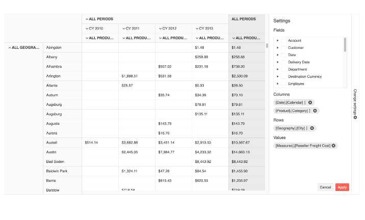
Expand the reporting capabilities of your dashboard in no time with the new React Pivot Grid (also called Pivot Table). High on the most-wanted list, this interactive component enables your user to cross-intersect and summarize table data in multiple ways and use advanced calculations. You can data-bind the React Pivot Grid to an OLAP service and customize it extensively. Features in v.1.0 include row and column sorting and filtering, row and column totals and end-user configurator interface.
New Component: React MultiSelectTree
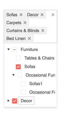
The new React MultiSelectTree is a form component that lets the user choose multiple predefined values from a hierarchical list. The component marries the real-estate savings of a drop down with the richness of selecting multiple values from a tree view. The KendoReact MultiSelectTree supports filtering, custom rendering, keyboard navigation and the ability to expand and collapse the hierarchical data items. You can use it in both controlled and uncontrolled mode.
See React the MultiSelectTree demo
New Component: React Heatmap
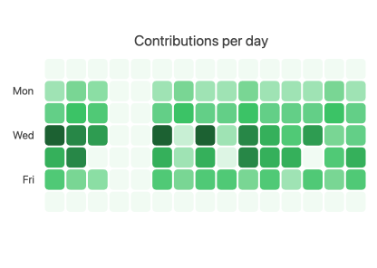
In R3 2021, we’re expanding the KendoReact Charts library with the addition of the KendoReact Heatmap (also known as Cluster Heatmap). This chart component visualizes data in a two-dimensional matrix where the relative value of data points is represented by different colors. Out-of-the-box, you get built-in color scales, a variety of marker shapes, panning and zooming, tooltips, crosshairs and more. Like any other data consuming KendoReact component, the React Heatmap can be bound to any data source.
See the React Heatmap Chart demo
New Component: React Breadcrumb
The new React Breadcrumb component provides users with an easy way to navigate within a folder structure or a web page and trace their way back. Breadcrumbs are often used as a secondary navigation element in collaborative and knowledge-management platforms, ecommerce websites, documentation and more. You can customize the appearance of the component by including icons (font and custom) as part of the breadcrumb (or substituting them completely, for a fun twist) and changing how the visual separator between them looks. Fully accessible, the KendoReact Breadcrumb is Section 508 and WAI-ARIA compliant.

New Component: React Typography
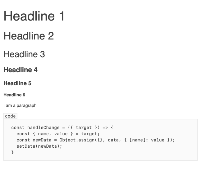
Ensuring text styling is consistent with your design system app-wide is easy with the new React Typography component! With its help, you get full control over what text styles and rules should be enforced throughout your entire project, from a single place. The KendoReact Typography component brings a ready-to-use typographic scale (type scale) that matches the existing Kendo UI themes and can be used by other KendoReact components, for example the React Editor.
New Component: React StackLayout
The KendoReact StackLayout component takes the hassle out of aligning multiple elements in a stack. You can take any set of components, say, cards, charts or buttons, and easily apply vertical or horizontal orientation to all, align them and add the required spacing. You can do all this and more with the new KendoReact StackLayout by quickly changing a few properties.
See the React StackLayout demo

New Component: React GridLayout
The KendoReact GridLayout component allows you to easily arrange its contents into rows and columns in a grid structure. It offers a grid-like system for organizing the content in your app based on the CSS grid layout. You can configure items per row or column, as well as span content across them. Much like the Typography and StackLayout components, the KendoReact GridLayout can help you apply the same basic rules (in this case: page structure) across multiple pages throughout your app, ensuring UI consistency.

React Data Grid Improvement: Column Auto-Size
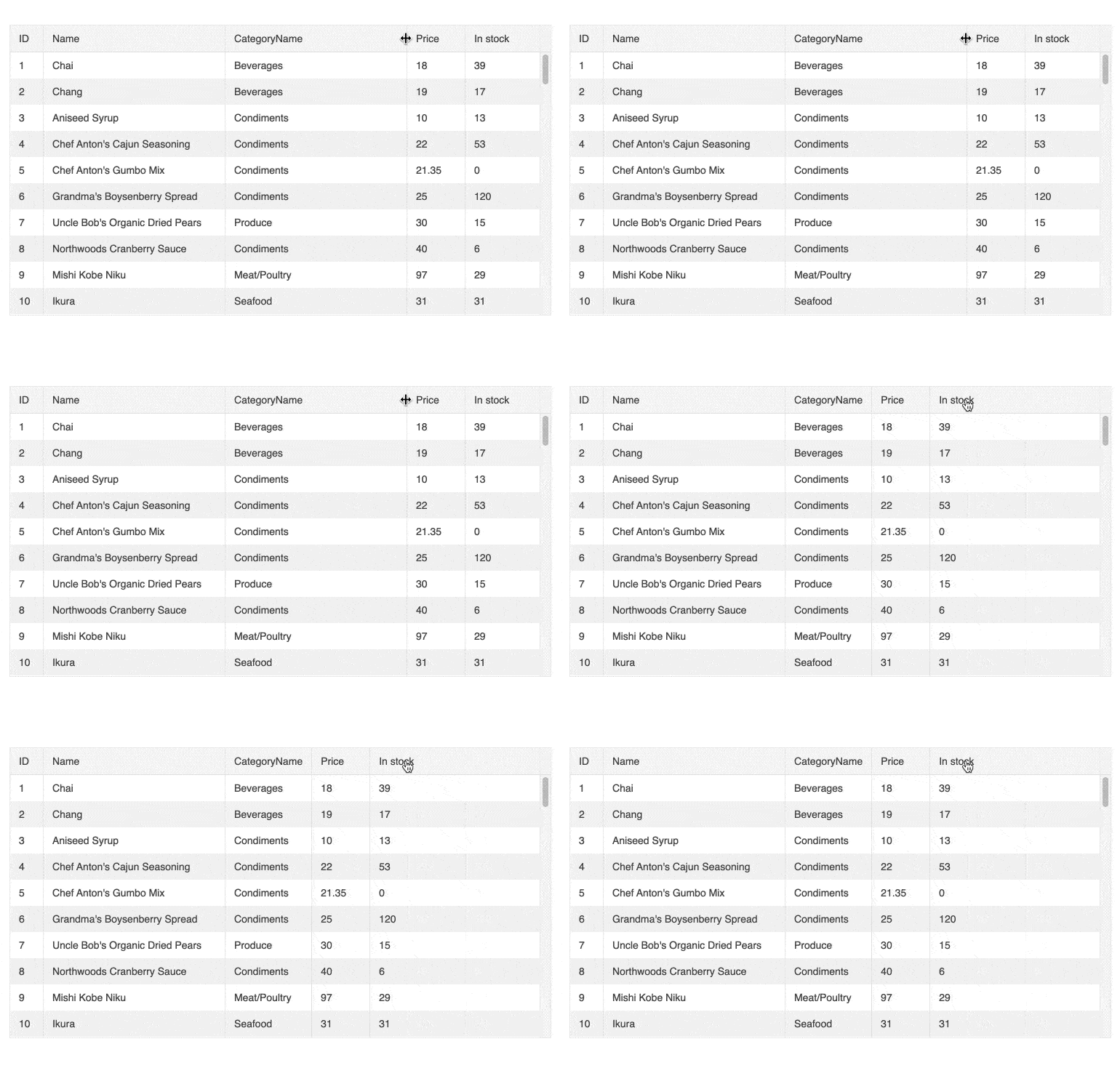
This new React Grid feature brings a popular Excel behavior to the KendoReact Data Grid: double-clicking on the resize handler in the column header will automatically resize the column to fit the smallest possible width while keeping all text visible. This can also be set as an automated grid setting via a method called fitColumns.
See the React Data Grid demo: Column Auto-Size
React Data Grid Improvement: Ungroup via Column Menu
Now you can easily group and ungroup a column with a single click in the KendoReact Data Grid column menu. This can work with or without having the group panel enabled. This feature makes it easy to toggle grouping without using a mouse, just a keyboard.
See the React Data Grid demo: Ungroup via Column Menu

React Data Grid, Gantt Chart and TreeList Accessibility Improvements
While the KendoReact Data Grid, Gantt Chart and TreeList were already fully accessible, accessibility is like art in that your work is never final—it can always get better. With R3 2021, we’ve done additional accessibility research and testing and improved the way screen readers read these three components. We’ve also implemented multiple smaller fixes along the way.
React Gantt Chart Improvement: Range Selection and Multiple Cell Selection
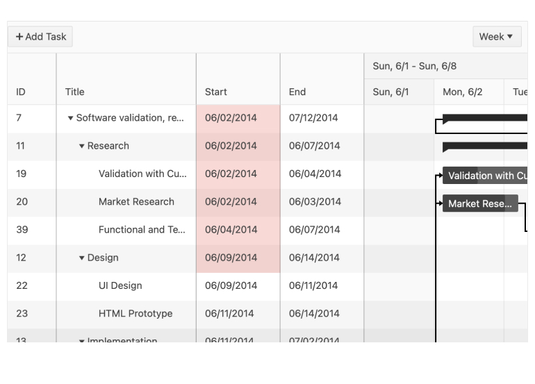
Much like with the TreeList, the React Gantt Chart component also received an upgrade of selection options. With R3 2021, you now can quickly and easily enable multiple-cell selection in the KendoReact Gantt Chart via drag and drop (or Ctrl/Cmd and click) for rows and ranges of cells.
See the React Gantt demo: Range selection and multiple cell selection
React TreeList Improvement: Range Selection and Multiple Cell Selection
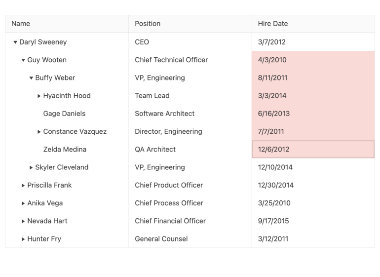
With R3 2021, the React TreeList selection modes now include range selection. The TreeList component enables this functionality quickly and easily through the new built-in Cell Selection and Range Selection support for rows and cells. The user has the standard options of dragging and dropping or using Control/Command key and click combinations to select multiple cells or a range of cells.
See the React TreeList demo: Range selection and multiple cell selection
React Tooltip Improvement: Support for SVG Elements
You can now use the React Tooltip to create tooltips for SVG elements. This comes in handy when you have SVG graphics (for example, charts or maps) rendered on the page. With the new KendoReact Tooltip, adding a tooltip over these elements is now a breeze.
See the React Tooltip demo: Support for SVG elements

React Chip Improvement: Custom Content
We’re expanding the possibilities of how your React Chip component (also called “pill”) can look by enabling you to define new types of custom content for the chip. For example, you can add custom icons, links or virtually any other content.
See the React Chip demo: Custom content
React FileManager Template
Тhe new React FileManager is a great template that will help you implement file management into your React app in no time. The KendoReact FileManager template is an in-depth sample that developers can use as a demo for how to manage a file system within any React app. The FileManager template allows users to perform the most common folder and file operations like moving files around by dragging and dropping, creating or deleting folders and uploading and adding files from their local file system. The template is built entirely with KendoReact components, such as the React Grid, TreeView, Toolbar, Breadcrumb and Upload components.
See the React File Manager sample app

Upgrade: Bootstrap 5 Support
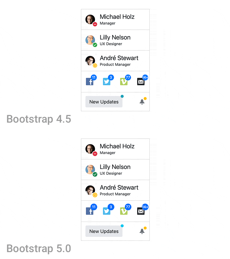
As part of our commitment to supporting industry standards as they are updated, KendoReact now supports the latest version of Bootstrap.
Learn more about the React Bootstrap Theme
KendoReact - R3 2021
- New Component: React Pivot Grid (Table)
- New Component: React MultiSelectTree
- New Component: React Heatmap
- New Component: React Breadcrumb
- New Component: React Typography
- New Component: React StackLayout
- New Component: React GridLayout
- React Data Grid Improvement: Column Auto-Size
- React Data Grid Improvement: Ungroup via Column Menu
- React Data Grid, Gantt Chart and TreeList Accessibility Improvements
- React Gantt Chart Improvement: Range Selection and Multiple Cell Selection
- React TreeList Improvement: Range Selection and Multiple Cell Selection
- React Tooltip Improvement: Support for SVG Elements
- React Chip Improvement: Custom Content
- React FileManager Template
- Upgrade: Bootstrap 5 Support


