
KendoReact
What's New R2 2021
What's New HistoryNew Component: React External Drop Zone
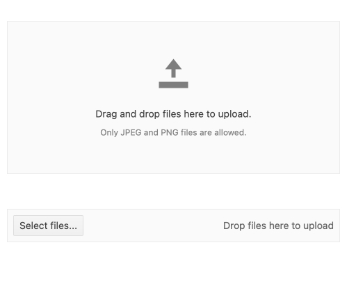
The new External Drop Zone Component enables the end-user to drag and drop files from a file system to a dedicated zone on the web page. From there, the React developer can choose what to do with the available file information. This functionality is typically used for uploading files to a server, but there are many other possibilities! The KendoReact External Drop Zone extends the functionality available in our Upload package and comes with a few helpful customization options.
Upload package and comes with a few helpful customization options.
See React External Drop Zone demo
New Component: React Skeleton
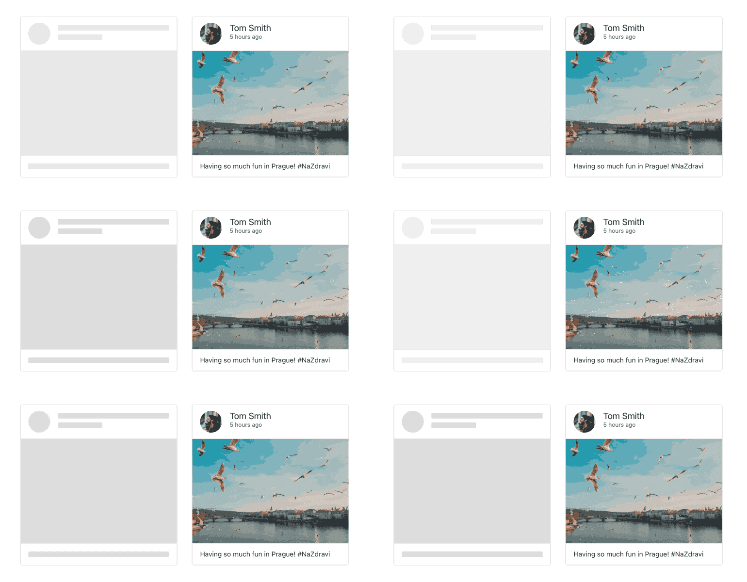
Widely requested by our users, the new React Skeleton component is a handy, user-friendly way to show that content is about to be loaded without using spinners or loading bars. A key UX benefit of the Skeleton component is that it mimics the size and layout of the elements that are in the process of loading. This lets users intuit what is about to be loaded as they wait for content to appear, giving the illusion of a performance increase versus traditional loading animations. The new KendoReact Skeleton comes with three essential placeholder shapes (circle, line/text and rectangle) as well as wave and pulse animations.
See React Skeleton demo
New Component: React Circular Gauge
Data visualization is an important part of any dashboard, and with R2 2021, we’re adding a new type of gauge to the KendoReact Chart Library. Joining the ranks of the existing KendoReact Arc, Linear and Radial Gauges is the new React Circular Gauge. As the name gives away, the React Circular Gauge lets developers create a sleek-looking circular data visualization to add into their applications. The component comes with two render modes (SVG and canvas), scaling, support for animations and different colors and more.
See React Circular Gauge demo

KendoReact Documentation Upgrade: Adding TypeScript and Hooks Examples
While classes are still the most popular way to write React components, functional components and hooks are gaining popularity and have seen greater adoption across the React ecosystem. Whether you prefer classes or hooks, the KendoReact docs and demos now include equivalent demos for hooks and TypeScript for most of our code samples! We are actively expanding this to full coverage.
Adding to that, another popular request has been to have TypeScript examples in our code samples since TypeScript usage has also grown within the React community. On a fun note, KendoReact is written in TypeScript so we’re certainly excited to see the widespread adoption of this language! With this release, we’re also adding another layer to our demos: developers can now choose between JavaScript or TypeScript code. As mentioned, we aren't quite at 100% coverage for all code samples yet, but we are actively working towards this. Depending on when you're reading this, we may even already be done.
Taking both upgrades into account, for almost any given code sample you can now select between:
- Class components using JavaScript
- Class components using TypeScript
- Function components and Hooks using JavaScript
- Function components and Hooks using TypeScript

React Data Grid Improvements: Virtualization Placeholders
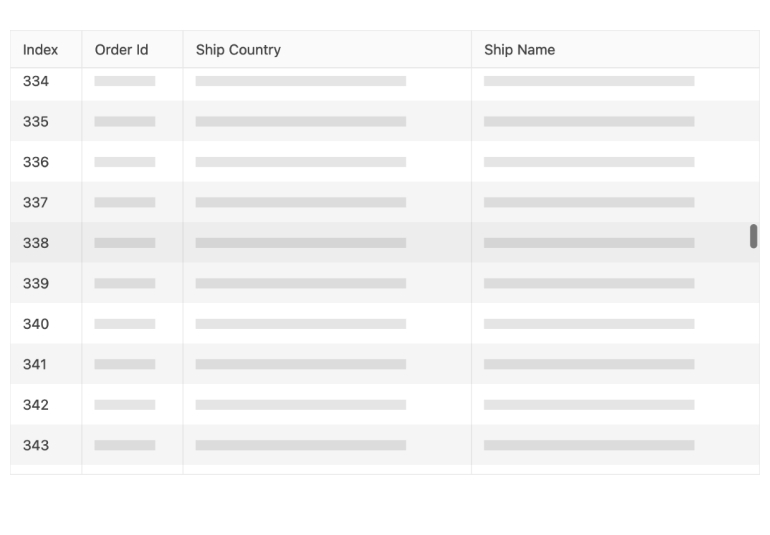
The KendoReact Grid now supports the same placeholder UX of the Skeleton component as a built-in solution for cells that haven’t fully loaded their content yet—all without the need to write extra code. This new feature specifically targets the grid’s row and column virtualization functionality.
See React Data Grid demo: Virtualization Placeholders
Data Grid Improvements: Range Selection
In some Data Grid usage scenarios, you want to enable the end user to select individual table cells or a range of cells (by clicking and/or dragging) and see calculations based on the selection. With R2 2021, the React Grid selection options enable this functionality quickly and easily through the built-in Cell Selection and Range Selection support for rows and cells.
See React Data Grid demo: Range Selection
Data Grid Improvements: Expand/Collapse All Groups
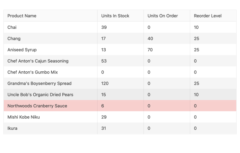
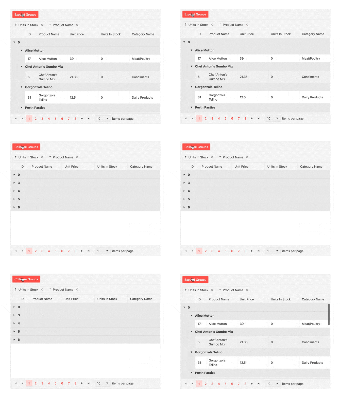
KendoReact developers can now enjoy improved rendering in the Data Grid with out-of-the-box support for expand and collapse options for all groups. Further additions in the KendoReact Data Tools (kendo-react-data-tools) can be used for managing the expanded states easily.
See React Data Grid demo: Expand/Collapse All Groups
Data Grid Improvements: Persist Grouping
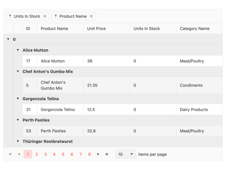
The new KendoReact Grid Persist Grouping feature ensures that the state of grouped items being expanded or collapsed will persist through data operations of the Grid. The main benefit of this feature is best evident in scenarios when users expand and collapse groups, moving away from the current page, and then move back to the original page. All groups will have their state persisted and things will be just like the user left them.
See React Data Grid demo: Persist Grouping
React DatePicker, DateTimePicker, DateInput & TimePicker Improvements: Floating Label
For our date inputs library, this release adds support for the placeholder property, which is shown whenever the component is untouched or not focused. Providing an empty placeholder allows the label to "float." This improvement helps achieve better consistency with the Material Design guidelines and is available for the KendoReact DatePicker, DateTimePicker, DateInput and TimePicker.
See DatePicker demo & DateTimePicker demo: Floating Labels

React Scheduler Improvements: Multiple Event Selection
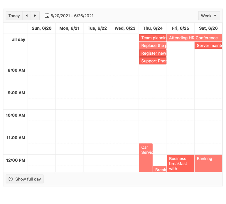
Occasionally, an end user may want to move or edit multiple Scheduler events simultaneously – say, if a series of meetings needs to change from mornings to afternoons or meeting duration needs to be changed. The KendoReact Scheduler now provides this functionality out of the box: enable the selection, dragging and even resizing of multiples events at the same time.
See Scheduler demo: Multiple Event Selection
React ColorPicker Improvements: Contrast Color
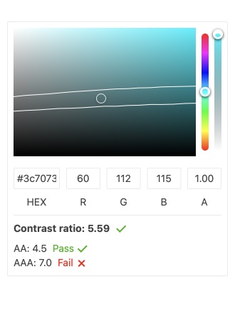
The KendoReact ColorPicker now enables contrast calculations between two colors based on WCAG contrast ratio recommendations. The component differentiates between two contrast levels: AA (minimum contrast) and AAA (enhanced contrast). Color contrast between text and background is a key accessibility concern in web development as it can affect people’s ability to perceive the information displayed on the screen.
See ColorPicker demo: Contrast Color
KendoReact - R2 2021
- New Component: React External Drop Zone
- New Component: React Skeleton
- New Component: React Circular Gauge
- KendoReact Documentation Upgrade: Adding TypeScript and Hooks Examples
- React Data Grid Improvements: Virtualization Placeholders
- Data Grid Improvements: Range Selection
- Data Grid Improvements: Expand/Collapse All Groups
- Data Grid Improvements: Persist Grouping
- React DatePicker, DateTimePicker, DateInput & TimePicker Improvements: Floating Label
- React Scheduler Improvements: Multiple Event Selection
- React ColorPicker Improvements: Contrast Color


