
KendoReact
What's New R3 2020
What's New HistoryNew Component: React Gantt Chart
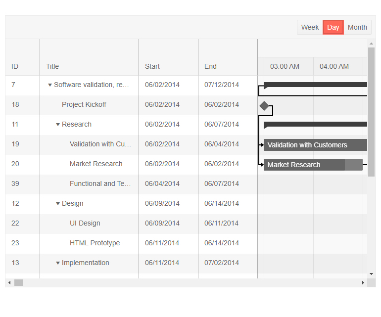
One of the most anticipated UI components of the R3 2020 release is the new React Gantt Chart. The Gantt is a type of bar chart that illustrates a project schedule. It allows users to plan, organize and track various tasks, see how they are related and how long each task should take to complete. Tasks have a visual bar to indicate their start and end date, how far along a particular task is, whether the task is on-time or late and much more.
New Component: React AppBar
The AppBar has become a staple for many web applications, targeting both desktop and mobile devices. The React AppBar component serves as the main header of your application, containing navigation elements and the title of the application or current page. It also allows you to add several action buttons and change available action items to ensure the perfect fit in your applications. The KendoReact team designed this component to be as flexible as possible, giving you a plethora of customization options when adding this React UI component to your applications.

New Component: React TextArea
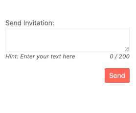
The React TextArea is another addition to the list of KendoReact form components. The new TextArea component is suitable for any scenario that requires multiple lines of text to be entered in a form field. Thanks to the various KendoReact themes, the TextArea (also known as Multi-line TextBox) component fits naturally into any design language and you can adjust its look-and-feel based on custom UX requirements.
New Component: React Rating
The new React Rating UI component allows users to leave a rating in a digestible, visual way. It enables you to easily display rating values that users can choose and change through the component's interface. With its built-in support for partial steps, KendoReact Rating can accommodate round, half or partial rating values, such as a 4.9 star rating. The new Rating component works well by itself or integrated into other React UI components, such as the KendoReact Data Grid.

New Component: React Chip
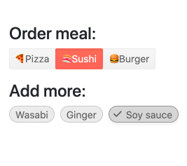
The new KendoReact Chips and ChipList components let you add stylized containers, often referred to as a "pill", to your React application.
The React Chip component is responsible for a single "pill" and can contain text, an image or avatar (optional) and a built-in icon such as an "X" to indicate that an action can be taken. The Chip can be used by itself or as part of other components to showcase unique values that have been selected by the user

New Component: React ChipList
The React ChipList component takes the React Chip and provides additional functionality related to a list. This includes the ability to manage a collection of Chips, such as adding and removing items and managing currently selected items from a list of Chips.
New Component: React Badge
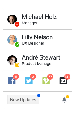
Popularized by mobile operating systems, badges represent small icons utilized to indicate unread messages or notifications. The Badge component has expanded its usage and become a popular element in web applications as well. With the new KendoReact Badge component, you can easily attach your own Badges to existing UI elements. It comes with built-in support for text and visibility, settings for size, positioning and overlap as well as the ability to just showcase a simple dot. The new React Badge component can be added to any existing user experience with a single line of code and some quick property edits.
New Component: React Loader
While KendoReact has some CSS styling for a loading indicator, the Progress Kendo UI team wanted to take this experience to the next level. With R3 2020, we are introducing the React Loader—a component perfectly suited for letting your users know that a process such as loading of remote data or fetching a view is happening in the background, while being visually pleasing. With several built-in animations and a slew of configuration options to make the KendoReact Loader your own, this component will make your application pop with its sleek UX.
To see available Loader styles, as well as get ideas for how you can customize the component to make it your own, head on over to the KendoReact Loader component section in our documentation.
See React Loader demo

React Data Grid Improvements: Row Pinning
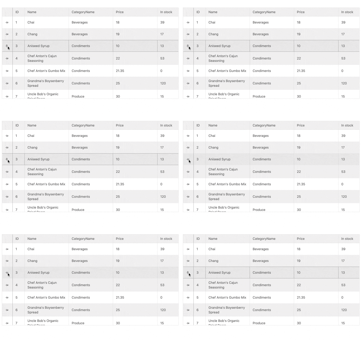
Adding to the growing list of data table features in the KendoReact Grid, the React Data Grid can now pin rows to the header and keep them always visible as users scroll through the rows of the Grid.
See React Data Grid demo: Row Pinning
Data Grid Improvements: Customizable Pager
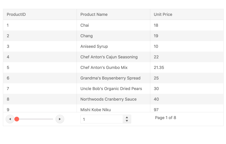
While the KendoReact Data Grid has had a built-in paging mechanism since its first release, with the introduction of the standalone KendoReact Pager component we wanted to move away from something that is purely built in and apply a more extensible model. This means that the KendoReact Grid now uses the KendoReact Pager to serve its paging mechanism.
This feature will be most useful to those of you who want full customization of the paging mechanism and the ability to override the default setup.
See React Data Grid demo: Paging
Data Grid Improvements: Pin Columns Through Column Menu
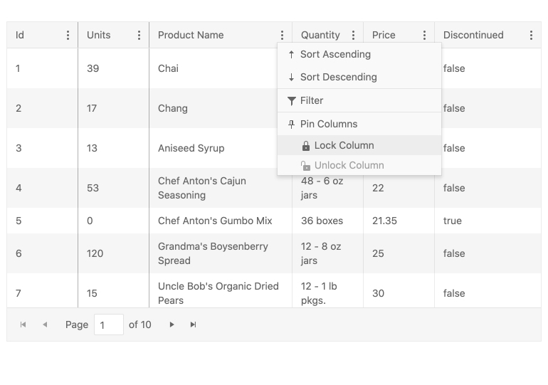
Column pinning, also known as frozen or sticky columns, is a feature that already exists in the KendoReact Grid. With this release, we are enhancing the user experience of the end user, letting them select which columns to pin (either to the left or to the right) through the already available column menu.
See React Data Grid demo: Pinned Columns
React Editor Improvements: Insert Image Dialog Updates
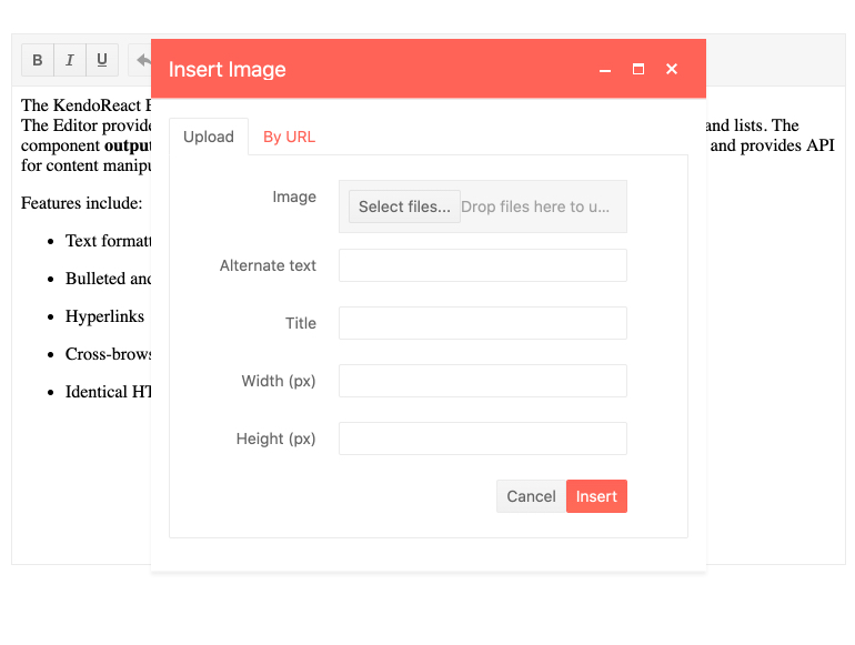
This feature allows images from the local file system to be uploaded and inserted into the content of the Editor. Previously, uploads were limited to images hosted on the web and required a URL to be added. With this new enhancement, end users can select images from their own devices and upload them into the Editor content.
See React Editor demo: Image Dialog
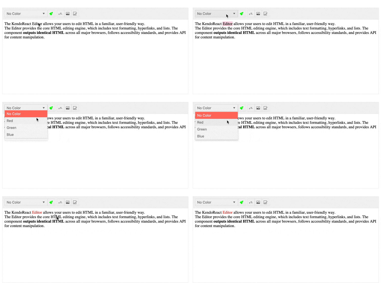
Editor Improvements: Font Color & Background Color Tools
Extending the KendoReact Editor features further with R3 2020, you can now enjoy additional tools to control both the font color and the background color, much like with the equivalent tools you find in word processors today.
See React Editor demo: Built-in Tools
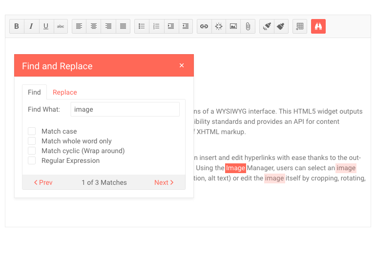
Editor Improvements: Find and Replace Tool
A quality-of-life update for KendoReact Editor users, the Find and Replace tool lets them search through the content of the Editor exclusively, without the necessity to rely on browser tools to search through the entire page. The tool also allows users to potentially apply a Find and Replace command throughout the entire content.
See React Editor demo: Find and Replace
New and Improved Documentation and Demos
Over the last couple of months, we have focused heavily on increasing the performance of our documentation pages. We understand that you rely on documentation daily to guide your work and that any page performance enhancements we deliver positively impact your productivity.
That's why we're excited to share that with R3 2020 we have increased the performance of the KendoReact docs across the board! We have seen the performance of some pages increase fourfold, improving the experience for desktop and mobile device users alike.
KendoReact - R3 2020
- New Component: React Gantt Chart
- New Component: React AppBar
- New Component: React TextArea
- New Component: React Rating
- New Component: React Chip
- New Component: React ChipList
- New Component: React Badge
- New Component: React Loader
- React Data Grid Improvements: Row Pinning
- Data Grid Improvements: Customizable Pager
- Data Grid Improvements: Pin Columns Through Column Menu
- React Editor Improvements: Insert Image Dialog Updates
- Editor Improvements: Font Color & Background Color Tools
- Editor Improvements: Find and Replace Tool
- New and Improved Documentation and Demos
