
KendoReact
What's New R1 2022
What's New HistoryNew Component: React ExpansionPanel
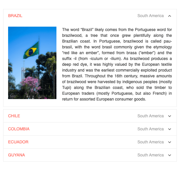
The ExpansionPanel is a fundamental UI layout component that organizes any content into a UI element, consisting of a title bar and expandable and collapsible content. It comes in handy when you want to save some real estate on the page. The new React ExpansionPanel component supports any type of content within its content area, can expand and collapse with built-in animations, provides custom icon support and much more.
See the React ExpansionPanel Component demo
New Component: React ScrollView (Carousel)
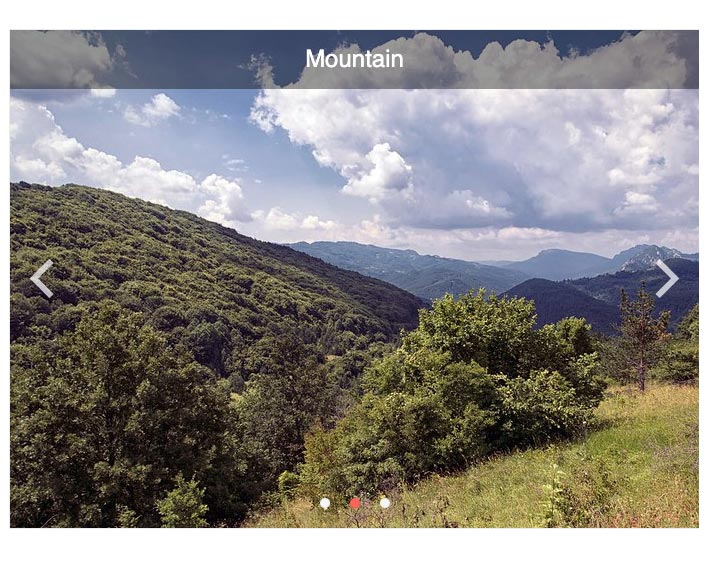
The new React ScrollView, also referred to as a Carousel, displays images or content in a horizontally scrollable collection with built-in navigation tools. Items within the ScrollView are displayed as dots in the navigation overlay and scrolling through content can be done automatically, through a set time interval, or manually by the end user.
See the React ScrollView Component demo
New Component: React Barcode
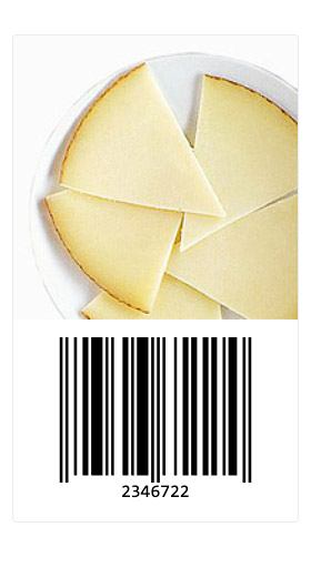
The new React Barcode component enables you to represent 2D barcodes within any React application and comes with built-in support for several Barcode types. Additionally, the KendoReact Barcode can be displayed as either an SVG or Canvas element.
See the React Barcode Component demo
New Component: React QR Code
The new React QR Code component enables you to generate various types of QR codes within your React app. You get support for different types of QR codes (including more complex ones such as Swiss QR Codes) and the ability to add custom overlays to any QR code, for example, to add a logo within your QR Code. Additionally, the React QR Code supports SVG and Canvas rendering.
See the React QR Code Component demo

New Component: React Popover
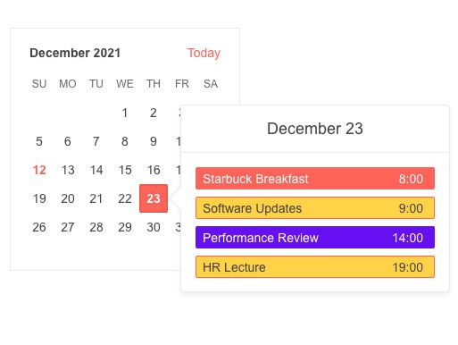
The KendoReact Popover component is perfect for displaying rich content when users hover, click or focus on elements within any React application. The difference between it and the Popup or the Tooltip components is that the Popover supports more complex content and layouts. A common use case for this component is the additional element displayed with calendar events, which might include a list of attendees, meeting room information or agenda notes.
See the React Popover Component demo
New Component: React FlatColorPicker
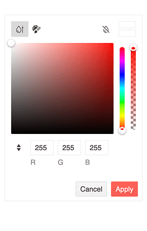
The new KendoReact FlatColorPicker component adds another option for your users to select colors in React applications. It provides a flat view for the ColorGradient and the ColorPalette components and adds a header and footer. Unlike the React ColorPicker component, the FlatColorPicker is not rendered within a popup or dropdown but is immediately rendered to the page.
See React FlatColorPicker Component demo
New Component: React Drag & Drop Utilities
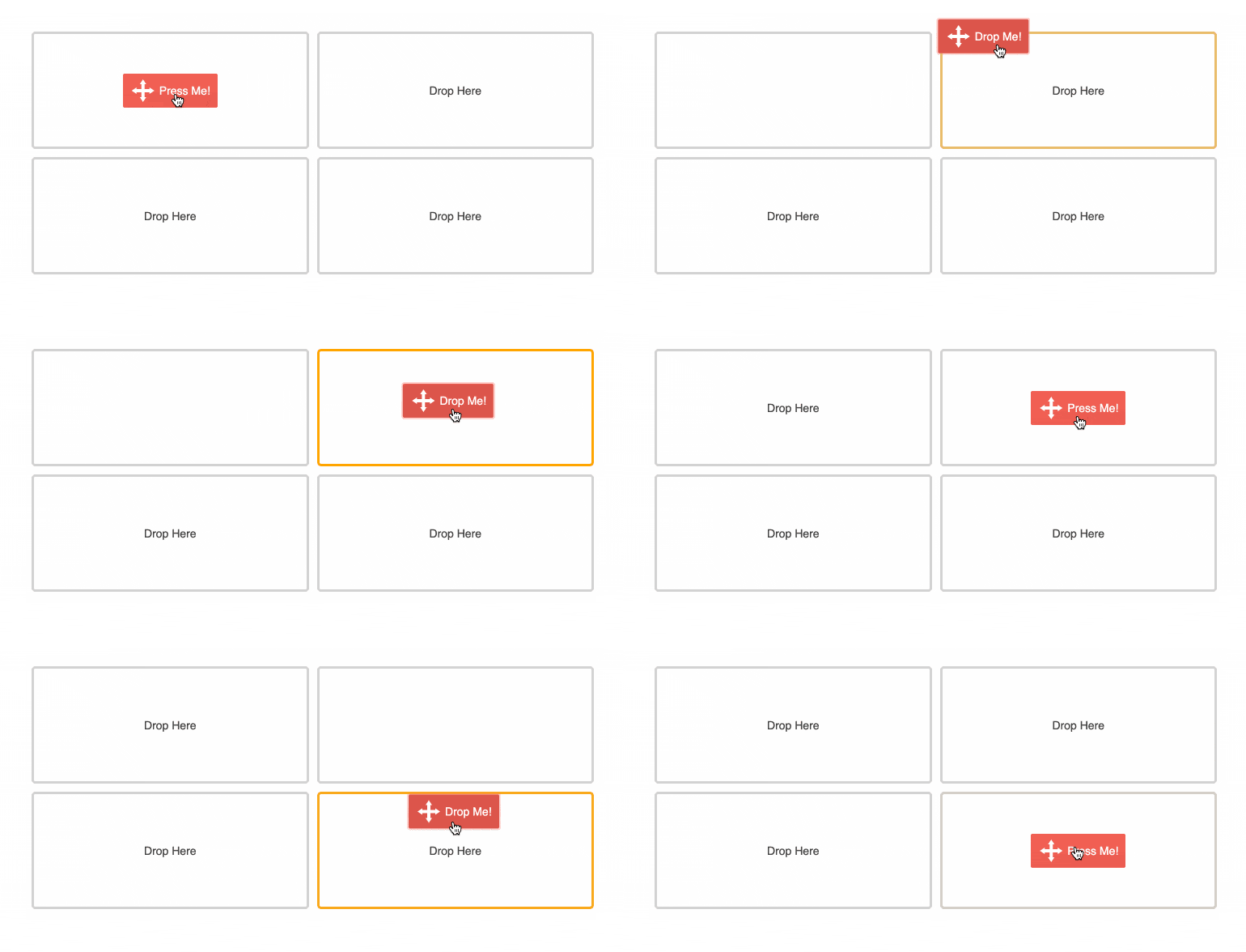
With R1 2022, we’re shipping a new, revamped set of components and hooks that can be used to add drag and drop interactivity to your React applications. This includes the new DragAndDrop, Draggable and Droppable React components, as well as the useDraggable and useDroppable hooks. Using these components in combination will enable React developers to have the ultimate flexibility in implementing drag & drop functionality in your apps.
See React Drag & Drop Utilities Component demo
Figma Kits Improvement: Near 100% Coverage with 90+ Components
Our Telerik & Kendo UI Kits for Figma, initially launched in 2021, keep growing fast and with v1.7, we now have introduced Figma components for almost all KendoReact components. There's really just one exception: the Charts library, which we are already working on.
React PivotGrid Improvement: Bind to Local Data
With R1 2022, the KendoReact PivotGrid component has added support for binding to local data. This is in addition to the original option for binding to an OLAP cube, which required a server-side implementation to serve data. With this update, developers can pull or create data within the client and bind it directly to the React PivotGrid component, depending on the application requirements.
React Buttons, Inputs, DateInputs and DropDown Packages: New Theme Rendering Options
The Kendo UI bundle of products includes four UI component libraries that help developers design and build apps with four of the most popular JavaScript frameworks and libraries: Angular, React, jQuery and Vue. Some of the developers using our libraries are either extending and customizing our UI components or building their own custom design languages. One key piece of feedback that we have received concerning the Kendo UI themes and their extensibility and customization is that, sometimes, more flexibility is needed for you to be able to meet all design requirements.
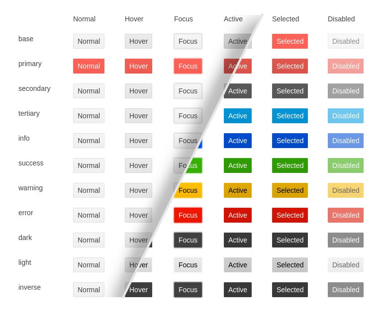
As a part of an ongoing effort to make Kendo UI and its themes more flexible and to help users cover design and UX requirements more easily, we are revisiting all Kendo UI components in the context of the Default, Bootstrap and Material themes. Specifically, we are working towards introducing common options that can be set on a component level to define the main theme colors, the size and shape of the individual components and more.
With R1 2021, we have updated the Buttons, Inputs, DateInputs, and DropDowns (30+ components in total) to offer the following theme rendering options:
- themeColor
- fillMode
- size
- shape
- rounded
These options have rolled out with the v5 release of the Kendo UI Sass-based themes. These updates will cause breaking changes for anyone who has customized our KendoReact components, so we highly recommend adding some time for addressing breaking changes as part of any update process you may have planned.
Read the blog: "Improvements Coming to Telerik and Kendo UI Themes in 2022"
React Data Grid Improvement: Live Data Sample in Docs
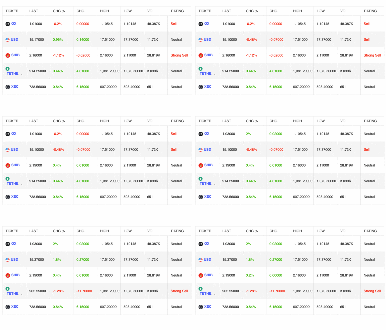
While the KendoReact Data Grid has supported live updating data since its initial release, we did not have a dedicated demo highlighting this functionality in our documentation. With R1 2022, we now have specific examples that showcase how to display live data with your React Data Grid!
See the React Data Grid demo: Live Data Updating
React Data Grid Improvement: Column Virtualization with Multi-Column Headers
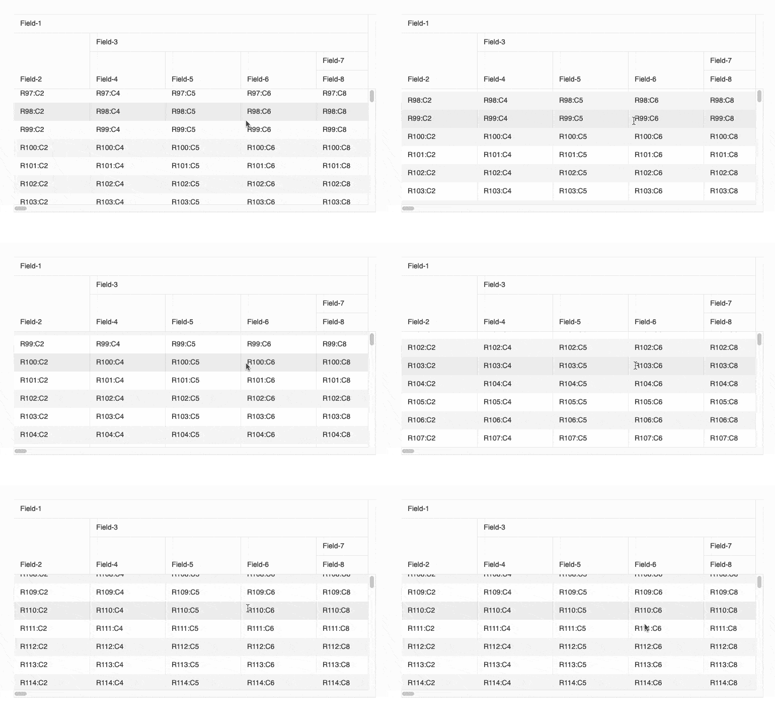
Virtualization is a popular approach to improve performance when displaying large datasets into your React Data Grid. Large datasets often mean a more complex structure—and likely, the need to have headers spanning several columns (multi-header columns). Having both virtualization and multi-header columns enabled simultaneously posed some challenges, which we’ve resolved with the latest version of the KendoReact Data Grid. Now, table virtualization and multi-header columns work seamlessly together.
See the React Data Grid demo: Column Virtualization with Multi-Column Headers
React Data Grid Documentation: New Performance Section
We know that performance is a key attribute you expect from your React table. To help all developers working with the KendoReact Data Grid get outstanding performance, we created a new documentation section to show features and tactics for making your React Data Grid as fast as possible. Our goal is to provide tips and tricks for how to get the best performance possible from this already powerful UI component.
React Scheduler Improvement: Item Auto-Height & Adaptive Slot Height
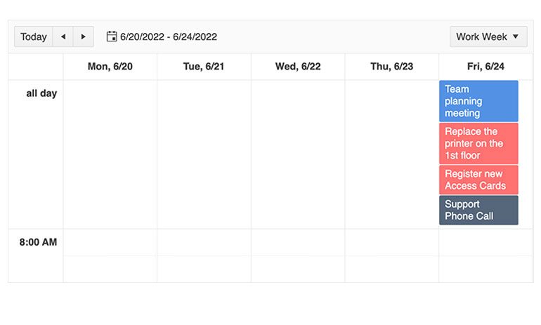
Тhe new Adaptive Slot Height feature in our React Scheduler is the answer for when you expect the number of events users schedule to vary a lot from day to day. By setting a minimum height of the Scheduler slot, you can prevent it from disappearing if no events have been scheduled. Similarly, if more events have been scheduled, using adaptive slot height is how you can ensure the Scheduler view will extend to accommodate them all, if needed.
The new Item Auto-Height feature deals with the same ability to auto-adjust or have a defined event height when events are displayed horizontally. This includes the TimelineView and the MonthView, plus the allDay section of Day, Week and WorkWeek views.
See React Scheduler Adaptive Slot Height demo
React Editor Improvement: Updated Selection
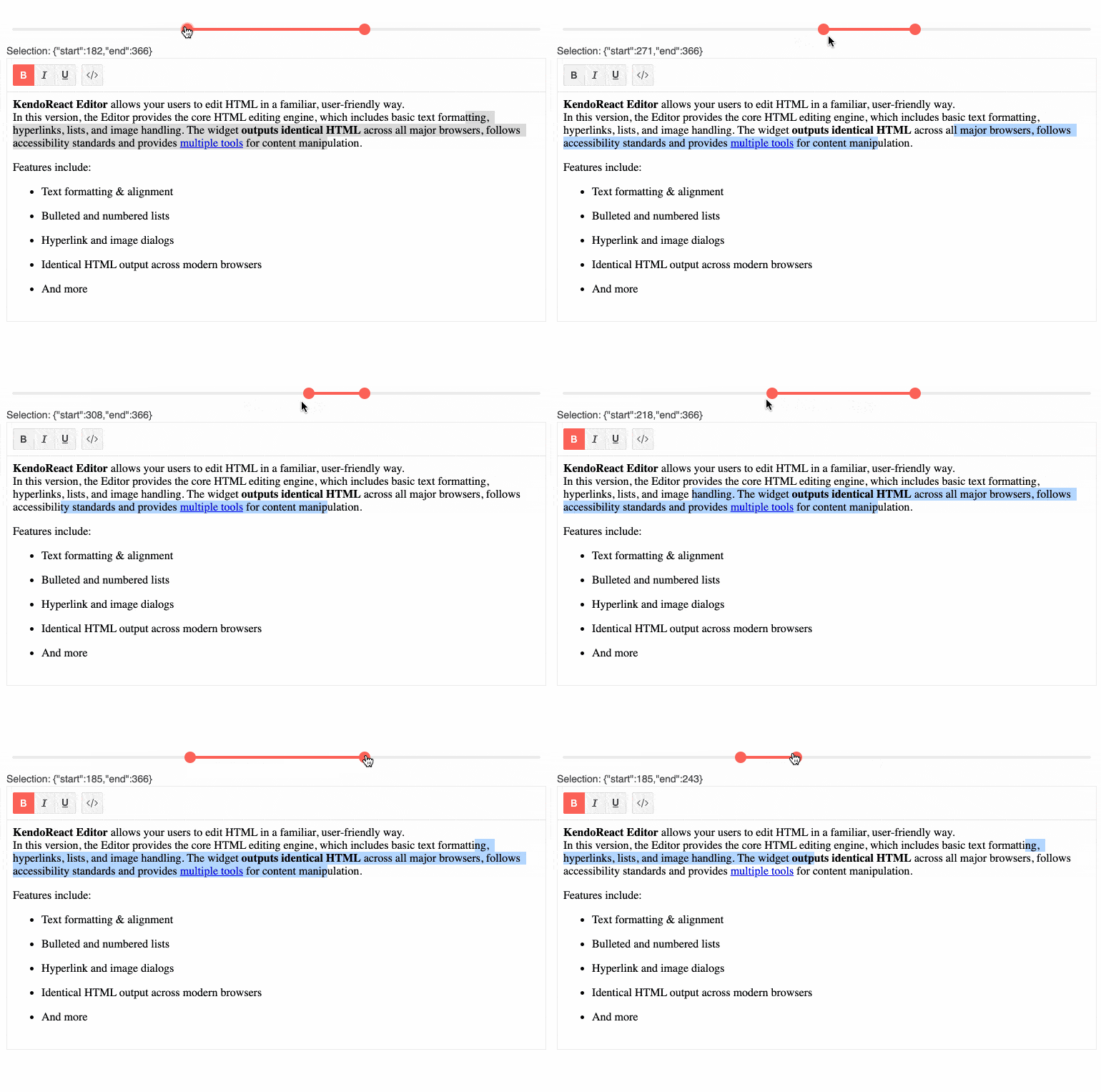
With this update, the KendoReact Editor is now ready to support new scenarios, such as automatically extracting the HTML from the Editor’s content upon selection or extracting content when a user presses a button. This is all possible thanks to improvements we made to the KendoReact WYSIWYG Editor’s Selection feature.
See the React Editor demo: Selection
React Editor Improvement: Updated Tools for Handling Lists
The React Editor received an update to how lists are handled within the rich text editor’s content area: users can now work with alphabetical lists. The React Editor component has also improved how nested lists are handled. With this update, we’ve added the ability for users to control what type of list should be used when creating sub-items within existing lists.
React Editor Improvement: Editor Resizing
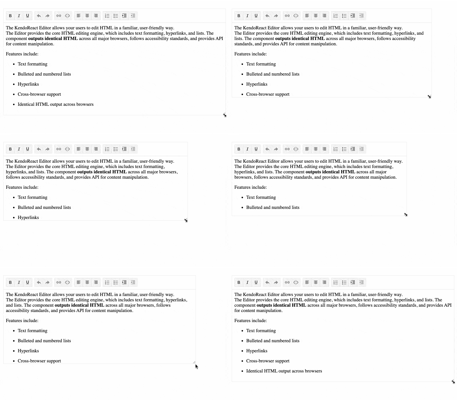
Until this release, the KendoReact Editor had a static height and width, but with R1 2022 users can enjoy a new resizing feature. You can now easily add a drag handle for when users hover over the edges of the component, giving them an intuitive experience for resizing the React Editor.
See the React Editor demo: Editor Resizing
React Editor Improvement: Image Resizing
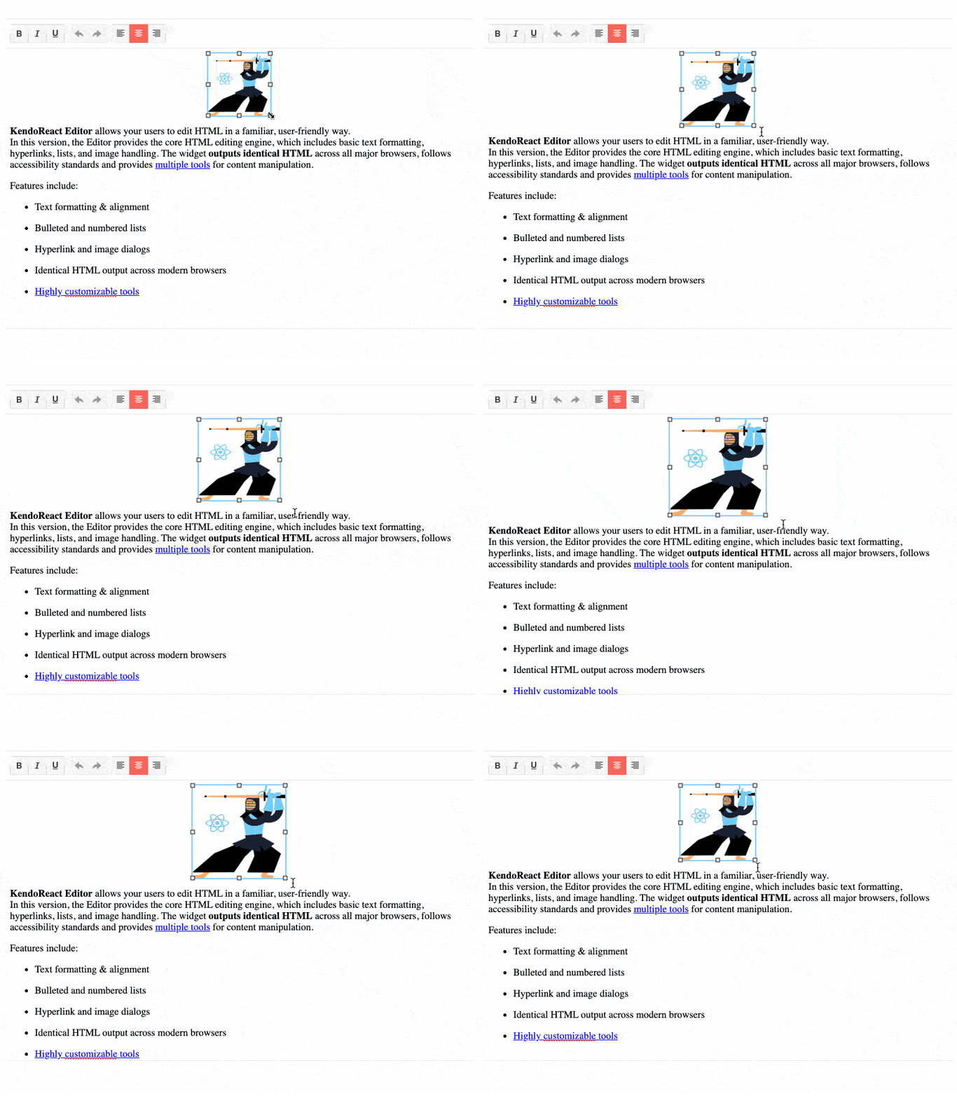
Another update that the KendoReact Editor received with this update is the option to resize images directly in the Editor’s content. When this feature is enabled, users can click on an image to activate a border with indicators they can drag to resize the image through a familiar interface.
See the React Editor demo: Image Resizing
React Editor Improvement: Expose TypeScript Interfaces for onMount, onExecute, onPaste, onFocus, and onBlur Events
With this release, the rich text editor in KendoReact is enhanced with new TypeScript interfaces for events, which are useful when initially rendering the component or when users interact with its content. Specifically, the KendoReact Editor now exposes interfaces for the onMount, onExecute, onPaste, onFocus and onBlur events.
React Charts Improvement: Updated Default Colors
The theme updates have also brought new and updated colors to all KendoReact Charts. These new default colors are used when no color has been set for a series. Previously, the default colors were limited in number and would be recycled if there were a large amount of series. With R1 2022, this is no longer the case and new colors will be used for all series. Additionally, we have taken the time to ensure that the colors and their look-and-feel are more modern and fit better with the styles of each KendoReact theme.
Various React Components Enhanced: Context Provider for Default Props
You may have noticed that more complex KendoReact components, such as the React Data Grid, are built using other KendoReact components. This means that components can have multiple layers of nested components—which, if you are looking to customize a component extensively, can become complex.
To make the KendoReact components easier to customize in these scenarios, we have been working with exposing `React.Context` to override properties of a deeply nested component. For this update, we’re introducing the Props Context to the DateInputs, Inputs and DropDown packages. As a next step, we want to gather your feedback and understand how these changes work for you. This will help us extend this functionality to other packages and components in the future, so we encourage you to try this new feature out and let us know what you think via our Feedback Portal (or your preferred way of reaching out).
See the Context Provider documentation: React Inputs, React DateInputs, React DropDowns
React TileLayout Improvement: Define Keys to Avoid Re-Rendering
With this release, we are introducing built-in keys to help avoid re-rendering the React TileLayout component when interacting with the items collection. This will help improve the performance so you can pleasantly surprise many of your TileLayout users just by upgrading to the latest version.
React PanelBar Improvement: Controlled Mode & Tab Mounted Options
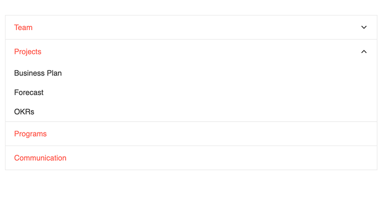
The KendoReact PanelBar now supports controlled mode. With that, developers can fully control the state of the React PanelBar instead of relying purely on the uncontrolled mode. Additionally, a Boolean option that allows content of collapsed panels to stay mounted is now available. This gives more power to developers in how they customize and interact with the component.
See the React PanelBar Controlled State demo
New Sample Projects: Using the KendoReact Data Grid with ASP.NET Core and Node.js Backends
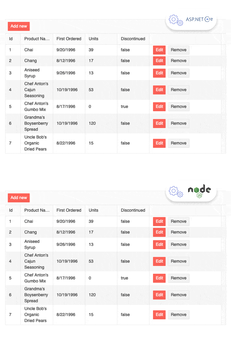
A common question developers ask when it comes to our React Data Grid is how to deal with requests on the server. As a demo says more than 1,000 words, with this release we are introducing two full stack sample applications built with the KendoReact Data Grid on the frontend and these popular technologies on the backend:
- ASP.NET Core
- Node.js
You can use this example as a reference when building your own applications. We hope it helps reduce the complexity of server communication with the React Data Table component.
See the Data Grid with NodeJS Express Server sample app
See the Data Grid with ASP.NET Core Server sample app
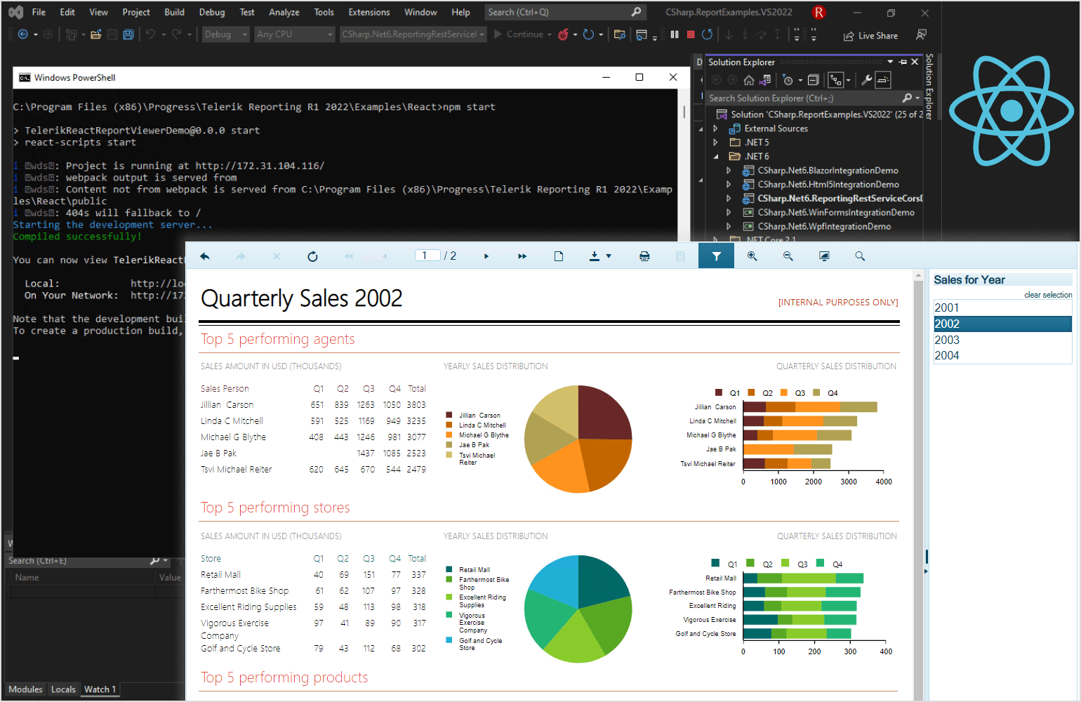
Telerik Reporting: New React Report Viewer
Telerik Reporting lets developers and users create, view and export rich, interactive and reusable reports. These reports can then be viewed in desktop, web and mobile applications alike through the various report viewers. With this release, the Telerik Reporting team has added official support for React applications via the new React ReportViewer.
See the Telerik Reporting React ReportViewer on npm
KendoReact - R1 2022
- New Component: React ExpansionPanel
- New Component: React ScrollView (Carousel)
- New Component: React Barcode
- New Component: React QR Code
- New Component: React Popover
- New Component: React FlatColorPicker
- New Component: React Drag & Drop Utilities
- Figma Kits Improvement: Near 100% Coverage with 90+ Components
- React PivotGrid Improvement: Bind to Local Data
- React Buttons, Inputs, DateInputs and DropDown Packages: New Theme Rendering Options
- React Data Grid Improvement: Live Data Sample in Docs
- React Data Grid Improvement: Column Virtualization with Multi-Column Headers
- React Data Grid Documentation: New Performance Section
- React Scheduler Improvement: Item Auto-Height & Adaptive Slot Height
- React Editor Improvement: Updated Selection
- React Editor Improvement: Updated Tools for Handling Lists
- React Editor Improvement: Editor Resizing
- React Editor Improvement: Image Resizing
- React Editor Improvement: Expose TypeScript Interfaces for onMount, onExecute, onPaste, onFocus, and onBlur Events
- React Charts Improvement: Updated Default Colors
- Various React Components Enhanced: Context Provider for Default Props
- React TileLayout Improvement: Define Keys to Avoid Re-Rendering
- React PanelBar Improvement: Controlled Mode & Tab Mounted Options
- New Sample Projects: Using the KendoReact Data Grid with ASP.NET Core and Node.js Backends
- Telerik Reporting: New React Report Viewer


