
Kendo UI for Angular
What's New R1 2023
What's New HistoryAngular Pager and ToolBar Enhancement: Sizing Options
To help developers adapt Kendo UI components to smaller screen sizes, the Pager and Toolbar components now have sizing options that give control over how they are rendered. These enhancements are part of what helps the Data Grid compact mode but can also be used on their own.
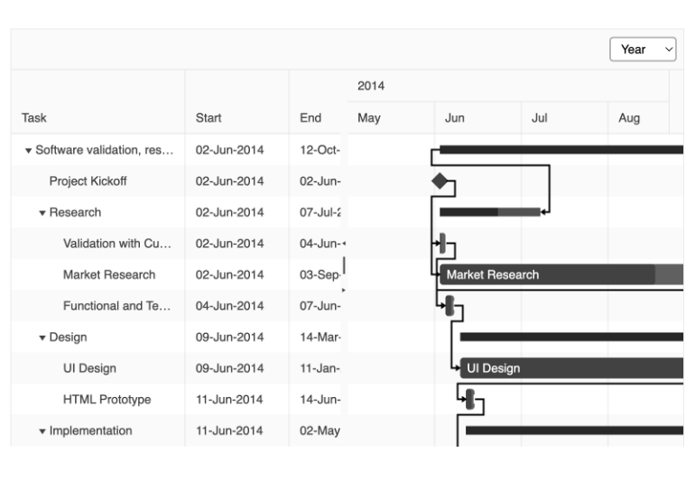
Angular Gantt Enhancement: Year View
To ensure that users get the view they need, the Angular Gantt component now has a Year View in its list of Views.
See the Angular Gantt Year View demo
All Angular Components: SVG Icon Support
Until now, Kendo UI themes have used font icons. With this release, SVG icons are also supported. You can now choose to use SVG or font icons.
Read the Angular SGC Icon documentation
Angular Scheduler Enhancement: Improved Keyboard Navigation
The Angular Scheduler supports keyboard shortcuts for those who prefer or need to navigate and interact with the component via keyboard. With this release, we have improved TAB behavior to ensure the best experience possible.
See the Angular Scheduler Keyboard Navigation demo

Angular Bullet Charts Enhancement: Label Support
You can now set a simple property to display labels in the Angular Bullet Chart to give users more context to what they are looking for.
See the Angular Bullet Chart Labels demo

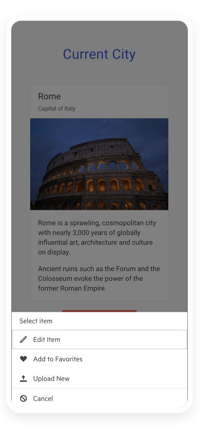
New Component: Angular ActionSheet
The Angular ActionSheet, sometimes called BottomSheet, is a UX device used for smaller screens when you need to alert or prompt users to action. It appears on the bottom of a screen as a modal dialog and presents users with a choice of actions that they must take. Since this element is popular in iOS and Android, it gives you an easy way to add a popular workflow to mobile or responsive applications.
See the Angular ActionSheet demo
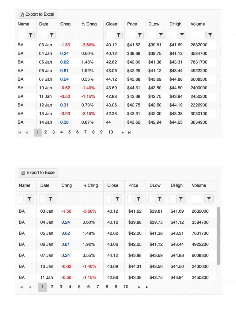
Angular Data Grid Enhancement: Compact Grid
Small screens are a primary channel for app delivery and developers are challenged with presenting data grid views in ways that device users can understand. To help solve this need, the Angular Data Grid now has a compact rendering mode. In this mode, cell padding will automatically be decreased regardless of which built-in theme is being used (Kendo Default, Material, Fluent, Bootstrap).
See the Angular Compact Grid demo
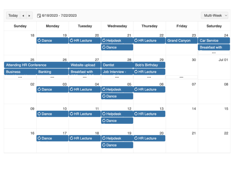
Angular Scheduler: Multi-Week View
To give you and your users ultimate flexibility, the Angular Scheduler’s Muti-Week View feature allows you to set a custom set of weeks to display. This is similar to the Month view except you can set the start date. Once set, the week of that date plus three more weeks will be presented.
See the Angular Scheduler Multi-Week View demo
Angular 15 Support
We always strive to deliver support for Angular framework releases as soon as they are released and Angular 15 is no exception. Take advantage of better performance, free yourself from ng modules, enjoy API improvements, and more!
Read more in the "Angular 15 - She's Here" blog post

TileLayout Enhancement: Keyboard Navigation
To ensure the best user experience and accessibility compliance, users can navigate, select, and interact with items in in the TileLayout component with keyboard shortcuts.
See the Angular TileLayout Keyboard Navigation demo

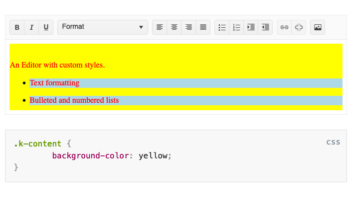
Angular Editor Enhancement: Custom Stylesheet Support
The Angular Editor now includes the ability to use custom stylesheets to format the content contained within it. This helps you match the style to the rest of your application or satisfy any other custom requirements you may face.
See the Angular Editor Custom Stylesheet demo
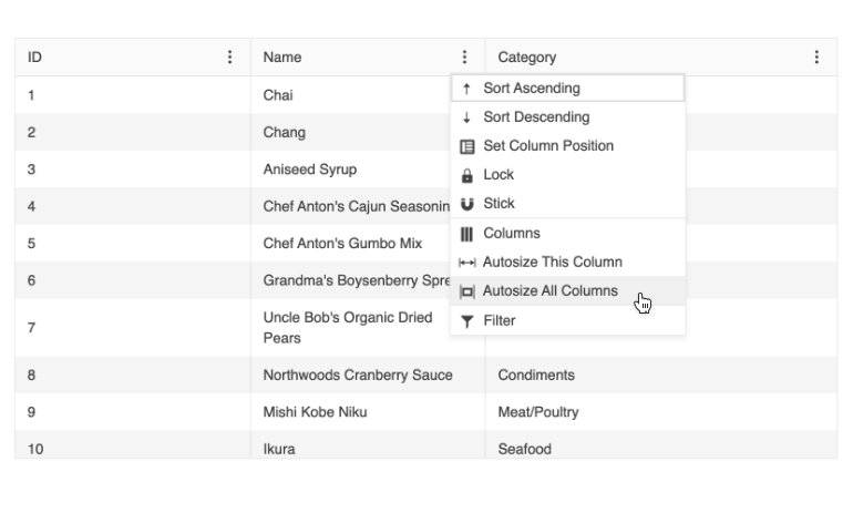
Angular Data Grid Enhancement: Column Menu Auto-Size Option
Developers working with the Angular Data Grid have the option to configure the columns to autofit to the viewable area the grid occupies. They also have the option to give users the ability to decide for themselves if they’d like to automatically size one or all columns. With this feature enabled, they will find the option on the column menu.
See the Angular Data Grid Column Menu Demo
Various Angular Components: Improved CSP Compliance
Content Security Policy (CSP) is a standard that browsers use to prevent cross-site scripting and other attacks. Our goal is for Kendo Ui for Angular to work within a strict CSP environment and have taken a step in that direction. With this release, we have removed styles that have led to the need for the ‘unsafe-inline’ exception.
See Kendo UI for Angular Content Security Policy

Kendo UI for Angular - R1 2023
- Angular Pager and ToolBar Enhancement: Sizing Options
- Angular Gantt Enhancement: Year View
- All Angular Components: SVG Icon Support
- Angular Scheduler Enhancement: Improved Keyboard Navigation
- Angular Bullet Charts Enhancement: Label Support
- New Component: Angular ActionSheet
- Angular Data Grid Enhancement: Compact Grid
- Angular Scheduler: Multi-Week View
- Angular 15 Support
- TileLayout Enhancement: Keyboard Navigation
- Angular Editor Enhancement: Custom Stylesheet Support
- Angular Data Grid Enhancement: Column Menu Auto-Size Option
- Various Angular Components: Improved CSP Compliance


