Pie Charts
RadChart has been deprecated since Q3 2014 and is no longer recommended for use, as it does not support modern browsers. We strongly recommend using RadHtmlChart, Telerik's modern client-side charting component. To transition from RadChart to RadHtmlChart, refer to the following migration articles:
Explore the RadHtmlChart documentation and online demos to determine how it fits your development needs.
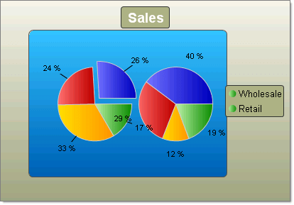
Pie charts are used to display the contribution of fractional parts to a whole. A Pie chart uses a single series of data. Multiple series of data can be defined and are each displayed in a separate pie chart.
You can tailor the look of each pie slice individually by working with the pie chart series Appearance property:
-
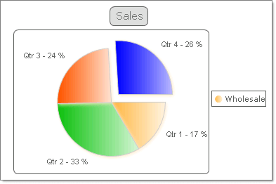
You can "explode" (i.e. offset) a single slice of the pie to emphasize a portion of the data by setting the pie chart series item Appearance.ExplodedSeries property to true.
-
The Appearance.FillStyle FillSettings property allows you to set the fill for each slice to Solid, Gradient, ComplexGradient, Hatch or Image. You also have control over gradients (colors, direction and angle), images (alignment, orientation), colors and shadows.
-
Control the label format and appearance for each slice using the pie chart series item Label property.The Label.TextBlock.Text can make use of built-in formats, such as "#Y" to show the values for the Y axis or "#%" to show the percentage value of a slice. The figure below uses a format similar to "Qtr 1 - #%".
-
You can chnage the size of the Pie by the DiameterScale property. The property accepts values between 0 and 1 and as it's name says it specifies the Diameter of the Pie. The closer to 1 the values is - the bigger the Pie's Diameter becomes.
To create a Pie chart set the RadChart DefaultType property or ChartSeries.Type Pie.