.NET MAUI RefreshView Styling
The RefreshView lets you style the built-in indicator to match the colors and sizes of your app. To fully replace the indicator, use RefreshView Templates instead.
Apply an Indicator Style
To style the built-in indicator, use the following properties of the RadRefreshView:
IndicatorStyle(Style)—Specifies the style applied to the built-in indicator selected byIndicatorType. TheTargetTypeof the style must be compatible with the selected indicator. Otherwise, the RefreshView ignores the style.IndicatorStyledoesn't change the indicator type.
The following table lists the indicator class that matches each IndicatorType value:
IndicatorType | Style TargetType |
|---|---|
Circular | telerik:RadCircularRefreshViewIndicator |
Spinner | telerik:RadSpinnerRefreshViewIndicator |
Arrow | telerik:RadArrowRefreshViewIndicator |
Indicator Styling Properties
All built-in indicators expose the following properties:
Color(Color)—Specifies the color of the indicator.WidthRequest(double)—Specifies the requested width of the indicator.HeightRequest(double)—Specifies the requested height of the indicator.
The RadCircularRefreshViewIndicator exposes the following additional properties:
CircleBackgroundColor(Color)—Specifies the background color of the circle.CircleRadius(double)—Specifies the radius of the circle.StrokeThickness(double)—Specifies the thickness of the progress arc.CircleShadowColor(Color)—Specifies the color of the circle shadow.CircleShadowOpacity(double)—Specifies the opacity of the circle shadow.CircleShadowOffset(Size)—Specifies the offset of the circle shadow.CircleShadowBlurRadius(double)—Specifies the blur radius of the circle shadow.
Style the Built-In Indicators
The following example demonstrates how to apply a custom style to each built-in indicator of the RadRefreshView.
-
Add the styles to the page resources:
XAML<Style x:Key="CircularIndicatorStyle" TargetType="telerik:RadCircularRefreshViewIndicator"> <Setter Property="Color" Value="#00897B" /> <Setter Property="CircleBackgroundColor" Value="#E0F2F1" /> <Setter Property="CircleRadius" Value="22" /> <Setter Property="StrokeThickness" Value="4" /> <Setter Property="CircleShadowColor" Value="#00897B" /> <Setter Property="CircleShadowOpacity" Value="0.4" /> <Setter Property="CircleShadowOffset" Value="0,3" /> <Setter Property="CircleShadowBlurRadius" Value="6" /> </Style> -
Define the RefreshView controls and set the
IndicatorStyleproperty:XAML<telerik:RadRefreshView x:Name="circularRefreshView" IndicatorType="Circular" BackgroundColor="#EEEEEE" IndicatorStyle="{StaticResource CircularIndicatorStyle}" Refreshing="OnRefreshing"> <Label Text="Circular indicator - pull down" Padding="20" /> </telerik:RadRefreshView> -
Add the
teleriknamespace:XAMLxmlns:telerik="http://schemas.telerik.com/2022/xaml/maui" -
Handle the
Refreshingevent and end the refresh when the data is loaded:C#private async void OnRefreshing(object sender, EventArgs e) { await Task.Delay(1000); ((RadRefreshView)sender).IsRefreshing = false; }
The following image shows the result:
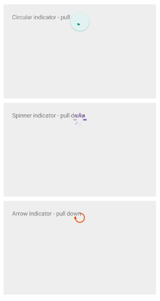
For a runnable example demonstrating the RefreshView styling, see the SDKBrowser Demo Application and go to the RefreshView > Styling category.