.NET MAUI Cartesian Chart Bar Series
The BarSeries is used to visualize data in a categorical chart, where each bar represents a category and its value. The bars can be displayed vertically or horizontally, depending on the chart's orientation.
Data Binding
The BarSeries binds to data through the following properties:
ItemsSource(IEnumerable)—Defines the collection of data items that the series plots.HorizontalBinding(string)—Defines the name of the data-item member that provides the value of each bar and this value is plotted along the horizontal axis.VerticalBinding(string)—Defines the name of the data-item member that provides the value of each bar and this value is plotted along the vertical axis.VerticalAxis(Telerik.Maui.Controls.Charts.ChartAxis)—Defines the vertical axis for the series which values resolved from theVerticalBindingproperty are plotted against.HorizontalAxis(Telerik.Maui.Controls.Charts.ChartAxis)—Defines the horizontal axis for the series which values resolved from theHorizontalBindingproperty are plotted against.
Combine Mode
The CombineMode (enum of type Telerik.Maui.Controls.Charts.ChartBarCombineMode) property defines how the bars from the same chart with different series are combined when they share the same category. The available options are:
- (Default)
Cluster—Renders bars side by side in each category. Stack—Renders bars stacked on top of each other, with the height of the stack representing the total value for that category.Stack100—Renders bars stacked on top of each other, with the height of the stack representing 100% of the total value for that category. Each bar's height is proportional to its value relative to the total.
For a runnable example with the Stacked bar series, go to the SDKBrowser Demo Application and navigate to the Charts > Series category.
Bars Customization
Use the following properties to customize the appearance of the bars:
Fill(Brush)—Defines the fill of the bars.Stroke(Brush)—Defines the brush to paint the stroke of the bars.StrokeThickness(double)—Defines the thickness of the bar stroke.CornerRadius(double)—Defines the corner radius of the bars. The default value is0, which means that the bars will have sharp corners. Set a positive value to round the corners of the bars.
Labels Customization
Use the following properties to configure the labels visualized for each data point:
-
ShowLabels(bool)—Defines whether the axis labels will be displayed. -
LabelPosition(enumof typeTelerik.Maui.Controls.Charts.BarLabelPosition)—Defines the position of the labels relative to the bars before theLabelOffsetis applied. The available options are:Base—Anchors the label inside the bar, next to its baseline (zero) end.Center—Anchors the label inside the bar, centered between its baseline and value ends.TopInside—Anchors the label inside the bar, next to its value end.- (Default)
TopOutside—Anchors the label outside the bar, beyond its value end.
-
LabelOffset(Size)—Defines the offset of the labels from the bars. -
LabelStyle(Stylewith target typeChartLabelAppearance)—Defines the style of the axis labels.
Example
The following example shows how to define a BarSeries.
- Define the
BarSeriesand the chart definition in XAML:
<charts:RadCartesianChart>
    <charts:RadCartesianChart.BindingContext>
        <models:CategoricalViewModel />
    </charts:RadCartesianChart.BindingContext>
    <charts:RadCartesianChart.Axes>
        <charts:CategoricalAxis />
        <charts:NumericalAxis Location="Left" />
    </charts:RadCartesianChart.Axes>
    <charts:RadCartesianChart.Series>
        <charts:BarSeries HorizontalBinding="Category"
                          VerticalBinding="Value"
                          ItemsSource="{Binding Data}" />
    </charts:RadCartesianChart.Series>
</charts:RadCartesianChart>- Add the
chartsnamespace:
xmlns:charts="clr-namespace:Telerik.Maui.Controls.Charts;assembly=Telerik.Maui.Controls"- Add the data model:
public class CategoricalData
{
    public string Category { get; set; }

    public double Value { get; set; }
}- Add the
ViewModel:
public class CategoricalViewModel
{
    public ObservableCollection<CategoricalData> Data { get; } = new ObservableCollection<CategoricalData>
    {
        new CategoricalData { Category = "Jan", Value = 42 },
        new CategoricalData { Category = "Feb", Value = 58 },
        new CategoricalData { Category = "Mar", Value = 37 },
        new CategoricalData { Category = "Apr", Value = 71 },
        new CategoricalData { Category = "May", Value = 64 },
        new CategoricalData { Category = "Jun", Value = 88 },
    };
}
This is the result:
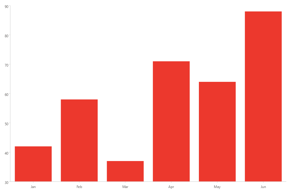
For a runnable example with the Cartesian Chart bar series, go to the SDKBrowser Demo Application and navigate to the Charts > Series category.