.NET MAUI Cartesian Chart Categorical Axis
The CategoricalAxis arranges the data points in categories. The axis is divided into discrete slots and each data point is visualized in the slot that corresponds to its categorical value.
Use a CategoricalAxis when one of the chart dimensions represents categories rather than numeric values—for example, when plotting a BarSeries against a NumericalAxis.
You define the axis through the Axes collection of the RadCartesianChart.
Axis Location
Use the Location (enum of type Telerik.Maui.Controls.Charts.ChartAxisLocation) property to specify the axis location. The available options are Left, Right, Top, or Bottom.
Use the GapLength (double) property to specify the distance between the axis and the chart area. The value is in the [0, 1] range, defaults to 0.3.
Line Styling
Use the following properties to customize the appearance of the axis line:
LineColor(Color)—Defines the color of the axis line.LineThickness(double)—Defines the thickness of the axis line.
Ticks
Use the following properties to control the ticks of the axis:
MajorTickColor(Color)—Defines the color of the major ticks.MajorTickThickness(double)—Defines the thickness of the major ticks.MajorTickLength(double)—Defines the length of the major ticks.
Plot Mode
The PlotMode (enum of type Telerik.Maui.Controls.Charts.AxisPlotMode) property defines how the data points are plotted relative to axis ticks. The available options are:
BetweenTicks—The data points are plotted between two consecutive ticks. This is the default value.OnTicks—The data points are plotted directly on the axis tick positions.- (Default)
OnTicksPadded—The data points are plotted directly on the axis tick positions, centered in their slot so the first/last points are inset from the plot area edges.
Labels Customization
The Categorical Axis exposes the following properties for configuring its position, labels, and appearance:
ShowLabels(bool)—Defines whether the axis labels will be displayed.LabelStyle(Stylewith target typeChartLabelAppearance)—Defines the style of the axis labels.LabelInterval(int)—Defines the step at which the axis renders labels.CategoryLabelFormat(string)—Defines the format of the axis labels.
Example
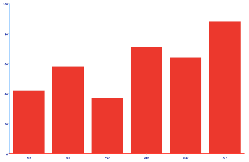
The following example shows how to configure a CategoricalAxis as the horizontal axis of the chart.
- Define the
CategoricalAxisand Chart in XAML:
<charts:RadCartesianChart>
    <charts:RadCartesianChart.BindingContext>
        <models:DateTimeViewModel />
    </charts:RadCartesianChart.BindingContext>
    <charts:RadCartesianChart.Resources>
        <Style x:Key="axisLabelStyle" TargetType="charts:ChartLabelAppearance">
            <Setter Property="TextColor" Value="#3F51B5" />
            <Setter Property="FontSize" Value="11" />
            <Setter Property="FontAttributes" Value="Bold" />
        </Style>
    </charts:RadCartesianChart.Resources>
    <charts:RadCartesianChart.Axes>
        <charts:DateTimeAxis MajorStep="1"
                             MajorStepUnit="Month"
                             MajorTickColor="#865FC5"
                             MajorTickThickness="3"
                             MajorTickLength="8"
                             LabelFormat="MMM/yyyy"
                             LineColor="#FF453A"
                             LineThickness="2"
                             LabelStyle="{StaticResource axisLabelStyle}" />
        <charts:NumericalAxis Location="Left"
                              MajorTickLength="8"
                              MajorTickThickness="3"
                              LineColor="#0B84FF"
                              LineThickness="2"
                              LabelStyle="{StaticResource axisLabelStyle}" />
    </charts:RadCartesianChart.Axes>
    <charts:RadCartesianChart.Series>
        <charts:LineSeries HorizontalBinding="Date"
                           VerticalBinding="Value"
                           ItemsSource="{Binding Data}" />
    </charts:RadCartesianChart.Series>
</charts:RadCartesianChart>- Add the
chartsnamespace:
xmlns:charts="clr-namespace:Telerik.Maui.Controls.Charts;assembly=Telerik.Maui.Controls"- Add the data model:
public class CategoricalData
{
    public string Category { get; set; }

    public double Value { get; set; }
}- Add the
ViewModel:
public class CategoricalViewModel
{
    public ObservableCollection<CategoricalData> Data { get; } = new ObservableCollection<CategoricalData>
    {
        new CategoricalData { Category = "Jan", Value = 42 },
        new CategoricalData { Category = "Feb", Value = 58 },
        new CategoricalData { Category = "Mar", Value = 37 },
        new CategoricalData { Category = "Apr", Value = 71 },
        new CategoricalData { Category = "May", Value = 64 },
        new CategoricalData { Category = "Jun", Value = 88 },
    };
}
This is the result:
For runnable examples with the Cartesian Chart categorical axes, go to the SDKBrowser Demo Application and navigate to the Charts > Axes category.