.NET MAUI Calendar Navigation
You can navigate between the different views of the .NET MAUI Calendar programmatically or let the user change the views from the UI.
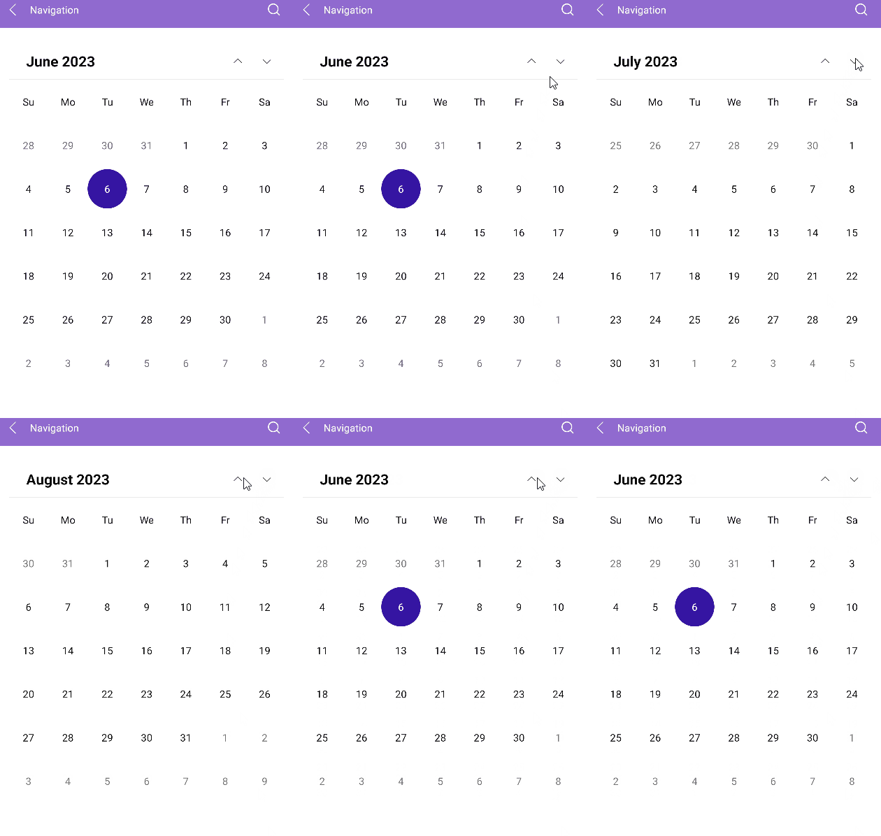
Navigating through Buttons
The Calendar header has two buttons (Previous and Next) that allow the user to navigate in the current view. For example, in the Month view, the Previous button navigates to the previous month, and the Next button navigates to the next month.
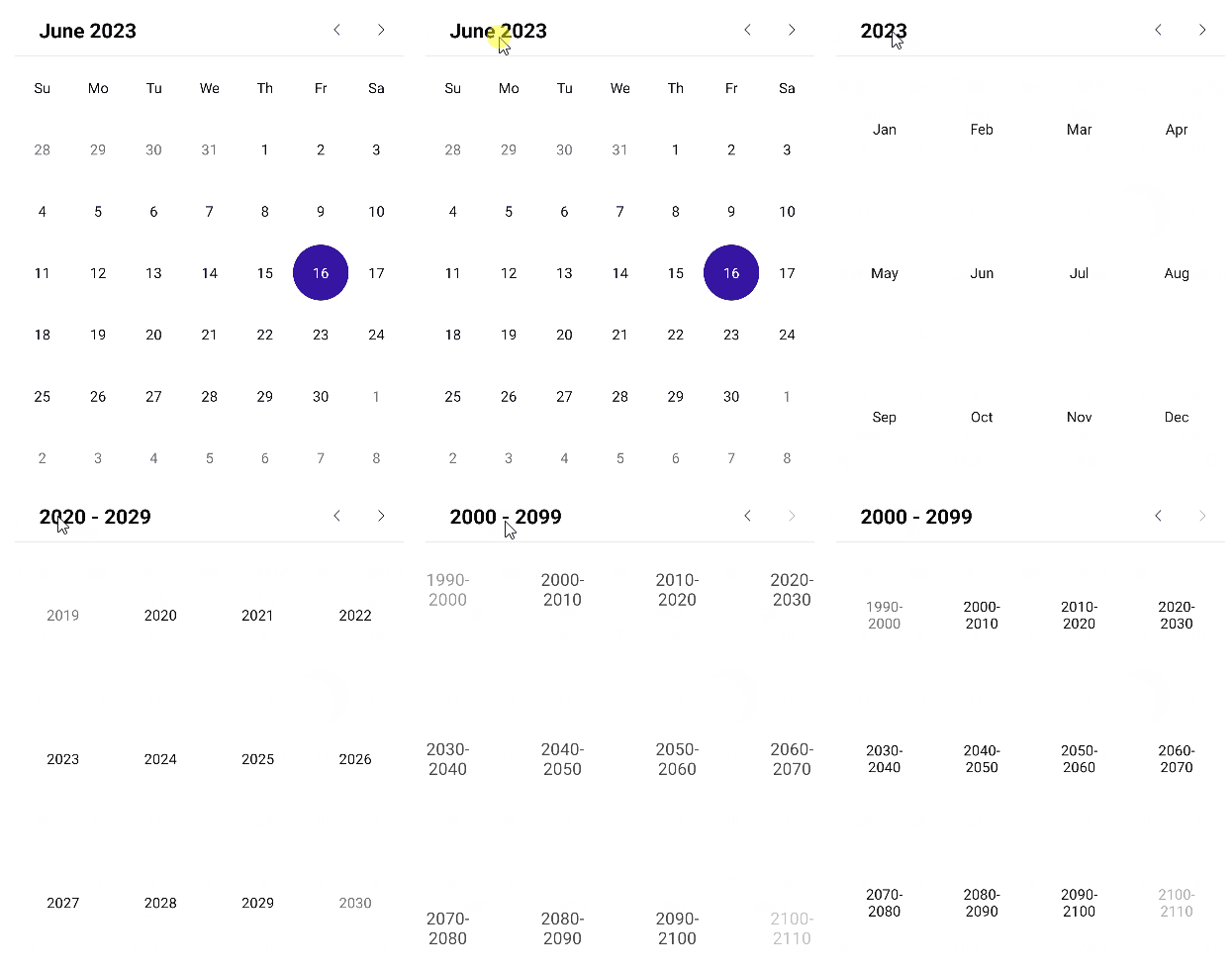
Navigating to the Parent View
The user can interact with the UI and navigate to the parent view by tapping or clicking the header label of the Calendar.
Restricting the Navigation Depth
To restrict the navigation depth to specific parent or child views, use the following properties:
MinDisplayMode(Telerik.Maui.Controls.Calendar.CalendarDisplayMode)—Specifies the minimum display mode of the Calendar.MaxDisplayMode(Telerik.Maui.Controls.Calendar.CalendarDisplayMode)—Specifies the maximum display mode of the Calendar.
Setting the Scroll Direction
The user can scroll between the display modes of the Calendar horizontally or vertically. To specify the scroll direction, use the NavigationDirection property.
NavigationDirection(enum of typeTelerik.Maui.Orientation)—Specifies the scroll direction in the view mode of the Calendar. The available options areHorizontal(default) andVertical.
<telerik:RadCalendar NavigationDirection="Vertical" />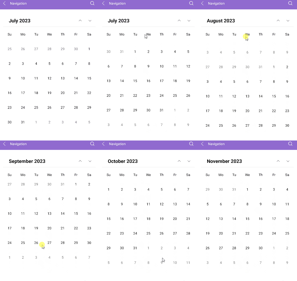
For a runnable example with the navigation of the Calendar, see the SDKBrowser Demo Application and go to the Calendar > Features category.
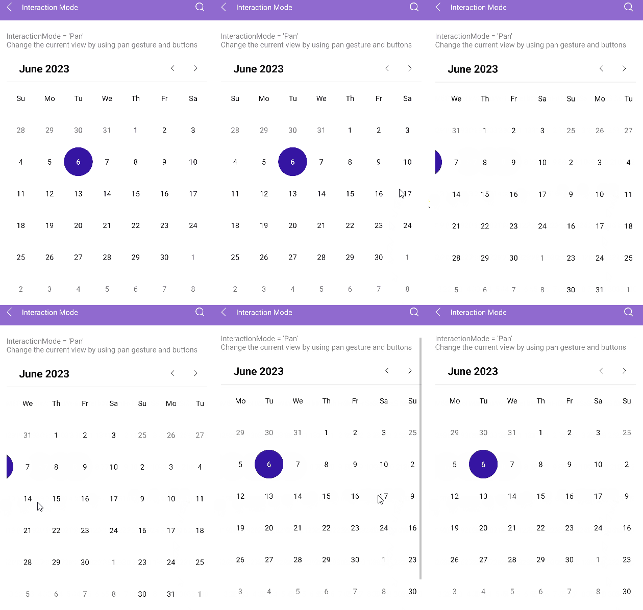
Changing the Interaction Mode
Use the InteractionMode(enum of type Telerik.Maui.Controls.Calendar.CalendarInteractionMode) property of the Calendar to determine whether the user can navigate in the current view through gestures. The available options are None and Pan (default):
- When the
InteractionModeisNone, the users can navigate to next or previous view in the current display mode by using the navigation buttons. - When the
InteractionModeisPan, the users can navigate through gestures that target the content area of the Calendar component.
For a runnable example with the Calendar interaction mode, see the SDKBrowser Demo Application and go to the Calendar > Features category.