.NET MAUI Calendar Overview
Updated over 1 year ago
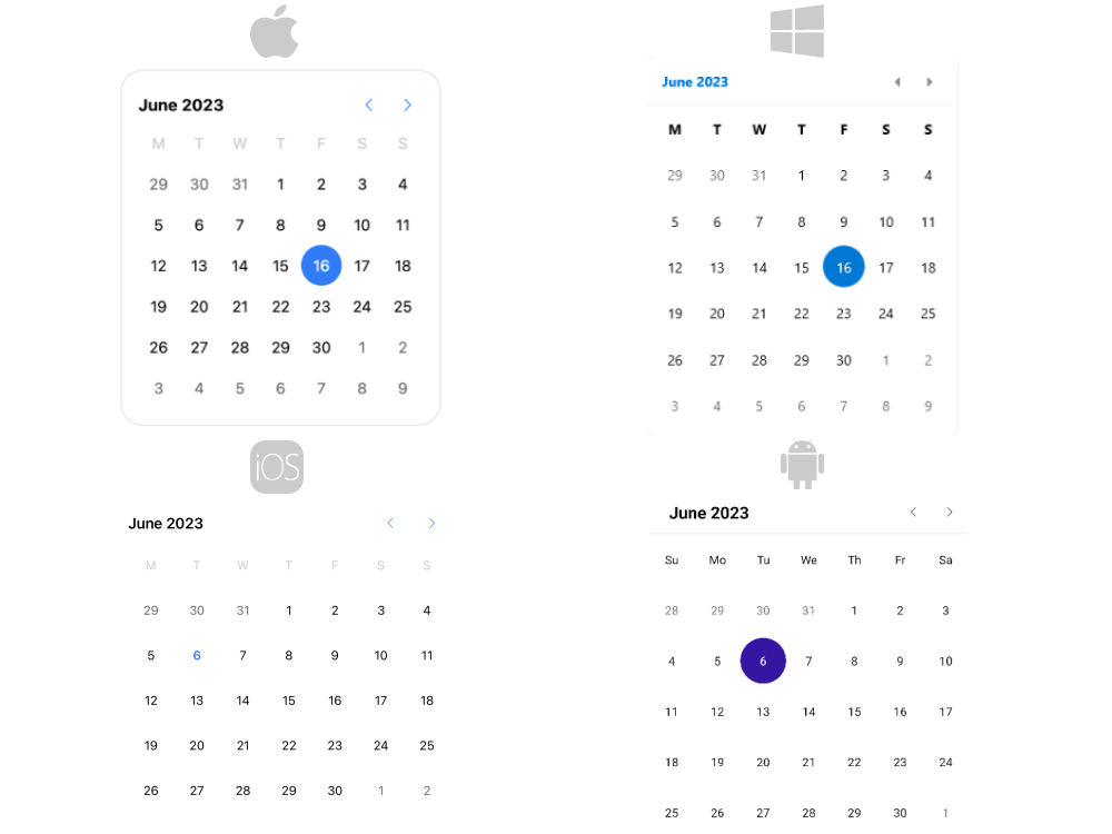
The Telerik UI for .NET MAUI Calendar allows you to select single or multiple dates by navigating between centuries, decades, years, and months. The control is culture-aware, providing globalization support for all .NET calendar implementations. You can customize its appearance by using the flexible styling API and exposed templates.

Key Features of the .NET MAUI Calendar
- Different display modes—The Calendar features year, month, decade, and century display modes.
- Date ranges—Restrict the visible/selectable dates in the Calendar by utilizing the
MinDateandMaxDateproperties. - Selection modes—the Calendar provides different types of selection: Single, Multiple, Range, or None. The selected dates can be changed programmatically or when the user taps on a calendar date cell.
- Flexible date navigation—Navigate in the current view by using the buttons in the header of the Calendar.
- Visibility of the names of the days—The Calendar control allows you to hide the names of the days when using the month view.
- Blackout dates—You can disable specific dates by adding them to the
BlackoutDatescollection. - Header text formatting—You can set the header text format for each display mode.
- Templates—The templates allow you to customize how the days, months, years, and decades are presented in the corresponding view.
- Commands support—The Calendar provides commands that allow the user to navigate in the current view or between the views.
- Flexible styling API—The styling API allows you to customize the border around the header, the label, navigation buttons, and the content of the corresponding view.
- Globalization support—The Telerik UI for .NET MAUI Calendar control supports globalization and allows you to adjust its culture through the
Cultureproperty.