What’s New in Telerik UI for ASP.NET Core R1 2021

Summarize with AI:
Happy New 2021, Fellow Developers! We hope it brings above all health, inspiration and prosperity to all of you! With the first Telerik UI for ASP.NET Core release of the year we are excited to share all new components, features and tools that you can plug into your projects and create modern and engaging applications in half the time.
The Telerik R1 2021 release includes five new Telerik UI for ASP.NET Core components like the Floating Action Button, Bottom Navigation, Expansion Panel, Radio Group, Checkbox Group plus new Grid, ListView, TileLayout and Editor features, brand new Visual Studio Code Wizard and many more! Read ahead and see what’s new in Telerik UI for ASP.NET Core R1 2021!
New UI for ASP.NET Core Components
New UI for ASP.NET Core Bottom Navigation Component
Bottom Navigation Overview
In addition to the App Bar component we shipped with Telerik R3 2020 last September, we are adding a Bottom Navigation Component and expanding the collection of navigational components to ease the development of your ASP.NET Core apps. The BottomNavigation component enables intuitive movement between primary destinations in an app (typically between three and five) represented by icon and optional text labels. The component comes with large number of configuration settings, events, built-in accessibility, keyboard navigation and right-to-left support (RTL).
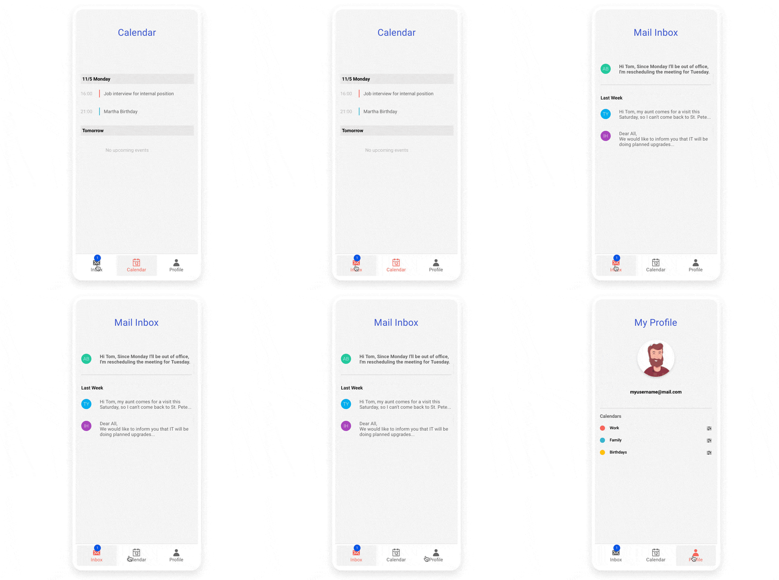
Telerik UI for ASP.NET Core Bottom Navigation Component
Bottom Navigation Component Customization
The bottom navigation appearance can be completely adapted to your app scenario and you can quickly set its: orientation, theme color, border, fill type, shadow and item flow to achieve the desired look and feel.
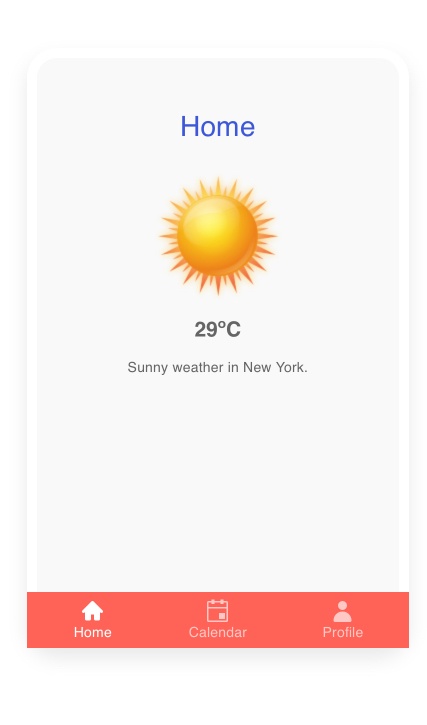
Telerik UI for ASP.NET Core Bottom Navigation Custom Appearance
The bottom navigation control also exposes specific configuration attributes for each of its items: text (optional), icon, CSS class, selected & enabled states and more.
Bottom Navigation Component Templates
In addition to customizing the appearance, you can render completely custom HTML including other Telerik UI for ASP.NET Core components in the bottom navigation.
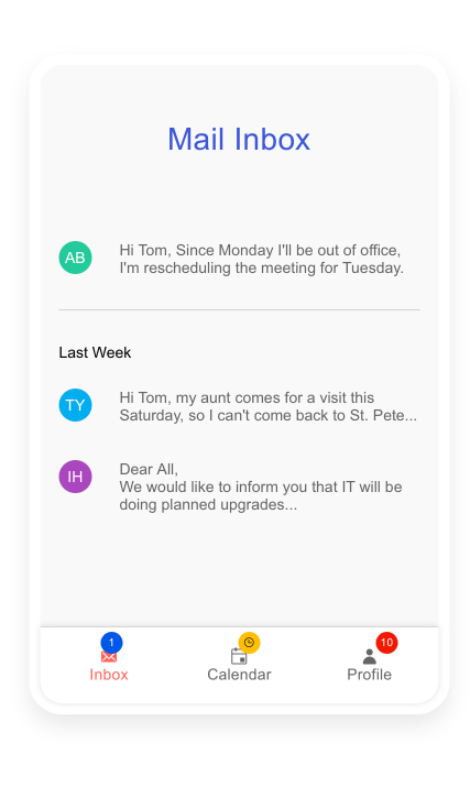
Telerik UI for ASP.NET Core Bottom Navigation Templates
New UI for ASP.NET Core Floating Action Button
Floating Action Button Overview
The Telerik UI for ASP.NET Core Floating Action button (FAB) comes handy when you need to enable quick access to the most common action in your apps UI. The name of the FAB button comes from the fact that it floats above the screen content and displays one primary action contextual to the current screen. The Telerik UI for ASP.NET Core FAB button comes with large number of configuration settings, events, built-in accessibility, keyboard navigation and right-to-left support (RTL).
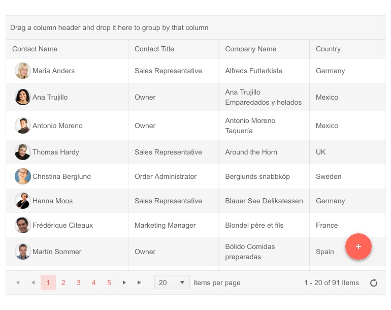
Telerik UI for ASP.NET Core Floating Action Button
Floating Action Button Configuration and Customization
The Floating Action Button can be easily customized according to your app requirements thanks to its large number of settings related to appearance and functionality:
- Alignment: Using the Align, AlignOffset and PositionMode settings you have full control over the FAB button position (fixed, absolute and even offset)
- Appearance: Name, Icon, Text, Shape, Size, Theme Color
- Speed dial actions: You can also configure the FloatingActionButton to display additional related actions (speed dial actions)

Telerik UI for ASP.NET Core Floating Action Button Shapes
Floating Action Button Templates
In case you need to go beyond customization and render custom content for the floating action button items (for example for its speed dial actions) you can easily achieve that using the FAB button templates feature.
Floating Action Button Events
The Floating Action Button component exposes several events to enable you to handle business logic in your ASP.NET Core apps: OnExpand, OnCollapse, OnItemClick, OnClick.
New UI for ASP.NET Core Expansion Panel Component
Arrange your app content nicely with areas that can easily be expanded and collapsed with the new Telerik UI for ASP.NET Core Expansion Panel component.
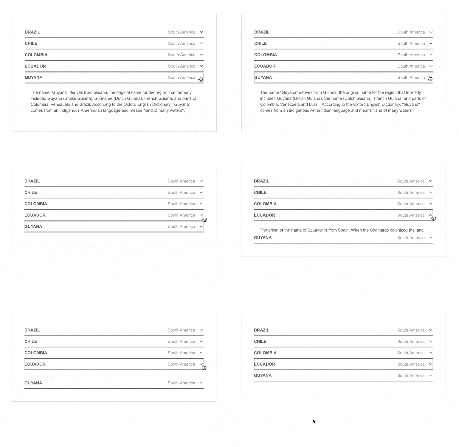
Telerik UI for ASP.NET Core Expansion Panel
The Expansion panel can be easily configured with the provided properties: Name, Title, SubTitle and Content. Additionally, it comes with options to:
- Enable/disable it via its Disabled property
- Expand/collapse via its Expanded property
- Prevent expansion/collapse via its Toggleable property
- Disable visual animation when expanding collapsing via its Animation property
And like most other Telerik UI for ASP.NET Core components it includes RTL support and requires zero work to interact with it using just keyboard thanks to its built-in keyboard navigation support.
New UI for ASP.NET Core CheckBox Group Component
CheckBoxGroup Component Overview
The Telerik CheckBoxGroup component for ASP.NET Core provides an out-of-the-box way to have a data bound styled list of checkboxes. The checkbox group control includes many configuration settings, events, built-in accessibility, keyboard navigation and right-to-left support (RTL).
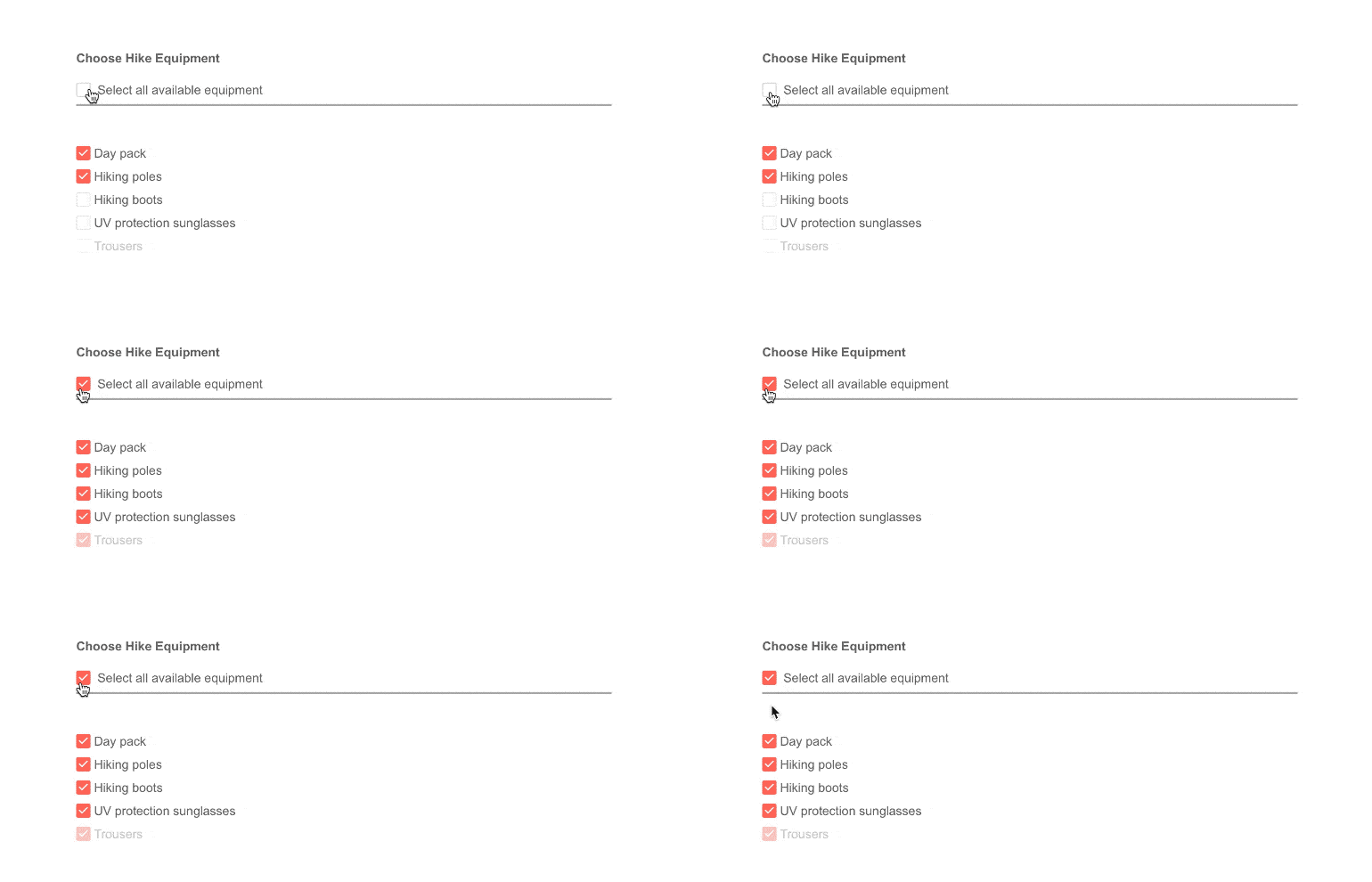
Telerik UI for ASP.NET Core CheckboxGroup Component
CheckBoxGroup Binding
CheckBoxGroup data binding is available via the two methods: Items () and BindTo(). You can use the Items() method for binding each of checkbox group items and BindTo() methods when binding the checkboxgroup to a data model.
CheckBoxGroup Labels and Layout
The CheckBoxGroup list items can be arranged in horizontal and vertical positions and for further custom looks you have full control over the labels positioning. See how in the official docs.

Telerik UI for ASP.NET Core CheckboxGroup Layout and Labels
New UI for ASP.NET Core Radio Group Component
RadioGroup Overview
The new RadioGroup component represents a styled list of radio buttons, similar to the CheckBoxGroup component, however users are able to select just one option from the list.
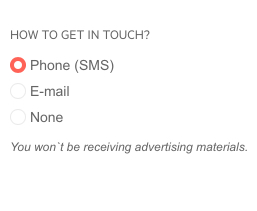
Telerik UI for ASP.NET Core RadioGroup Component
RadioGroup Binding
Just as with the CheckBoxGroup, the binding can be performed via the Items() and BindTo() methods.
RadioGroup Labels and Layout
The RadioGroup items can be arranged in a horizontal or vertical position. For further custom looks you have full control over the labels positioning. See how in the official docs.

Telerik UI for ASP.NET Core RadioGroup Layout & Labels
Form Component Integration
Last but not least both RadioGroup and CheckBoxGroup components fit nicely as built-in configuration items in the Form component.
New Telerik UI for ASP.NET Core Features
Grid Export to CSV
The Telerik UI for ASP.NET Core Grid has been enhanced with option to export its data to a CSV file (in addition to the existing options to export to PDF and Excel formats). By default, the Telerik UI Grid exports all rows, however you can configure it to export only selected rows. More information on available Grid export options can be found on the dedicated documentation page.
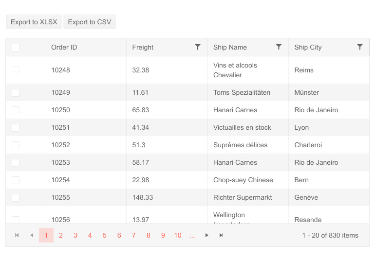
Telerik UI for ASP.NET Core Grid Export to CSV
Organize Items in the Grid Column Menu
The Grid column menu has been enhanced with a new rendering mode available as configuration option that can be easily set. By default, the column menu is initialized with the "classic" render mode, and if you would like to take advantage of the new styling you can easily switch it to "modern."
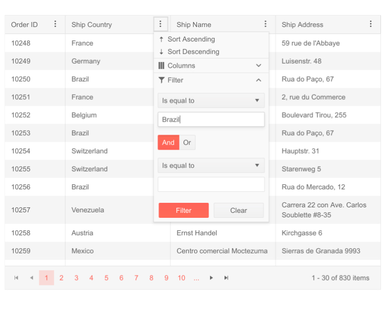
Telerik UI for ASP.NET Core Grid Column Menu Modern Rendering
Exportable Property for Grid Columns
The Telerik UI for ASP.NET Core Grid columns now have a new Exportable property that lets you define which columns will be exported and which skipped. In addition to that, you can set a column as exportable only when specific file format is used (for example exportable for CSV, but not for PDF).
New Editor Feature: Import, Edit and Export Files
The Telerik UI for ASP.NET Core Editor component can easily serve as a rich text editor by allowing you to import, edit and export its content. Supported file import formats include: DOCX, RTF, HTML and TXT, and with regards to the export supported formats, these include: DOCX, RTF, PDF, HTML, TXT.

Telerik UI for ASP.NET Core Editor - Import, Edit & Export
New Editor Feature: List with Roman Numerals as Bullets
The Telerik UI for ASP.NET Core Editor component now supports unordered lists of items, as well as the option to create numbered lists with both Arabic and Roman numerals. An example of the new features can be found in the Editor All Tools demo.
New Editor Feature: Table Aligning Tool
When working with tables in Editor users can now easily align them using the new built-in tools for aligning to left, center or right. In the Editor All Tools demo you can select the editor table and the alignment options will appear in the toolbar allowing you to perform the needed alignment with a click of a button.
New TileLayout Feature: Add/remove items options
The Telerik TileLayout component now supports dynamically adding and removing tiles. It's a perfect fit for dashboard-like applications where app users will have the flexibility to reorganize KPIs, add new items by dragging and dropping them from a side bar into the main visual area or completely remove them.
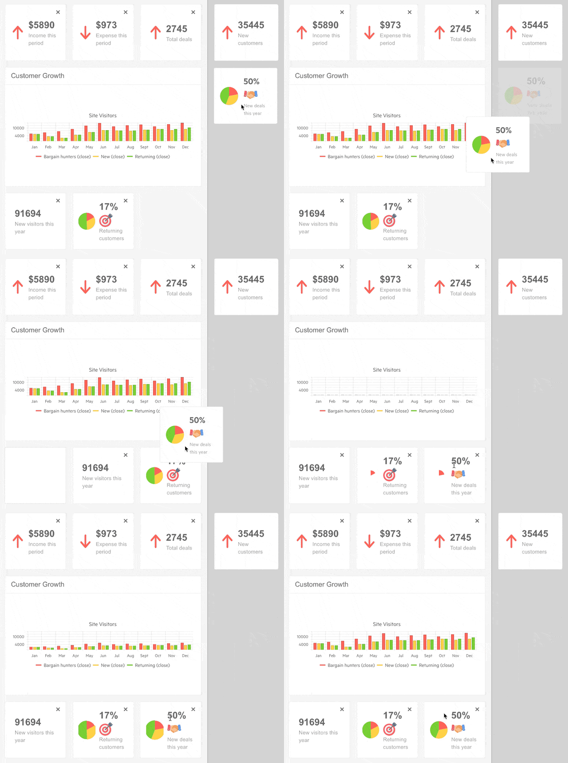
Telerik UI for ASP.NET Core TileLayout Add & Remove Items
New ListView Grouping Feature
ListView items can now be organized into groups using the DataSource grouping capability and proper configuration of the ListView template, so that it can accommodate the grouped data as shown in the List View grouping demo.
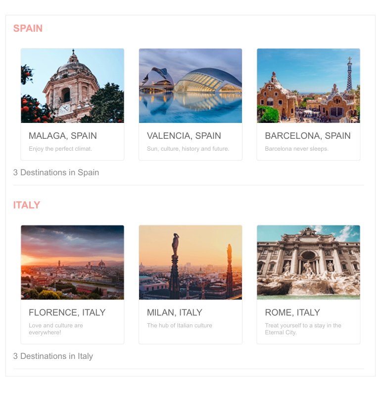
Telerik UI for ASP.NET Core ListView Grouping
Keyboard Navigation and Accessibility
With the R1 2021 release we added built-in keyboard navigation and support for the accessibility standards WAI-ARIA, Section 508 and WCAG 2.1 for several components: ScrollView, Drawer, Timeline and TileLayout.
New Visual Studio Code Wizard
In previous releases we gave lots of love to Visual Studio and expanded our extensions and templates for it. With R1 2021 shipped a new Visual Studio Code wizard that will ease the process of project creation with Telerik UI for ASP.NET components. Using the wizard, you can easily get started with predefined project templates that already integrate Telerik UI for ASP.NET Core components like the Grid, Chart and form inputs. You can also quickly configure a SASS theme and pick among Default, Material and Bootstrap.
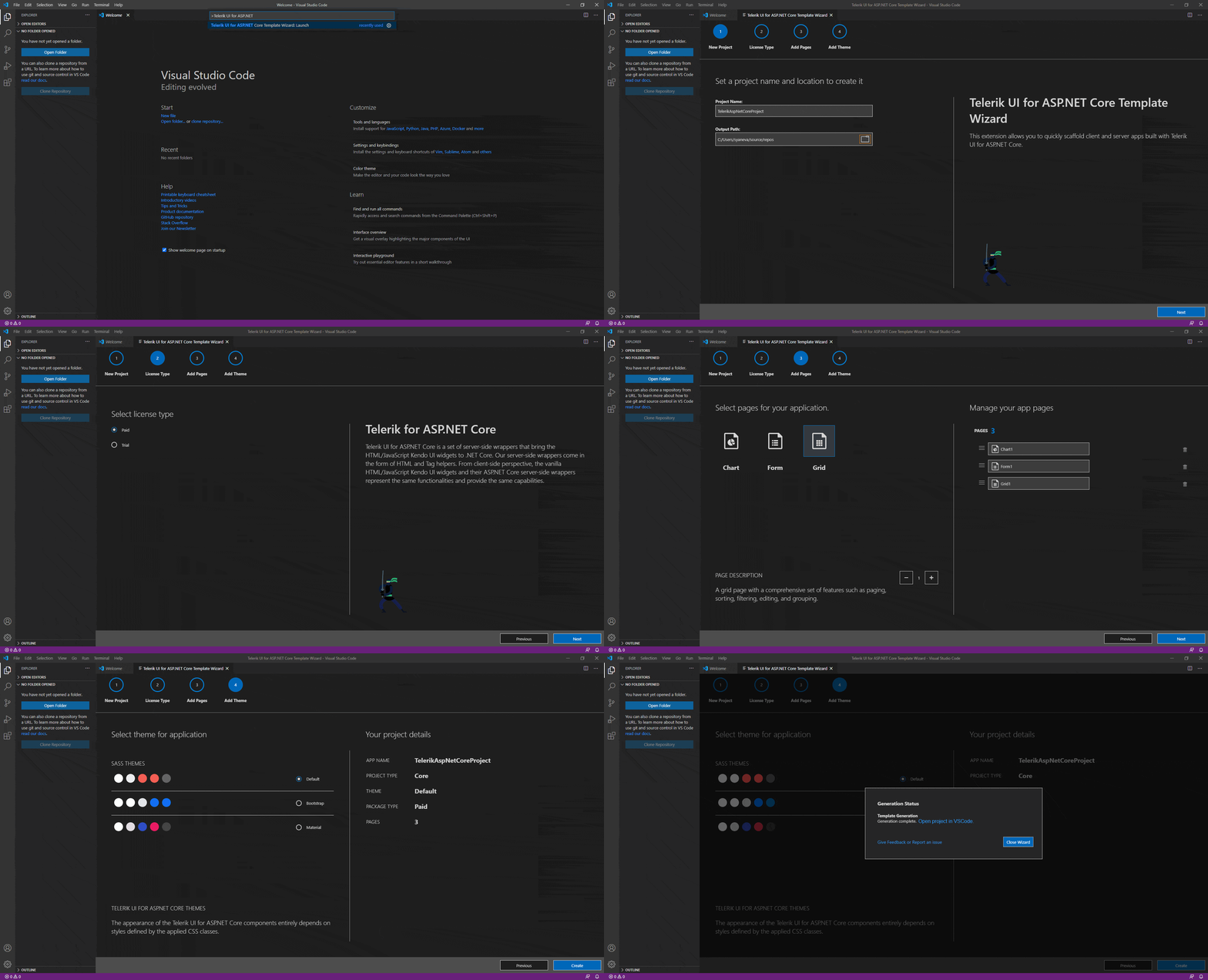
Visual Studio Code Wizard with UI for ASP.NET Core Templates
Improved Highlight of Area Series
Area charts can now have a visual indication when user hover over the various series. With the new feature the area charts will make non-hovered series transparent to give focus on the series that user is most interested in.
New Features in Telerik Document Processing: WordsProcessing Support for Content Controls
With R1 2021 release we have something new and for those of you who are using Telerik Document Processing within their ASP.NET Core apps! Content Controls enable users to add specific semantics to the document: restricting input, modifying editing behavior, etc. Usually, the content controls are used to create a template that allows you to fill specific data by interaction with the document (using checkboxes, predefined options, calendars). With the latest version of the RadWordsprocessing library you can create and manipulate the content controls inside a document.
Download the Latest Telerik UI for ASP.NET Core Now
Download and try a trial version of Telerik UI for ASP.NET Core, or if you are an active license holder you can just grab the latest and greatest from the Your Account page! Share your thoughts with us on our feedback portal and help us shape the future of UI for ASP.NET Core.
Special Twitch Session & Webinar
Be sure to sign up for the Telerik R1 2021 release webinar on Tuesday, January 26 | 11 am – 1 pm ET or join the full-day live session on Twitch on Friday, January 29, 8:00 am – 5:00 pm ET to see the newly released components and features in action and get ideas on how to use them in your projects for a deeper look at all the new features in the release.
Thank you for your continuous support & happy ASP.NET Core coding!

Maria Ivanova
Maria Ivanova is a Manager of Product Management at Progress, for Telerik and Kendo UI components and developer tooling. She joined the company in 2019 as a Product Manager for Telerik UI web components and is passionate about developing impactful and innovative software products. Maria believes that to create great products, it's important to challenge the status quo, closely collaborate with customers, and embrace a spirit of experimentation.
