New ASP.NET Core UI Components and Features with Telerik R3 2020 Release

Summarize with AI:
It’s September and time for the R3 2020 release of Telerik UI for ASP.NET Core! It is massive and includes great time-saving controls such as Image Editor, App Bar, Loader, Text Area, Wizard, Pager and new features like Grid Sticky Columns, Gantt Planned vs Actuals, Column Options and Templates, TreeList Checkbox Selection, Drag, Drop & Reorder, compatibility with .NET 5.0 and more!
With the third major release for 2020 we are excited to share all new components, features and enhancements that you can plug into your ASP.NET Core projects and create modern and engaging applications. As always, we listened to your feedback and included in the release many of the most voted items and features. Read ahead and see what’s included in Telerik UI for ASP.NET Core R3 2020!
Compatibility with .NET 5.0 Release Candidate
We are happy to announce that Telerik UI for ASP.NET Core R3 2020 release is compatible with .NET 5.0 Release Candidate, and we aim at staying aligned with all updates by Microsoft with its official release later this year in November.
New Telerik UI for ASP.NET Core Components
UI for ASP.NET Core Image Editor Component
Image Editor Overview
The new Image Editor is a flexible graphics editing UI component that allows end users to modify their images directly in their browser, without installing any third-party software. The ImageEditor comes with a canvas and handy toolbar exposing the built-in options to load, crop, resize, use zooming features, undo and redo commands and download the modified image.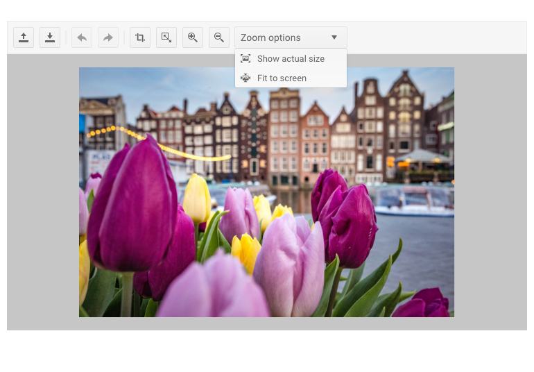
Telerik UI for ASP.NET Core Image Editor Component
Image Editor Resizing
When resizing an image, the ImageEditor displays a tool panel with options that will let you adjust width, height and lock aspect ratio. As you modify the image size settings and preview the applied changes, you can easily switch back and forth using the Undo/Redo buttons in the toolbar.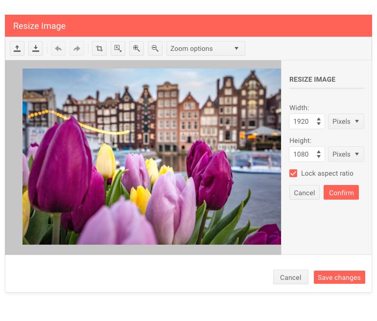
Telerik UI for ASP.NET Core Image Editor Resizing
Image Editor Cropping
Cropping an image also comes with a tool panel, which enables you to tweak aspect ratio, orientation, width and height of the image. Again, you can view the applied changes in real-time and have the option to revert a step back using the Undo button or confirm the changes and download the modified image.

Telerik UI for ASP.NET Core Image Editor Cropping
Image Editor Zoom Options
The zooming options are split into easily accessible Zoom-In and Zoom-Out buttons (as more common operations), and a separate dropdown for “Fit to Screen” and “Show Actual Size” operations. When using the “Show Actual Size” option, the image is displayed in its 100% size (if it's bigger than the image area, a scrollbar will be displayed). When the “Fit to Screen” option is selected, the image is displayed at its maximum with regards to the paddings of the area.
Image Editor Built-In Keyboard Support
Like most of the Telerik UI for ASP.NET Core components, the ImageEditor comes with out-of-the box keyboard navigation support.
UI for ASP.NET Core App Bar Component
AppBar Component Overview
The new App Bar is a component that can serve as header or footer template of a page and is used to provide contextual information and actions related to the application current screen. Using the AppBar templates you can easily include plain text or other controls and customize the component, so it matches your app requirements.

Telerik UI for ASP.NET Core AppBar Component
AppBar Configuration and Customization
As application scenarios vary a lot, we ensured that the AppBar is fully customizable, and you can easily adapt it as needed. You can configure the AppBar position mode (static, fixed or sticky), position (none, top, bottom), theme color (light, dark or inherited from the respective theme) and the array of AppBar items.
AppBar Items Configuration and Customization
Furthermore, as the AppBar component serves as a container for other items, you can configure both the AppBar and each of its items. On the AppBar items level you can specify CSS class name, width, type – spacer item or content item, as well as support for templates.
AppBar Event
The AppBar supports resizing, and we have exposed a resize event that is fired when the window gets resized and let you have control over the showing and hiding of AppBar items when the visible part of the viewport changes.
UI for ASP.NET Core Loader Component
Loader Component Overview
The new ASP.NET Core Loader component is a great match for cases where you need to indicate to users in your apps that a process is in progress—loading data, submitting a form or performing large volume of updates. The Loader provides multiple built-in options for configuring its animation, size and colors.
Telerik UI for ASP.NET Core Loader Component
Loader Component Customization
The Loader component allows for complete customization and comes in different shapes, animations, colors and sizes.
- Available Loader animations include: Pulsing (default), InfiniteSpinner and ConvergingSpinner.
- Using the ThemeColor property of the Telerik Loader component, you can easily set its color to one of the predefined colors from the Theme Builder.
- In addition to the colors, you can also adjust the Loader size, so that it fits your app scenario. The possible out-of-the box Loader sizes include small, medium and large.

Telerik UI for ASP.NET Core Loader Component Colors
Loader Component Integration
The Loader UI control can be easily integrated with other ASP.NET Core UI components to indicate that an operation is executing. Check out a demo on how to integrate a Loader with a Button component.
 Telerik UI for ASP.NET Core Loader Component Button Integration
UI for ASP.NET Core Text Area Component
TextArea Component Overview
The Text Area UI component is a nice addition for any application requiring wider or multi-line text editing capabilities such as descriptions, comments or address details. The control comes with multiple built-in features that let you easily customize every aspect of its look and behavior, such as defining maximum length of the text, number of columns and rows, placeholder, enabling/disabling, resizing and labels. Additionally, it exposes a Change event, to let you handle the business logic of your ASP.NET Core app.
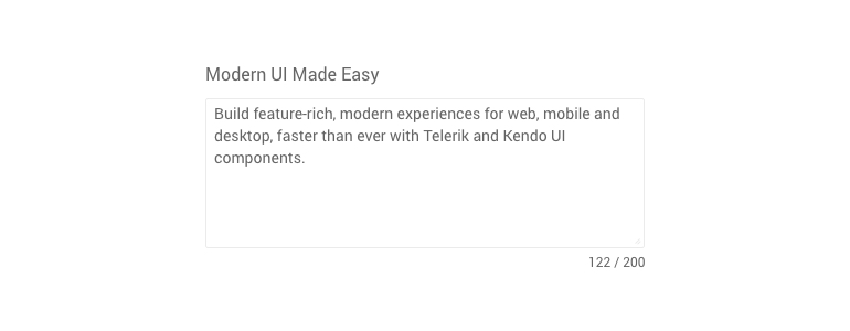
Telerik UI for ASP.NET Core TextArea Component
TextArea Component Labels
The ТextArea can have label associated with it. You can choose from three labeling options—the textarea label can be added in front of the input, within the content or as a fancy floating label.
 Telerik UI for ASP.NET Core TextArea Component with Floating Label
TextArea Right-To-Left Support
Like most of the Telerik UI for ASP.NET Core Components, the Text Area comes with out-of-the box RTL support.
UI for ASP.NET Core Wizard and Pager Components
Earlier in June, we announced the availability of another two gems that are part of R3 2020 scope—the Wizard and Pager for ASP.NET Core components. While we already received quite positive feedback about their usage and benefits, for those of you who missed their announcement, make sure to check out their full review in this blog post.
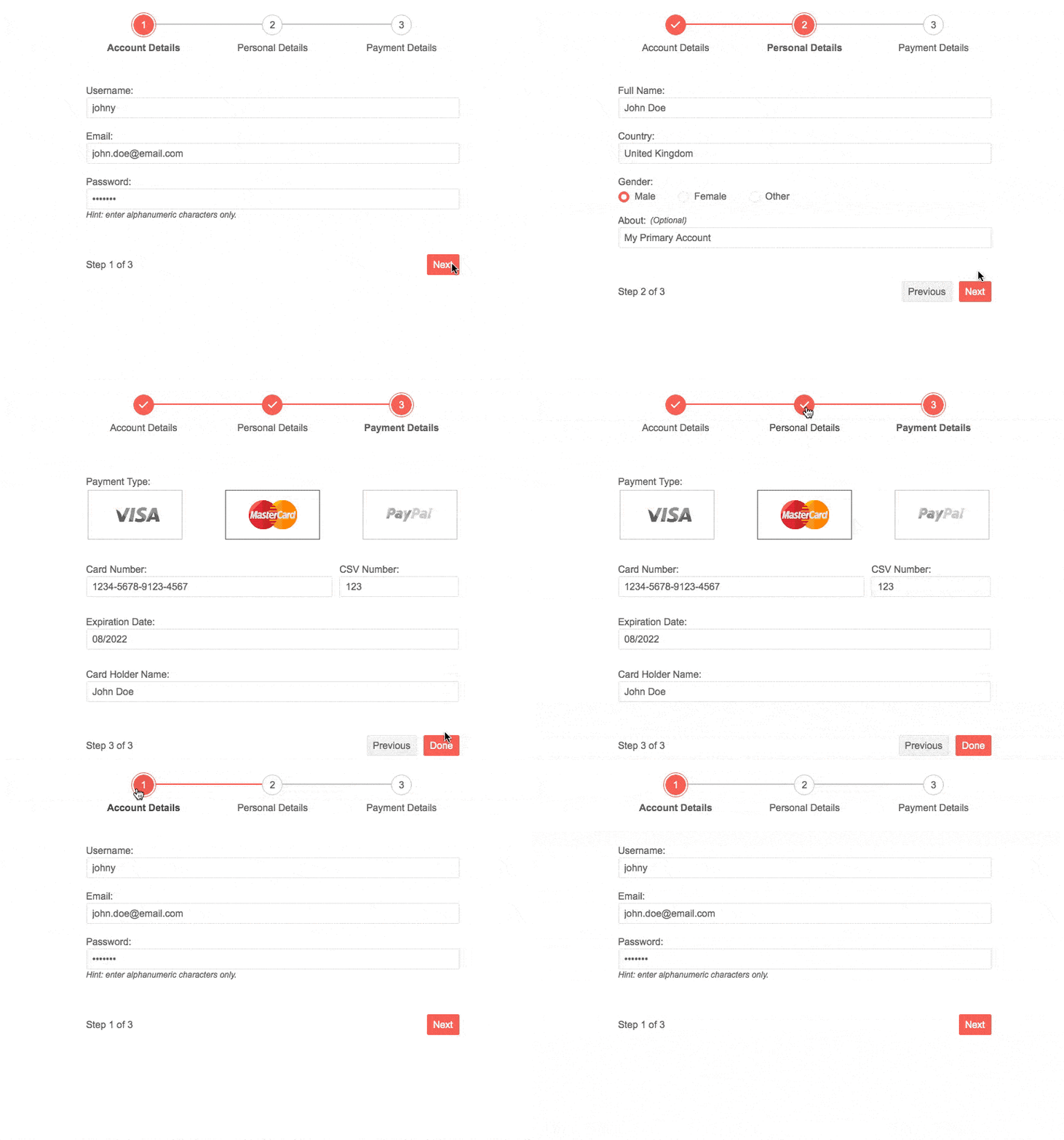
Telerik UI for ASP.NET Core Wizard Component
Telerik UI for ASP.NET Core Component Features
Along with the multiple new components, we focused efforts on enhancing some of your favorite components: Grid, Gantt, TreeList, Scheduler, Spreadsheet and Numeric Textbox.
New UI for ASP.NET Core Gantt Component Features
The Gantt component received a lot of enhancements with this release and several highly requested features were included in the latest version of Telerik UI for ASP.NET Core. Namely: comparing planned versus actual task execution, multiple configuration column options for the task section of the Gantt, column templates that let you render custom task content and more! We hope that providing these built-in features will help you save a ton of time when working on ASP.NET Core applications related to project management, task management, resource management and productivity applications.
Gantt Planned vs Actual Comparison
The Gantt is a go-to tool, not just for task planning and execution, but also a great visual way to compare if tasks are progressing according to plan. With the new Gantt feature Planned vs Actuals you can easily compare if a task's actual start and end dates are according to plan.
You will get visual indicators that show if planned start and end dates are kept, or if a task's actual date is after or before the planned start/end dates.
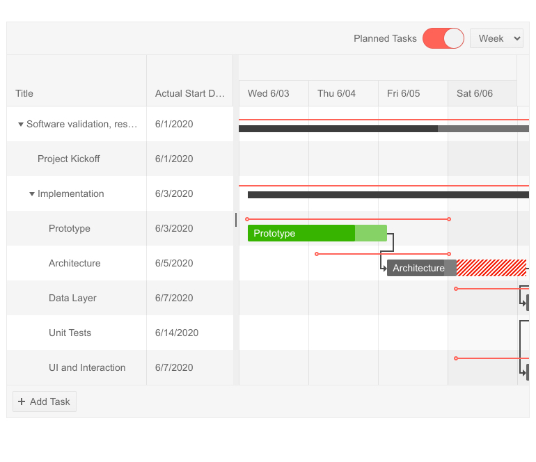 Telerik UI for ASP.NET Core Gantt - Planned vs Actual
Gantt Column Templates
The Gantt column templates feature will let you render any content you may need, not just plain text. Whether is it images, links, or formatted multi-line description—all of that is now possible.
 Telerik UI for ASP.NET Core Gantt Column Templates
Gantt Column Options
To give further flexibility to both you as a developer and your app users, we enabled multiple Gantt column options and attributes:
- Sorting
- Filtering
- Expanding
- Header template and attributes
- Hidden
- Menu
- Using editors
- And more
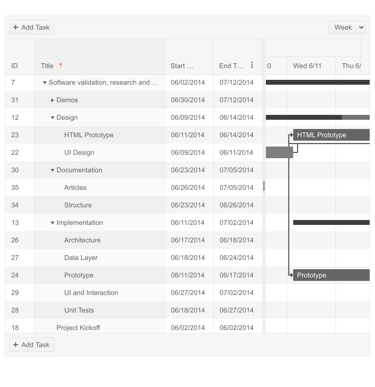
Telerik UI for ASP.NET Core Gantt Column Sorting
New UI for ASP.NET Core Grid Features
Grid Sticky Columns
The new Grid Columns Sticky feature is specifically beneficial for grids with a large number of columns that need to be visualized on limited screen space. The concept of sticky columns enables certain column(s) to stay visible in the viewable area, while leaving the rest of the non-sticky columns scrollable.
The Sticky columns feature is available alongside frozen columns. If you wonder what the difference between frozen and sticky columns is, here is the answer: while the frozen columns in the Grid are rendered on the left side of the widget, the sticky columns are displayed in the scrollable area with the non-frozen columns.
To try out the new feature, simply set the Sticky property of the corresponding column to true, and this will make the column sticky. Sticking/unsticking columns is enabled in the Grid Column Menu, so end users can easily configure the data in a way they prefer.
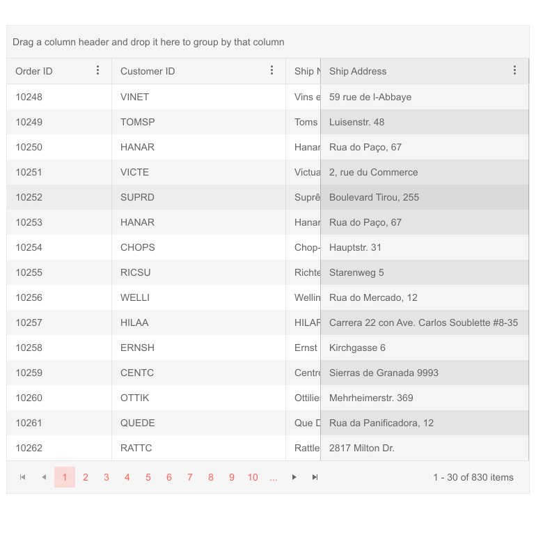 Telerik UI for ASP.NET Core Grid Sticky Column
Grid Foreign-Key Binding to Remote Collection
With this new feature you can easily bind a foreign-key column to a remote data source. In order to bind the column to a remote collection of items, supply an URL Action instead of a static collection. In order to ensure that the column values will be bound to the correct foreign value, you also need to supply the DataValueField and DataTextField options. Check out the code sample and demo of implementing grid column foreign-key binding.
New UI for ASP.NET Core TreeList Features
TreeList Component Drag, Drop & Reorder
With the R3 2020 release, we enhanced the TreeList drag-and-drop feature with an option to reorder items. When enabled, the items of the TreeList can be dragged and dropped across all levels (by default reordering is be disabled). The functionality also includes tooltips/markers that show users where exactly the tree list item will be dropped.
TreeList Component Checkbox Selection
The TreeList now supports checkbox selection: you can select and have access to parent items with all of its related children rows, or just a single tree list item.
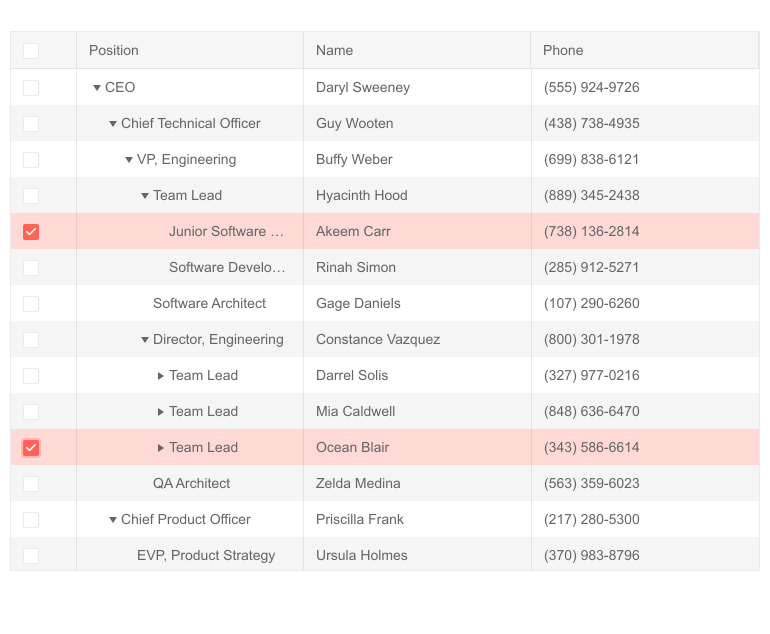
Telerik UI for ASP.NET Core TreeList Checkbox Selection
UI for ASP.NET Core PivotGrid Row and Column Header Sorting
With the new PivotGrid feature you can now perform data sorting by row and column header values. This allows you to sort values on top level dimension members, as well as drill-down dimension hierarchy, view sliced values and again sort on lower level dimension members.
UI for ASP.NET Core Spreadsheet: Render Cells Using Custom HTML
With the R3 2020 release, we shipped a highly requested Spreadsheet feedback portal item. By adding a single property .Html(true) and setting it to true, you can render the Spreadsheet cell value as custom HTML. Additionally, we exposed a method that will let you set the HTML property dynamically. You can try it yourself with a runnable example in the documentation API here.
UI for ASP.NET Core Scheduler Recurrence Editor Section 508 and WCAG 2.0 compliant
Further improving the accessibility of the Scheduler UI component, in R3 2020 we ensured that recurrence editor conforms to Section 508 and WCAG 2.0 standards.
UI for ASP.NET Core Numeric Textbox: Selecting All Text on Focus
The new SelectOnFocus property of the numeric textbox editor will be handy for users performing data editing and need to start typing immediately after the focus is placed on specific NumericTextBox. When SelectOnFocus is set to true, the whole text will be selected upon focus.
Telerik ASP.NET Core Numeric TextBox - Selecting all text on focus
Convert ASP.NET Core Projects to Telerik UI for ASP.NET Core Projects
With the new Visual Studio wizard, you can quickly and easily convert existing ASP.NET Core projects to Telerik UI for ASP.NET Core, meaning you will get automatically all the needed NuGet references and visual studio project templates.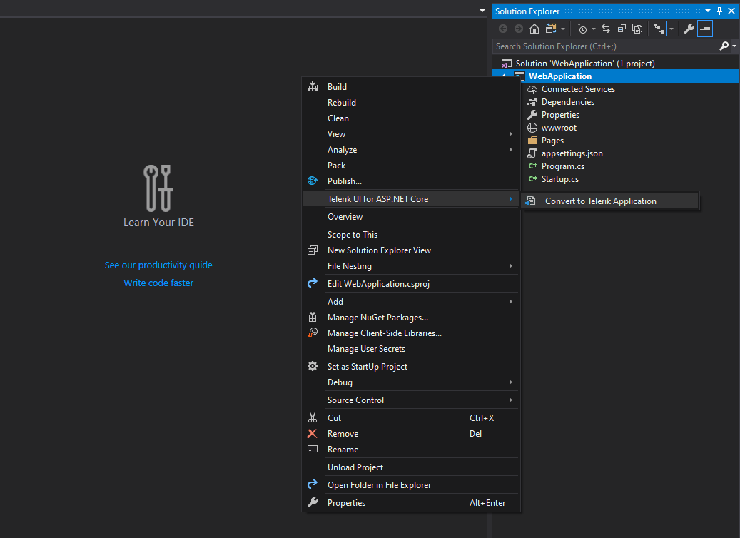
Telerik UI for ASP.NET Core Convert Wizard
Visual Studio Dashboard Project Template
Announced earlier in June, the new Visual Studio Dashboard project template for ASP.NET Core, is already seen as real time-saver by developers creating dashboard-like applications, so make sure you check out its original announcement in the blog post.
Telerik Document Processing Enhancements
SpreadProcessing: Support for XLS Import and Export
The RadSpreadprocessing library now supports import and export to and from XLS file format (Excel 97 - Excel 2003 binary file format, developed by Microsoft for representing spreadsheets).
Check out the features help topic and learn how to work with XLS files in SpreadProcessing, using XlsFormatProvider.
PdfProcessing: CMap Tables support
The CMap Tables in the PDF documents define mappings between character codes and character selectors. Now you can seamlessly import documents containing the predefined in the PDF format CMap Tables and ensure even the custom ones are imported as expected. Find out how to enable the support for them in the CMap Tables help topic.
Improved Documentation and Demos
As we know how important the documentation and examples are for developers, we continuously dedicate efforts to improve the resources related to Telerik UI for ASP.NET Core. With the Telerik R3 2020 release, we completely revamped the ASP.NET Core demos and documentation with the goal of making your journey better and faster.
Check out the new Telerik UI for ASP.NET Core components demos and documentation and let us know what you think!
Download Telerik UI for ASP.NET Core
Download the Latest from Telerik UI for ASP.NET Core
We would like to thank for the continuous support and encourage you to download a free trial version of Telerik UI for ASP.NET Core, or if you are an active license holder you can just grab the latest and greatest from the Your Account page! Share your thoughts with us on our feedback portal and help us shape the future of UI for ASP.NET Core.
Telerik Web Products R3 2020 Webinar
Join the live dedicated to Telerik Web Products R3 2020 release webinar on Monday, September 28, 2020, starting at 11 am ET as Ed Charbeneau and Sam Basu present the major updates for Telerik UI for ASP.NET MVC, Core, AJAX and Blazor in detail.
Happy ASP.NET Core Coding!

Maria Ivanova
Maria Ivanova is a Manager of Product Management at Progress, for Telerik and Kendo UI components and developer tooling. She joined the company in 2019 as a Product Manager for Telerik UI web components and is passionate about developing impactful and innovative software products. Maria believes that to create great products, it's important to challenge the status quo, closely collaborate with customers, and embrace a spirit of experimentation.
