New Release of Telerik UI for ASP.NET Core brings Wizard and Pager Components!

Summarize with AI:
Just a month after the R2 2020 release of Telerik UI for ASP.NET Core we are happy to share another update that includes two new components—Wizard and Pager— as well as a new Visual Studio Dashboard project template, compatibility with .NET 5 preview 5 and many new enhancements. Read on and see the highlights in the latest release of Telerik UI for ASP.NET Core!
Compatibility with .NET 5.0 Preview Versions
We continue with our efforts to stay current with all updates by Microsoft in the preview versions of .NET 5.0 until its official release later this year in November. We are happy to share that Telerik UI for ASP.NET Core latest release is compatible with .NET 5.0 preview 5.
New UI for ASP.NET Core Components
New UI for ASP.NET Core Wizard Component
Wizard Component Overview
The new Telerik UI for ASP.NET Core Wizard lets you easily break up long processes into multiple steps and simplify user input tasks by exposing to them just one form at a time. Each Wizard step can have its own content (form or other HTML), comes with built-in form validation (via Form component integration) for the input data and a progress indicator showing the number of steps left towards achieving their final goal for the process.
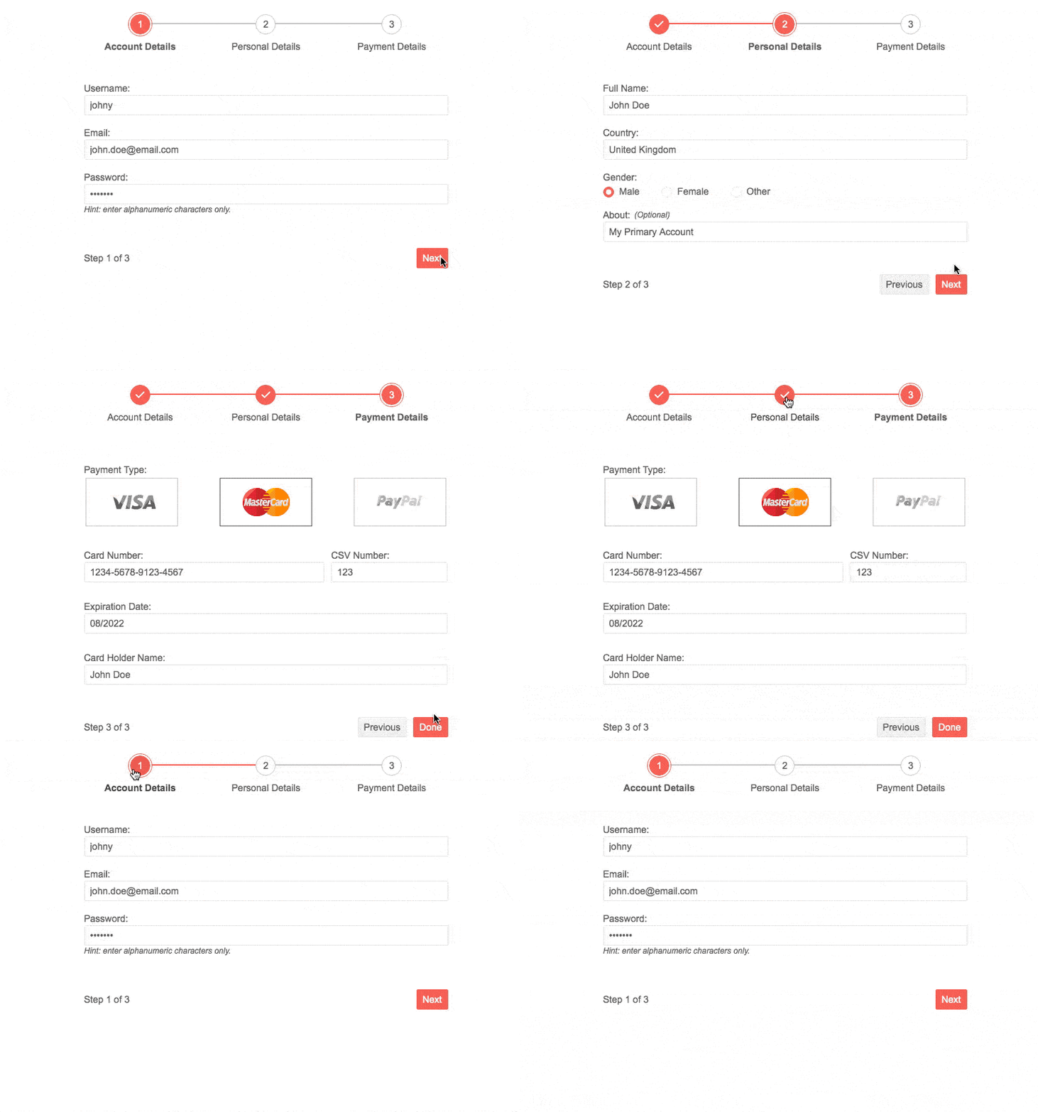
Telerik UI for ASP.NET Core Wizard Component
Wizard Component Initialization HTML and TAG Helpers
To add the Wizard in your ASP.NET Core applications, simply initialize it by giving it a name and adding the needed number of steps and content, as shown in the code sample below:
@(Html.Kendo().Wizard()
        .Name("wizard")
        .Steps(s=> {
            s.Add().Content("Initial Step");
            s.Add().Content("Second Step");
            s.Add().Content("Final Step");
        })
)
For those of you who prefer using TAG helpers over HTML helpers, you can directly plug the <kendo-wizard> and <wizard-steps> tags to configure your Wizard component.
Wizard Component Form Integration
The Telerik UI for ASP.NET Core Wizard provides simple, yet powerful integration with the Telerik UI for ASP.NET Core Form component.
Each step of the Wizard can accept a .Form() configuration method which defines many out-of-the box options (as they are available in the Form control itself). This gives you the benefit of having all the functionality available in the stand-alone Form component within the Wizard.
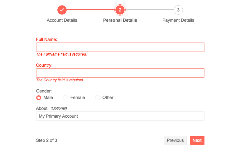
Telerik UI for ASP.NET Core Wizard Component integration with Form Component
A partial example on how to integrate Form component can be found in the code section below (for more details, check out the Wizard Form demo).
@(Html.Kendo().Wizard()
        .Name("wizard")
        .Events(ev => ev.Done("onDone"))
        .Tag("form")
        .Steps(s =>
        {
            s.Add()
            .Title("Registration")
            .Form(f => f
                .Validatable(v =>
                {
                    v.ValidateOnBlur(true);
                    v.ValidationSummary(vs => vs.Enable(false));
                })

                .FormData(new { Username = "johny", Email = "john.doe@email.com", Password = "pass123", DateOfBirth = String.Format("{0:ddd, dd MMM yyyy}", DateTime.Now)})
                .Items(items =>
                {
                    items.Add().Field("Username").Label(label => label.Text("Username:"));
                    items.Add().Field("Email").Label(label => label.Text("Email:"));
                    items.Add().Field("Password").Label(label => label.Text("Password:")).InputHtmlAttributes(new { @type = "password" }).Hint("Hint: enter alphanumeric characters only.");
                    items.Add().Field("DateOfBirth").Label(label => label.Text("DateOfBirth:").Optional(true));
                })
            )

…

)
In order to facilitate the scenarios where Forms are integrated within the Wizard, the Telerik UI for ASP.NET Core Wizard can be initialized either from a <form> element or a <div> element. The configuration is set via the .Tag() configuration option.
@(Html.Kendo().Wizard()
        .Name("wizard")
        .Tag("form")
        .ValidateForms(true)
        .Steps(s=> {…}
)
Wizard Component Loading Content
The Wizard lets you load step content in multiple ways:
- Using the built-in support for asynchronously loading content from remote URLs via the ContentUrl configuration option (loading data with AJAX)
- Loading Local Content via the Built-in Form Configuration
- Loading Local HTML Content
Wizard Component Layout
You can configure the rendering of the Wizard layout using the ContentPosition option to one of the three: a Stepper in a horizontal orientation above the content of the Wizard, vertical left or vertical right side of the Wizard step content.
@(Html.Kendo().Wizard()
        .Name("wizard")
        .ContentPosition(WizardContentPosition.Right)
        .Steps(s=> {…}
)
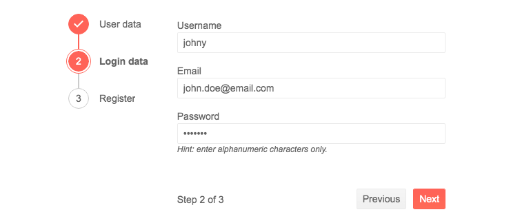
Telerik UI for ASP.NET Core Wizard – Left Vertical Position of Stepper
Wizard Component Accessibility and Keyboard Navigation
The Wizard has built-in Keyboard Navigation that will allow easy navigation and interaction with the steps and inputs of the component using keyboard. It also comes with out-of-the box support for accessibility standards such as WCAG, Section 508 and WAI-ARIA attributes, that let users with disabilities use the Telerik Wizard with ease.
New UI for ASP.NET Core Pager Component
Pager Component Overview
The Telerik UI for ASP.NET Core Pager is a responsive standalone UI component which enables the splitting of content and its visualization into pages. The Pager component allows integration with other data-bound UI components that do not have built-in paging such as the ListView, and you can use it for paging your data in templates too!

Telerik UI for ASP.NET Core Pager
Pager HTML Helper or TAG Helper
To add the Pager to your applications using an HTML helper you need to define a standalone data source and pass it by name to the Pager and to the data-bound control that will use it, as shown in the example below:
@(Html.Kendo().DataSource<Kendo.Mvc.Examples.Models.OrderViewModel>()
     .Name("dataSource1")
     .Ajax(t=>t.Read(read => read.Action("People_Read", "Pager")).PageSize(20))
)

@(Html.Kendo().Pager()
     .Name("pager")
     .DataSource("dataSource1")
     .PageSizes(true)
)
Alternatively, you can use the handy TAG helper option:
<kendo-datasource name="dataSource1" type="DataSourceTagHelperType.Ajax" server-operation="false">
    <transport>
        <read url="@Url.Action("TagHelper_Products_Read", "DataSource")" />
    </transport>
</kendo-datasource>


<kendo-pager name="pager1" refresh="true" datasource-id="dataSource1" page-sizes="true">
</kendo-pager>
Pager Configuration and Settings
The Pager component can be configured to show a specific number of buttons that will be shown in a numeric page, or accept user input via its type setting:
.Numeric(true) //default
.Input(true)
Additionally, you have control over which built-in Pager elements will be rendered:
- PageSizes() - renders the dropdown that allows the user to change the page size
- Refresh() - renders a refresh button
- PreviousNext() - toggles the visibility of buttons for navigating to the first, last, previous and next pages
- Info() - toggles the visibility of the current pager information
Pager Built-In Localization
The UI for ASP.NET Core Pager component has built-in localization support, which makes it easy to translate messages such as: the text of the tooltips for its page and navigation links, information text and labels to any language that your app may require.
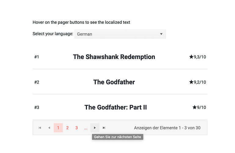
Telerik UI for ASP.NET Core Pager Localization
New Visual Studio Dashboard Template Project
For those of you building dashboard-like application the new Visual Studio Dashboard Project Template will come handy with its predefined layout and UI building blocks.
Once you update your Telerik UI for ASP.NET Core version with the latest package, you can create a new project and choose the new Dashboard template from the Create New Telerik Project Wizard.

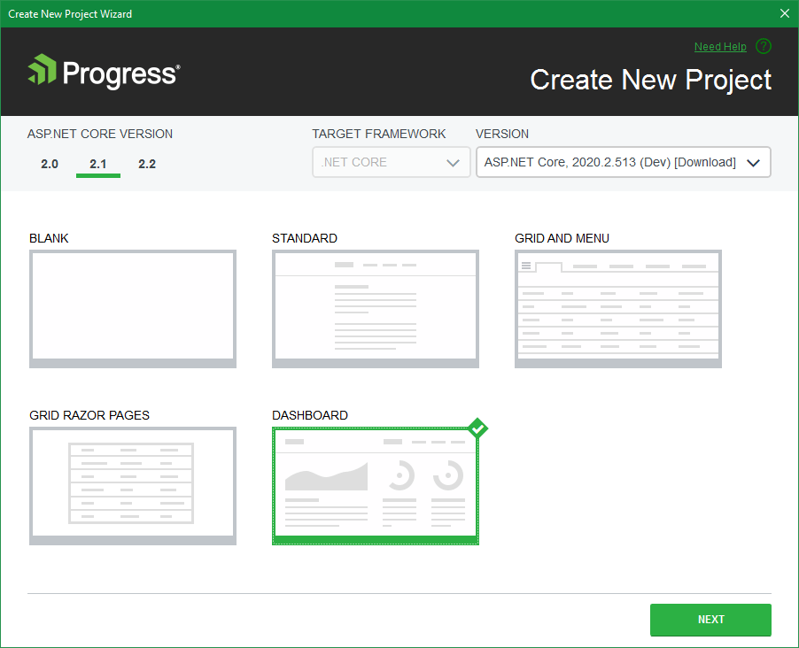
Telerik UI for ASP.NET Core Dashboard Project Template
What’s Coming Next in Telerik UI for ASP.NET Core?
Check out the Telerik UI for ASP.NET Core roadmap page and see what we are already cooking for the R3 2020 release due in September. Not only will you get an insider’s look at our components and features pipeline for Telerik UI for ASP.NET Core, but you’ll continue to have the opportunity to help us improve the suite with your valuable feedback.
Download the Latest from Telerik UI for ASP.NET Core
We would like to thank for the continuous support and encourage you to download a free trial version of Telerik UI for ASP.NET Core, or if you are an active license holder you can just grab the latest and greatest from the Your Account page! Share your thoughts with us on our feedback portal and help us shape the future of UI for ASP.NET Core.
Happy ASP.NET Core Coding!

Maria Ivanova
Maria Ivanova is a Manager of Product Management at Progress, for Telerik and Kendo UI components and developer tooling. She joined the company in 2019 as a Product Manager for Telerik UI web components and is passionate about developing impactful and innovative software products. Maria believes that to create great products, it's important to challenge the status quo, closely collaborate with customers, and embrace a spirit of experimentation.
