What’s New in Telerik UI for Blazor R3 2021 Release!

Summarize with AI:
Hey developer folks, it’s Telerik R3 2021 release time and we’re excited to announce that the Telerik UI for Blazor component suite has reached a new milestone of 85+ truly native components!
The new Telerik UI for Blazor 2.27 release brings Carousel, Barcode, Breadcrumb components, along with more Gantt features, Scheduler & TreeView enhancements, accessibility improvements, Design Kits for Figma, compatibility with .NET 6 RC1 and much more!
TL;DR Telerik UI for Blazor R3 2021
Below is a summary of the R3 2021 Telerik UI for Blazor release content shipped between January and May (Telerik UI for Blazor 2.25, 2.26 and the current 2.27 releases):
- New UI Components: Gantt Chart, Breadcrumb, Carousel, Barcode, Stack Layout, Grid Layout, Stepper, Wizard
- New Data Grid Features: Keyboard Navigation with Column Virtualization, Pass Context to Command Buttons, Alignment of Cell Values, No Data Template, Delete Confirmation, Support for interfaces
- New Pager Features: Go to Page Input, Page Size Dropdown list (also available in Grid, TreeList and ListView components)
- New Scheduler Features: Resource Grouping, Delete Confirmation, Timeline View, Date Header Template, more exposed events
- New TreeList Features: Keyboard Navigation with Column Virtualization, Pass Context to Command Buttons, Alignment of Cell Values, No Data Template, Delete Confirmation, Support for interfaces
- New TreeView EventArgs parameter in multiple events
- New Grouping feature in ComboBox, MultiSelect, AutoComplete and DropDownList
- New OnModelInit event in Grid, TreeList, Scheduler and ListView
- New features and improvements in Telerik Document Processing distribution: PDFProcessing, SpreadProcessing, SpreadSheetProcessing and WordsProcessing
- New FocusAsync method in all input components feature
- Tooltip for Dynamic Targets
- Accessibility Improvements
- Improved themes & swatches picker in component demos
- Support for Bootstrap 5
- Compatibility with .NET 6 Release Candidate 1 including Telerik UI for Blazor components running in hybrid scenarios inside native MAUI, WPF and WinForms apps
- Design Kits for Figma: 30+ components for each of the themes that come with the Telerik UI for Blazor—Default, Bootstrap and Material
Deep Dive into 2.27 Release of UI for Blazor
Read ahead and see in detail all the new components, features and tooling that will help you speed up the development of Blazor Server and WebAssembly apps!
New Blazor Carousel UI Component
The UI for Blazor Carousel (also known as ScrollView or ImageGallery) is a component that helps you visualize images and content in a stylish and well-organized way. It includes options for paging its content, configuration for left and right navigation arrows, automatic page change (with animation), setup of time interval between image changes and more. Like the rest of the Blazor UI components in Telerik offering, it comes with built-in keyboard navigation support and accessibility.
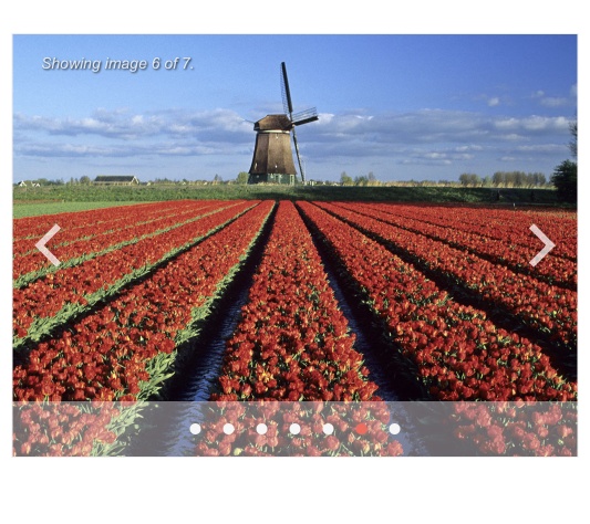
Telerik UI for Blazor Carousel Component
New Blazor Barcode UI Component
The Telerik Blazor Barcode component displays data in a machine-readable format, and the generated barcodes are suitable for both printing and on-screen scanning. The component supports various encoding types (Code11, Code39, Code93, Code128(A|B|C), EAN8, MSImods and more) and can represent both numeric and character data.
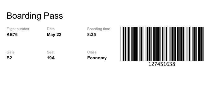
Telerik UI for Blazor Barcode Component
The Barcode generator allows for customization of its appearance through a multitude of exposed properties such as: Background, Color, Text Color, Barcode Border Color, Barcode Padding, Width, Height and more! You can additionally show/hide the barcode label (text), add checksum and configure rendering engine for SVG or Canvas.
New Blazor Breadcrumb UI Component
The new Breadcrumb component provides developers with an easy way to create a sleek navigation in Blazor apps with a large amount of content or hierarchical structure. Using the Breadcrumb, you can significantly reduce the number of actions needed by a user to get to a certain app resource. Additionally, the Breadcrumb provides a visual aid that indicates the current location of the user and is a simple way to add contextual information to landing pages.

Telerik UI for Blazor Breadcrumb Component
The component comes with items template support for custom content rendering including breadcrumb items with icons, images and various styles. To make it adaptive, it includes three collapse modes for better visualization when the available space is scarce:
- Auto (default)—The first and the last item always remain visible; however, the rest of the items are automatically collapsed based on the width of the Breadcrumb.
- Wrap—Items are wrapped on multiple rows when their total width is bigger than the width of the Breadcrumb.
- None—All items are positioned on the same row.

Telerik UI for Blazor Breadcrumb—Collapse Modes
New Features in Blazor Gantt Component
The first version of Telerik Blazor Gantt component was shipped last month in August, and we made a promise that in September you could expect more features related to task dependencies, column resizing and reordering, as well as editing enhancements.
Here we are in September, and those features are now available as built-in functionalities within the component:
- Gantt task dependencies—the component now supports various task dependencies such as start-to-start, start-to-finish, finish-to-finish, etc. Task relations are visualized as lines in the timeline view of the gantt and can be easily managed by end users by dragging and dropping them to the corresponding task start/ end.
- Gantt columns resizing (within TreeList view)—by setting a single property, your end users can easily expand/shrink columns.
- Gantt columns reordering (within TreeList view)—again with a single property setting you give end users the flexibility to rearrange the gantt columns as needed.
- Toggle InCell edit mode with double-click—seamless editing experience within the tree list part of the gantt with a double-click. Plus, start and end dates of tasks now display DateTimePicker editor for better UX.
- Tooltip and other improvements.
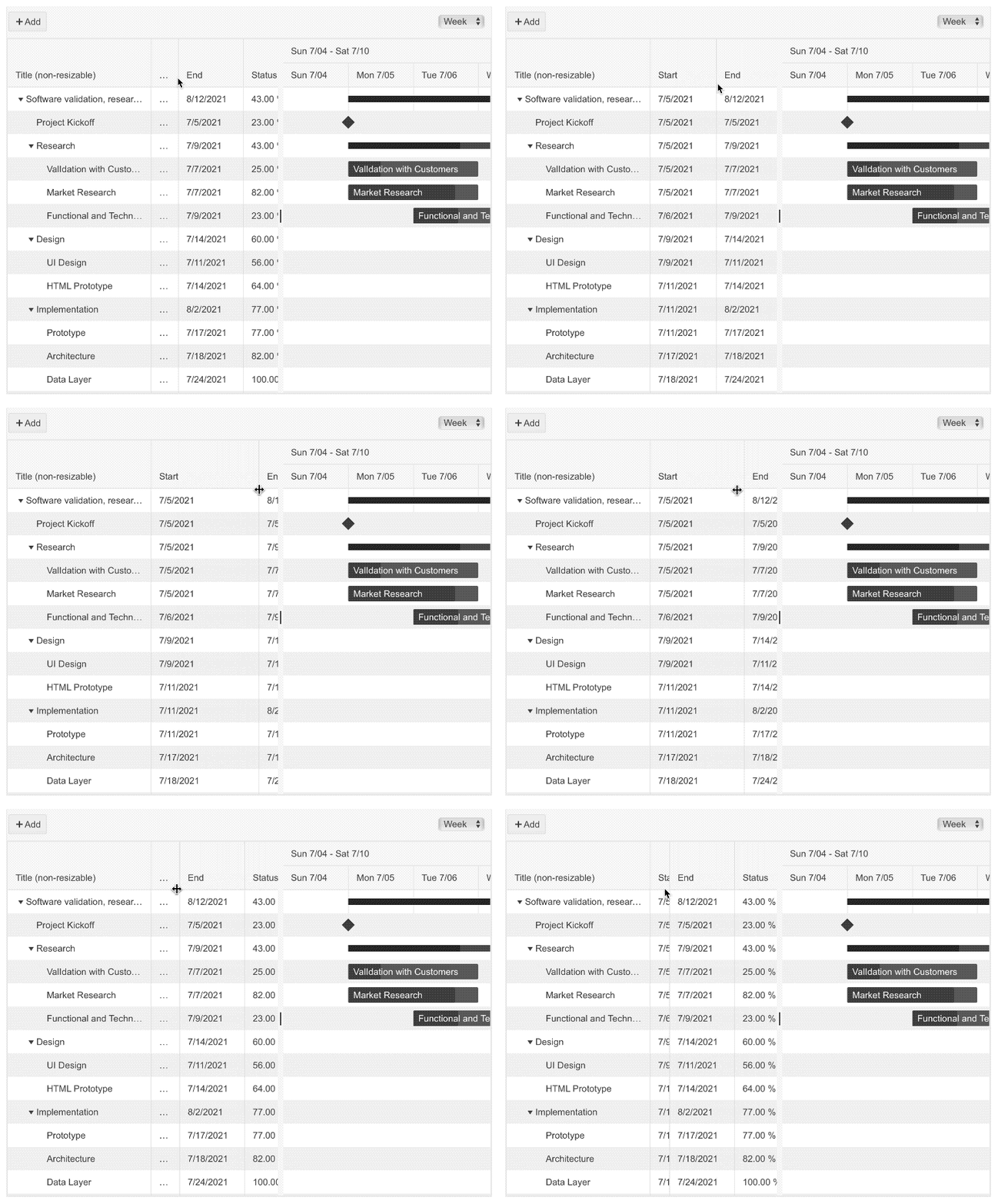
Telerik UI for Blazor Gantt—Column Resizing
Binding Blazor Data Grid and TreeList to Interfaces
Both the Grid and TreeList components now support binding to interfaces, and you have the flexibility to decide which instance model to plug for their Add, Edit and Delete commands. For the Add command, you can use custom buttons in the toolbar and use the State of the component to define your own InsertedItem. As for the Edit and Delete commands, these are supported out of the box.
New Scheduler Component Features
In addition to the existing Day, Week and Month views, the Scheduler component now provides the option tо visualize appointments in a timeline view in a continuous horizontal direction. The timeline view supports horizontal and vertical resource grouping options, by one or more resources.
You have multiple configurable parameters available: start and end times (day and workday), slot duration, slot divisions, column width, item template for custom content rendering and more!
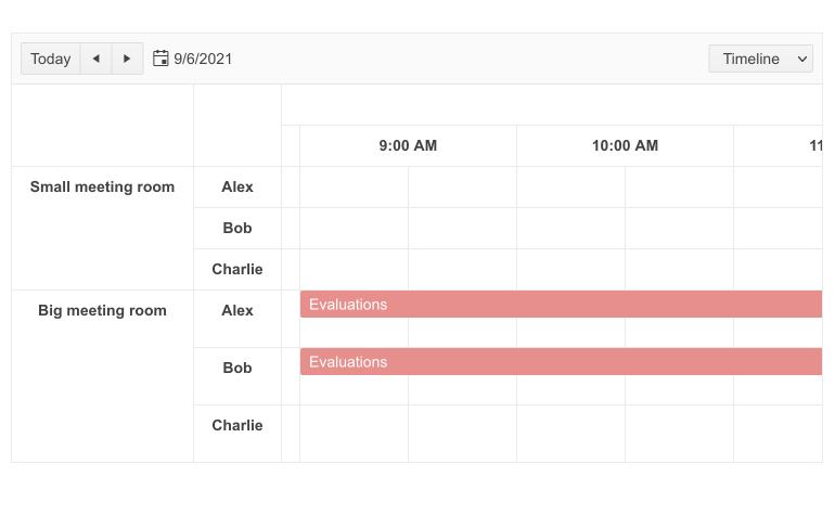
Telerik UI for Blazor Scheduler Timeline View
In R3 2021 we also added several new Scheduler events that will help you easily control the logic when appointments are clicked or need to be managed by end users. The new events include: OnItemClick, OnItemContextMenu and OnItemDoubleClick.
TreeView EventArgs Parameter
Several TreeView events received the EventArgs parameter, namely the OnItemClick, OnItemDoubleClick and OnItemContextMenu events, providing you the option to use the position of the action/event to show a custom element.
Accessibility Improvements
Continuing our efforts to provide a high level of accessibility by Telerik components, in this release we ensured that multiple top-used components received a boost to comply with WCAG 2.1 and Section 508 accessibility standards. The list of components includes: Button, ToggleButton, TextBox, NumericTextBox, MaskedTextBox, TextArea, DateInput, DatePicker, DateTimePicker, TimePicker and DateRangePicker.
Tooltip Improvements—Dynamic Targets
In addition to showing the Tooltip UI component with initially rendered items, it can now be integrated with dynamically added HTML out of the box (relates to implementation of the following Feedback Portal item).
Theming Improvements & Design Assets
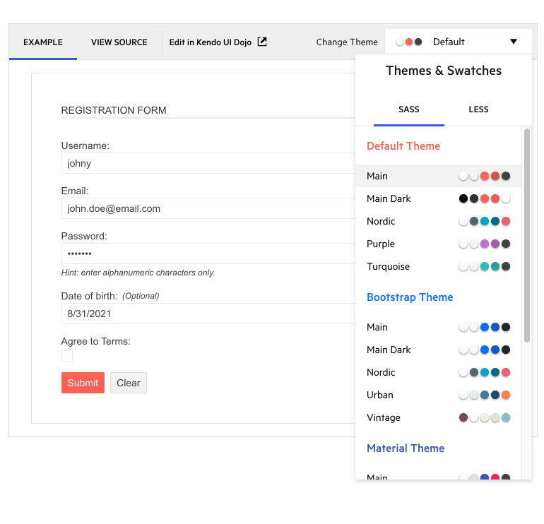
Improved Themes & Swatches Picker in Component Demos
The Default, Material and Bootstrap themes now shine with different coloring options, which you can apply in Telerik UI for Blazor component demos by selecting one of the many new available swatches:
- Default now includes Main, Main Dark, Nordic, Purple & Turquoise swatches
- Bootstrap: Main, Main Dark, Nordic, Urban, Vintage
- Material: Main, Arctic, Fuchsia, Lime Dark, Main Dark
Themes & Swatches in Telerik Demos
Support for Bootstrap 5
Following the announcement of Bootstrap 5 earlier this summer, we worked to ensure that we can accommodate various preferences for its support. If you want to be compatible with the latest updates, make sure to use the bootstrap-main swatch. If you wish to continue using the previous versions, you can reference Bootstrap-3 and Bootstrap-4.
Design Kits for Figma
To achieve efficient collaboration between designers and developers on your team, we have created three Telerik UI Design Kits for Figma (one for each of the top three themes we ship with Telerik UI for Blazor—Material, Bootstrap and Default—of our own styling).
Telerik & Kendo UI Design Kits for Figma
The design files include 30+ of the most widely used UI for Blazor components, such as Grid, Scheduler, Dropdowns and Inputs, with their detailed anatomical structures, colors, indicators and icons. The included building blocks and elements enable smooth collaboration between designers and developers, and our goal is to continuously grow the number of included components and ensure full coverage.
Compatibility with .NET 6 Release Candidate 1
Telerik UI for Blazor is now compatible with the newly released .NET 6 Release Candidate 1! While there are multiple exciting new things Microsoft just announced and they will be a topic of exploration (such as rendering Blazor components from JavaScript), we are happy to say that Telerik UI for Blazor is compatible with the hybrid apps model via the Microsoft BlazorWebView controls for WPF and Windows Forms. This enables you to embed Blazor functionality and one of the 85+ Telerik Blazor components into existing Windows desktop apps based on .NET 6.
Check out the dedicated sample project that shows example of Telerik UI for Blazor web components running in hybrid scenarios inside native MAUI, WPF and WinForms apps.
Download Telerik UI for Blazor 2.27.0
Head over to the Telerik UI for Blazor page and download a free trial of Telerik UI for Blazor 2.27.0. Or, if you are an active license holder, you can grab the latest and greatest from the “Your Account” page, or update your NuGet Telerik.UI.for.Blazor package reference to version 2.27.0. directly in your Blazor solutions.
Download Telerik UI for Blazor
Webinar & Dedicated Twitch Sessions
Be sure to sign up for the Telerik R3 2021 release webinar and live Twitch sessions to see the newly released components and features in action:
- Twitch Session Monday, September 20, 10:00 am ET for web products
- Twitch Session Tuesday, September 21, 10:00 am ET for desktop products
- Telerik R3 2021 Webinar Wednesday, September 29 I 11:00 am – 1:00 pm ET
Thank You!
- Your Telerik Blazor Team at Progress

Maria Ivanova
Maria Ivanova is a Manager of Product Management at Progress, for Telerik and Kendo UI components and developer tooling. She joined the company in 2019 as a Product Manager for Telerik UI web components and is passionate about developing impactful and innovative software products. Maria believes that to create great products, it's important to challenge the status quo, closely collaborate with customers, and embrace a spirit of experimentation.

