Telerik UI for Blazor 2.25.0—Wizard, Stepper, StackLayout, GridLayout and More!

Summarize with AI:
Four brand-new components, new features to existing ones and enhancements to our Grid and TreeList—release 2.25.0 of Telerik UI for Blazor has a lot to offer.
Hey Blazor and Telerik UI for Blazor folks,
It’s release time again, and this month Telerik UI for Blazor brings four brand-new components—Wizard, Stepper, StackLayout and GridLayout—new features to existing Blazor components such as the Scheduler resource grouping, grouping in drop-down components, plus multiple Grid and TreeList enhancements that are almost a tradition for every new Telerik UI for Blazor version!
Read the June 2021 release blog post ahead to find out more about the full 2.25.0 content, which you can plug and play in your Blazor Server and WebAssembly apps!
Blazor Wizard UI Component
Wizard Component Overview
Surely one of the 2.25.0 release highlights is the Telerik Blazor Wizard UI component! Using the Wizard, you can easily carry out multi-step processes and simplify user input by exposing just one form at a time. Each Wizard step can have its own content (form or other HTML), easy-to-integrate form validation for the input data, keyboard navigation and a progress indicator showing the number of steps left toward achieving the final goal for the process. Each of the steps allows further configuration, localization and customization.
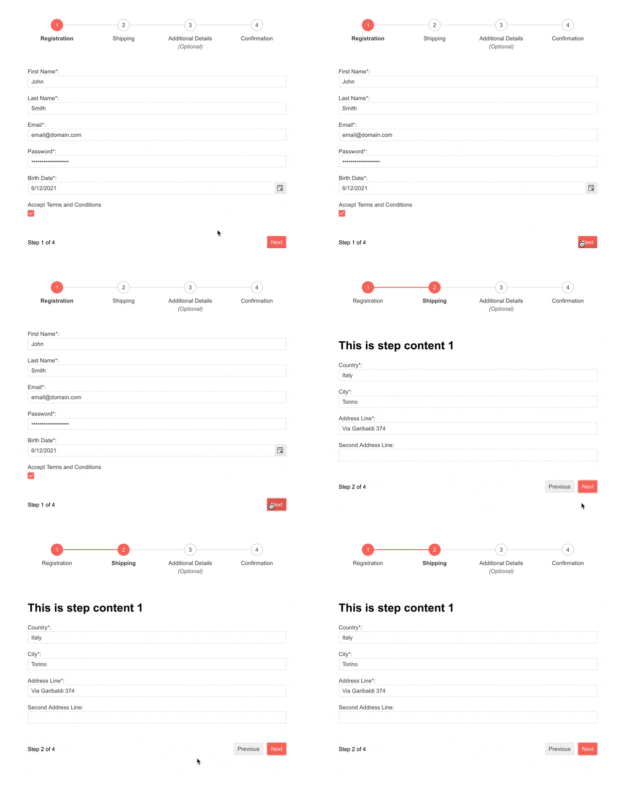
Telerik UI for Blazor Wizard UI Component
Wizard Component Configuration
By default, the Wizard component’s height is dynamic and will fill its container’s width, depending on its content. However, both width and height are exposed as configurable parameters. And this is just the beginning of what you have at your fingertips. 😊 The Wizard allows you to configure almost every aspect of it:
- StepperPosition – allows the configuration of the stepper position: top (default), bottom, left, right
- Value – the current step index
- ShowPager – configure the Wizard pager visibility
- WizardButtons – if specified, allows you to define custom buttons; otherwise the Wizard displays default button options
- WizardSettings – wrapper of the Wizard settings where you can inject the specific stepper settings (Linear and StepType)
- StepType – step with indicators and labels, or just labels
- Linear – specifies linear flow of the Wizard steps (requires completion of the previous step before proceeding to the next one)
And more!
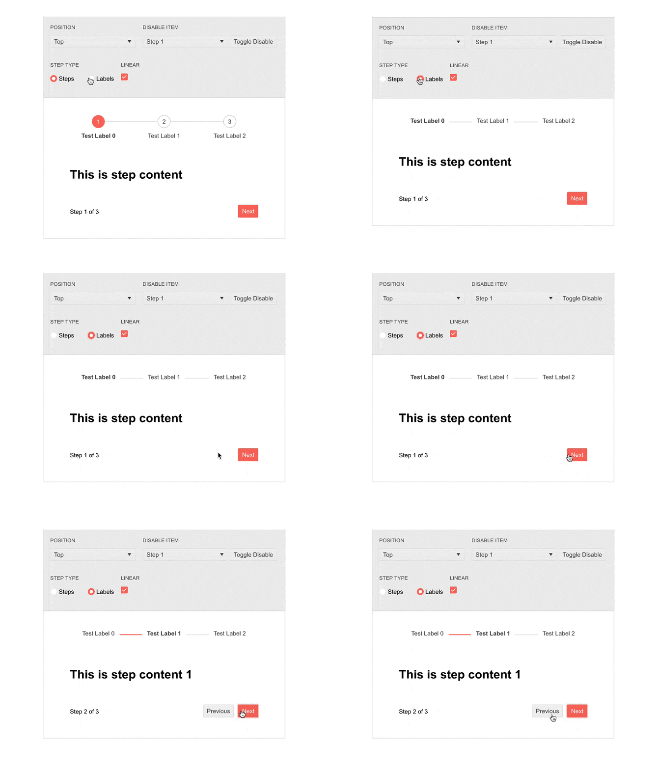
Telerik UI for Blazor Wizard Configuration Options
The Wizard component internally utilizes another new component—the Stepper (reviewed in detail in the next section). We made sure you have control over the main properties of the internal stepper and complete customization options of each of the Wizard steps: Content, Icon, IconClass, ImageUrl, Optional, Disabled, Text, Label and Valid.
Wizard Form Integration and Validation
The Telerik Wizard component allows smooth integration and use of the Telerik Blazor Form component within its content, thus providing a sleek option for user input and the benefit of built-in form validation. Check out this demo, which shows how to easily restrict going to the next Wizard step when the Form validation is not satisfied.
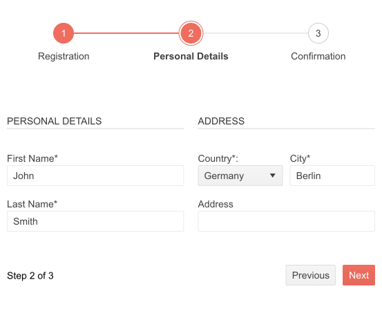
Telerik UI for Blazor Wizard Form Integration
Wizard Component Button Options
The Wizard component features three default button options: Next, Previous and Done.
In case you need to define custom buttons, this is achievable by overriding the Wizard buttons through WizardButtons parameter.
Wizard Component Events
The Wizard component exposes the following events, which are triggered when:
- ValueChanged – after a step has changed
- OnFinish – when the “Done” button on the Wizard is clicked
- OnChange – before a step has changed
Blazor Stepper UI Component
Stepper Component Overview
The new Telerik Stepper for Blazor component is a feature-rich UI control that navigates users through a sequence of logical steps and visualizes their progress. The Stepper is a perfect match to walk users through processes like application, shopping cart, reservation or configuration.
The component comes with options for full customization of icons, labels, indicators, orientation, built-in keyboard navigation and support for localization of labels. While it can be used as a standalone component, it is also an integral part of the Wizard component.

Telerik UI for Blazor Stepper Component
Stepper Component Orientation
The Stepper component includes two modes—horizontal and vertical—which can be easily set via the Orientation property.
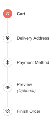
Telerik UI for Blazor Stepper Vertical Orientation
Stepper Customization via Templates
You can fully control the rendering and styles of the component steps. Using the provided option for step templates, you can customize the stepper indicators and labels as needed. Furthermore, you can set icons in the step indicators and configure the different options provided by the Icon, IconClass, ImageUrl and SpriteClass parameters.

Telerik UI for Blazor Stepper Templates
Steps State and Validation
The Stepper component exposes Disabled and Optional parameters that let you respectively disable a step or mark it with an optional label. Additionally, you can add validation logic for each step and, based on its result, render a success or error icon (in the step indicator or as part of the step label).

Telerik UI for Blazor Stepper States
Blazor StackLayout and GridLayout UI Components
In this release we are introducing two well-known components from the desktop world in a web Blazor flavor—the StackLayout and GridLayout. Our goal with these two components is to support developers who are transitioning from desktop development to building and arranging web layouts in a familiar way by stacking UI components within Blazor applications.
StackLayout UI Component
Using the StackLayout component for Blazor, you can easily arrange its inner elements horizontally, or vertically in a stack. It represents a single-line flex container and supports nesting stack panels, so that you are enabled to build more complex layouts.

Telerik UI for Blazor StackLayout UI Component
StackLayout UI Component Configuration
The StackLayout component exposes the following configuration options: width & height, orientation, spacing, horizontal align, vertical align and CSS class.
GridLayout UI Component
For more complex layout arrangements you can rely on the GridLayout component, which offers a flexible grid-layout system with rows and columns. It is based on the well-known CSS Grid Layout system and allows items to be configured per specific row and column and could span across them.

Telerik UI for Blazor GridLayout UI Component
GridLayout UI Component Configuration
The GridLayout allows configuration on multiple levels, namely:
- Grid – CSS class, row & column spacing, vertical & horizontal alignment, and collections of rows, columns and items
- Grid Layout Row – row height
- Grid Layout Column – column width
- Grid Layout Item – CSS class, definition of row & column of the item, row span & column span
Blazor Grid UI Component—New Features
The Telerik Grid was the first native Blazor component in the product back in 2019 (even when Telerik UI for Blazor was still not yet a product, but just a bold experiment).
Over the last couple of years, it has matured significantly and now includes 100+ features, such as virtualization (column & rows), multi-column headers, rows drag and drop, grouping with load on demand and so many more!
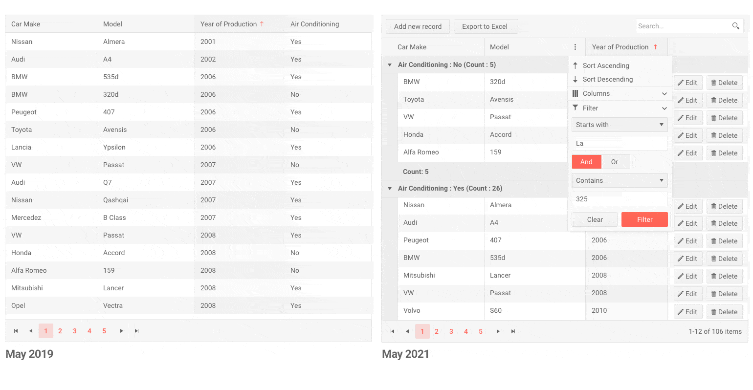
Telerik UI for Blazor Grid Component—Then & Now
In the current 2.25.0 release we are adding several new features to make it shine even more:
Pass Context to Command Buttons
With this new feature, you will have an easy option at hand to apply conditional Grid row command buttons depending on the properties of a row item. This will be achieved by adding context (current row item) to the current ChildContent parameter.
Keyboard Navigation with Column Virtualization
The feature enables keyboard navigation capabilities in grids with configured virtual columns. Users can easily navigate through virtual column ranges (subsets of the columns in a given row) and edit items without a touch of the mouse.
Alignment of Grid Cells Content
A new parameter TextAlign is introduced to the bound Grid columns that lets you align grid cells content. The parameter will be from type ColumnTextAlign enum and accepts “right”, “left” and “center” values, which in turn attaches text-alignt:right/left/center styles to the grid column.
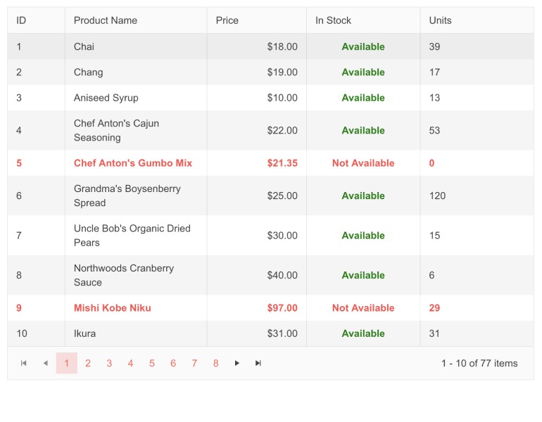
Telerik UI for Blazor Grid Cell Alignment
Blazor TreeList New Features
All of the above-mentioned features for the Grid component have also been applied to the TreeList, namely:
- TreeList Pass Context to Command Buttons
- Alignment of TreeList Cell Content
- Keyboard navigation with column virtualization
Scheduler Component Resource Grouping
The Telerik Blazor Scheduler UI component now provides built-in resource grouping functionality (for one or more resources), which can be enabled through the SchedulerGroupSettings tag. The Scheduler resource groups can have vertical or horizontal orientation.
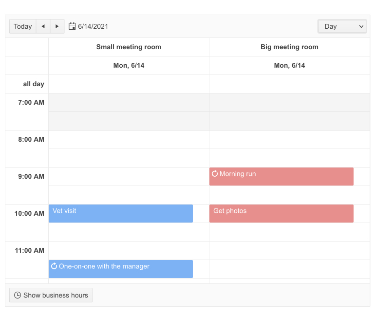
Telerik UI for Blazor Scheduler Resource Grouping
New Drop-downs Feature: Grouping
In the previous release we added a virtualization feature to our drop-down components (AutoComplete, DropDownList, MultiSelect and ComboBox), and in this release we are expanding their functionality with grouping.
To enable grouping in drop-down components, set the GroupField parameter, and the component will render a sticky header with the group name and list all corresponding items in a container that can be scrolled.
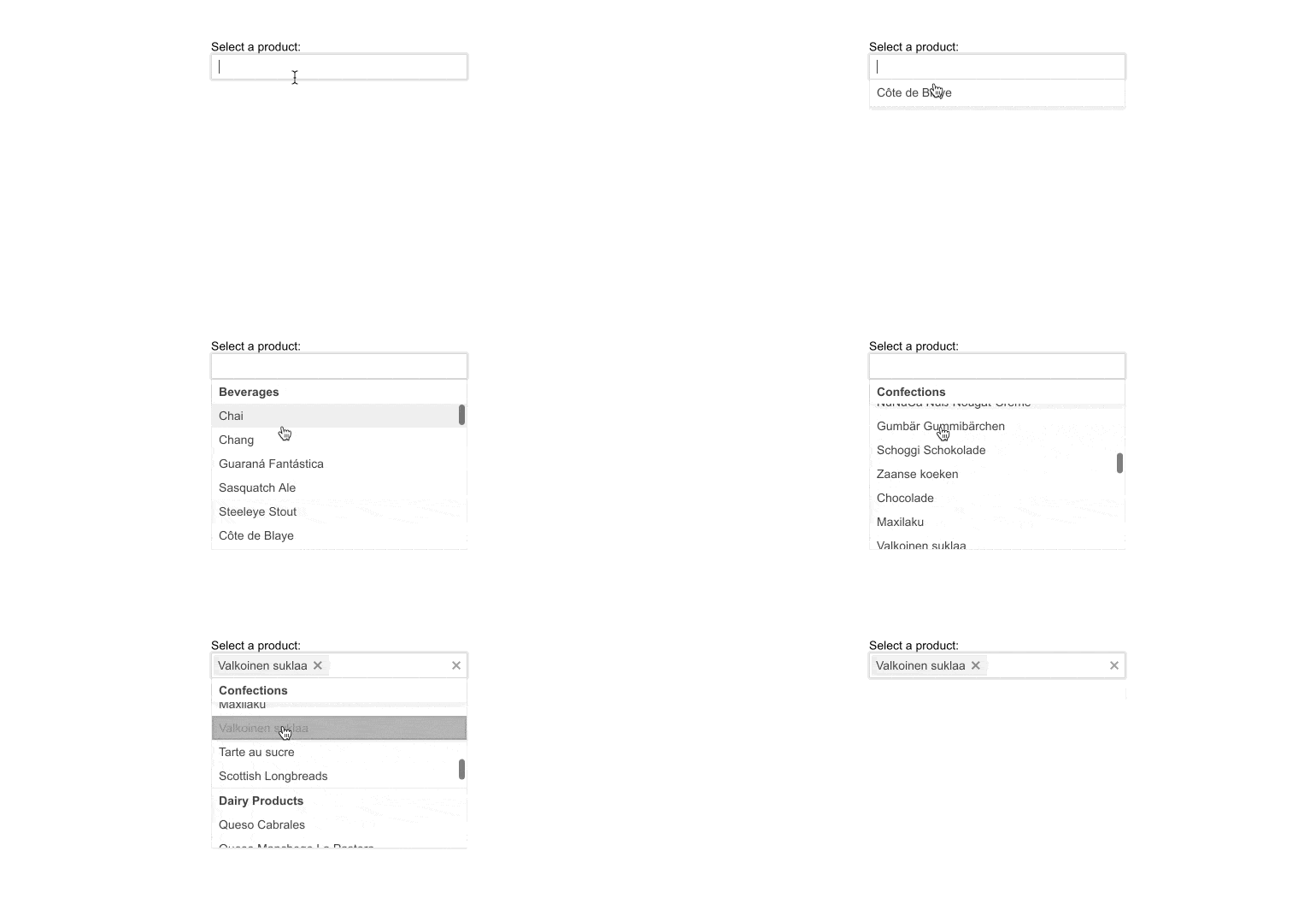
FocusAsync Method in Multiple Components
Last but not least, we added FocusAsync method to multiple relevant components from the text inputs, data and time pickers, drop-down lists, buttons and checkbox categories (AutoComplete, Textbox, TextArea, Editor, ColorPalette, to name a few). The method is a feature developed in direct relation to a customer request in the Telerik Blazor Feedback Portal.
Download Telerik UI for Blazor 2.25.0
We encourage you try out the latest and greatest from Telerik UI for Blazor and let us know what you think!
- For everyone new to Telerik UI for Blazor—you can download a free trial of Telerik UI for Blazor 2.25.0 from the Telerik UI for Blazor page.
- Telerik active license holders can grab the latest version from the “Your Account” page or directly update the Telerik.UI.for.Blazor NuGet package reference to version 2.25.0 in existing Blazor solutions.
Thank You!
– Your Telerik Blazor Team at Progress

Maria Ivanova
Maria Ivanova is a Manager of Product Management at Progress, for Telerik and Kendo UI components and developer tooling. She joined the company in 2019 as a Product Manager for Telerik UI web components and is passionate about developing impactful and innovative software products. Maria believes that to create great products, it's important to challenge the status quo, closely collaborate with customers, and embrace a spirit of experimentation.
