Telerik UI for Blazor 2.26.0—Gantt Chart, Grid, TreeList, Scheduler Improvements and More!

Summarize with AI:
Continuing with our promises for 2021 roadmap delivery, this month Telerik UI for Blazor brings the Gantt Chart UI component, as well as multiple new features to the Grid, TreeList, Scheduler, Pager and more!
Let’s deep dive in the August 2021 release to find out more about the full 2.26.0 content, which you can plug and play in your Blazor Server and WebAssembly apps!
Blazor Gantt Chart UI Component
Gantt Chart Component Overview
The Gantt is a well-known tool that is heavily used in project and task management applications, process execution and monitoring, and task scheduling—to name a few. While the initial plan was to deliver the Gantt Chart in September 2021, due to the growing demand for the component in Blazor applications, we did some rescheduling and managed to ship its v1 with the current release of Telerik UI for Blazor 2.26.
The Telerik Gantt for Blazor consists of two main parts which visualize the same set of data in two modes side by side—hierarchical tree list structure and a visual timeline. Even though this is first release of the Telerik Gantt UI control for Blazor, we made sure it includes a long list of essential built-in features such as: binding to flat and hierarchical data, predefined task types, multiple Gantt views, sorting, filtering, editing, task tooltips and templates.
By using the multi-release approach we hope to unlock the possibility for you to start developing your apps immediately and at the same time ensure you receive another solid set of features in just a few weeks with Telerik UI for Blazor 2.27 release in September.
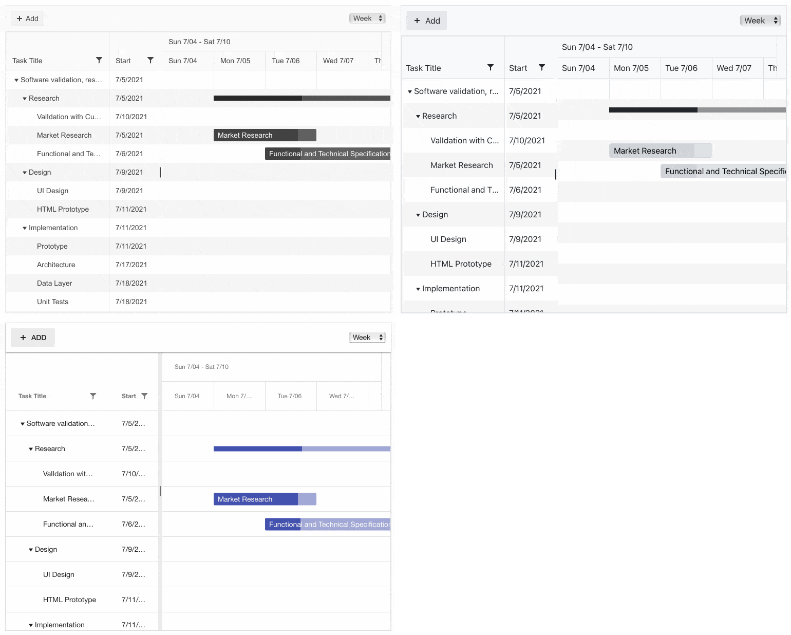
Telerik UI for Blazor Gantt Chart UI Component
Gantt Views
The timeline part of the Gantt component offers four built-in predefined views which define the granularity of the time slots:
- DayView – visualizes tasks in a daily view with granularity for up to an hour (main Gantt header row shows the day, and the secondary row shows hourly slots)
- WeekView – visualizes tasks in a weekly view with granularity for up to a single day (main Gantt header row shows the week, and the secondary row shows daily slots)
- MonthView – visualizes tasks in a monthly view with granularity for up to a whole week (main Gantt header row shows the month, and the secondary row shows weekly slots)
- YearView – visualizes tasks in a yearly view with granularity for up to a whole month (main Gantt header row shows the year, and the secondary row shows monthly slots)
For each of the views you can configure the slot width, start and end dates of the time interval.
Gantt Data Binding
The Gantt chart can be bound to flat or hierarchical data. The data binding mode is determined by parameters associated with a hierarchy (task parent, id and flag defining children).
Gantt Sorting
By setting the Telerik Gantt Sortable parameter to "true" users can easily order data by clicking on the column headers.
Gantt Filtering
The Gantt offers various way to filter data—you can enable filter row which will appear right underneath the column header row.
You can also enable column filter menu which let users filter data as by adding one or more operand.
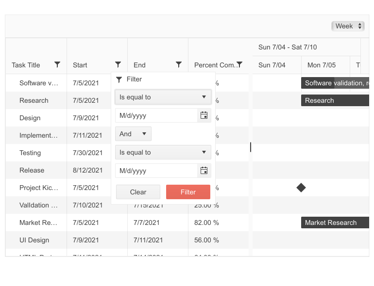
Telerik UI for Blazor Gantt Chart Filter Menu
Alternatively, you can configure the Gantt column filter menu to display a list with checkboxes and a search input box for easy discoverability of the available filter by values.
Gantt Toolbar
The Gantt toolbar allows you to organize common user actions in a neat, convenient way. It comes with built-in command for adding new tasks, and an option to add other common custom actions.
Gantt Tasks
For proper visualization of tasks, the Telerik Gantt component for Blazor requires some of its data fields to be mandatory:
- TitleField – task description
- StartField – task start date (used for rendering in the timeline)
- EndField – task end date (used for rendering in the timeline)
- PercentCompleteField – a number in the range 0.00-1.00, which will determine the percentage of task completion
Additionally, your models can provide the following optional data:
- IdField – unique identifier of each task (needed for editing and hierarchical scenarios)
- ParentIdField – unique identified of the parent task (if null, the task is shown on root level)
- HasChildrenField – flag determining whether a model item is a parent or leaf node in the hierarchy
- ItemsField – property which contains the child items
Gantt Task Types
Following the needed tasks types for managing projects, the Gantt component offers three different types:
- Regular – normal tasks, which can be resized, moved and edited independently
- Summary – top-level tasks with special rendering denoting that they have child tasks; the start and end dates and percent complete values of the summary tasks are calculated based on their child tasks’ values
- Milestone – regular tasks that have a zero duration, typically used to denote that important part of a project is reached
The Gantt is smart enough to determine the type of task based on the provided values of the data items. For example:
- If you set the start date equal to end date, the Gantt will automatically set the task as milestone
- Setting an end date for a milestone task from the TreeList editor will convert it to a regular task
- Adding a child to a regular task will convert it to a summary, and so on
Task Editing
The Gantt component allows editing of tasks in both parts of the components—the TreeList and the TimeLine.
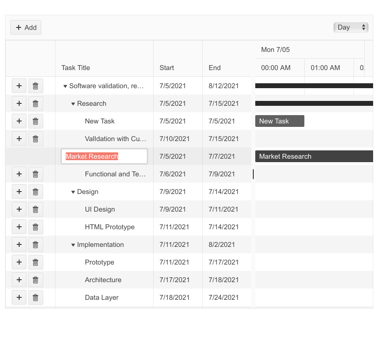
Telerik UI for Blazor Gantt Chart InCell Editing
Users can edit data in the tree list by clicking a task and typing in directly new input values in the corresponding cells (Blazor Gantt Chart InCell editing).
In the timeline section of the Gantt, users can perform edits through drag-and-drop operations—moving and resizing tasks, changing PercentComplete through a dedicated drag handle, etc. Just like in the TreeList section, a double-click on a task element will open the pop-up editor for advanced editing.
Task Templates
Using the Gantt Chart templating feature, you can render custom content for regular tasks in the timeline section. This allows you to visualize images and custom formatting directly in the task slot.
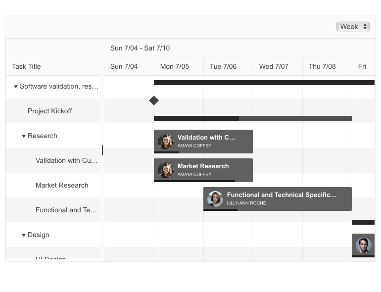
Telerik UI for Blazor Gantt Task Custom Content
Tooltip
In case you want to keep the task slot in the timeline concise but still need to display additional information about a Gantt task, you can do so in the tooltip component shown when hovering over a task in the Gantt timeline section. The tooltip also provides a template option that allows you to render custom content.
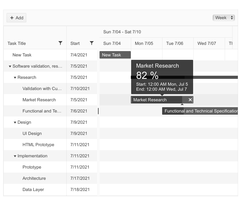
Telerik UI for Blazor Gantt Tooltip Template
Gantt Chart v2 List of Features
Next month with Telerik UI for Blazor 2.27 release you can expect the second set of Gantt features including:
- Task dependencies – well known from project/task management dependencies (start-to-start, start-to-finish, finish-to-finish, etc.)
- Gantt column resizing and reordering (within TreeList view)
- Toggle off InCell edit mode with double-click
- Option to edit tasks in tree list part with DateTimePicker (currently in v1 this is available only in the Gantt Timeline view)
- Tooltip improvements (with the current release there is a known issue with long-duration tasks, scrolling and tooltip position)
Blazor Grid UI Component—New Features
No Data Template
The new Grid “no data” template feature will let you show custom content going beyond the default “No data” message when the grid has no data to show. If you need to render images, styled text or even other components simply place it within the tags <NoDataTemplate></NoDataTemplate> in the Grid.
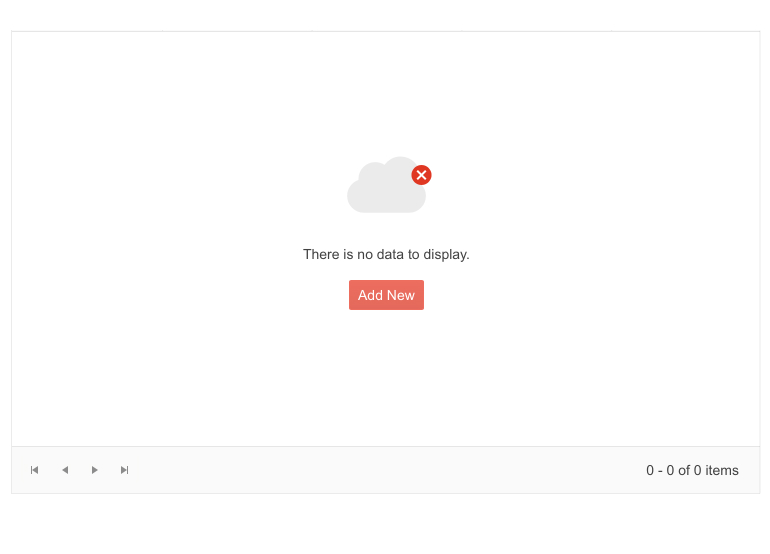
Telerik Blazor Grid Component—No Data Template
Delete Confirmation
By setting the new ConfirmDelete property of the Grid to true, you can add an extra step in the data deletion process and show a delete confirmation dialog as a better styled alternative to the built-in browser capability.
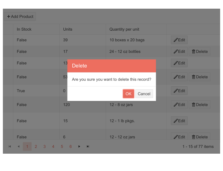
Telerik Blazor Grid Component—Delete Confirmation
Blazor TreeList UI Component New Features
All of the above-mentioned features for the Grid component have also been implemented in the TreeList, namely:
- No data template – allowing you to show custom content when the TreeList has no data to show
- Delete confirmation – allowing you to ask users for confirmation of TreeList data deletion
Scheduler UI Component New Features
In late June, we shipped built-in resource grouping functionality for the Telerik Blazor Scheduler UI, and this month we added several new features:
- Scheduler DateHeaderTemplate – allowing you to render custom content and formatting in the Scheduler column header cells when using day, week and multiday views
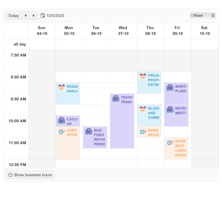
Telerik UI for Blazor Scheduler Date Header Template - Scheduler No data template (equal functionality as the one described for the Grid and TreeList)
- Scheduler Delete Confirmation (equal functionality as the one described for the Grid and TreeList)
More good news about the Scheduler—in our upcoming release we plan to add more features and improvements such as Timeline View and ContextMenu event.
Pager UI Component New Features
Page Size Dropdown
The new feature gives built-in flexibility to adjust the number of shown records per page. By setting PageSizes property to a collection of values, the Telerik Pager for Blazor renders a dropdown list with corresponding page size options. Choosing a value from the dropdown will change the page size in the pager. You can also show “All” item in the dropdown list by passing null element to the page size element collection.
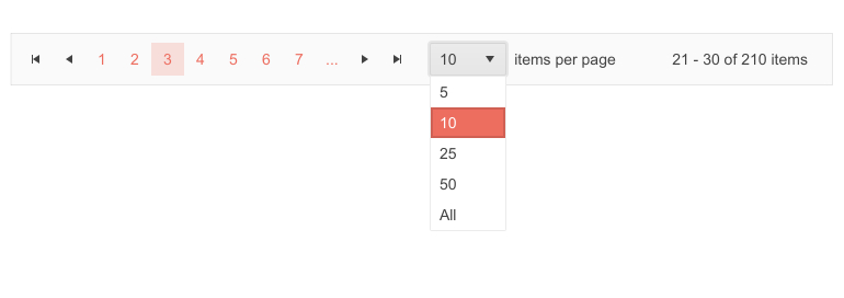
Telerik Blazor Pager—Records per Page DropDownList
Pages Count Input
In addition to using buttons to navigate the pager component, we also added a handy input option that allows users to type a numeric value and navigate to the respective page. This can be achieved by setting the Pager InputType parameter to either buttons or numeric input.

Telerik Blazor Pager—Go To Page Input
Pager Settings in Grid, TreeList and ListView
Because internally we integrate the Pager UI component in our Grid, TreeList and ListView Blazor components, we made sure that they received all new Pager settings improvements as well. To take advantage of them, you can configure them as follows:
- In the Grid add GridPagerSettings tag within the <GridSettings>:
<GridPagerSettingsInputType="@PagerInputType.Input"PageSizes="@PageSizes"/><GridSettings><GridPagerSettingsInputType="@PagerInputType.Input"PageSizes="@PageSizes"/><!-- OR --><GridPagerSettingsInputType="@PagerInputType.Butons"PageSizes="@PageSizes"ButtonsCount="10"/></GridSettings> - Analogically do the same pager configuration in the TreeList:
<TreeListSettings><TreeListSettingsInputType="@PagerInputType.Input"PageSizes="@PageSizes"/><!-- OR --><TreeListPagerSettingsInputType="@PagerInputType.Butons"PageSizes="@PageSizes"ButtonsCount="10"/></TreeListSettings> - And in the Blazor ListView you can configure the Pager as follows:
<ListViewSettings><ListViewPagerSettingsInputType="@PagerInputType.Input"PageSizes="@PageSizes"/><!-- OR --><ListViewPagerSettingsInputType="@PagerInputType.Buttons"PageSizes="@PageSizes"ButtonCount="7"/></ListViewSettings>
Download Telerik UI for Blazor 2.26.0
Try out the latest from Telerik UI for Blazor and let us know what you think!
- For everyone new to Telerik UI for Blazor—you can download a free trial of Telerik UI for Blazor 2.26.0 from the Telerik UI for Blazor page.
- Telerik active license holders can grab the latest version from the “Your Account” page or directly update the Telerik.UI.for.Blazor NuGet package reference to version 2.26.0 in existing Blazor solutions.

Maria Ivanova
Maria Ivanova is a Manager of Product Management at Progress, for Telerik and Kendo UI components and developer tooling. She joined the company in 2019 as a Product Manager for Telerik UI web components and is passionate about developing impactful and innovative software products. Maria believes that to create great products, it's important to challenge the status quo, closely collaborate with customers, and embrace a spirit of experimentation.
