What’s New in the Kendo UI Angular Components with R1 2020

Summarize with AI:
The R1 2020 release of Kendo UI for Angular is here, bringing several new components like the card, avatar, file select, and checkbox & radio button. This release also comes with important features like column virtualization, treeview drag & drop, and more!
A new year means a new release of the Kendo UI for Angular components! This release brings a whole slew of new components and important updates to existing ones, so let’s jump straight in and see what is new in the land of UI components for Angular!
New Angular Components
New Component: TreeList

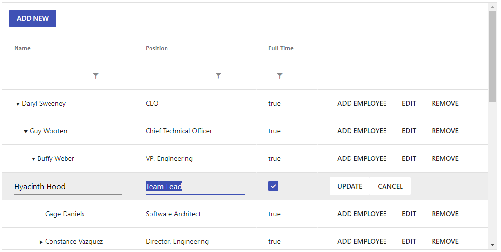
This is a component that we know a lot of folks have been looking for, and I'm incredibly excited to be able to announce that the Kendo UI for Angular TreeList is here! For those not familiar, the TreeList combines the hierarchical layout of a TreeView with the column and tabular structure of a data grid. This is different than a traditional hierarchy within the Grid as the data is completely homogeneous (all fields are the same) and the columns align between parent and child rows.
While we have marked the TreeList as beta due to this being the initial release, the component still has a ton of features available out of the box. Here's just a short list of the highlights:
- Data binding
- Paging
- Sorting
- Filtering
- Editing
- Column re-ordering and resizing
- Virtualized columns
- Frozen columns
- Column menu
- Export to PDF & Excel
- and more!
So, as you can see we are already covering most of the features that you come to expect out of a TreeList from day one!
To play around with the TreeList and see all of this in action, head on over to the Kendo UI for Angular TreeList documentation article!
New Component: Checkbox

You may have used check boxes with Kendo UI for Angular before, but up until now it has just been through applying CSS classes. With the R1 2020 release, the Kendo UI team put together an Angular directive that can be applied to native checkbox HTML element. This provides not only the styling associated with your favorite Kendo UI theme (Default, Bootstrap, or Material, etc.), it also ensures that this checkbox just enhances what the Angular framework already provides out of the box.
Head on over to the Kendo UI for Angular Checkbox Component demo page to see how you can add this component in to your apps today!
New Component: Radio Button

Like the checkbox component above, the Kendo UI for Angular team put together a directive to help apply consistent styling across the board with any Angular application written with the Kendo UI for Angular components. As radio buttons and checkboxes are all a standard part of building forms, these two components help ensure that all aspects of a form can be built with Kendo UI for Angular.
For more information you can jump over to the Kendo UI for Angular Radio Button docs section!
New Component: Avatar
![]()
Avatars represent many things in applications today; profile pictures in social media, chat heads in messaging platforms – even icons. With the Kendo UI for Angular Avatar component developers can easily add a sleek way to represent people or entities in your application by setting an image, icons, or using initials (e.g. “CB” using my initials). The shape of these items can be set as square, circle, or a general rounded shape via a quick configuration option.
To see just how easy it is to use the Angular Avatar component in your apps today, check out the Kendo UI for Angular Avatar docs.
New Component: Card

The Kendo UI for Angular Card widget is an additional layout element to help developers set up beautiful and modern application designs. Popularized with Bootstrap and Material Design, this layout component can be used by itself or as a part of a template for other components to create a compelling user experience. As a part of the implementation the component offers clean and defined sections like header and content, as well as the ability to define card actions via buttons that can be customized to fit your interaction needs.
To see just how to implement this new Card component you can refer to the Card demos and docs page right here.
New Component: Chip & Chip List

The Kendo UI for Angular Chip component covers a style of elements popularized in Material Design and mobile application design. The component consists of a container (often in a “pill” design), text, optional image, and remove icon. This can be used as a part of a component that provides multiple inputs or a quick way to list out predefined options which can be selected by the end user.
As a part creating the Angular Chip component the Kendo UI for Angular team also introduced the Chip List, which gives developers an easy way to provide a list of chips. The component also provides a selection feature, allowing developers to easily maintain the set of currently selected chips.
New Component: File Select
Like the Upload component, the Kendo UI for Angular File Select component gives your end users an intuitive way to select a single, or multiple, file(s) from their local machine. The unique aspect of the File Select component is that it allows a developer to have full control over when, and how, the file gets uploaded.
The FileSelect comes with many configuration options out of the box, but if you need some extra control over behavior and the look and feel the component fully supports templates using the Angular framework templates. Also, like all our UI components that target forms, the FileSelect component integrates with Reactive Forms!
For more information you can refer to the FileSelect documentation section.
New Component: Floating Label

This may need to be labeled as “newish.” A Floating Label has become almost a standard aspect of input elements in today’s web design. While floating labels have existed within the Kendo UI for Angular U components themselves, this standalone component gives developers the power to implement floating labels within their own input elements or enhance other Kendo UI for Angular UI components. You might have seen this referred to as the TextBoxContainer component in our documentation in the past, but we think that calling it the “Floating Label” component seems much better :)
Expanded Component Features
TreeView - Drag & Drop Nodes

This feature has been one of the most top-requested features within Kendo UI for Angular and I’m happy to announce that we added drag & drop capabilities within our Angular TreeView! With the new Drag & Drop feature of the TreeView end-users can drag nodes to other areas of the TreeView including items within the same level of hierarchy as well as nodes in different levels of the hierarchy. If the node has any children, they will also be dragged along. If you have multiple TreeViews in the same page you can even drag-and-drop nodes between the two different components!
Check out the TreeView Drag & Drop docs for more information.
Upload - Support for Chunking
When uploading files, a traditional approach is to take the entire file and just start streaming the file from start to end. This is unfortunately a bit fragile as network connections can be interrupted. This is where chunking comes in to play, breaking files down to smaller pieces (chunks) and upload these chunks in a sequence. With this approach uploads can easily be resumed after a network connection is regained and can help with pausing and resuming uploads as well. With R1 2020, Kendo UI for Angular Upload component now supports chunking any selected file!
Head on over to the upload component docs for examples of how to start using this new feature.
Grid - Column Virtualization

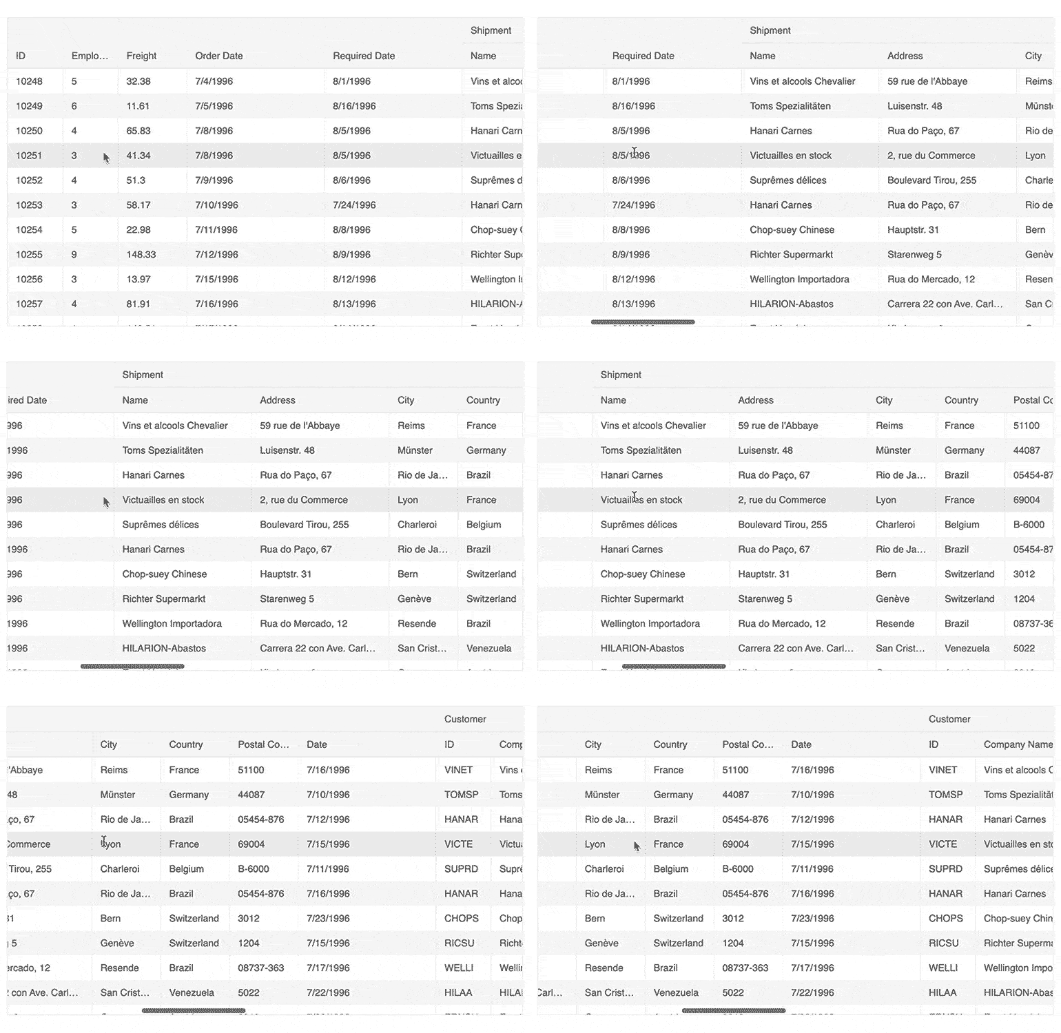
With Column Virtualization in the Angular Data Grid, developers can throw as many columns as they need in to the Grid without worrying about performance degradation. Combine this with the pre-existing row virtualization and the Angular Data Grid can support huge data sets with countless rows and columns. As you can see in the animated GIF above, this operation is buttery smooth and the Kendo UI for Angular Grid doesn’t break a sweat!
Grid - Performance Improvements
Through the work of implementing column virtualization, the Kendo UI for Angular team went through the source code of the Angular Grid and implemented various performance-improving tweaks to ensure that the R1 2020 release of the Kendo UI for Angular Grid is the fastest yet. This includes initial load of the component and its data, as well as interactions like scrolling.
Editor - Keyboard Navigation
With the new Keyboard Navigation feature, the Kendo UI for Angular Editor can now be easily utilized with just a keyboard. Ideal for scenarios where productivity improvements can be made with just using the keyboard or improving accessibility.
Editor - Accessibility
The Kendo UI for Angular Editor component now comes with built-in support for accessibility out-of-the-box. Without additional configuration options developers can rely on the Editor to be compliant with Section 508, WCAG 2.1 and WAI-ARIA standards.
New Sample Apps
Financial Dashboard App

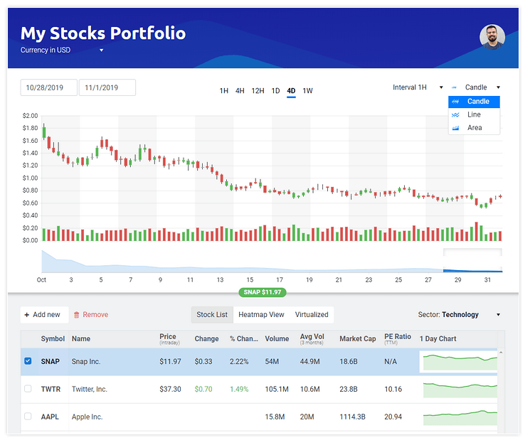
Over the last couple of months the Kendo UI for Angular team put together a sample application, focused on creating a Stock Portfolio Dashboard, which showcases the power of the Kendo UI for Angular components. This includes our Stock Chart, a Data Grid with live and changing data, as well as various navigation elements and other data visualization components. We think this is a great way to learn the Kendo UI for Angular components, and a good look into a more real-life application.
Feel free to head over to the Angular Stocks Portfolio app and see the application in action! For full source code you can refer to this GitHub repo.
Grid & Chart Integration
A common request that we receive with all Kendo UI flavors is to showcase integrations between the Data Visualization package and the Data Grid. While this does require some code to implement it is certainly very achievable and is customizable too! We decided to put together one approach for how these two components can work together. Specifically, we created a sample project that shows a Kendo UI Chart updating based on the selection of cells within a Kendo UI Grid.
Interested in how this all works? Head on over to this GitHub page to get the source code for the project and dive in to the code!
Have Some Feedback?
Did we miss your favorite component or feature with this release? Have you had a chance to try out a new component and want to provide some feedback on what we can add? Feel free to comment in the comment section below, or head on over to our public feedback portal and add your ideas there! Many of the items we added with R1 2020 came directly from items brought up in our feedback portal so it’s a great way to ensure that we add a component that you need!
Join Us For a Live Webinar!
Want to check out the features I just mentioned above live and in action? Join myself and my colleagues on the Kendo UI for Angular team during our live webinar on Thursday, January 23rd at 11:00 AM ET! We’ll be covering all of Kendo UI throughout the day, but the Angular-specific section will kick things off right at 11:00 AM! Seats are limited, so head on over to the webinar page to sign up today and reserve your seat!

Carl Bergenhem
Carl Bergenhem was the Product Manager for Kendo UI.
