
Unified Blazor Web App Project Template Fully Explained

Summarize with AI:
Deciding which Blazor template to use depends on the type of application you want to build. We’ll focus on the Blazor Web App template, but first we’ll review each option to understand the differences.
On Nov. 13, 2023, Microsoft released ASP.NET Core with .NET 8. The release came with significant updates to the Blazor architecture. The updated Blazor architecture includes new rendering modes that allow a greater performance and flexibility. To support the new render modes, a new Blazor Web App project template was introduced.
In this article, we’ll learn about the Blazor Web App project template, the template options and the output of each option.
Render Mode Basics
Before we can understand each template option, we first need to learn about each of Blazor’s render modes. ASP.NET Core with .NET 8 supports four render modes, starting with the default mode, static server-side rendering (static SSR). From this base, three interactive modes can be chosen: interactive server, interactive WebAssembly and interactive auto. Interactivity modes can be enabled on a per-component or per-application basis.
Static Server
Static SSR renders static HTML on the server using ASP.NET Razor Components. As the name implies, static SSR does not offer any interactivity and relies on web standard form POSTs.
Interactive Server
Interactive SSR using Blazor Server utilizes a SignlaR connection to communicate events and updates between the server and web browser.
Interactive WebAssembly
Interactive WebAssembly uses Blazor WebAssembly to render components in the client. Application logic is executed by the .NET WebAssembly runtime.
Interactive Auto
Interactive Auto will initially render using Blazor Server. While the application is using Blazor Server, resources for Blazor WebAssembly are downloaded to the browser. Once Blazor WebAssembly resources are cached, subsequent visits will operate using Blazor WebAssembly.
A simple guide to each mode can be seen in Table 1. If you’re looking for a detailed explanation of the new render modes and their trade-offs, see the article Getting Started with Blazor’s New Render Modes in .NET 8.
| Name | Description | Render location | Interactive |
|---|---|---|---|
| Static Server | Static server-side rendering (static SSR) | Server | |
| Interactive Server | Interactive server-side rendering (interactive SSR) using Blazor Server | Server | |
| Interactive WebAssembly | Client-side rendering (CSR) using Blazor WebAssembly† | Client | |
| Interactive Auto | Interactive SSR using Blazor Server initially and then CSR on subsequent visits after the Blazor bundle is downloaded | Server, then client |
Table 1: Blazor Interactive Modes.
†Client-side rendering (CSR) is assumed to be interactive. “Interactive client-side rendering” and “interactive CSR” aren’t used by the industry or in the Blazor documentation.
Choosing the Right Template
Currently there are quite a few template options for Blazor, shown in Figure 1. Deciding which template to use will depend on the type of application you want to build. For this article, we’ll be focused on the Blazor Web App template, but we’ll first review each option to so we can understand the differences.

Figure 1: All available Blazor templates listed in Visual Studio.
- Blazor Web App – A template for creating a Blazor application with server rendering and optional server and client interactive modes.
- Blazor Standalone WebAssembly App – This template is used to create a Blazor WebAssembly app with client rendering and interactivity. It does not include a server project in the solution. This template is ideal for Progressive Web Applications (PWAs). PWA content can be added by checking the Progressive Web Application option during setup.
- Blazor Server App – This template is used to create a Blazor application with global server interactivity. The template is for starting new .NET 6 & 7 applications only. For .NET 8 apps, use the Blazor Web App template.
- Blazor * Empty – A bare-bones version of the template by the same name. The template is for starting new .NET 6 & 7 applications only.
- .NET MAUI Blazor Hybrid App – This template is used to create a Blazor Hybrid with .NET MAUI application. Blazor Hybrid is ideal for applications that can run on web, desktop and mobile.
The new Blazor Web App template, seen in Figure 2, was created to consolidate the getting started experience into a single starting point. Through the Blazor Web App template, multiple options can be used to configure the code that is generated.
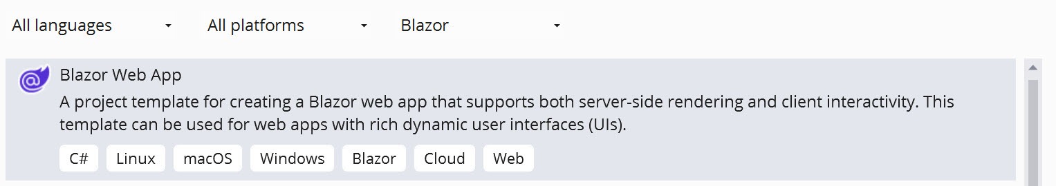
Figure 2: Blazor Web App template selection.
Static Options and Base Configurations
The Blazor Web App dialog offers quite a few options for generating a new Blazor app. Options for a new project include Authentication, Render Mode, Interactivity Location and more. Let’s review each set of options to get an understanding of how the generated content is affected. We’ll start by configuring a basic app, then turn on additional features so we can compare the results.
Bare-Bones Blazor App
Let’s begin with a “bare-bones” Blazor application. This application will have no interactivity and only include files essential to running the application. With this configuration, the application will render using static server-side rendering.
In addition, we’ll disable the Include sample pages option, and select None for the Interactive render mode. With these options selected, the Interactivity Location has no effect on the generated content. This configuration can be seen in Figure 3.
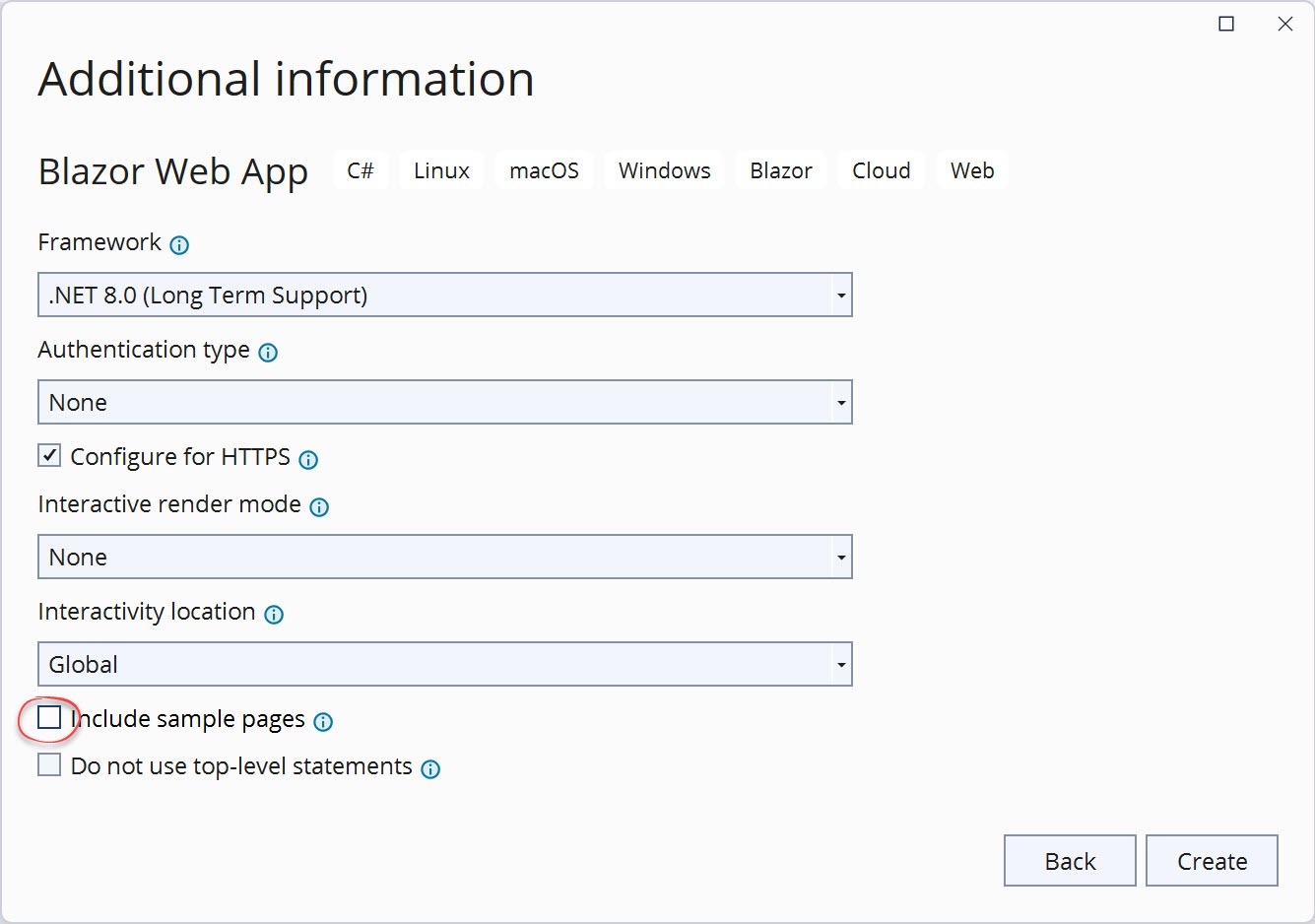
Figure 3: A bare-bones Blazor configuration. Authentication type: none, Interactive render mode: none, Interactivity location: global, and Include sample pages: not selected.
The generated content for this solution is a single server project. Because this is a “bare-bones” configuration, each file included in this solution will appear in all projects. Sometimes these files will include additional code to support specific features. Let’s take this opportunity to learn about each of these essential files. A complete list is shown in Figure 4.
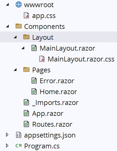
Figure 4: Project files in the solution explorer.
- /wwwroot – Web standard static resources including: CSS, JavaScript, JSON, images and HTML. Content from this folder is always publicly available once the application is published.
- /Components – The default folder for all components used in the application. Folders in Blazor will automatically determine the component’s namespace unless otherwise specified.
- /../Layout – Components in this folder are layout components.
- /../Layout/MainLayout.razor – The default layout for the application. This is the outermost rendered content of the application.
- /../Layout/MainLayout.razor.css – The CSS for HTML rendered by the MainLayout component.
- /../Pages – Components in this folder have a route directive and can be routed to by the application with a URL.
- /../Pages/Error.razor – A generic error page that is displayed when an error is encountered by the application.
- /../Pages/Home.razor – The default page, aka application root. This page is shown when the application’s root URL "/" is navigated to. The content for this page is a welcome message and is not affected by the template options.
- /../Components/_Imports.razor – The _Imports.razor file acts as a global using statement for all .razor files that are siblings or children to it. The contents of this file my be appended to, depending on the options chosen for the project template.
- /../Components/App.razor – The App.razor file is the first component rendered by the application and contains the base HTML for the application. This includes the html, head and body elements. Included are references to static resources such as CSS, JavaScript, fonts and images the application requires. The HeadOutlet and Routes components are children of the App component, and their applied parameters may vary depending on the render mode chosen.
- /../Components/Routes.razor – The Routes component is the router for the application. Components are rendered inside the Routes component when navigated to. The Routes component is affected by the Authentication template option.
- /appsettings.json – The application’s settings file in JSON format.
- /Program.cs – The application’s entry point. The application’s configuration is defined here. The interactivity template options will append code in this file.
Running the “bare-bones” app will display the Home page, shown in Figure 5. Notice the lack of style—this is due to the Include sample pages option being disabled. The results of choosing None for the Interactive render mode aren’t apparent when viewing the running app, especially with no sample pages.
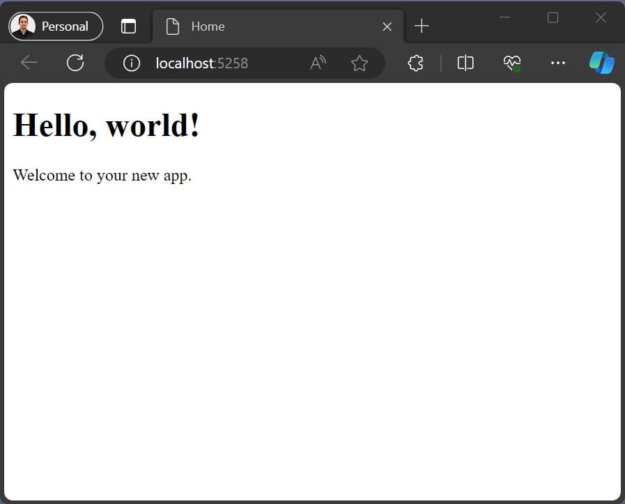
Figure 5: A bare-bones Blazor application, displaying a “Hello, world!”
Overall, this is great for starting with a blank canvas because only the minimum framework components are present. In the next example, we’ll enable Include sample pages to see what’s added to the output.
Adding Sample Pages
Let’s create a new project again, this time with the Include sample pages option selected. This application will have no interactivity but will include the new static rendering capabilities. This configuration can be seen in Figure 6 below.
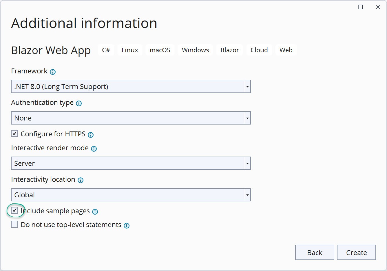
Figure 6: A static rendered Blazor configuration. Authentication type: none, Interactive render mode: none, Interactivity location: global, and Include sample pages is selected.
The generated content for this solution is a single project. In addition to the bare-bones application are static assets to provide a basic theme, navigation elements and a fetch data sample component. Let’s examine the additional content created by enabling Include sample pages. The generated files are shown in Figure 7.
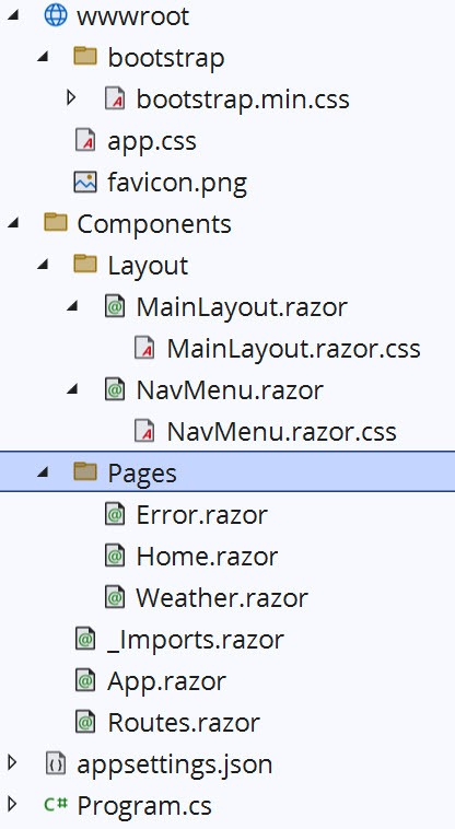
Figure 7: Project files in the solution explorer.
With this configuration, the wwwroot folder contains a minified Bootstrap CSS file and favicon. Bootstrap is used to create a basic theme for the application. In addition, the app.css file and component.css files have themes added to them.
Selecting Include sample pages also produces the sample components, and a NavMenu component. Because there was no interactivity mode chosen, only the Weather sample is added. In the Weather component, the @attribute [StreamRendering] demonstrates a long-running render processes. StreamingRendering improves the user experience with by updating the rendered component as data is processed on the server.
Running the app will display the Home page, shown in Figure 8. The sample theme and content are immediately visible.
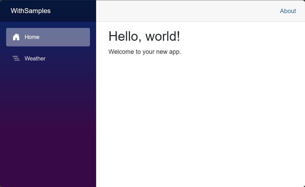
Figure 8: A sample Blazor application running in the browser, displaying a “Hello, world!” message.
This configuration is a good start for applications that don’t require interactivity. The additional theme and component samples are helpful for getting started quickly. In the next example, we’ll add Server interactivity to see what changes.
Server Interactivity Options
Global Interactive Server
Let’s create a new project with interactivity enabled. There are three interactivity modes: Server, WebAssembly and Auto. These modes can also be modified as Global or Per Page/Component by choosing the Interactivity location. We’ll begin by selecting the Server interactivity mode and Global option. This configuration can be seen in Figure 9 below.
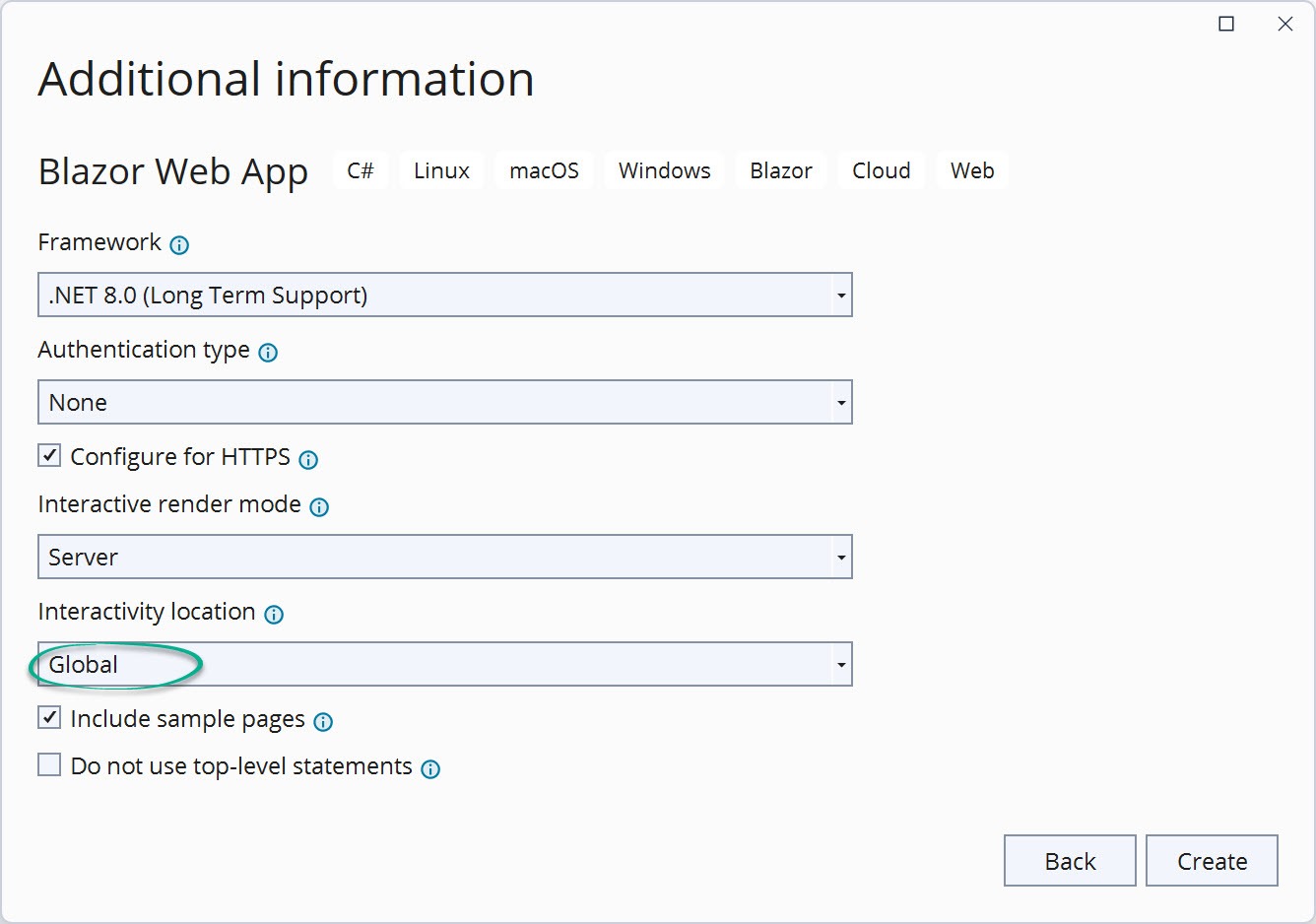
Figure 9: A static rendered Blazor configuration. Authentication type: none, Interactive render mode: server, Interactivity location: global, and Include sample pages is selected.
When interactivity is added to a Blazor application the App.razor and Program.cs files will be configured with settings for the desired interactive mode. In addition, when Include sample pages is enabled the samples demonstrate specific ideas for the mode they’re used with. The generated files for this project can be seen in Figure 10.

Figure 10: Project files in the solution explorer.
When server interactivity is enabled, the Program.cs file includes statements to enable the feature. The Services collection uses AddInteractiveServerComponents to add services that support interactivity on the server. While the AddInteractiveServerRenderMode method configures interactive server-side rendering (interactive SSR) for the app.
Program.cs
// Add services to the container.
builder.Services.AddRazorComponents()
    .AddInteractiveServerComponents();

// Configure SSR for the app
app.MapRazorComponents<App>()
    .AddInteractiveServerRenderMode();
The Global setting will apply the application’s render mode in App.razor. In the App.razor page, the HeaderOutlet and the Routes component instances have @rendermode="@InteractiveServer" applied. This means any child of these components will have server interactivity.
The Counter and Weather sample components are generated to correspond with the Global setting. Since the interactive mode was set on the Routes component instance, no render mode needs to be specified in the samples. In addition, the Weather component sample lacks the @attribute [StreamRendering] because interactivity via the OnInitializedAsync event provides a similar experience.
These settings are ideal for apps that will be completely server interactive for all components. In the next example, we’ll choose the Per Page/Component option for a more granular approach.
Per Page/Component Interactive Server
Let’s create a new server interactive project, but this time with the Per Page/Component option. The generated project will be similar to the previous project, but the App, Counter and Weather components will be slightly different. This configuration can be seen in Figure 11.
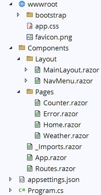
Figure 11: A Blazor interactive server configuration. Authentication type: none, Interactive render mode: server, Interactivity location: per page/component, and Include sample pages is selected.
With the Per Page/Component option, the App.razor component does not specify any rendering modes for any component instances. This allows any page or child component to choose its own rendering mode. If no rendering mode is specified, then those components are rendered static (no interactivity).
To demonstrate the flexibility of the Per Page/Component project, Counter and Weather sample components include relevant configurations. The Counter component code has the @rendermode InteractiveServer added to indicate it will choose server interactivity. The Weather component doesn’t require interactivity and is statically rendered. The @attribute [StreamRendering] is used to display a “loading” message while the Weather component data loads. After the data loads, StreamRendering updates the rendered component by patching the HTML the final rendered results.
These settings are ideal for apps that need to be optimized with static server rendering when interactivity is not needed. For components that require server interactivity, the feature can be enabled through the rendermode attribute. In the next example, we’ll use the WebAssembly render mode options.
WebAssembly Interactivity Options
Global WebAssembly Interactivity
Let’s create a new project with WebAssembly interactivity starting with the interactivity location option set to Global. The configuration for this project can be seen in Figure 12.
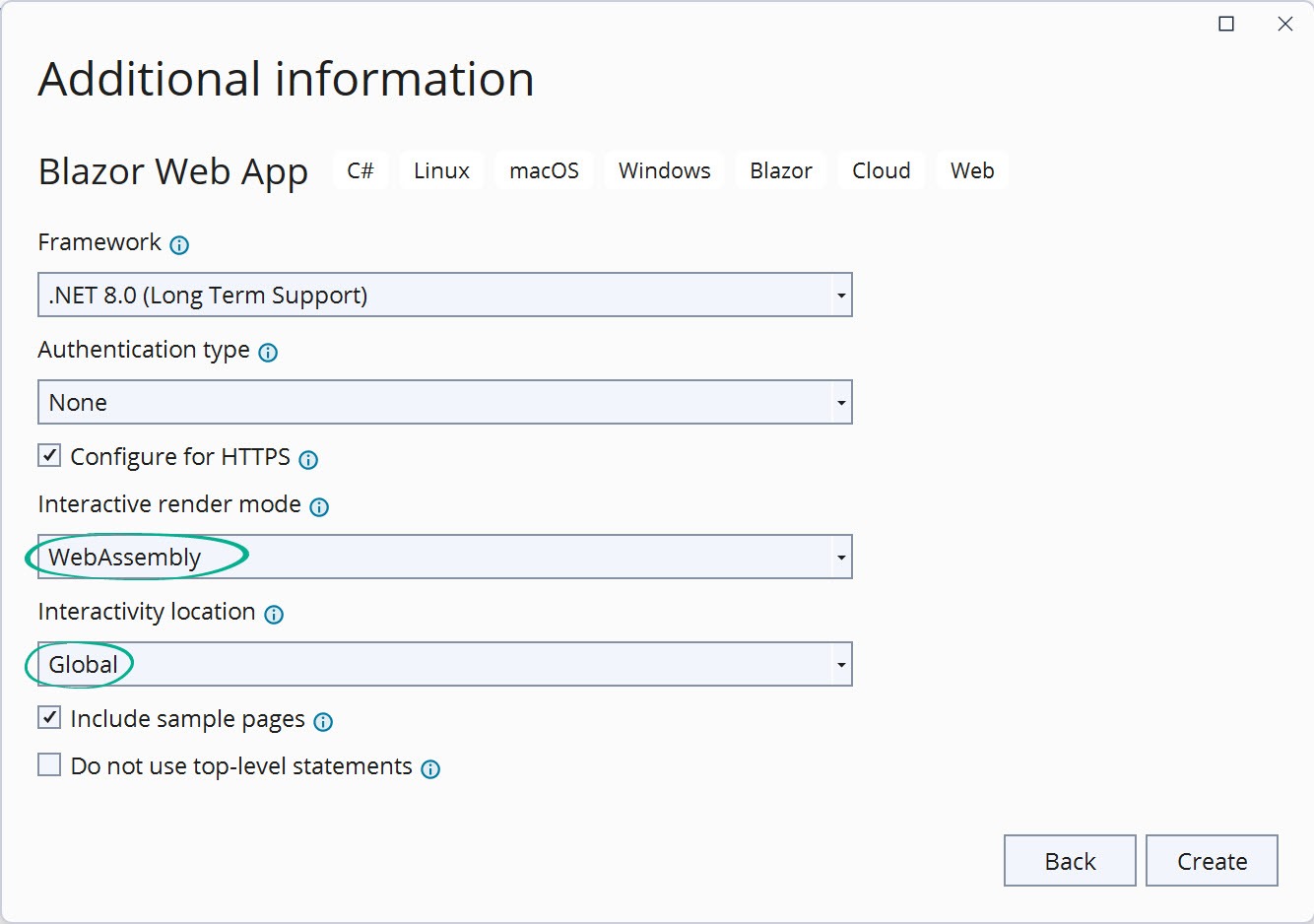
Figure 12: A Blazor interactive WebAssembly configuration. Authentication type: none, Interactive render mode: WebAssembly, Interactivity location: global, and Include sample pages is selected.
Unlike the Server interactivity modes that only create one project per solution, all WebAssembly and Auto options include two projects. One project is for the Server application, and the other is the Client interactive pages and components. The generated project is shown in Figure 13.
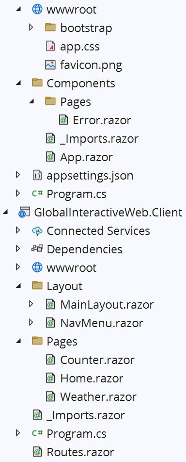
Figure 13: Project files in the solution explorer.
In the server project, the Program.cs file includes statements to activate WebAssembly Interactivity. The Services collection uses AddInteractiveWebAssemblyComponents to add services that support interactivity on the client, while the AddInteractiveWebAssemblyRenderMode method configures interactive client-side rendering for the app. The AddAdditionalAssemblies method locates components in the Client app creating a reference on the server app.
// Add services to the container.
builder.Services.AddRazorComponents()
    .AddInteractiveWebAssemblyComponents();

app.MapRazorComponents<App>()
    .AddInteractiveWebAssemblyRenderMode()
    .AddAdditionalAssemblies(typeof(Counter).Assembly);
The Global setting will apply the application’s render mode in App.razor. In the App.razor page, the HeaderOutlet and the Routes component instances have @rendermode="@InteractiveWebAssembly" applied. This means any components rendered as children of these components will have server interactivity. Since these are the root-most components in the application, the app is globally WebAssembly interactive.
In addition, the Routes.razor file is generated in the Client app where all interactivity takes place. When Include sample pages is enabled, the sample components are generated in the Client project, including Counter, Weather and NavMenu.
These settings are ideal for apps that use WebAssembly interactive for all components, thus reducing server overhead. In the next example, we’ll choose the Per Page/Component option, which will enable static SSR in addition to Interactive WebAssembly.
Per Page/Component Interactive Server
Let’s create a new WebAssembly interactive project, but this time we’ll choose the Per Page/Component option. The generated project will be similar to the previous project, but the App, Routes, Counter and Weather components will be slightly different. This configuration can be seen in Figure 14.
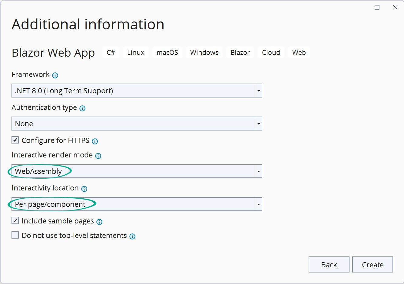
Figure 14: A Blazor interactive WebAssembly configuration. Authentication type: none, Interactive render mode: WebAssembly, Interactivity location: per page/component, and Include sample pages is selected.
With the Per Page/Component option, the App.razor component does not specify any rendering modes for any component instances. This allows any page or child component to choose its own rendering mode. If no rendering mode is specified, then those components are rendered static (no interactivity).
To support both server and client components, the Route component is generated in the Server project and references the Client components’ routes through the AdditionalAssemblies property. The files for this project are shown in Figure 15.
<Router AppAssembly="@typeof(Program).Assembly" AdditionalAssemblies="new[] { typeof(Client._Imports).Assembly }">
    ...
</Router>
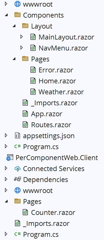
Figure 15: Project files in the solution explorer.
The Counter is the only interactive component with this configuration, and therefore is placed in the Client project. The @rendermode InteractiveWebAssembly attribute in the Counter indicates its interactivity mode. The remaining components are generated in the Server project as they will be rendered statically. The Weather component is configured with StreamRendering, as opposed to interactivity.
These settings are ideal for apps that need to be optimized with static server rendering when interactivity is not needed. For components that require WebAssembly interactivity, the feature can be enabled through the rendermode attribute. In the next example, we’ll use the Automatic option.
Automatic Interactivity Options
The Automatic Interactive render will use the server or WebAssembly for interactivity depending on the resources available on the client. Let’s choose the Auto (Server and WebAssembly) option as shown in Figure 16. Choosing the Auto (Server and WebAssembly) option will produce nearly identical results to WebAssembly Interactivity with the respective Global or Per Page/Component options. The key differences are in the Program.cs file and use of the rendermode attributes in components.
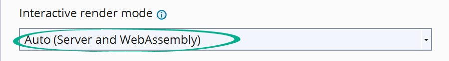
Figure 16: The Auto (Server and WebAssembly) selection setting from the new project dialog.
In the server project, the Program.cs file includes statements to activate both WebAssembly Interactivity and Server Interactivity. The app’s render modes are also configured using both the AddInteractiveWebAssemblyRenderMode and AddInteractiveServerRenderMode methods. The AddAdditionalAssemblies method locates components in the Client app creating a reference on the server app.
// Add services to the container.
builder.Services.AddRazorComponents()
    .AddInteractiveServerComponents()
    .AddInteractiveWebAssemblyComponents();

app.MapRazorComponents<App>()
    .AddInteractiveServerRenderMode()
    .AddInteractiveWebAssemblyRenderMode()
    .AddAdditionalAssemblies(typeof(Counter).Assembly);
When the Global option is selected, the InteractiveAuto attribute is applied to the Routes component instance in App.razor. Since the mode is set at the root level of the application, all components for this setting will be generated in the Client project.
The files for the Auto (Server and WebAssembly) and Global options can be seen in Figure 17 (right). For the Per Page/Component option, the InteractiveAuto attribute appears in the Counter component only. All other components use static server rendering and are generated in the Server project. The files for the Auto (Server and WebAssembly) and Per Page/Component options can be seen in Figure 17 (left).
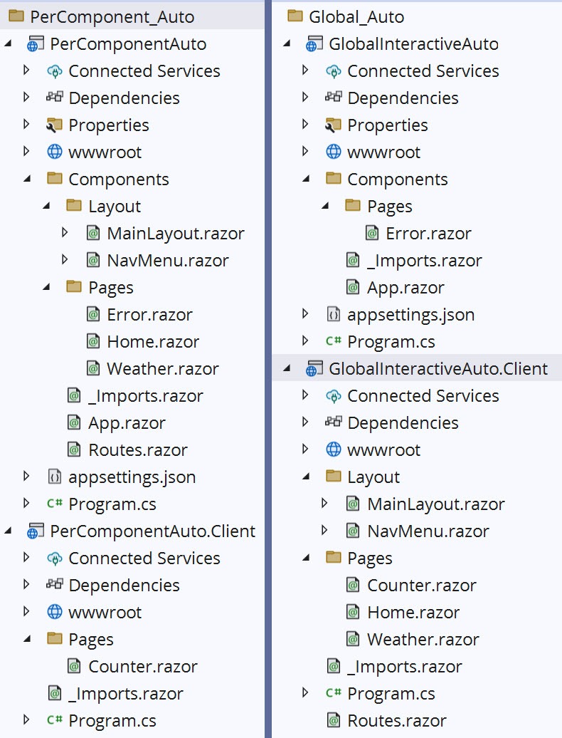
Figure 17: Comparing files created by the Auto (Server and WebAssembly). Global files are displayed on the right. Per Page/Component files are displayed on the left.
Automatic rendering strikes a balance between the two modes. These settings are ideal for apps that can need to optimize initial app load times.
A Note About Authentication Type Options
Authentication is a complex topic and is not within the scope of this article. The option creates all of the files necessary for authenticating users and managing user profiles. For more information on the topic please reference the official documentation.
Conclusion
Starting a new Blazor project in .NET 8 might seem overwhelming at first due to the extensive list of templates and options. The Blazor Web App template is the best solution for Blazor applications that can utilize static server rendering (non-PWA or non-Blazor Hybrid apps). The Blazor Web App template consolidates all Blazor configurations into one, while giving multiple options to choose the right starting point. Knowing what capabilities your app needs will determine which options to choose, but ultimately Blazor can be reconfigured manually at any time if new requirements arise.
Use a component library in sync with Microsoft’s release cadence. Telerik UI for Blazor offers more than 110 truly native Blazor components to make it fast and easy to develop new Blazor apps or modernize legacy apps. It can help you get started with your Blazor web app. Try it free for 30 days.

Ed Charbeneau
Ed
Related Posts
Comments
All articles
Topics
Web MobileMobile
Desktop
Design
Productivity
People
