
ASP.NET 8 Blazor Sections Fully Explained

Summarize with AI:
.NET 8 introduced sections for controlling content from child components. Let’s explore sections in Blazor and how to implement them with layouts.
In .NET 8, ASP.NET Core introduced sections, a new feature that allows the control of content from child components. Sections can be used both in layouts and across nested parent-child components.
While sections are entirely new to Blazor, the concept may seem familiar if you’ve used other ASP.NET technologies. Sections are like ContentPlaceHolder in Web Forms or RenderSection in ASP.NET MVC. In this article, we’ll explore sections in Blazor, learn how to implement sections with layouts and best practices.
The SectionOutlet and SectionContent Components
What makes sections possible in Blazor is a corresponding pair of objects, SectionOutlet and SectionContent.
What makes sections possible in Blazor is a corresponding pair of objects, SectionOutlet and SectionContent. The SectionOutlet and SectionContent are found in the Sections namespace of ASP.NET Core. To bring SectionOutlet and SectionContent into scope, add the following using statement to the application’s _Imports.razor file.
@using Microsoft.AspNetCore.Components.Sections
SectionOutlet is a component that renders content provided by SectionContent components with matching SectionName or SectionId arguments. Two or more SectionOutlet components can’t have the same SectionName or SectionId.
SectionContent is a component that provides content as a RenderFragment to SectionOutlet components with a matching SectionName or SectionId.
If several SectionContent components have the same SectionName or SectionId, the matching SectionOutlet component renders the content of the last rendered SectionContent.
SectionName vs. SectionId
A section is created using a SectionOutlet and identified by either the section SectionName or SectionId parameter. The SectionName parameter is a string that is used to target the SectionOutlet from a SectionContent component. Although the argument passed to SectionName can use any type of casing, it is common to use kebab casing (for example, top-section) which is the casing choice for HTML element IDs.
Let’s look at a typical Blazor application template to see where this feature may be implemented. In Microsoft’s Blazor template, there is an element with the class top-row. By default, top-row displays a link to an about page, shown in Figure 1.
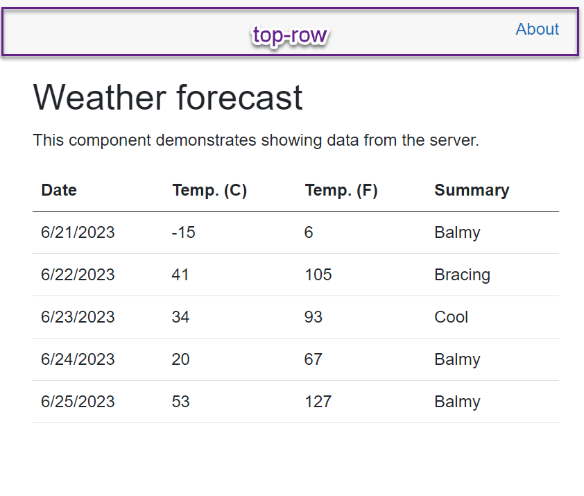
Figure 1: A Blazor application with the top-row element highlighted for emphasis.
The only way to add content to the top-row is by editing the source code directly. However, adding sections to top-row makes it susceptible to being customized by any child component in the application.
To add a section, we’ll modify the source code of MainLayout.razor. Currently a div element defines the top-row in the layout, and an anchor tag inside links to the About page.
<div class="top-row px-4">
    <a href="https://learn.microsoft.com/aspnet/core/" target="_blank">About</a>
</div>
We can allow content to appear before the existing anchor by adding a SectionOutlet before the About link. The SectionOutlet will be named before-top-row to help identify where the content will appear when it is rendered, in this case before the first element within the top-row.
<div class="top-row px-4">
    <SectionOutlet SectionName="before-top-row"/>
    <a href="https://learn.microsoft.com/aspnet/core/" target="_blank">About</a>
</div>
With the SectionOutlet added, any child component using the MainLayout can display content in before-top-row. It’s now possible to insert content before the About link, to demonstrate a dedicated help link for each page.
Inside ShowData.razor we’ll add a SectionContent component and assign the SectionName to before-top-row. Inside the SectionContent, a link is added for ShowData Help.
<SectionContent SectionName="before-top-row">
    <a href="/showdata-help" target="_blank">ShowData Help</a>
</SectionContent>
When the application is started, the homepage is shown and only the About link is displayed. Since this page does not have a SectionContent component, no additional content is rendered. When we navigate to the ShowData page, the ShowData Help link is rendered, as seen in Figure 2. Navigating back to the home page will refresh the content and the additional link is not displayed.

Figure 2: A Blazor application shown in two frames. The first frame shows the Home page with an About link menu item. The second frame shows the ShowData page with the ShowData Help and About links.
One of the difficulties with this approach is discoverability. There is no way to know about the ContentSection without directly looking at the source code of MainLayout. In addition, there is no documentation, Intellisense or other method of surfacing section information to developers working on the code. For a better developer experience (DX), we can use the ContentId parameter instead of ContentName.
The ContentId parameter accepts an object instead of a string. Because ContentId uses an object, the name is strongly typed and recognized by the compiler. To use the ContentId parameter, a static SectionOutlet object is declared in code. The SectionOutlet object is then assigned to the SectionOutlet component’s ContentId parameter.
In the sample below, the SectionId parameter is used instead of SectionName. A static SectionOutlet with the name BeforeTopRow is declared. The SectionOutlet references a static field named BeforeTopRow. The name of the object follows C# naming conventions and makes use of XML Documentation Comments.
<div class="top-row px-4">
    <SectionOutlet SectionId="BeforeTopRow" />
    <a href="https://learn.microsoft.com/aspnet/core/" target="_blank">About</a>
</div>

@code{

    /// <summary>
    /// A section of the layout displayed at the top of the main layout.
    /// </summary>
    public static SectionOutlet BeforeTopRow = new();
}
To use the SectionOutlet, a SectionContent component is created and the SectionId is set to the static object. The rendered result is the same as using SectionName—however, we get the added benefits shown in Figure 3-1, when typing the class name of the layout the SectionId is displayed (Figure 3-2) with documentation describing its use (Figure 3-3).
<SectionContent SectionId="MainLayout.BeforeTopRow">
    <a href="/showdata-help" target="_blank">ShowData Help</a>
</SectionContent>![[1] Code for a SectionId property being typed. [2] The Intellisense menu displaying the sections for MainLayout. [3] The description for BeforeTopRow, provided by XML Comments.](https://d585tldpucybw.cloudfront.net/sfimages/default-source/10x/intellisense-figure3.png?sfvrsn=443537e6_1)
Figure 3: [1] Code for a SectionId property being typed. [2] The Intellisense menu displaying the sections for MainLayout. [3] The description for BeforeTopRow, provided by XML Comments.
Creating Default Content
If several SectionContent components have the same SectionName or SectionId, the matching SectionOutlet component renders the content of the last rendered SectionContent.
This feature can be leveraged to provide default section content. Building on the previous example, we’ll add a SectionContent component directly beneath the SectionOutlet of the same SectionId. Then the existing About link is moved inside the SectionContent. Now the About link will be displayed until another SectionContent replaces it.
<div class="top-row px-4">
    <SectionOutlet SectionId="TopRow" />
    <SectionContent SectionId="TopRow">
        <a href="https://learn.microsoft.com/aspnet/core/" target="_blank">About</a>
    </SectionContent>
</div>

@code {

    /// <summary>
    /// A section of the layout displayed at the top of the main layout.
    /// </summary>
    public static SectionOutlet TopRow = new();
}
Sections are helpful for creating template regions in a layout. They can be loosely typed using string values or strongly typed using objects. Sections can be used to prepend, append or replace content depending on how SectionOutlets are arranged. Sections are not limited to these use cases either—when combined with nested LayoutComponents, their full potential can be seen.
Using Sections with Layouts
Sections in Blazor really show their potential when used with layouts as they can provide a rich set of view templates for any application. Many modern applications require multiple layout schema for different types of views or data.
Consider the basic two-column (Figure 4) and three-column (Figure 5) layouts commonly seen in web applications today. With sections and layouts, managing a two- or three-column layout template is easily achieved. Let’s look at how this can be implemented using HTML, CSS and SectionOutlet.
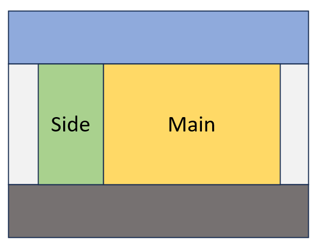
Figure 4: A two-column layout with side bar and main sections.
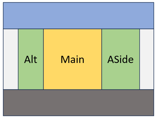
Figure 5: A three-column layout with alt, main and aside sections.
Shown in Figure 6, a MainLayout is used as a base for two- and three-column layouts. The MainLayout also contains Header, Body and Footer sections. In the MainLayout’s Body, either a TwoColumn or ThreeColumn layout is nested. The TwoColumn layout has a Side column for navigation, while the Main section is used for the primary content of the application. The ThreeColumn layout includes an additional column for an aside, or tangentially related information.
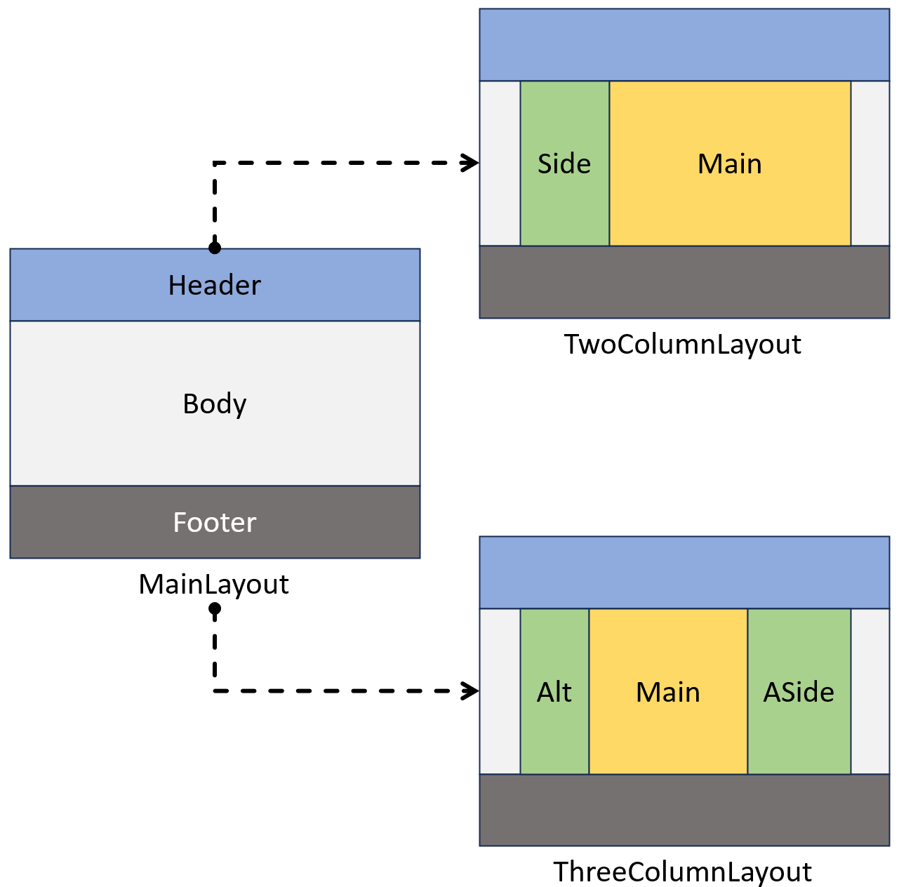
Figure 6: A diagram showing a MainLayout, TwoColumn layout and ThreeColumn layout. The MainLayout serves as a base for the two layouts.
The nesting behavior of layouts in Blazor adds an additional benefit as each of the three layouts incorporates Header and Footer sections. The sections only need to be defined once in the MainLayout and are inherited by the other layouts.
To begin developing the three layout templates, we’ll start with the MainLayout. Starting with a clean MainLayout.razor file, we’ll add the necessary HTML elements to create a header, footer, and body design.
<div class="wrapper">
    <div class="grid-container">
        <header>
            <div class="container">
                <!-- Header -->
                <h1>Untitled</h1>
            </div>
        </header>
        <div class="container">
            <!-- Body -->
        </div>
        <footer>
            <div class="container">
                <p>Copyright ... All Rights Reserved.</p>
                <!-- Footer -->
            </div>
        </footer>
    </div>
</div>
Next, we’ll write the CSS code used to display the elements on the page in the desired orientation and color.
.wrapper {
    /* push footer to the bottom of the page */
    height: 100%;
}
.container {
    /* maintian whitespace around content*/
    width: 80%;
    max-width: 1100px;
    margin: 0 auto;
}
.grid-container {
    display: grid;
    grid-template-rows: auto 1fr auto;
    row-gap:2rem;
    /* push footer to the bottom of the page */
    min-height: 100%;
    background: whitesmoke;
}

header {
    background: #34ace0;
    padding: 1rem;
}

footer {
    background: #227093;
    padding: 1rem;
    color:white;
}
To turn these elements into a Blazor layout, we’ll need to implement the LayoutComponentBase class. Then we’ll add code for the Header, Body and Footer SectionOutlets. The Body SectionOutlet will be optional but adds a nice DX when the layout is consumed.
We’ll use a static class named Sections to help identify what sections are available for this layout. We’ll also make sure to use XML Documentation Comments to communicate the intentions of each section.
@inherits LayoutComponentBase
...
@code {
/// <summary>
/// Sections for the MainLayout
/// </summary>
internal static class Sections
{
/// <summary>
/// The root <header></header> element of the application
/// </summary>
internal static SectionOutlet? Header = new();
/// <summary>
/// The root content container of the document.
/// This element has no semantic meanding. When using this section be sure to specify a main element for accessibility.
/// Default, uses the Body of the layout component.
/// </summary>
internal static SectionOutlet? Body = new();
/// <summary>
/// The root <footer></footer> of the application
/// </summary>
internal static SectionOutlet? Footer = new();
}
}
With the SectionOutlet fields defined, we can now add the SectionOutlet components. Each SectionOutlet component will use the SectionId property that corresponds to the field in the Sections class.
<div class="wrapper">
    <div class="grid-container">
        <header>
            <div class="container">
                <!-- Header -->
                <SectionOutlet SectionId="Sections.Header" />
                <SectionContent SectionId="Sections.Header">
                    <h1>Untitled</h1>
                </SectionContent>
            </div>
        </header>
        <div class="container">
            <!-- Body -->
            <SectionOutlet SectionId="Sections.Body" />
            @Body
        </div>
        <footer>
            <div class="container">
                <p>Copyright ... All Rights Reserved.</p>
                <!-- Footer -->
                <SectionOutlet SectionId="Sections.Footer" />
            </div>
        </footer>
    </div>
</div>
With the MainLayout complete, we’ll create a child layout named TwoColumn layout. This layout will be placed inside the Body of the MainLayout and render two columns. We’ll start by creating the HTML which consists of a wrapper element which will define the grid’s properties. Then two inner elements are added, one for each column.
<div class="grid">
    <nav>
        <!-- Nav -->
    </nav>
    <main>
        <!-- Main/Body -->
    </main>
</div>
Next, we’ll define the grid properties through CSS. In this case the grid will have two columns with a ratio of 2:5, or 2fr by 5fr.
div.grid {
    display:grid;
    grid-template-columns: 2fr 5fr;
    column-gap: 2rem;
}
The TwoColumn component uses MainLayout as its layout, thus creating the nesting effect.
To use the MainLayout, we’ll add the @layout directive and specify the layout to use. Next, the SectionOutlets are defined in code using a static class and static fields. The two columns are named after their semantic
meaning, Nav for representing the navigation column and Main for representing the main content of the document. We’ll also make sure to use comments to communicate the HTML semantic meaning of each section.
@inherits LayoutComponentBase
@layout MainLayout
...
@code {
/// <summary>
/// Sections for the TwoColumn layout.
/// Uses MainLayout.
/// </summary>
internal static class Sections
{
/// <summary>
/// An <nav></main> element representing the layout's navigation column.
/// This nav element should contain navigation for this layout.
/// </summary>
internal static SectionOutlet? Nav = new();
/// <summary>
/// A <main></main> element representing the layout's second column.
/// Default, uses the Body of the layout component.
/// </summary>
internal static SectionOutlet? Main = new();
}
}
To complete the TwoColumn layout, the SectionOutlet components are added with the SectionId property that corresponds to the field in the Sections class.
<div class="grid">
    <nav>
        <!-- Nav -->
        <SectionOutlet SectionId="Sections.Nav" />
    </nav>
    <main>
        <!-- Main/Body -->
        <SectionOutlet SectionId="Sections.Main" />
        @Body
    </main>
</div>
We repeat this process for the ThreeColumn layout. It also inherits from LayoutComponentBase and nests inside MainLayout, uses similar HTML and CSS, and includes SectionOutlets for each column. The completed code is shown below.
@inherits LayoutComponentBase
@layout MainLayout
<div class="grid">
<section>
<SectionOutlet SectionId="Sections.Alt" />
</section>
<main class="demo-outline--main">
<SectionOutlet SectionId="Sections.Main" />
@Body
</main>
<aside>
<SectionOutlet SectionId="Sections.Aside" />
</aside>
</div>
@code {
/// <summary>
/// Sections for the ThreeColumn layout.
/// Uses MainLayout.
/// </summary>
internal static class Sections
{
/// <summary>
/// A <section></section> element representing the layout's first column.
/// </summary>
internal static SectionOutlet? Alt = new();
/// <summary>
/// A <main></main> element representing the layout's middle column.
/// Default, uses the Body of the layout component.
/// </summary>
internal static SectionOutlet? Main = new();
/// <summary>
/// An <aside></aside> element representing the layout's second column.
/// </summary>
internal static SectionOutlet? Aside = new();
}
}
With the three layouts complete, we can start using them in our application.
To use a layout, we’ll add a @layout directive to a view with the desired layout. For this example, we’ll use the TwoColumn layout. After declaring the layout, we’ll add a SectionContent component for
each section available, including the MainLayout’s Header and Footer.
The only section not used is the MainLayout’s Body section, as this section is occupied by the TwoColumn layout. Each SectionContent uses the SectionId to determine which section outlet it represents.
@layout TwoColumn
@page "/"

<PageTitle>Index</PageTitle>
<SectionContent SectionId="MainLayout.Sections.Header">
</SectionContent>

<SectionContent SectionId="TwoColumn.Sections.Main">
</SectionContent>

<SectionContent SectionId="TwoColumn.Sections.Nav">
</SectionContent>

<SectionContent SectionId="MainLayout.Sections.Footer">
</SectionContent>
After defining the SectionContent components, we can fill them with the content to be displayed in the view.
<SectionContent SectionId="MainLayout.Sections.Header">
    <h1>Index</h1>
</SectionContent>

<SectionContent SectionId="TwoColumn.Sections.Main">
    <h1>Hello, world!</h1>

    Welcome to your new app.
</SectionContent>

<SectionContent SectionId="TwoColumn.Sections.Nav">
    <h2>Navigation</h2>
    <NavMenu/>
</SectionContent>

<SectionContent SectionId="MainLayout.Sections.Footer">
    Footer for index.razor
</SectionContent>
With the content in place, we can start the application and see the fully rendered output. In Figure 7, the application is displayed with the columns outlined for clarity. The navigation column is shown in green, and the main column is shown in yellow.
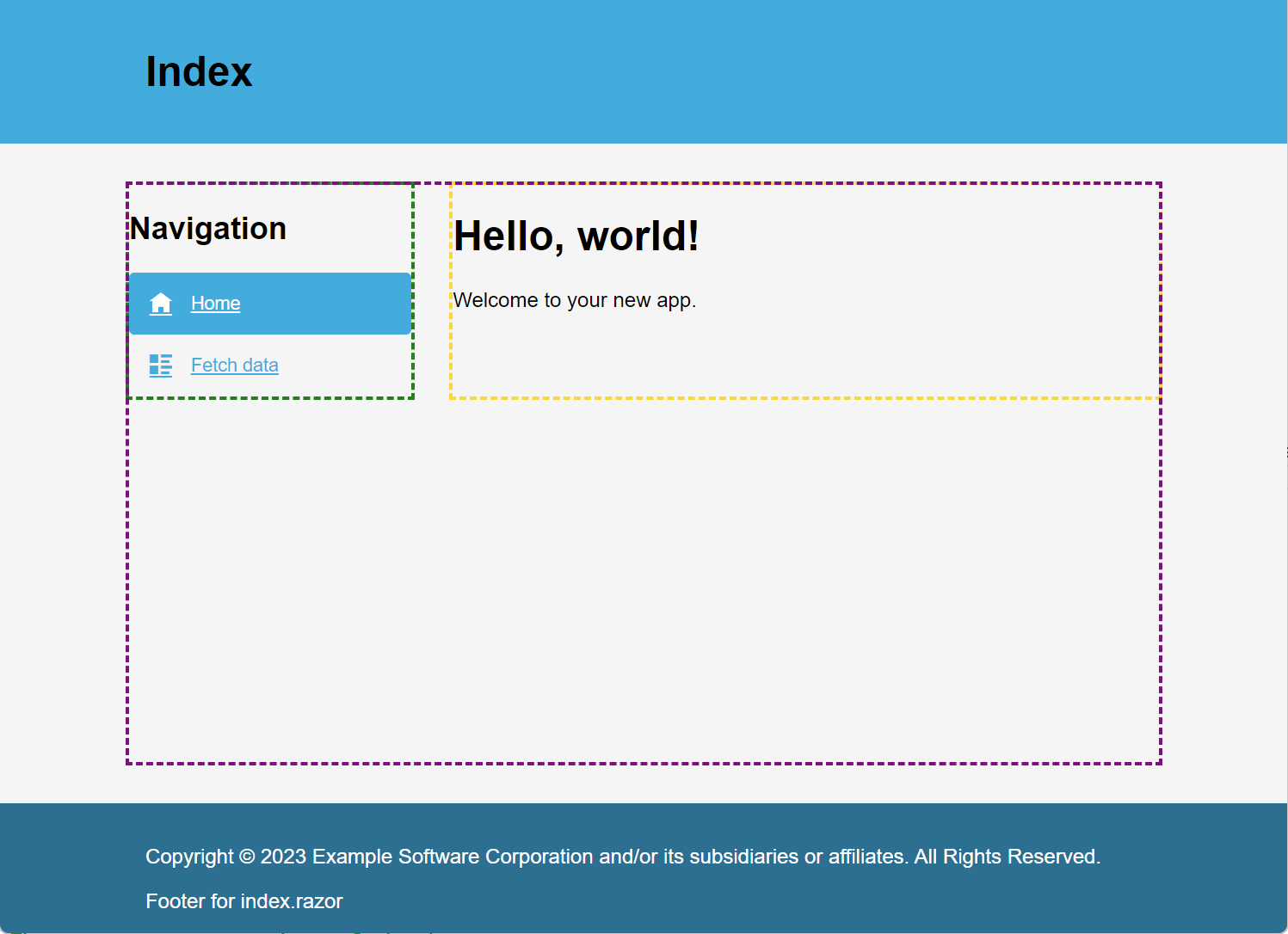
Figure 7: The Index page rendered in the browser with two columns. The navigation column outlined in green, and the main column is outlined in yellow.
The process is repeated for the ShowData view using the ThreeColumn layout. In Figure 8, we can see the three columns displayed by the browser. The main column is outlined in yellow, with the two side columns outlined in green.
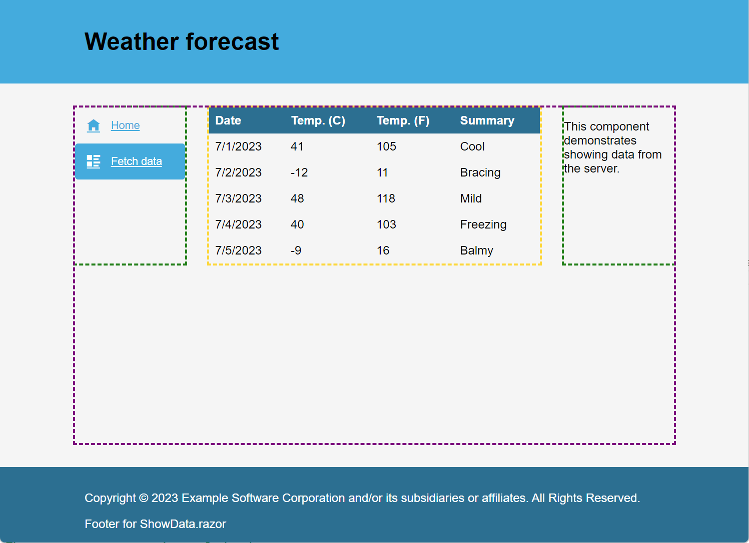
Figure 8: The ShowData page rendered in the browser with three columns. The main column is outlined in yellow, and the side columns are outlined in green.
Sections Summary
Through examples, we saw the new sections feature introduced for Blazor with ASP.NET Core in .NET 8. Sections enable child components to control the rendered content in designated areas of a component through a SectionOutlet. Sections can be defined by string name or by using a strongly typed object. A strongly typed SectionId can be used to support Intellisense, documentation and discoverability for a better DX.
We saw that sections can be combined with layout components to create a robust template system for an application. With HTML, CSS and SectionOutlet, the TwoColumn and ThreeColumn layouts were created. Because of the nesting feature in Blazor, the TwoColumn and ThreeColumn utilize MainLayout while still providing access to MainLayout’s sections.
So far we’ve used HTML and CSS to create rows and columns for our layouts. If you’re not a HTML and CSS expert, it’s still possible to make great looking layouts while utilizing sections with Progress Telerik UI for Blazor.
Telerik UI for Blazor and Sections
In previous examples, we used CSS grid to define the rows and columns for layouts. Another option is to use Telerik UI for Blazor’s TelerikGridLayout.
The TelerikGridLayout is a component-based method of defining a grid layout with minimal or no CSS. With the TelerikGridLayout, a grid is defined within razor markup. Let’s recreate the MainLayout, TwoColumn and ThreeColumn layouts using TelerikGridLayout.
We’ll start by creating a new MainLayout and inheriting from LayoutComponentBase. Next, the TelerikRootComponent is added. The TelerikRootComponent is a component that wraps the entire application and provides state and functionality to Telerik UI components.
@inherits LayoutComponentBase

<TelerikRootComponent>
</TelerikRootComponent>
Inside the TelerikRootComponent, a TelerikGridLayout is added. The TelerikGridLayout provides an easy way to organize UI elements in a grid layout system, with rows and columns. The component is based on a CSS grid layout but includes the familiarity of Blazor components. The component can set grid properties including row and column spacing, horizontal and vertical align options, row height, column width and more.
<TelerikRootComponent>
    <TelerikGridLayout RowSpacing="2rem">
    </TelerikGridLayout>
</TelerikRootComponent>
Inside the grid layout, the rows and columns are defined. GridLayoutRows, a collection of GridLayoutRow components set the properties for each row in the grid. With columns, the GridLayoutColumns and GridLayoutColumn components are used.
For the MainLayout we’ll create definitions the header, body and footer rows. A GridLayoutRow is added for each row with the height property set to the desired value.
<TelerikGridLayout RowSpacing="2rem">
    <GridLayoutRows>
        <GridLayoutRow Height="auto" />
        <GridLayoutRow Height="1fr" />
        <GridLayoutRow Height="auto" />
    </GridLayoutRows>
</TelerikGridLayout>
With the grid properties defined, the grid items are added. The GridLayoutItems and GridLayoutItem represent the content for each row or column in the grid. A LayoutItem is added for header, body and footer rows, and their content is set using HTML elements.
<TelerikGridLayout>
...
    <GridLayoutItems>
        <GridLayoutItem>
            <header>
                <div class="container">
                    <!-- Header -->
                </div>
            </header>
        </GridLayoutItem>
        <GridLayoutItem>
            <div class="container">
                <!-- Body -->
            </div>
        </GridLayoutItem>
        <GridLayoutItem>
            <footer>
                <div class="container">
                    <p>Copyright ... All Rights Reserved.</p>
                    <!-- Footer -->
                </div>
            </footer>
        </GridLayoutItem>
    </GridLayoutItems>
</TelerikGridLayout>
With the grid markup complete, we can add the sections using SectionOutlet.
Although the grid is defined without CSS, some CSS classes are added for aesthetics.
<TelerikRootComponent>
<TelerikGridLayout RowSpacing="2rem" Class="grid-container">
<GridLayoutRows>...</GridLayoutRows>
<GridLayoutItems>
<GridLayoutItem>
<header>
<div class="container">
<!-- Header -->
<SectionOutlet SectionId="Sections.Header" />
<SectionContent SectionId="Sections.Header">
<h1>Untitled</h1>
</SectionContent>
</div>
</header>
</GridLayoutItem>
<GridLayoutItem>
<div class="container">
<SectionOutlet SectionId="Sections.Body" />
@Body
</div>
</GridLayoutItem>
<GridLayoutItem>
<footer>
<div class="container">
<p>Copyright ... All Rights Reserved.</p>
<SectionOutlet SectionId="Sections.Footer" />
</div>
</footer>
</GridLayoutItem>
</GridLayoutItems>
</TelerikGridLayout>
</TelerikRootComponent>
@code {
/// <summary>
/// Sections for the MainLayout
/// </summary>
internal static class Sections
{
/// <summary>
/// The root <header></header> element of the application
/// </summary>
internal static SectionOutlet? Header = new();
/// <summary>
/// The root content container of the document.
/// This element has no semantic meanding. When using this section be sure to specify a main element for accessibility.
/// Default, uses the Body of the layout component.
/// </summary>
internal static SectionOutlet? Body = new();
/// <summary>
/// The root <footer></footer> of the application
/// </summary>
internal static SectionOutlet? Footer = new();
}
}
With the MainLayout complete, we can create the TwoColumn. The TwoColumn layout will use MainLayout, creating hierarchy. A TelerikGridLayout component is added and the columns are defined using the GridLayoutColumn component. Two columns are created with a ratio of 2:5 by setting the Width property using fractional units, 2fr and 5fr. Following the grid definition, a GridLayoutItems component is added with the HTML content for each column. Finally, we complete the sections using SectionOutlet.
@inherits LayoutComponentBase
@layout MainLayout
<TelerikGridLayout ColumnSpacing="2rem" >
<GridLayoutColumns>
<GridLayoutColumn Width="2fr" />
<GridLayoutColumn Width="5fr" />
</GridLayoutColumns>
<GridLayoutItems>
<GridLayoutItem>
<nav>
<SectionOutlet SectionId="Sections.Nav" />
</nav>
</GridLayoutItem>
<GridLayoutItem>
<article>
<SectionOutlet SectionId="Sections.Body" />
@Body
</article>
</GridLayoutItem>
</GridLayoutItems>
</TelerikGridLayout>
@code {
/// <summary>
/// Sections for the TwoColumnLayout.
/// Uses MainLayout.
/// </summary>
internal static class Sections
{
/// <summary>
/// An element representing the layout's navigation column.
/// This nav element should contain navigation for this layout.
/// </summary>
internal static SectionOutlet? Nav = new();
/// <summary>
/// A <main></main> element representing the layout's second column.
/// Default, uses the Body of the layout component.
/// </summary>
internal static SectionOutlet? Main = new();
}
}
The same process is repeated for the ThreeColumn layout. The code for this component is shown below.
<TelerikGridLayout ColumnSpacing="2rem" >
<GridLayoutColumns>
<GridLayoutColumn Width="2fr" />
<GridLayoutColumn Width="3fr" />
<GridLayoutColumn Width="1fr" />
</GridLayoutColumns>
<GridLayoutItems>
<GridLayoutItem>
<section>
<SectionOutlet SectionId="Sections.Alt" />
</section>
</GridLayoutItem>
<GridLayoutItem>
<article>
<SectionOutlet SectionId="Sections.Body" />
@Body
</article>
</GridLayoutItem>
<GridLayoutItem>
<aside>
<SectionOutlet SectionId="Sections.Aside" />
</aside>
</GridLayoutItem>
</GridLayoutItems>
</TelerikGridLayout>
@code {
/// <summary>
/// Sections for the ThreeColumnLayout.
/// Uses MainLayout.
/// </summary>
internal static class Sections
{
/// <summary>
/// A <section></section> element representing the layout's first column.
/// </summary>
internal static SectionOutlet? Alt = new();
/// <summary>
/// A <main></main> element representing the layout's middle column.
/// Default, uses the Body of the layout component.
/// </summary>
internal static SectionOutlet? Main = new();
/// <summary>
/// An <aside></aside> element representing the layout's second column.
/// </summary>
internal static SectionOutlet? Aside = new();
}
}
Whether pure CSS is used or the component approach is take with Telerik UI for Blazor, the end use is exactly the same. A layout is used by adding a @layout directive to a view. After declaring the layout, SectionContent
components are used for each section available.
In Figure 9, the TwoColumn layout is used to create a user profile interface. The first column displays a TelerikPanelBar component for navigation. The second column displays form fields for the user profile.
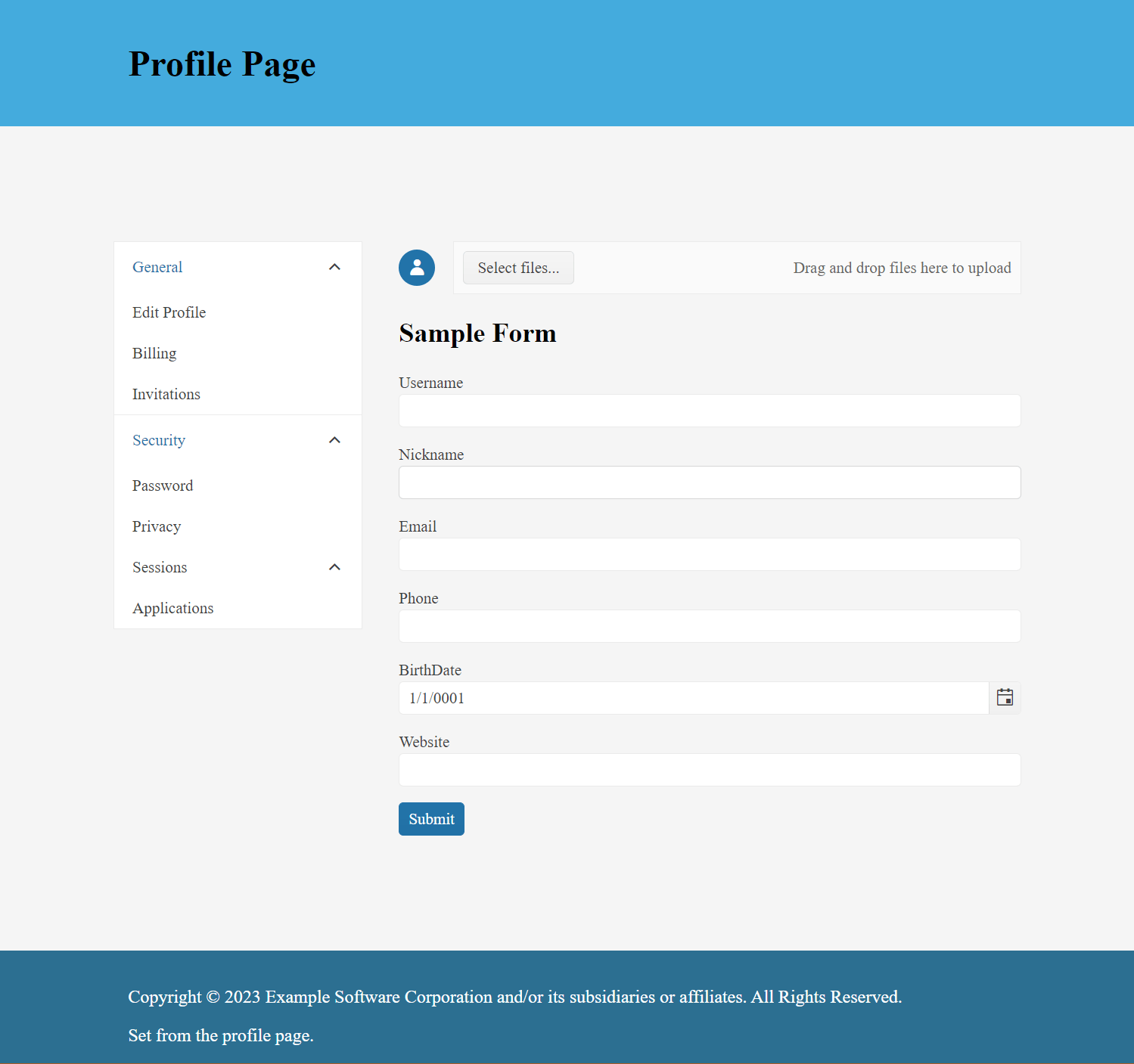
Figure 9: A user profile interface using a two-column layout.
In Figure 10, the ThreeColumn layout is used to create a social media feed. The first column uses a TelerikTreeView to list trending topics. The second column displays the social media posts using a TelerikStackLayout and TelerikCard components. The last column displays an interface for sharing that includes a TelerikQRCode component.
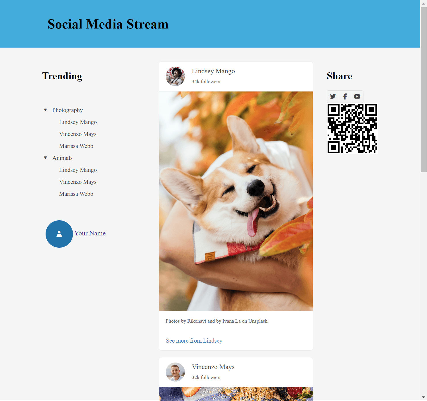
Figure 10: A social media feed interface using a three-column layout.
Conclusion
The TelerikGridLayout component makes a good companion to Blazor sections. The component allows layouts to be created in the context of Razor instead of switching to CSS files. The TelerikGridLayout is just one of more than a hundred components in the Telerik UI for Blazor library. Want to start taking advantage of the TelerikGridLayout, or any of the other 110+ ready-made components, like the Data Grid or the Scheduler? Start a free trial of Telerik UI for Blazor today.
Source Code
Source code for this article can be found on GitHub. Please read the prerequisites before getting started.

Ed Charbeneau
Ed
Related Posts
Comments
All articles
Topics
Web MobileMobile
Desktop
Design
Productivity
People
