Top 10 Best React UI Libraries 2026 (AI + DX Edition)

Summarize with AI:
A 2026 React UI library choice must have worthwhile AI integrations. KendoReact is hard to beat: 120+ components, accessibility compliance, dedicated support, AI-assisted theming and MCP integration.
Choosing a UI library used to be a fairly contained decision: we compared component counts, checked the styling approach and picked whatever fit our project best.
In 2026, the decision looks different. A meaningful share of our UI code is now written with AI assistants, which means a library’s value depends partly on how well those tools understand it. When an AI assistant can generate correct code for a component library, we save review time every single day. When it hallucinates props instead, that time quietly adds up as a recurring cost.
At the same time, the old requirements haven’t gone away. Data grids may still need to handle tens of thousands of rows, accessibility is increasingly a legal requirement rather than a nice-to-have, and somebody still needs to answer when a component breaks in production.
The State of React 2025 survey suggests teams are actively reevaluating their options. The average respondent has used 2.3 UI libraries, and even the most widely used options sit around 50-57% usage.
With that in mind, in this article, we’ll rank the top 10 React UI libraries for 2026 against the criteria we think matter most today: AI readiness, enterprise features, performance at scale, extensibility and developer productivity.
How We Ranked These Libraries
Every library on this list was assessed against five criteria:
AI readiness: Does the library offer an official MCP server,
llms.txtdocumentation or AI-powered tooling that helps coding assistants generate correct, current code?Enterprise features: Complex components like data grids and schedulers, accessibility compliance and a support path when something breaks in production.
Performance at scale: How components behave with large datasets and complex interactions, not just in demos.
Extensibility and theming: Design token support, theming systems and how much control you retain over the final output.
Developer productivity: Documentation quality, TypeScript support and how quickly a team can go from install to shipped feature.
With that framework in place, let’s get into the list!
1. Progress KendoReact
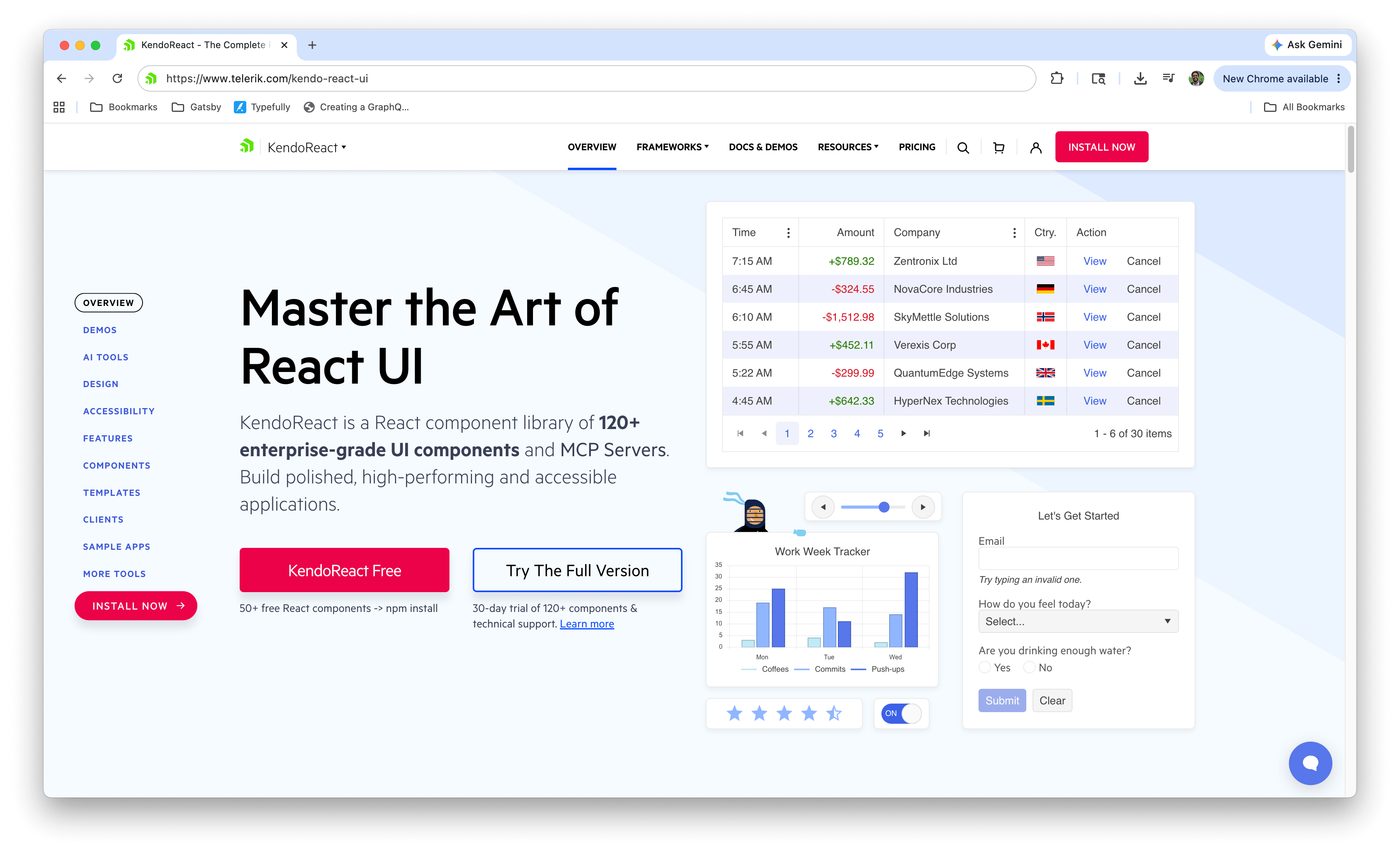
KendoReact is a commercial library of 120+ components maintained by Progress, covering foundational inputs and layout components as well as complex ones like the Data Grid, Scheduler, and Charts. It sits at the top of this list because it scores well across all five criteria at once, where most libraries trade one off against another.
On AI readiness, the KendoReact MCP Server gives AI assistants like Cursor and GitHub Copilot access to component APIs and current documentation, so generated code uses real props rather than guesses. ThemeBuilder adds AI-assisted theme generation, turning a plain English description into a set of design tokens that apply across the components.
The enterprise criteria are where its commercial model shows. The Data Grid virtualizes rows by default and handles very large datasets, accessibility is documented per component with WCAG compliance as an ongoing commitment, and a license includes dedicated support with predictable release schedules.
The tradeoff is cost. For smaller projects or teams that only need standard components, a license may be hard to justify, and several free options below will serve them well. However, KendoReact Free does offer 50+ components at no cost, which is a reasonable way to evaluate the library before deciding either way.
Best for: Teams building data-heavy enterprise applications that want AI-assisted workflows, accessibility compliance and reliable support in one package.
For a hands-on walk-through of the KendoReact MCP Server, check out the previous article, The KendoReact MCP Server with Cursor.
2. shadcn/ui
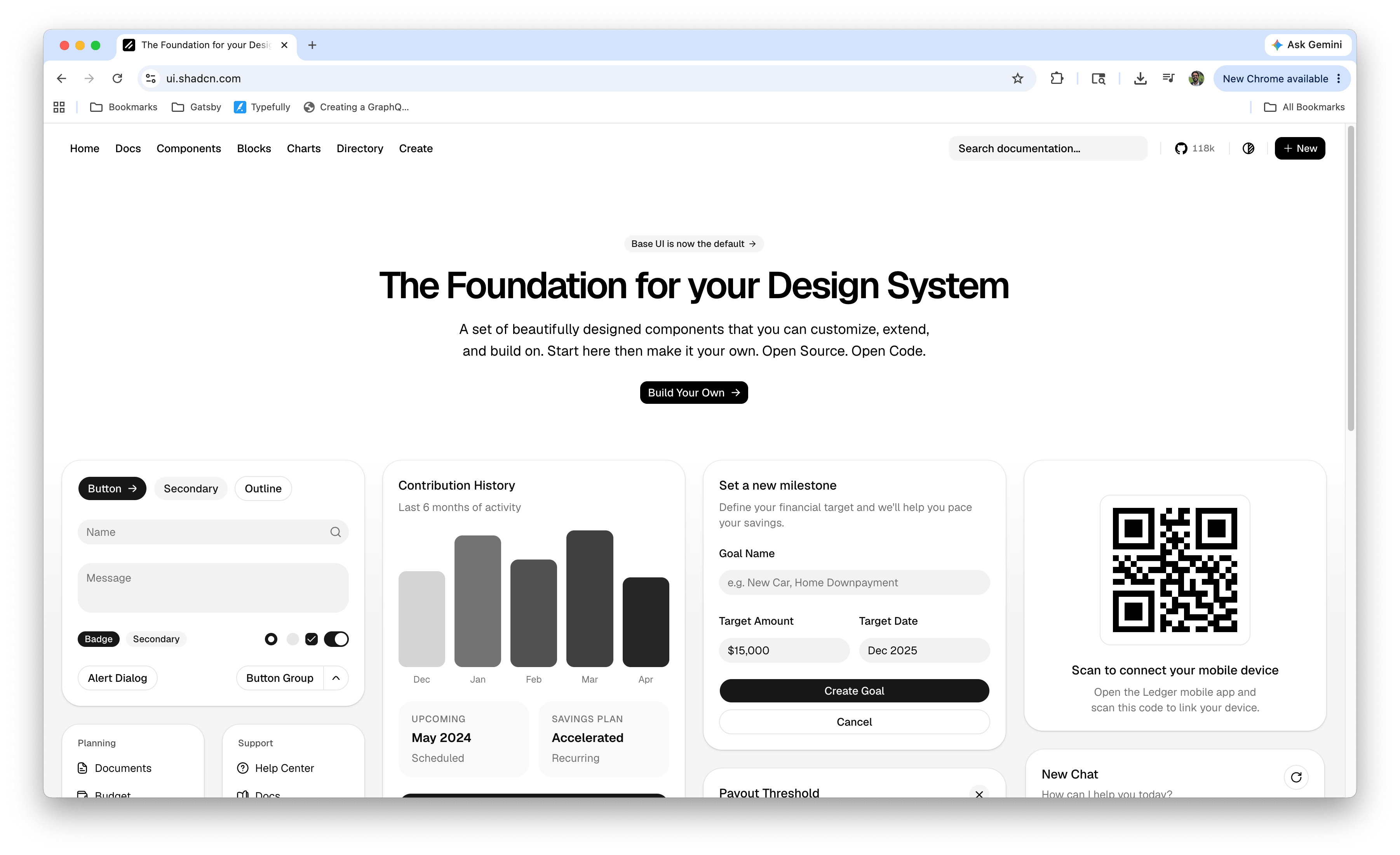
shadcn/ui has become the momentum leader in the React ecosystem, and its model is genuinely different. It isn’t a library you install from npm. Instead, you copy component source code directly into your project using its CLI. You own the code, there’s no runtime dependency and you can modify anything without fighting a library’s abstraction.
That code-ownership model turns out to be a natural fit for AI-assisted development. Because the components live in your repository as plain React and Tailwind CSS, AI assistants can read and modify them like any other project code. It’s also the default output of AI app builders like [v0](https:// which has reinforced its position. On top of that, shadcn/ui offers an official MCP server that lets assistants browse, search and install components from any configured registry using natural language.
The tradeoff is that ownership cuts both ways. Once you copy a component, maintaining it is your job. And for complex needs like data grids, you’ll be assembling solutions from TanStack Table and similar libraries rather than reaching for a built-in component.
Best for: Teams with strong Tailwind experience building design-forward products who want full control over their component code.
3. Tailwind CSS (+ Headless UI and Catalyst)
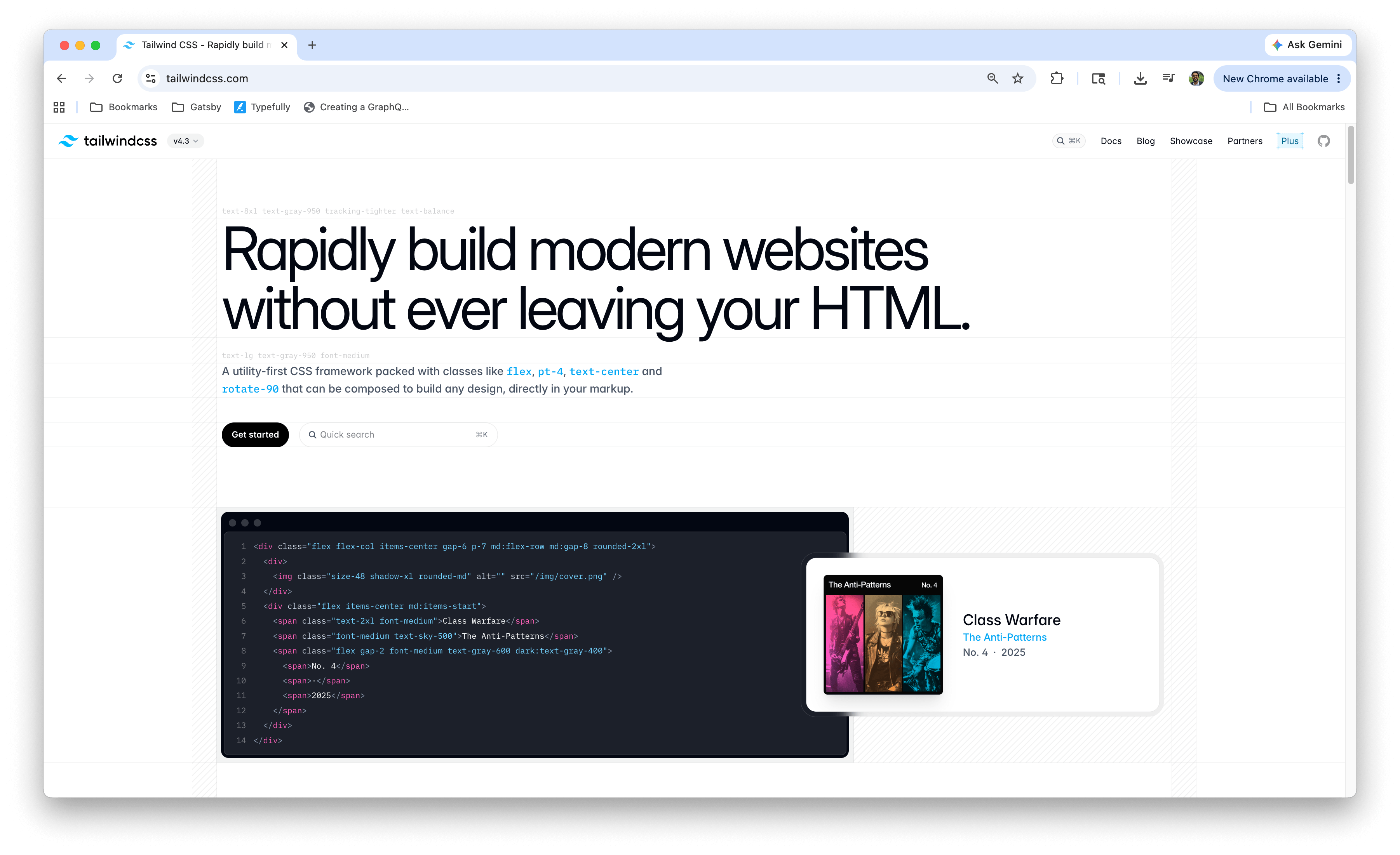
An honest caveat first: Tailwind CSS is a styling framework, not a component library. It earns a spot on this list because its ecosystem has become the substrate that much of modern React UI work is built on, including the copy-paste components of shadcn/ui at #2.
The component story comes from the Tailwind team itself. Headless UI provides unstyled, accessible primitives like menus, dialogs and comboboxes designed to pair with Tailwind classes. Catalyst, part of Tailwind Plus, is a full application UI kit with components you copy into your project, similar in spirit to the shadcn/ui model.
From an AI readiness perspective, Tailwind has a quiet structural advantage. Utility classes live inline in JSX, which means the styling is right where AI models read and write code. There’s no separate stylesheet for an assistant to lose track of, and the constrained utility vocabulary means generated styling tends to be consistent. It’s a big part of why most AI UI generators output Tailwind by default.
Best for: Teams that want a styling foundation the modern React ecosystem (and most AI tooling) is aligned around.
For a deeper look at Tailwind, its strengths and its tradeoffs, see A Primer on Tailwind CSS: Pros, Cons and Real-World Use Cases.
4. Base UI
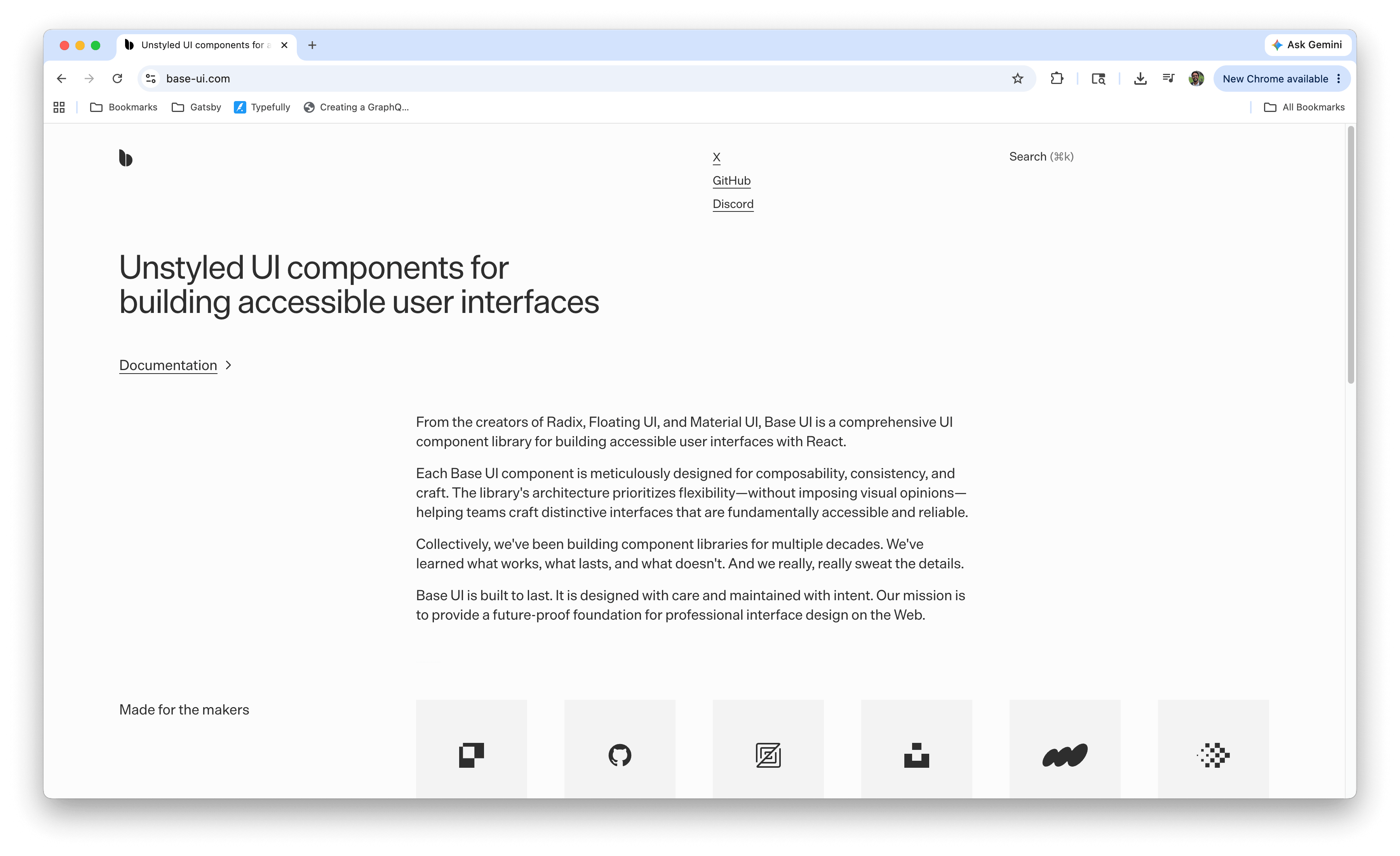
Base UI is the newest entry on this list and one of the most interesting. It’s an unstyled, accessibility-first component library built by the combined team behind Radix, MUI Base and Floating UI. In other words, the people responsible for much of the headless component movement joined forces to build its successor.
The library provides behavior, keyboard navigation, focus management and ARIA semantics while leaving every visual decision to you. That makes it a strong foundation for design systems where the visual language is fully custom but the interaction patterns need to be correct and accessible from day one.
Base UI is still young, and its adoption hasn’t yet caught up to the pedigree of its team. But for greenfield design system work in 2026, it’s positioned as the emerging headless standard, and it’s where the momentum in the unstyled space is heading.
Best for: Design system teams that want accessible, well-engineered primitives with complete styling freedom.
5. MUI (Material UI)
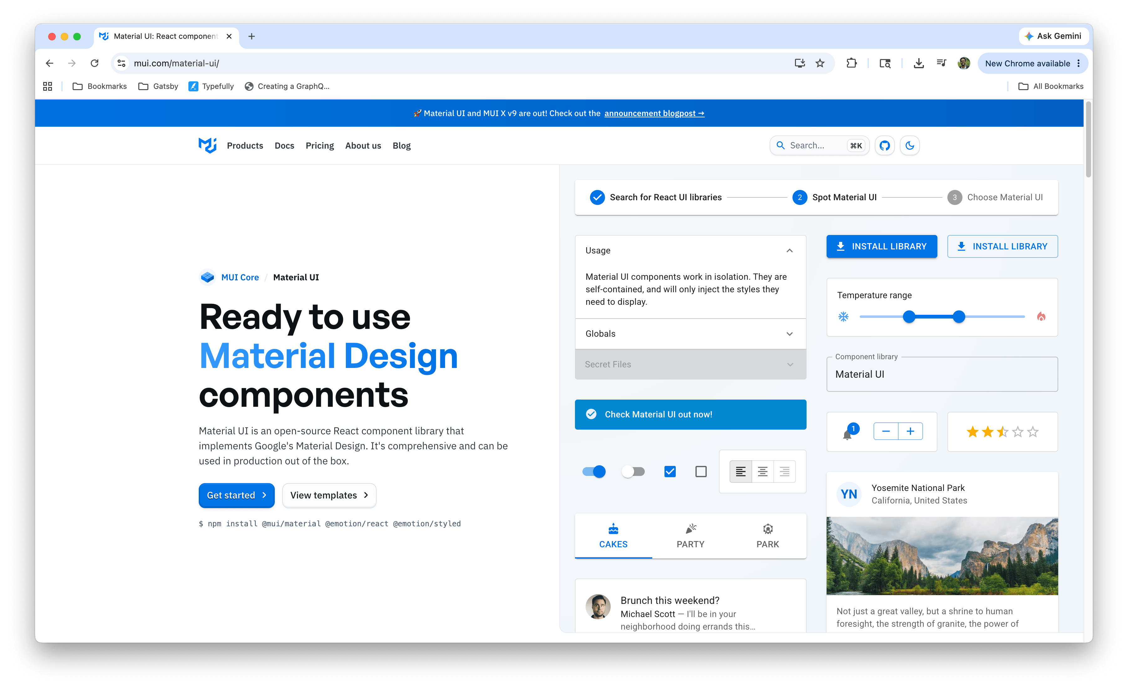
MUI remains the largest installed base in the React component world, with millions of weekly downloads and over a decade of production hardening. Its core library implements Material Design with deep theming support, and MUI X extends it with advanced components like the Data Grid, date pickers and charts that have few equals in the free-tier ecosystem.
Documentation is where MUI has always excelled. Its docs are comprehensive, interactive and battle-tested by one of the largest communities in frontend development. That maturity also means most problems a team runs into have already been solved and written up somewhere.
MUI has also been investing in AI readiness. An official MCP server (@mui/mcp) gives AI assistants access to the official docs and code examples so answers cite real documentation instead of hallucinated links, and the team publishes llms.txt files for tools that consume documentation directly. The main tradeoff is the design language itself: Material Design is opinionated, and moving far from it takes real theming effort.
Best for: Enterprise teams already invested in Material Design, or anyone who values ecosystem maturity and documentation depth above all else.
6. Ant Design
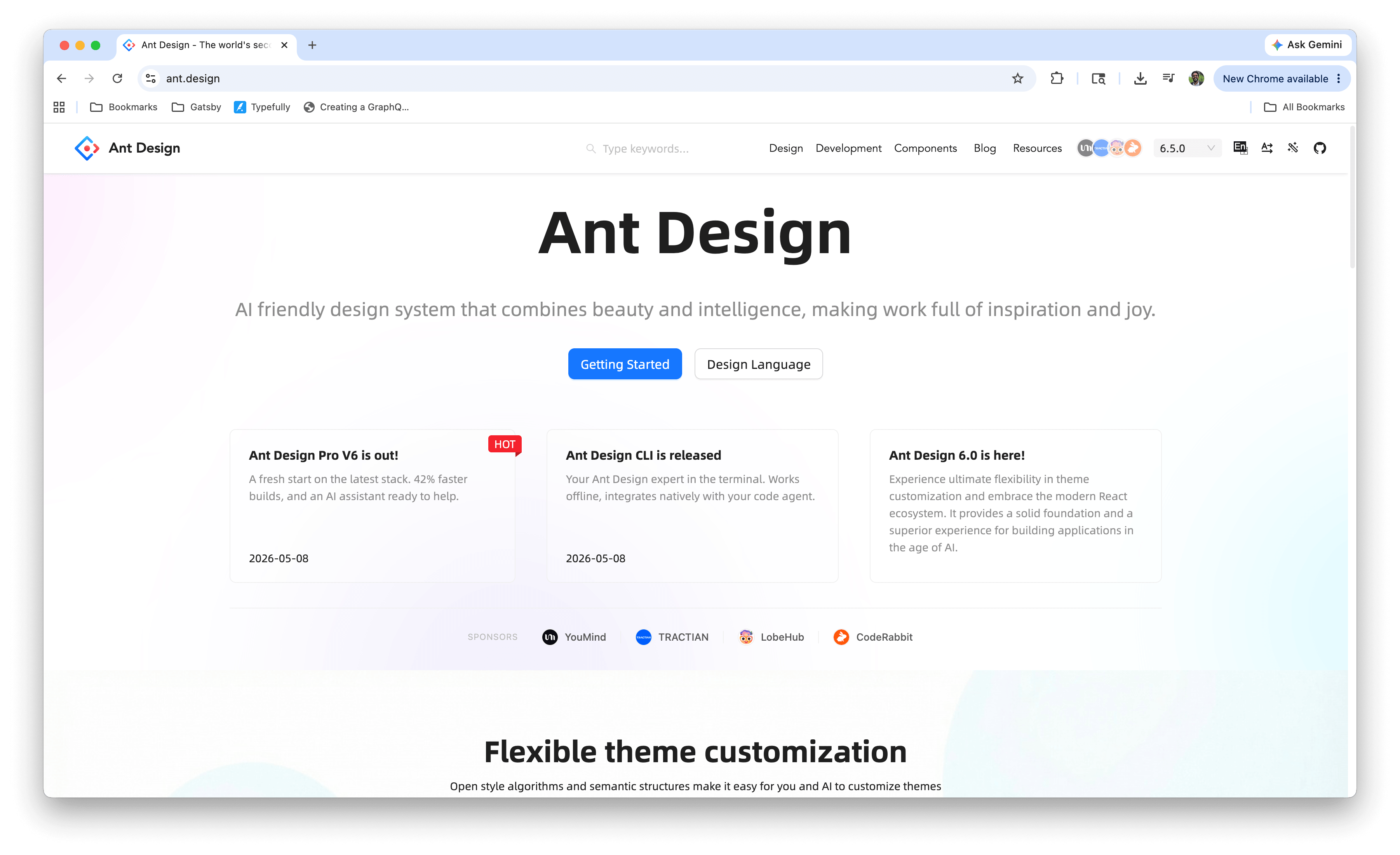
Ant Design is the workhorse of data-heavy enterprise dashboards. Its Table, Form, Tree and Transfer components are deeply featured in ways that would take weeks to replicate, and its design language is cohesive across a very large component set.
Ant Design has also invested meaningfully in AI readiness. An official MCP server ships via @ant-design/cli, exposing tools for component docs, props, runnable examples, design tokens, and even changelog analysis across versions. For AI tools that don’t support MCP, the team provides llms.txt and llms-full.txt files so assistants can consume structured documentation directly.
The tradeoffs are bundle weight and opinionation. Ant Design is one of the heavier libraries on this list, and its visual identity is distinct enough that fighting it rarely ends well. If your app should look like Ant Design, it’s excellent. If it shouldn’t, look elsewhere.
Best for: Internal tools, admin panels and data-dense enterprise dashboards where component depth beats visual customization.
7. Mantine
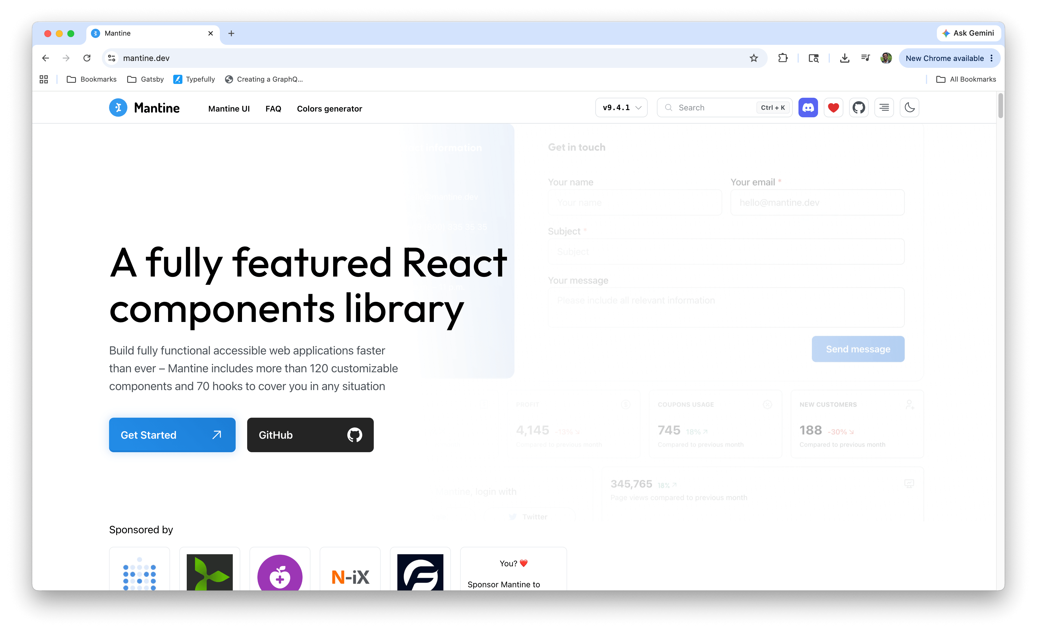
Mantine is the strongest middle-ground option in the ecosystem. It ships 100+ components alongside a hooks library that covers useForm, useDebouncedValue, useMediaQuery, useClipboard, and dozens more utilities that other libraries leave you to source separately. It’s TypeScript-first, well documented, and doesn’t carry the visual opinionation of MUI or Ant Design.
Mantine has kept pace on the AI front too. It publishes llms.txt documentation that’s regenerated with every release, along with an MCP server (@mantine/mcp-server, currently labeled experimental) that exposes component docs and props to AI assistants. Combined with its batteries-included approach, it’s a productive choice for teams that want a complete toolkit without commercial licensing.
Where Mantine trails the entries above is enterprise depth. There’s no commercial support path, and its data components, while solid, don’t reach the scale-handling depth of the KendoReact Grid or the Ant Design Table.
Best for: Product teams that want a full-featured, TypeScript-first library with great DX and no license cost.
8. Chakra UI
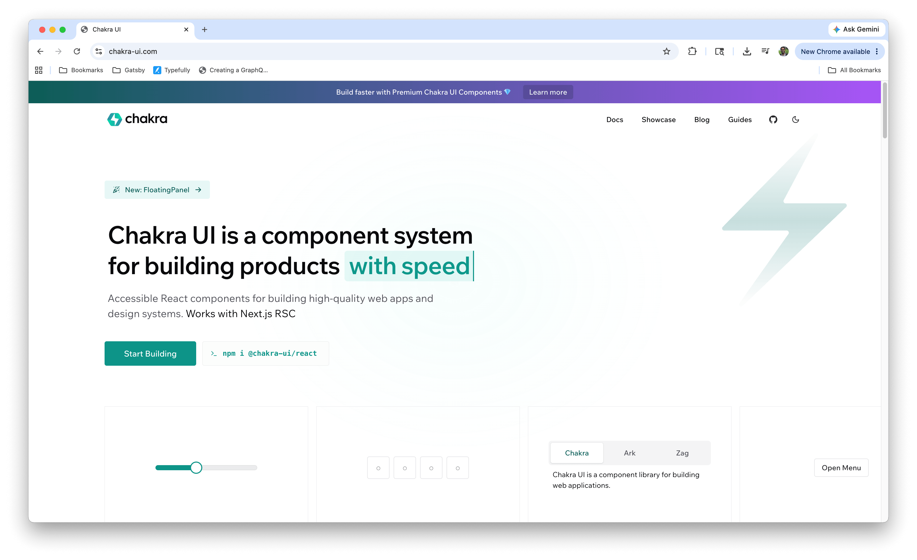
Chakra UI built its reputation on developer experience, with a prop-based styling API that makes composing accessible UIs feel natural. Version 3 brought a significant architecture overhaul, better performance and a more robust design token system.
Chakra’s AI investment is notable. The official @chakra-ui/react-mcp server` server gives assistants access to component APIs, usage examples, design tokens, theme customization tools, and even v2 to v3 migration guidance. That migration tooling is a thoughtful touch for teams with older Chakra codebases.
The reason Chakra sits here rather than higher is momentum. The ecosystem’s center of gravity has shifted toward Tailwind-first and headless approaches, and Chakra’s style-props model, while pleasant, is now the road less traveled. It remains a solid, well-maintained choice for teams that prefer it.
Best for: Teams that prefer style props over utility classes and value accessible defaults with minimal setup.
9. React Aria
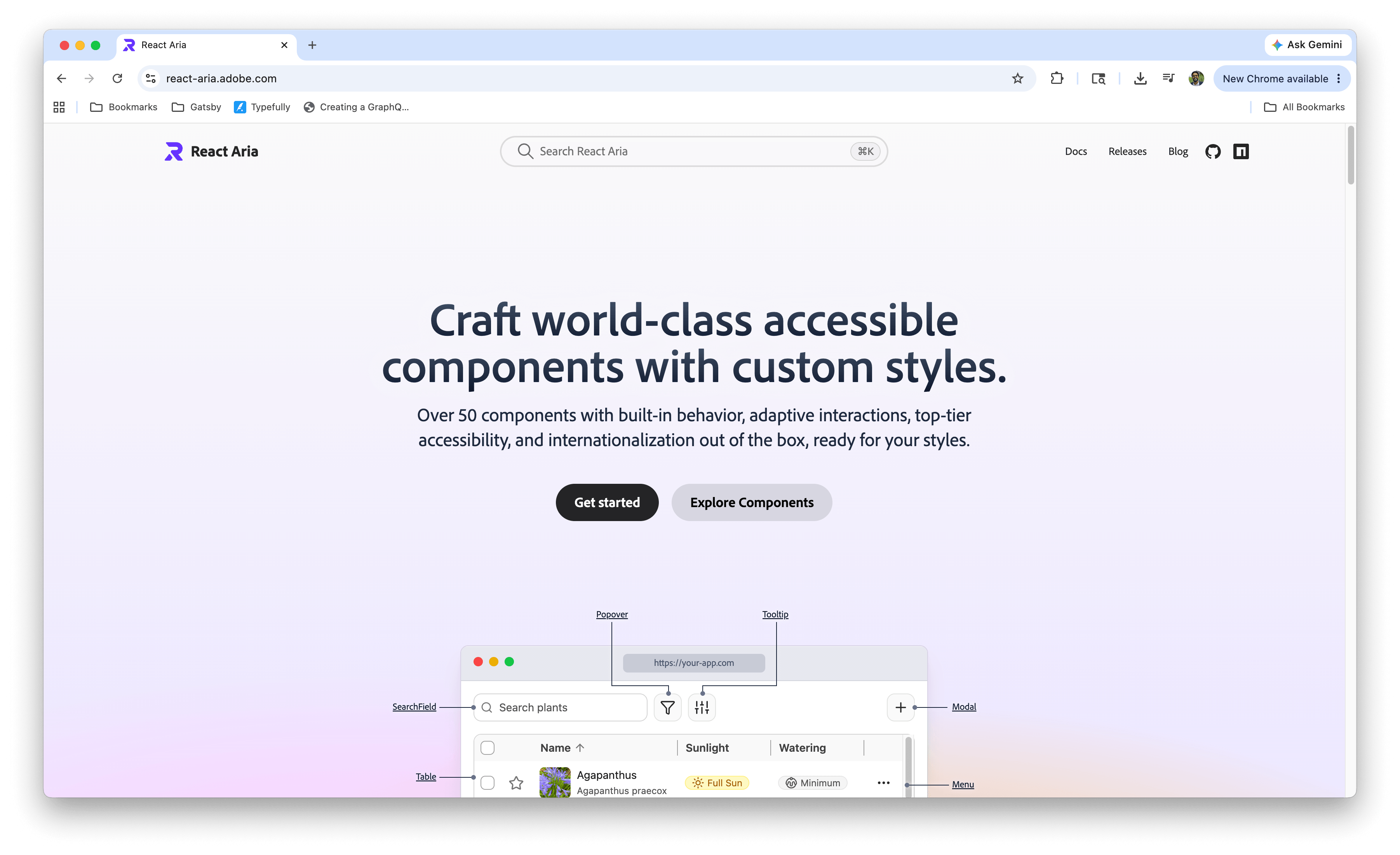
React Aria is Adobe’s accessibility-first library, available both as hooks and as unstyled components. It represents some of the most rigorous accessibility engineering in the ecosystem, with behavior tested across screen readers, browsers and input methods that most libraries never get to.
The depth here is real. Internationalization, right-to-left layouts, touch and pointer interactions, and focus management are all handled with a thoroughness that reflects Adobe’s enterprise requirements. If a component pattern exists in React Aria, you can trust its interaction behavior.
The tradeoff is effort. React Aria components ship unstyled, so the appearance is on you, though the library meets you partway with default class names, data attributes for every interaction state and copyable starter styles in the docs. It’s still more of a building material than a finished product, and teams should budget time for styling accordingly.
Best for: Teams with strict accessibility requirements building fully custom design systems.
10. Radix Primitives
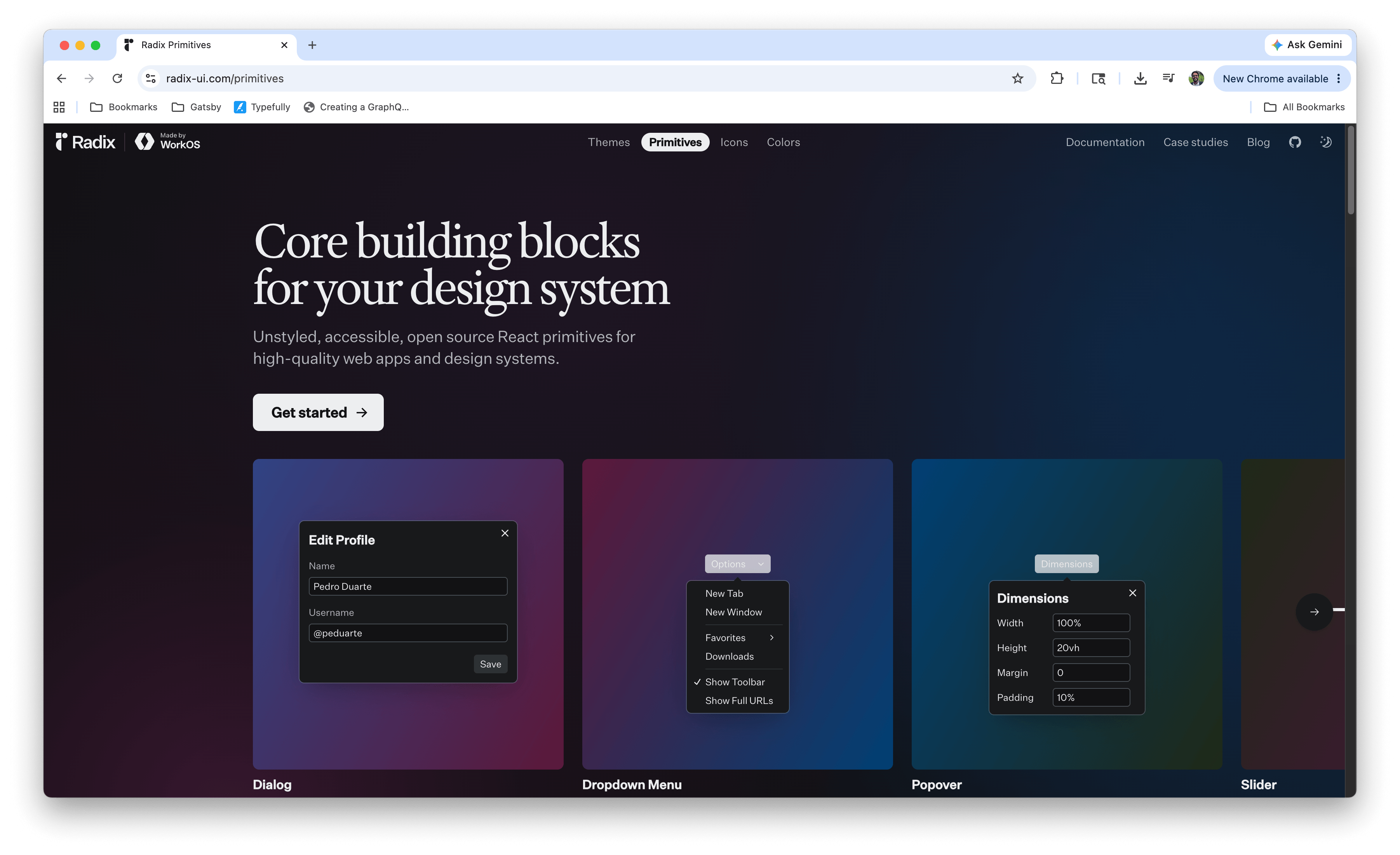
Radix Primitives closes out the list, which might surprise anyone who remembers it topping headless library rankings a couple of years ago. Its unstyled, accessible primitives remain excellent, and it quietly powers a massive share of production React apps as the foundation underneath shadcn/ui.
The reason for the ranking is trajectory rather than quality. Development pace has slowed, and the team behind Radix has largely moved on to build Base UI (#4 on this list). Radix isn’t going anywhere soon, and existing projects built on it have no urgent reason to migrate. But for new projects choosing a headless foundation in 2026, the succession is worth factoring in.
Best for: Existing projects already built on Radix, or teams adopting it indirectly through shadcn/ui.
What AI Readiness Actually Means
AI readiness showed up in nearly every entry above, so it’s worth being precise about what it means. AI coding assistants are only as good as their context. A model trained on data from a year ago will confidently generate component code with outdated props, deprecated APIs and patterns that no longer apply. Every one of those mistakes costs review time, and they compound across a team.
Model Context Protocol (MCP) addresses this by giving AI assistants a standardized way to query current, library-specific knowledge at generation time. Instead of guessing at a grid component’s API, the assistant asks the library’s MCP server and gets the real answer. Setting this up is usually a small configuration file. Here’s what it looks like for KendoReact in Cursor:
{
  "mcpServers": {
    "telerik_react_assistant": {
      "type": "stdio",
      "command": "npx",
      "args": ["-y", "@progress/kendo-react-mcp"],
      "env": {
        "TELERIK_LICENSE_PATH": "./telerik-license.txt"
      }
    }
  }
}
This configuration registers the KendoReact MCP server with the editor, and from that point on, prompts that reference KendoReact components are answered with knowledge of the actual component APIs rather than the model’s best guess.
Libraries that invest here (official MCP servers, llms.txt documentation, AI theming tools) are effectively making themselves legible to the tools most of us now code with daily. That’s why AI readiness carried the weight it did in these rankings.
For a broader look at how AI is reshaping React workflows, check out AI Productivity for React Developers in 2026.
Choosing for Your Team
Rankings aside, the right library depends on what you’re building and who’s building it:
- Data-heavy enterprise apps with support requirements: KendoReact, with Ant Design as another alternative.
- Design-forward products with a Tailwind stack: shadcn/ui, backed by the Tailwind ecosystem.
- Custom design systems: Base UI or React Aria, depending on how much accessibility rigor you need.
- A complete free toolkit with minimal assembly: Mantine or MUI.
It also helps to treat the decision as a cost question rather than a loyalty one. A free library that requires weeks of glue code, accessibility remediation, and workarounds isn’t free. A commercial library that eliminates those costs may be the cheaper option in practice. The honest math depends on your project’s scale and your team’s time.
Wrap-up
The React UI library landscape in 2026 rewards a different set of criteria than it did a few years ago. Component count still matters, but AI readiness, enterprise depth and the total cost of ownership matter more. The libraries at the top of this list are the ones investing in all three.
KendoReact took the top spot because it covers all of these areas at once: 120+ components, accessibility compliance, dedicated support, AI-assisted theming and a mature MCP integration. If you want to see what AI-assisted development looks like with a library built for it, explore the KendoReact AI tools and MCP Server, or start with KendoReact Free and its 50+ components at no cost!

Hassan Djirdeh
Hassan is a senior frontend engineer and has helped build large production applications at-scale at organizations like Doordash, Instacart and Shopify. Hassan is also a published author and course instructor where he’s helped thousands of students learn in-depth frontend engineering skills like React, Vue, TypeScript and GraphQL.
Related Posts
Comments
All articles
Topics
Web MobileMobile
Desktop
Design
Productivity
People