AI Prompt Cookbook for React Developers

Summarize with AI:
These 10 prompts can help React developers get immediate value from AI features in Progress KendoReact. Plus, learn about the techniques for why some prompts work well.
If there’s one thing that prompt engineering guides (like Anthropic’s and OpenAI’s) agree on, it’s that the quality of AI-generated output depends heavily on the quality of our input. Clear, specific, well-structured instructions tend to produce better results, while vague requests tend to produce vague code.
We’ve built a visual cheat sheet that accompanies this article with a quick-reference view of all the prompts and techniques covered below. For React developers working with Progress KendoReact, this prompt library is especially relevant because component libraries have specific APIs, prop patterns and conventions that generic AI models may not be aware of. Check it out here → https://kendoreact-ai-prompt-cookbook.up.railway.app/.
The KendoReact Agentic UI Generator addresses this gap by giving AI assistants specialized knowledge of KendoReact components through the MCP Server. But even with that context in place, the prompts we write still determine whether the generated output is “good enough” or what we had in mind.

Image generated with AI
This cookbook is a concise collection of practical, task-oriented prompts designed to provide immediate value from KendoReact AI tools. Each prompt is paired with a prompting technique from established research, so beyond just having something to copy and paste, we’re also picking up patterns that apply to any AI-assisted development workflow.
Prerequisites: Make sure the KendoReact Agentic UI Generator is installed and enabled before running these prompts. As you’ll see in this post’s prompts, the MCP Server exposes several specialized assistants—UI generation, styling, icons, accessibility and layout—each invoked with its own hashtag. For a complete setup walk-through with Cursor, check out The KendoReact MCP Server with Cursor.
Prompting Principles
Before jumping into the prompts themselves, let’s quickly cover the principles that make them work. These come from well-established prompting research published by Anthropic and OpenAI, and they apply whether we’re working with KendoReact or any other AI-assisted workflow.
Be Clear and Direct
Instead of a prompt that just says “make a table,” we describe what columns we need, what data operations to support and how the component should behave. The more specific our instructions, the less guesswork for the AI.
Provide Context and Constraints
AI assistants perform better when they understand boundaries. Telling an AI generator what framework we’re using, what data shape we’re working with and what the layout requirements are reduces guesswork.
Use Examples to Anchor Expectations
When describing a visual style or interaction pattern, referencing something concrete (“similar to a fintech dashboard” or “matching our existing sidebar navigation”) gives the AI a clearer target.
Iterate Rather Than Overload
A single massive prompt that tries to describe an entire application rarely works well. Starting with a focused request and refining in follow-up prompts produces more reliable results. Anthropic’s documentation specifically recommends chaining complex prompts for complex tasks, and OpenAI echoes this idea with their guidance on breaking tasks into subtasks.
Specify the Output Format
If we need responsive CSS Grid, we should say so. If we want TypeScript, it’s worth mentioning. Being explicit about the format we expect avoids unnecessary back-and-forth because AI tools tend to take our instructions quite literally.
With those principles as a foundation, let’s walk through the prompts.
1. Prompt for Scaffolding a New Project
The Task
We’re starting a new application and need a login screen plus an initial dashboard layout, which is one of the most common starting points for any React project.
Prompting Technique: Be Clear and Direct
The key here is to specify exactly what components and interactions we need upfront rather than asking for “a login page.” We describe the fields, the validation behavior and what happens after login.
The Prompt
#kendo_ui_generator I have an empty React application that needs a login
screen and an admin dashboard. Add a login form with email and password
fields, including validation for required fields and email format, using
KendoReact form components. After successful login, redirect to an admin
dashboard page with a collapsible sidebar menu on the left and a main
content area on the right displaying three summary metric cards
(total users, active sessions, revenue).
Why It Works
Notice how the prompt spells out the validation rules (“required fields and email format”), the layout structure (“collapsible sidebar menu on the left”) and the specific metrics to display. The Agentic UI Generator doesn’t have to guess what “admin dashboard” means to us because we’ve told it exactly what to build.
Go deeper: The KendoReact Prompt Library has additional project setup prompts for more complex scaffolding scenarios.
2. Prompt for Building a Data Grid
The Task
We need a sortable, filterable data grid for displaying product catalog data, which is a very popular component request for enterprise React applications.
Prompting Technique: Provide Context and Constraints
AI assistants produce dramatically better grid implementations when we describe the data shape and the specific operations we need. Compare a prompt like “make a grid” (which will produce a generic table) with one that describes our columns, data types and desired interactions.
The Prompt
#kendo_ui_generator Create a KendoReact Grid component for a product
catalog. The grid should display the following columns: product name
(text, filterable), price (currency format, sortable), category
(dropdown filter with predefined options), stock status (boolean
displayed as a badge), and last updated (date format). Enable paging
with 15 items per page, multi-column sorting, and row selection.
Wrap the grid in a Card component with a header showing the total
product count.
Why It Works
We’ve specified the data types for each column (text, currency, boolean, date), the filter behavior per column (text filter vs. dropdown filter) and the grid-level features (paging count, sorting type, selection).
This level of detail maps directly to KendoReact Grid props like filterable, sortable, pageable and column-level format settings, which is exactly the kind of specificity the Agentic UI Generator needs to produce accurate code.
3. Prompt for Connecting a Chart to a Data Source
The Task
We want to add a chart that visualizes data alongside an existing grid, and both should respond to the same date range filter.
Prompting Technique: Describe Relationships Between Components
When multiple components need to share state or respond to the same filters, we have to make that relationship explicit in the prompt. The AI can’t infer that our chart and grid should be connected unless we tell it.
The Prompt
#kendo_ui_generator Add a new section to my page with a KendoReact
Grid on the left and a Line Chart on the right. Above both, place a
DateRangePicker. The grid displays sales data with columns for date,
product, quantity, and revenue. The chart visualizes total revenue
over time as a line series. Both the grid and chart should filter
their data based on the selected date range from the DateRangePicker.
Use a shared data source so both components update reactively when
the date range changes.
Why It Works
The phrase “shared data source” and “both components update reactively” tells the generator to wire up shared state rather than creating two independent components. Without this, we may get a chart and grid that look correct but don’t actually talk to each other.
4. Prompt for Creating a Responsive Page Layout
The Task
We need a responsive page that adapts across mobile, tablet and desktop breakpoints.
Prompting Technique: Specify the Output Format
Mentioning “CSS Grid,” “flexbox” or specific column counts at each breakpoint removes ambiguity about how the layout should be implemented. This is where OpenAI’s guidance on specifying output format really applies: the more concrete we are about the implementation approach, the more predictable the result.
The Prompt
#kendo_ui_generator Create a responsive dashboard page using CSS Grid.
The layout should have 3 columns on desktop (above 1024px), 2 columns
on tablet (768px to 1024px), and 1 column on mobile (below 768px).
The top row spans the full width and contains a KendoReact Toolbar
with a search input, a category DropDownList filter, and a "Create New"
button. Below the toolbar, display 6 product Cards in the responsive
grid. Each card shows a product image placeholder, name, price, and
a rating indicator. Add consistent spacing between all grid items.
Why It Works
We’ve defined exact breakpoints (1024px, 768px), column counts at each breakpoint and what “responsive” means for this specific layout. Without these details, “responsive” could mean anything from a single-column stack to a fluid grid with auto-sizing.
5. Prompt for Generating a Custom Theme
The Task
We want to create a dark mode theme that matches a specific aesthetic.
Prompting Technique: Use Examples to Anchor Expectations
When describing visual styles, concrete reference points tend to work much better than abstract adjectives. “Modern and clean” is subjective and can mean different things to different people. “Dark background with blue accent colors, similar to a developer tools interface,” gives the AI a much sharper target to work with. Both Anthropic and OpenAI recommend using examples in prompts, and for styling tasks, those examples can be descriptive comparisons rather than literal code samples.
The Prompt
#kendo_style_assistant Generate a comprehensive dark mode theme for
my KendoReact application. Use a dark charcoal background (#1a1a2e)
with light gray text (#e0e0e0). The primary accent color should be
a muted teal (#16a085). Apply subtle border-radius (6px) to cards,
buttons, and input fields. Increase spacing between UI components
by 20% compared to the default theme. Ensure all interactive elements
have visible focus indicators that meet WCAG 2.2 AA contrast requirements.
Why It Works
We’ve given specific hex values rather than vague color names, defined the exact border-radius, quantified the spacing increase and specified the accessibility standard. The KendoReact Styling Assistant can translate these constraints directly into CSS custom properties without interpretation.
Want to go further with theming? Progress ThemeBuilder lets us generate and fine-tune complete design systems visually, including AI-powered theme generation where we can describe an aesthetic in plain English and get a full set of coordinated styles back.
6. Prompt for Adding Icons to a Navigation Bar
The Task
We need appropriate icons for a navigation menu.
Prompting Technique: Describe Intent, Not Just Position
Instead of telling the AI which icons to use (which means we’ve already done the work), describing the navigation items and their purpose lets the KendoReact Icon Assistant choose contextually appropriate icons from the KendoReact icon collection.
The Prompt
#kendo_icon_assistant I'm building a sidebar navigation for a project
management app. Add appropriate icons for the following menu items:
Dashboard (overview/home context), Active Projects (task/work context),
Team Members (people context), Reports (analytics/chart context),
and Settings (configuration context). Use SVG icons for better
accessibility support.
Why It Works
The parenthetical context hints (“overview/home context,” “analytics/chart context”) help the Icon Assistant understand the semantic meaning behind each menu item rather than just the label text, which tends to produce more thoughtful icon choices than simply asking for “icons for my nav.”
7. Prompt for Making a Grid Navigable by Keyboard
The Task
We have a Grid with custom cell templates containing interactive buttons, and keyboard navigation isn’t reaching them properly.
Prompting Technique: Describe the Problem, Not Just the Goal
For accessibility tasks, describing the specific interaction failure gives the AI enough context to provide a targeted solution rather than a generic checklist. A prompt like “make my grid accessible” is too broad to produce anything actionable, but describing exactly what’s broken narrows the problem space considerably.
The Prompt
#kendo_accessibility_assistant I have a KendoReact Grid with navigatable={true} and a custom cell in the "Actions" column that renders three buttons: "View Details," "Edit," and "Delete." Arrow keys move between the other cells as expected, but when the Actions cell is focused, pressing Enter does nothing and the three buttons stay unreachable from the keyboard. I want Enter or F2 to move focus into the cell, Tab and Shift + Tab to move between the three buttons, and Escape to return to cell navigation. The Grid should remain a single tab stop in the page tab order and meet WCAG 2.2 Level AA.
Why It Works
We’ve described the exact component setup (Grid with custom cell template), the specific failure (focus skips over buttons), the desired behavior (Tab into cell, arrow keys between buttons), and the compliance target (WCAG 2.2 Level AA). The KendoReact Accessibility Assistant can now provide a precise fix rather than a generic accessibility checklist.
8. Prompt for Building a Multi-Step Form
The Task
We need an employee onboarding form that collects information across multiple steps.
When the output itself is sequential (like a multi-step form), structuring our prompt to mirror that sequence helps the AI produce coherent, well-ordered results.
Prompting Technique: Structure in Steps
When the output itself is sequential (like a multi-step form), structuring our prompt to mirror that sequence helps the AI produce coherent, well-ordered results. Instead of describing all four steps in one paragraph, we give each step its own block with its own fields, components and validation rules. The prompt ends up shaped like the thing we’re asking for, which leaves the generator less room to merge two steps or quietly drop a field.
The Prompt
#kendo_ui_generator Create a 4-step employee onboarding form using
KendoReact Stepper and Form components.

Step 1 - Personal Info: Name (required), email (required, validated),
phone number fields. Show a user icon in the step header.

Step 2 - Job Details: Department selection using a DropDownList with
options (Engineering, Marketing, Sales, HR, Finance), role text input,
and start date using a DatePicker. Show a clipboard icon.

Step 3 - System Access: A CheckBoxGroup for system permissions
(Email, VPN, Dev Tools, Admin Panel) and a password field with
confirmation. Show a lock icon.

Step 4 - Review: Display a read-only summary Card showing all entered
data from previous steps, with a Submit button.

Add validation that prevents advancing to the next step until required
fields are completed.
Why It Works
Each step is clearly delineated with its own fields, components, icons, and validation requirements. The generator can produce each step as a discrete unit while still maintaining the shared state needed for the review step. Compared to a single-paragraph prompt trying to describe all four steps at once, the structured format is far easier for both humans and AI to parse.
9. Prompt for Transforming an Existing Layout
The Task
We have a carousel-based feature section that needs to be converted to a responsive grid.
Prompting Technique: Iterate Rather Than Overload
This prompt shows the “refinement” approach. Rather than describing an entire page from scratch, we’re asking the generator to modify one specific section. When working with existing code, targeted modification prompts consistently outperform full-page regeneration prompts because the scope stays manageable and the output stays predictable.
The Prompt
#kendo_layout_assistant I have an existing carousel feature section
on my page that displays 6 feature cards. Replace the carousel with a
responsive 3-column CSS Grid layout. Display 3 columns on desktop
(above 1024px), 2 columns on tablet (768px-1024px), and 1 column on
mobile (below 768px). Keep the existing card content and styling but
add consistent 16px gap between grid items and ensure proper vertical
alignment when cards have different content heights.
Why It Works
We’re being surgical about what to change (the carousel) and what to keep (the card content and styling). This constraint prevents the generator from unnecessarily rewriting parts of the page that are already working.
10. Prompt for Adding a Real-Time Data Dashboard Section
The Task
We need to add a monitoring section to an existing page with KPIs, charts and a live data feed.
Prompting Technique: Combine Context with Clear Component Mapping
For complex, multi-component layouts, mapping each UI element to a specific area of the page eliminates ambiguity. Instead of listing components and hoping the AI figures out the arrangement, we describe the spatial layout explicitly.
The Prompt
#kendo_ui_generator Create a system monitoring dashboard section using
a 3-row by 3-column responsive grid.

Top row: Three KPI Cards showing CPU Usage (percentage with a circular
gauge), Memory Usage (percentage with a progress bar), and Error Count
(numeric with a trend arrow indicator).

Middle row: A scrollable Log Stream panel on the left (1 column), a
Line Chart showing API response times over the last hour (center,
spanning 1 column), and a Bar Chart showing requests per service
(right, 1 column).

Bottom row: A Grid showing recent deployment history with columns for
timestamp, service name, version, and status (spanning 2 columns),
and a ListView showing the 5 most recent alert notifications
(1 column).

Make all sections responsive: stack vertically on mobile, 2 columns
on tablet, full 3-column layout on desktop.
Why It Works
The row-by-column mapping makes the spatial layout completely unambiguous since each cell has a defined component, data format, and visual treatment. Specifying the responsive behavior once at the end rather than repeating it for every cell also keeps the prompt efficient and readable.
Tip: For complex, multi-section layouts like this, tools like Claude Code and Cursor offer a “Plan” mode that breaks down large requests into smaller steps before generating code. If a single prompt feels like it’s trying to do too much, letting the AI plan first and then execute step by step can produce more reliable results, especially when multiple components need to coordinate with each other.
Quick Reference Card
Here’s a summary of the prompting techniques used throughout this cookbook and when to reach for each one.
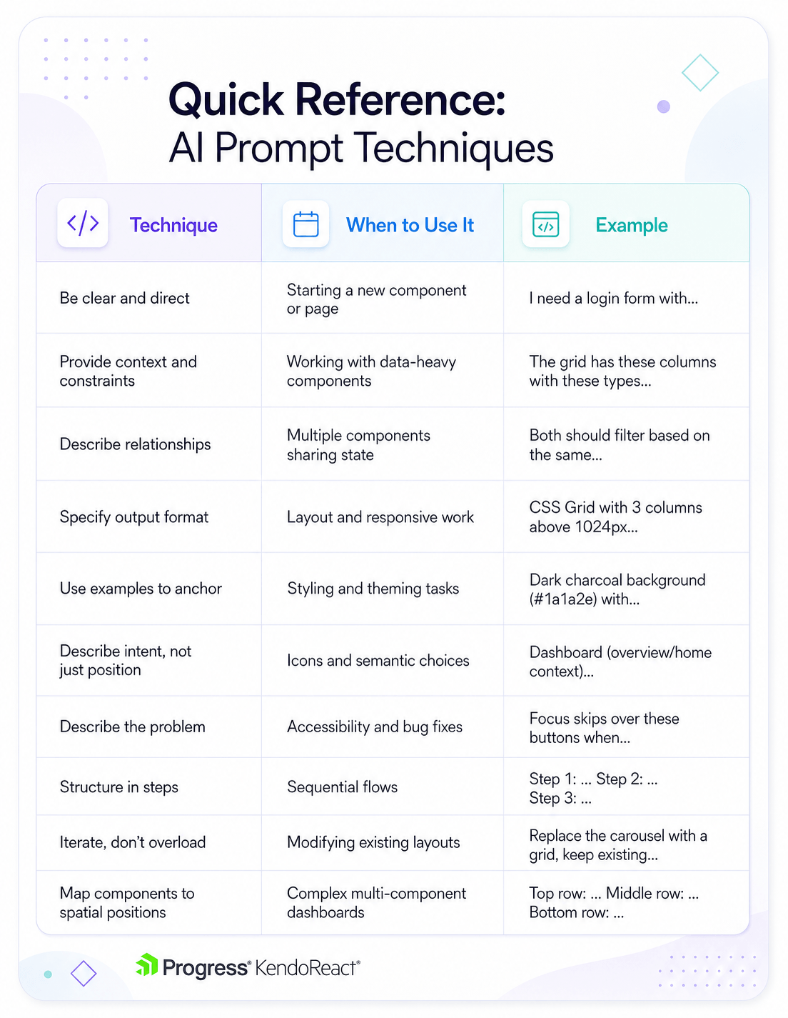
Image generated with AI
| Technique | When to Use It | Example |
|---|---|---|
| Be clear and direct | Starting a new component or page | “I need a login form with…” |
| Provide context and constraints | Working with data-heavy components | “The grid has these columns with these types…” |
| Describe relationships | Multiple components sharing state | “Both should filter based on the same…” |
| Specify output format | Layout and responsive work | “CSS Grid with 3 columns above 1024px…” |
| Use examples to anchor | Styling and theming tasks | “Dark charcoal background (#1a1a2e) with…” |
| Describe intent, not just position | Icons and semantic choices | “Dashboard (overview/home context)…” |
| Describe the problem | Accessibility and bug fixes | “Focus skips over these buttons when…” |
| Structure in steps | Sequential flows | “Step 1: … Step 2: … Step 3: …” |
| Iterate, don’t overload | Modifying existing layouts | “Replace the carousel with a grid, keep existing…” |
| Map components to spatial positions | Complex multi-component dashboards | “Top row: … Middle row: … Bottom row: …” |
Next Steps
This simple cookbook covers starter-level prompts for getting up and running with the KendoReact Agentic UI Generator, but there’s quite a bit more to explore for advanced scenarios.
The AI tooling landscape is moving fast. New models, new editor integrations, and new capabilities seem to land every few weeks. However, the prompting fundamentals we’ve covered here (e.g., being specific, providing context, iterating in steps, etc.) tend to hold up regardless of which model or tool we’re working with. Getting comfortable with these patterns now means we’ll be able to adapt quickly as the tools continue to evolve.
The full KendoReact Prompt Library has additional prompts and component-specific examples, while the KendoReact MCP Server documentation covers setup and configuration in detail. For a deeper dive into the prompting principles referenced throughout this guide, both Anthropic’s prompting best practices and OpenAI’s prompt engineering guide are worth bookmarking as resources that apply well beyond any single tool.
If the prompts in this cookbook look useful, start a free KendoReact trial and give them a try!

Hassan Djirdeh
Hassan is a senior frontend engineer and has helped build large production applications at-scale at organizations like Doordash, Instacart and Shopify. Hassan is also a published author and course instructor where he’s helped thousands of students learn in-depth frontend engineering skills like React, Vue, TypeScript and GraphQL.
Related Posts
Comments
All articles
Topics
Web MobileMobile
Desktop
Design
Productivity
People