The ASP.NET AJAX Gauge - Meet Telerik’s New HTML5-based Data Visualization Recruit
Summarize with AI:
With our previous release (Q2 2012) we introduced RadHtmlChart, but we didn’t stop there – even before the next major release we introduced a lot of the features you asked for.
Once again we leveraged the latest HTML5 goodness and RadHtmlChart now has its own younger brother – RadGauge. In fact, it’s a pair of twins – RadRadialGauge and RadLinearGauge to make the family life even more fun.
Put simply, you can use the gauge to show very specific data with relation to a given range. You could mimic a car dashboard and show the fuel left and have the last quarter glow bright red to draw the attention. But I bet you know better than me what you would need a gauge for, so let’s get down to the details :)
RadGauge basics
Pairing the gauge with the HtmlChart is no accident – we continued the trend to bring you quick, performing controls that use JavaScript to render. Need I list the benefits?
- the server does not have to perform the expensive image rendering usually used by data visualization controls (charts, gauges)
- there isn’t markup sent from the server, so the page becomes lighter
- the control renders on the client so it can expose client-side API – you can change the value without as much as an AJAX request
Once again, SVG is used for modern browsers and VML for the dinosaurs like IE6 and IE7. Yes, I dare mention them because the gauge will still work under them, despite targeting modern web development.
As I mentioned earlier – the RadGauge moniker holds two gauges – a radial and a linear. To make things clearer they are separated in different tags so you can’t confuse properties.
The simplicity and usability were once again focus during development, so the gauge’s markup is also very close to its rendering – WYSIWIG in a way ;-)
First look at the Radial Gauge
The RadRadialGauge does exactly what its name suggests – a rounded dial much like a car dashboard with an arrow pointing against the scale you defined. Let’s take a quick look at some markup:
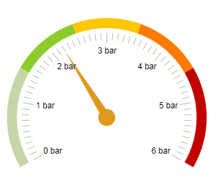
<telerik:RadRadialGauge runat="server" ID="RadRadialGauge1" Width="300px" Height="300px"> <Pointer Value="2.2"> <Cap Size="0.1" /> </Pointer> <Scale Min="0" Max="6" MajorUnit="1"> <Labels Format="{0} bar" /> <Ranges> <telerik:GaugeRange Color="#8dcb2a" From="1.5" To="2.5" /> <telerik:GaugeRange Color="#ffc700" From="2.5" To="3.5" /> <telerik:GaugeRange Color="#ff7a00" From="3.5" To="4.5" /> <telerik:GaugeRange Color="#c20000" From="4.5" To="6" /> </Ranges> </Scale></telerik:RadRadialGauge>
You will soon be able to see this live in a demo, but let me showcase it in advance:
- The pointer tag is the arrow, so it is only natural that you set its value there. A part of the arrow is its hub or Cap, which can control the overall size of the arrow – 0 means no arrow, 1 means the arrow will take the entire gauge.
- The Scale tag holds the main configuration of the gauge – min and max values, steps, etc. and hosts the configurators for its child elements:
- Labels, quite self-explanatory, are the text next to each major point on the scale
- Ranges are the colored sectors of the scale so you can configure them beautifully
- MajorTicks and MinorTicks (which you can’t see in this markup) control the ticks.
It doesn’t get simpler than that.
So, this renders the following gauge:
Quite quickly and quite pretty, right :) Of course, the large set of skins all other controls have are extended to the gauge, too. The screenshot is an example of the Forest skin.
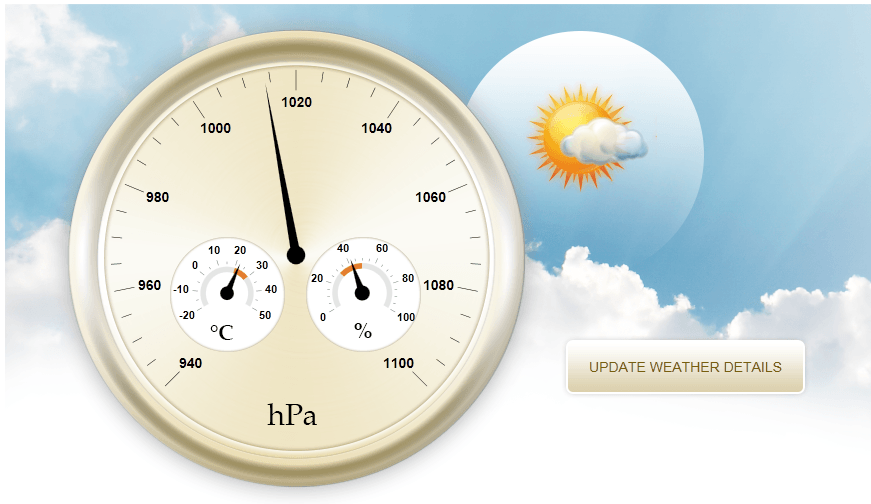
But this is not all, let me give you a sneak peek of what can be achieved with the gauge once you put the designers to work:
First Look at RadLinearGauge
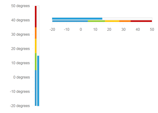
You can think of the linear gauge much in the same way you think of the thermometer outside your window – a line that fills up with mercury to show you cold or hot. It is not much different than its brother, but you can flip it:
<telerik:RadLinearGauge runat="server" ID="RadLinearGauge1" Width="150px" Height="350px"> <Pointer Shape="BarIndicator" Value="15"> <Track Opacity="0.2" /> </Pointer> <Scale Min="-20" Max="50" MajorUnit="10" Vertical="true"> <Labels Format="{0} degrees" /> <Ranges> <telerik:GaugeRange Color="#2a94cb" From="-20" To="5" /> <telerik:GaugeRange Color="#8dcb2a " From="5" To="17" /> <telerik:GaugeRange Color="#ffc700" From="17" To="27" /> <telerik:GaugeRange Color="#ff7a00" From="27" To="35" /> <telerik:GaugeRange Color="#c20000" From="35" To="50" /> </Ranges> </Scale></telerik:RadLinearGauge><telerik:RadLinearGauge runat="server" ID="RadLinearGauge1" Width="350px" Height="150px"> <Pointer Shape="BarIndicator" Value="15"> <Track Opacity="0.2" /> </Pointer> <Scale Min="-20" Max="50" MajorUnit="10" Vertical="false"> <Labels Format="{0} degrees" /> <Ranges> <telerik:GaugeRange Color="#2a94cb" From="-20" To="5" /> <telerik:GaugeRange Color="#8dcb2a " From="5" To="17" /> <telerik:GaugeRange Color="#ffc700" From="17" To="27" /> <telerik:GaugeRange Color="#ff7a00" From="27" To="35" /> <telerik:GaugeRange Color="#c20000" From="35" To="50" /> </Ranges> </Scale></telerik:RadLinearGauge>Design-time wizards
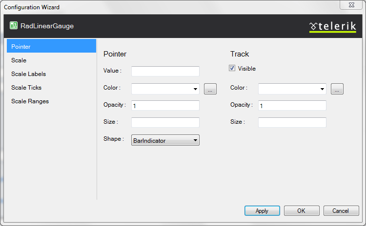
The markup you’ve seen so far isn’t much, but if you do not want to see it at all - this time we are shipping the control with a design-time configurator right from the start.
In conclusion
I hope you like what you saw, so once the release is out – download it, give it a try and experience all the new magic tricks we have cooked up for you.
There are even more features in the control, but I’ll keep them a secret for the release. *Hint* look at different pointer types and labels positioning. If there is something you want, but you cannot find – let us know, this is how the control can become better :-)

Marin Bratanov
Marin Bratanov was a Principal Technical Support Engineer in the Blazor division.


