
Telerik TabView for.NET MAUI—Tabbed UI with Native Look for macOS, Windows, iOS and Android

Summarize with AI:
No matter the platform your .NET MAUI app will be viewed on, create a native looking tab view with the Telerik TabView.
Do you encounter difficulties recreating a tab view UI that looks good on every platform? Progress Telerik created TabView for .NET MAUI to handle this need, and this post will review its features.
Telerik TabView is part of Telerik UI for .NET MAUI and it comes with:
- Native look on every platform
- Item selection functionality
- Four header position options
- Scrolling and gesture support
- Rich API to customize and style the UI
Let’s start and add Telerik .NET MAUI TabView to a .NET MAUI application.
First, we need to download and install Telerik UI for .NET MAUI.
Note! Call
UseTelerik();! Do not forget to call theUseTelerik()method inside the MauiProgram.cs file of your .NET MAUI project. This is needed for all Telerik UI for .NET MAUI components to register all built-in or additionally created handlers to Telerik components.
Then, we can create the component in C# or in XAML like this:
XAML
Xmlns:telerik="http://schemas.telerik.com/2022/xaml/maui"
<telerik:RadTabView x:Name="tabView"></telerik:RadTabView>
C#
using Telerik.Maui.Controls;
RadTabView tabView = new RadTabView();
Adding Tabs
To display something in the tab, you can define TabViewItem elements in its Items collection and set the TabViewItems’ HeaderText property as shown below:
<telerik:RadTabView x:Name="tabView">
    <telerik:TabViewItem HeaderText="Home" />
    <telerik:TabViewItem HeaderText="Folder" />
    <telerik:TabViewItem HeaderText="View" />
</telerik:RadTabView>
RadTabView tabView = new RadTabView();
Telerik.Maui.Controls.TabViewItem homeTab = new Telerik.Maui.Controls.TabViewItem()
{
     HeaderText = "Home",
};
Telerik.Maui.Controls.TabViewItem folderTab = new Telerik.Maui.Controls.TabViewItem()
{
     HeaderText = "Folder"
};
Telerik.Maui.Controls.TabViewItem viewTab = new Telerik.Maui.Controls.TabViewItem()
{
     HeaderText = "View"
};
tabView.Items.Add(homeTab);
tabView.Items.Add(folderTab);
tabView.Items.Add(viewTab);
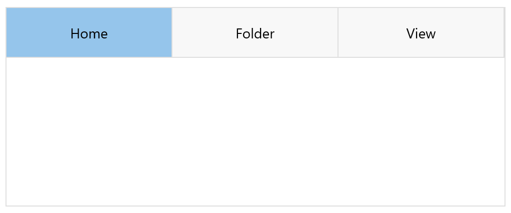
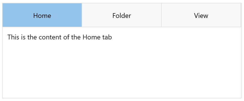
Every TabView item offers also several boolean properties to manipulate with. We can control whether it IsVisible, IsSelected or IsDisabled.
When loaded for the first time (if we didn’t change it), the first item will be selected and its isSelected property will return true, IsVisible will
be true, and isDisabled false. This will display a UI like this:
Now we have the initial setup. But why would we need tabs without content related to them, right? Before continuing with that, let’s play a with the header a bit more to see what its possibilities are.
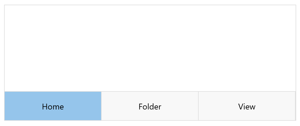
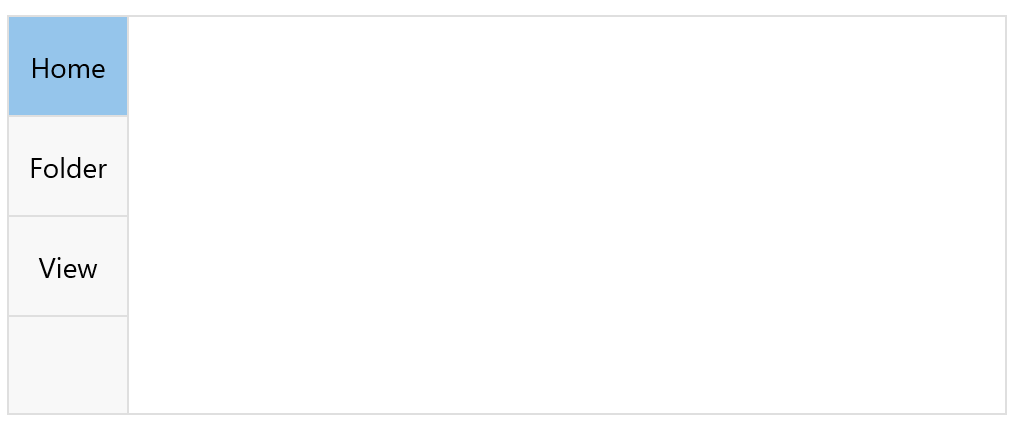
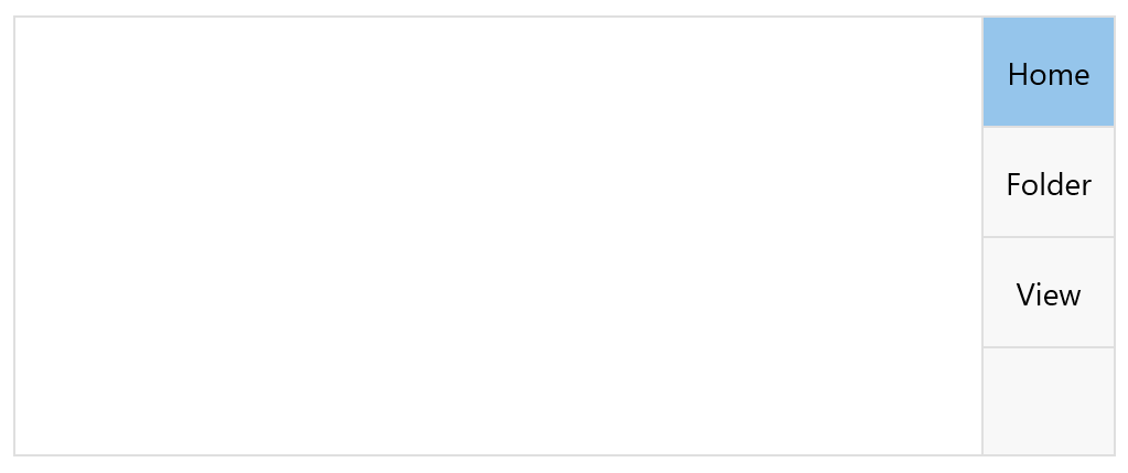
Setting the Header’s Position
First, we can change the HeadersPosition property of Telerik TabView for .NET MAUI to Bottom, Left, Right or leave it at
the default Top.
Overlaid and Scroll Tab Layouts
TabView control allows you to scroll through the tabs inside the TabView Header. You can control this with the IsHeaderScrollable (bool) property. The default value is True.
With IsHeaderOverlaid (bool), you can control whether the header area is overlaid on top of the content area. When the IsHeaderOverlaid is set to True,
the header area is centered and partially overlaps with one of the borders of the content area, based on the value of the HeaderPosition property. The padding of the content area is adjusted accordingly, to avoid overlapping
with the header area.
When the IsHeaderOverlaid is set to False, the header area is placed adjacent to the content area without any overlapping, based on the value of the HeaderPosition property.
Now, let’s set up the tabs’ content!
Tab Content
Every tab item has a Content property ready to be populated. You can do it directly in XAML or in C#:
XAML
<telerik:RadTabView x:Name="tabView" >
    <telerik:TabViewItem HeaderText="Home">
        <Label Margin="10" Text="This is the content of the Home tab" />
    </telerik:TabViewItem>
    <telerik:TabViewItem HeaderText="Folder">
        <Label Margin="10" Text="This is the content of the Folder tab" />
    </telerik:TabViewItem>
    <telerik:TabViewItem HeaderText="View">
        <Label Margin="10" Text="This is the content of the View tab" />
    </telerik:TabViewItem>
</telerik:RadTabView>
C#
  Telerik.Maui.Controls.TabViewItem homeTab = new Telerik.Maui.Controls.TabViewItem()
  {
      HeaderText = "Home",
      Content = new Label() { Text = "This is the content of the Home tab", Margin = new Thickness(10) },
  };
  Telerik.Maui.Controls.TabViewItem folderTab = new Telerik.Maui.Controls.TabViewItem()
  {
      HeaderText = "Folder",
      Content = new Label() { Text = "This is the content of the Folder tab", Margin = new Thickness(10) },
  };
  Telerik.Maui.Controls.TabViewItem viewTab = new Telerik.Maui.Controls.TabViewItem()
  {
      HeaderText = "View",
      Content = new Label() { Text = "This is the content of the View tab", Margin = new Thickness(10) },
  };
Content Area—Swipe or No Swipe
As you can see from the image, the TabView displays only the content of one item at a time—the one that is selected. The rest can be seen by changing the selection with a simple swipe gesture.
If you want to prevent this feature, you will need to set the IsContentSwipingEnabled (bool) property to False. The default value is True.
More About Selection
You have access to the selected item through two properties—SelectedItem and SelectedIndex. Using them, you can change the selection programmatically like this:
tabView.SelectedItem = tabView.Items[1];
Another important API worth mentioning is the SelectionChanged event that comes in use for more advanced scenarios. The event is raised when the SelectedItem is changed by the end user
or programmatically:
private void tabView_SelectionChanged(object sender, System.EventArgs e)
{
    // the new selected index is ((sender as RadTabView).SelectedIndex
}
Now, Let’s Play with the Look and Feel of the Control
TabView comes with a set of APIs that you can use to control the whole look and feel by changing the templates of the header, header item or TabView content. You can also keep the default templates but enhance their style. The full list of properties is below:
- HeaderTemplate (ControlTemplate) – Defines the template of the entire header area. This includes the tabs in the Header (Header area + Header items).
- HeaderItemTemplate (ControlTemplate) – Defines the template of the individual header items.
- ContentTemplate (ControlTemplate) – Defines the template of the entire content area.
- HeaderStyle – Specifies the style of the entire header area (border, background color, etc.).
- HeaderItemStyle – Specifies the style of the individual header items (font, text color, etc.).
- ContentStyle – Specifies the style of the entire content area (borders, background color, etc.).
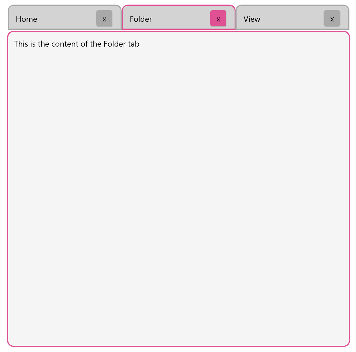
For example, if you want to replicate a bit of the traditional windows tab view, we can combine Templates and Styles:
- First we will set the
HeaderItemTemplateproperty to add a button:
<telerik:RadTabView.HeaderItemTemplate>

 <ControlTemplate>
  <telerik:RadBorder CornerRadius="10,10,0,0" BorderColor="{TemplateBinding BorderColor}"  	                                        BackgroundColor="LightGray" BorderThickness="2">
       <HorizontalStackLayout BackgroundColor="LightGray" HorizontalOptions="StartAndExpand"  >
       <Label Text="{TemplateBinding Text}" TextColor="{TemplateBinding TextColor}" HeightRequest="20"               Margin="10" VerticalTextAlignment="Center" HorizontalOptions="Center" WidthRequest="130"/>
       <telerik:RadButton BackgroundColor="{TemplateBinding BorderColor}"  Margin="0,0,10,0" WidthRequest="30" HeightRequest="30" Text="x" VerticalContentAlignment="Center" HorizontalOptions="End"/>
    </HorizontalStackLayout>
   </telerik:RadBorder>
 </ControlTemplate>
</telerik:RadTabView.HeaderItemTemplate>
Note: To preserve the binding of the of the header item properties, use
TemplateBindingto the properties that you will set from Styles—BorderBackground,BackgroundColor, etc.
- Use the
HeaderStyleto remove the outside border:
<telerik:RadTabView.HeaderStyle>
           <Style TargetType="telerik:TabViewHeader">
               <Setter Property="BackgroundColor" Value="Transparent" />
               <Setter Property="BorderColor" Value="Transparent" />
           </Style>
  </telerik:RadTabView.HeaderStyle>
- Use
HeaderItemStyleandContentStyleto play with the colors. In the code below, we apply different styles with Visual State Manager to have different colors when tabs are selected.
The final code and results are shown below:
   <telerik:RadTabView x:Name="tabView" WidthRequest="600" HeightRequest="600" HeaderSpacing="2">
       <telerik:RadTabView.HeaderItemTemplate>
           <ControlTemplate>
               <telerik:RadBorder CornerRadius="10,10,0,0" BorderColor="{TemplateBinding BorderColor}" BackgroundColor="LightGray" BorderThickness="2">
               <HorizontalStackLayout BackgroundColor="LightGray" HorizontalOptions="StartAndExpand">
<Label Text="{TemplateBinding Text}" TextColor="{TemplateBinding TetColor}" HeightRequest="20" Margin="10" VerticalTextAlignment="Center" HorizontalOptions="Center" WidthRequest="130"/>
                 <telerik:RadButton BackgroundColor="{TemplateBinding BorderColor}"  Margin="0,0,10,0" WidthRequest="30" HeightRequest="30" Text="x" VerticalContentAlignment="Center" HorizontalOptions="End"/>
               </HorizontalStackLayout>
             </telerik:RadBorder>
           </ControlTemplate>
       </telerik:RadTabView.HeaderItemTemplate>
       <telerik:RadTabView.HeaderStyle>
           <Style TargetType="telerik:TabViewHeader">
               <Setter Property="BackgroundColor" Value="Transparent" />
               <Setter Property="BorderColor" Value="Transparent" />
           </Style>
       </telerik:RadTabView.HeaderStyle>
       <telerik:RadTabView.HeaderItemStyle>
           <Style TargetType="telerik:TabViewHeaderItem">
               <Setter Property="FontAttributes" Value="Italic"/>
               <Setter Property="TextColor" Value="#99000000" />
               <Setter Property="VisualStateManager.VisualStateGroups">
                   <VisualStateGroupList>
                       <VisualStateGroup Name="CommonStates">
                           <VisualState Name="Normal" >
                               <VisualState.Setters>
                                   <Setter Property="Background" Value="Transparent" />
                                   <Setter Property="BorderColor" Value="DarkGray" />
                                   <Setter Property="BorderThickness" Value="2" />
                                   <Setter Property="CornerRadius" Value="10,10,0,0" />
                               </VisualState.Setters>
                           </VisualState>
                           <VisualState Name="Disabled">
                               <VisualState.Setters>
                                   <Setter Property="TextColor" Value="#61000000" />
                               </VisualState.Setters>
                           </VisualState>
                           <VisualState Name="Selected">
                               <VisualState.Setters>
                                   <Setter Property="TextColor" Value="#e05194" />
                                   <Setter Property="BorderColor" Value="#e05194" />
                                   <Setter Property="BorderThickness" Value="2" />
                                   <Setter Property="CornerRadius" Value="10,10,0,0" />
                               </VisualState.Setters>
                           </VisualState>
                       </VisualStateGroup>
                   </VisualStateGroupList>
               </Setter>
           </Style>
       </telerik:RadTabView.HeaderItemStyle>
       <telerik:RadTabView.ContentStyle>
           <Style TargetType="telerik:TabViewContent">
               <Setter Property="BackgroundColor" Value="WhiteSmoke" />
               <Setter Property="BorderColor" Value="#e05194" />
               <Setter Property="BorderThickness" Value="2" />
               <Setter Property="CornerRadius" Value="10"/>
           </Style>
       </telerik:RadTabView.ContentStyle>
       <telerik:TabViewItem HeaderText="Home">
           <Label Margin="10" Text="This is the content of the Home tab" />
       </telerik:TabViewItem>
       <telerik:TabViewItem HeaderText="Folder">
           <Label Margin="10" Text="This is the content of the Folder tab" />
       </telerik:TabViewItem>
       <telerik:TabViewItem HeaderText="View">
           <Label Margin="10" Text="This is the content of the View tab" />
       </telerik:TabViewItem>
   </telerik:RadTabView>
Try It and Share Feedback
To quickly get started with Telerik TabView for .NET MAUI, take a look at the online docs and the SDK samples on GitHub. Try it now, and if there is anything you need, do not hesitate to share your feedback or questions with the Progress Telerik team.

Rossitza Fakalieva
Rossitza Fakalieva is a Technical Manager, Microsoft MVP in Developer Technologies and a Director of the Bulgarian chapter of the global Women Who Code organization. She previously worked on the Telerik engineering team and defines herself as .NET enthusiast. She loves to empower others to grow in their career and in the tech field—by teaching, by delivering courses and presentations, and as part of her daily job.
Related Posts
Comments
All articles
Topics
Web MobileMobile
Desktop
Design
Productivity
People
