
Introducing Telerik ComboBox for .NET MAUI: All You Need from a Dropdown Control

Summarize with AI:
Telerik ComboBox for .NET MAUI is built to offer an intuitive interface for users to select one or more items from a dropdown list. It comes with a flexible styling API, dropdown customizations and more.
The ComboBox component from Progress Telerik UI for .NET MAUI presents users with an intuitive interface where they can select one or more items from a dropdown list. The control comes with a rich feature set:
- Single and multiple selection
- Token support
- Filtering and search
- A flexible styling API
- Dropdown customizations
- And more
Let’s see them in detail, but first we will start with adding Telerik ComboBox for the first time to our .NET MAUI application:
Add Telerik Combobox to .NET MAUI Application
First, we need to download and install Telerik UI for .NET MAUI.
Note! Call UseTelerik();
Do not forget to call the UseTelerik() method inside the MauiProgram.cs file of your .NET MAUI project.
When the .NET MAUI application has been set up, you are ready to add a ComboBox control to your page with XAML or C#:
XAML
xmlns:telerik="http://schemas.telerik.com/2022/xaml/maui"
<telerik:RadComboBox x:Name="combobox" />
or
C#
using Telerik.Maui;
using Telerik.Maui.Controls;
...
RadComboBox combobox = new RadComboBox();
Populate Telerik ComboBox for .NET MAUI with Data
The next step is to populate the .NET MAUI ComboBox with some items. To do that, you need to prepare your data as a collection of IEnumerable and set it to the control’s ItemsSource. In case the data is from a complex object type, you need to use also the DisplayMemberPath property.
For the purposes of this post, we will bind the ComboBox with a list of cities.
We can do it with static XAML like this:
<telerik:RadComboBox  >
  <telerik:RadComboBox.ItemsSource>
    <x:Array  Type="{x:Type x:String}">
      <x:String>Tokyo</x:String>
      <x:String>Uganda</x:String>
      <x:String>Ukraine</x:String>
      <x:String>Canada</x:String>
      <x:String>France</x:String>
      <x:String>Italy</x:String>
      <x:String>United Kingdom</x:String>
      <x:String>China</x:String>
      <x:String>Japan</x:String>
    </x:Array>
  </telerik:RadComboBox.ItemsSource>
</telerik:RadComboBox>
Or using the MVVM pattern and binding the combobox datacontext to an instance of a viewmodel.
<telerik:RadComboBox  >
  <telerik:RadComboBox.BindingContext>
    <local:ViewModel/>
  </telerik:RadComboBox.BindingContext>
</telerik:RadComboBox>
We will continue the post using this approach where the Items is a collection of Cities defined in ViewModel class. To display the names, we will use the Name property in this case:
<telerik:RadComboBox  ItemsSource="{Binding Items}"
DisplayMemberPath="Name" />
public  class  ViewModel
  {
    public  ViewModel()
    {
      this.Items  =  new  ObservableCollection<City>
      {
        new  City  {  Name  =  "Tokyo",  Population  =  13929286  },
        new  City  {  Name  =  "New York",  Population  =  8623000  },
        new  City  {  Name  =  "London",  Population  =  8908081  },
        new  City  {  Name  =  "Madrid",  Population  =  3223334  },
        new  City  {  Name  =  "Los Angeles",  Population  =  4000000},
        new  City  {  Name  =  "Paris",  Population  =  2141000  },
        new  City  {  Name  =  "Beijing",  Population  =  21540000  },
        new  City  {  Name  =  "Singapore",  Population  =  5612000  },
        new  City  {  Name  =  "New Delhi",  Population  =  18980000  },
        new  City  {  Name  =  "Bangkok",  Population  =  8305218  },
        new  City  {  Name  =  "Berlin",  Population  =  3748000  },
      };
    }

  public  ObservableCollection<City>  Items  { get;  set;  }
}
Configure the Selection
You can choose whether the user can select one or multiple items by configuring the SelectionMode property to Single or Multiple value.
In the post we will continue with Multiple Selection like this:
<telerik:RadComboBox  ItemsSource="{Binding Items}"
  DisplayMemberPath="Name"
  SelectionMode="Multiple">

</telerik:RadComboBox>
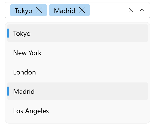
When Telerik ComboBox is in multiple selection mode, the selected items are visualized as tokens with a “remove” (x) button, so that users remove them from selection easily.
Selection API for More Advanced Scenarios
To handle more advanced scenarios, SelectionChanged event and a bunch of properties come in help.
The SelectionChanged event gives you access to the added and removed items from selection:
private void comboBox_SelectionChanged(object sender, ComboBoxSelectionChangedEventArgs e)
{
  // Here you can write custom logic using  e.AddedItems  & e.RemovedItems
}
And the properties that you can use to read the selection are:
- SelectedIndex – Specifies the index of the first item in the current selection or -1 if the selection is empty.
- SelectedItem – Defines the first item in the current selection, or null if the selection is empty.
- SelectedItems – Gets the collection of currently selected items.
You can also reply on two commands for selecting items that you can use outside the ComboBox—SelectAllCommand and ClearSelectionCommand.
Configure the Editing & Search Sodes
By default, Telerik ComboBox for .NET MAUI control is non-editable and the user can choose from the displayed items without typing.
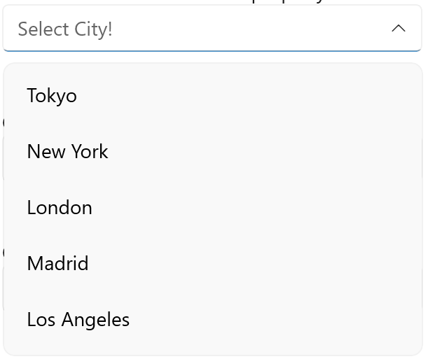
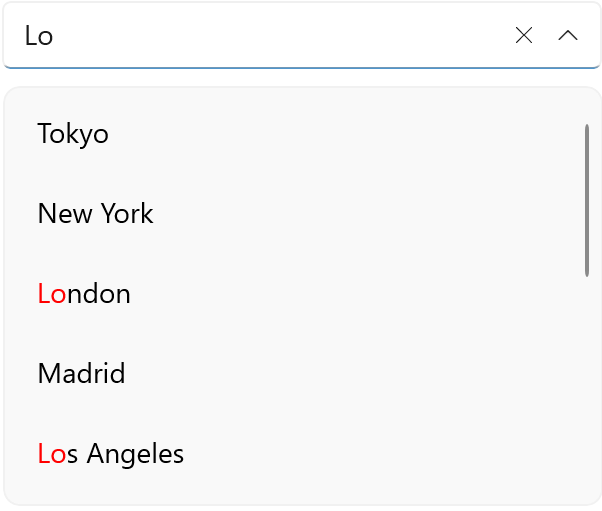
This, however, can be easily changed through the IsEditable Boolean property. When it is set to True, the user can type into the text input and thus initiate searching through thе ComboBox items.
Telerik ComboBox supports placing a Placeholder text to guide the user what to be typed.
Typing in the ComboBox is quite useful for quick selection, especially in the case with more items available.
You can also define whether the SearchMode will be:
- "StartsWith" (the default one)
- "Contains"
- "ContainsCaseSensitive"
- "StartsWithCaseSensitive"
Note: In a case where the ComboBox is bound to a complex object and you can use DisplayMemberPath, you can use the SearchTextPath property to define the name of the property against which the searching will be performed.
One more goody is that the result of the search can be highlighted in different color that you can set to the HighlightedColor property.
An example of ComboBox with editing enabled, search mode configured, placeholder and highlighting is shown below:
<telerik:RadComboBox  x:Name="comboBox"
  ItemsSource="{Binding Items}"
  DisplayMemberPath="Name"
  Placeholder="Select City!"
  HighlightTextColor="Red"
  IsEditable="True"/>
Style & Customize Telerik ComboBox
RadComboBox offers a flexible styling API that you can use to enhance the look and feel of your app. You can change the ComboBox background color, style the control’s dropdown box and modify the clear and dropdown buttons. In addition, you can change the placeholder text color and the highlighted text color.
The properties that you can use to control color, styles and fonts of different elements include:
- PlaceholderColor – Defines the color for the placeholder text.
- TextColor – Defines the color of the text when the control is editable and the color of the selected item when the control is not editable and the selection mode is single.
- BackgroundColor – Defines the background color of the control.
- BorderColor – Defines the color of the border.
- BorderThickness – Defines the thickness of the border.
- ClearButtonStyle – Defines the style for the clear button.
- Font Options (FontAttributes, FontFamily, FontSize) – Define the font options to the text of the RadComboBox.
Dropdown Styling
The following properties style the ComboBox dropdown:
- DropDownBorderColor
- DropDownBorderThickness
- DropDownBorderCornerRadius
- DropDownBackgroundColor
- DropDownButtonStyle
- DropDownVerticalOffset
Templates, Templates, Templates
Furthermore, there are more customizable templates that you can use to fully control the visual appearance of the RadComboBox control:
- ItemTemplate – Controls the items that are visualized in the dropdown list.
- SelectedItemTemplate – Defines the template of the selected items that are visualized in the dropdown list.
- TokenTemplate – Defines the template of the tokens that are visualized when multiple selection is performed.
- ShowMoreTemplate – Defines the template of the Show More UI that gets visualized when the control is not focused, and the space is not enough to show all tokens when using the multiple selection mode.
- SelectionBoxTemplate – Defines the template of the selected item in the box section of the control.
Header & Footer
You can add a header and footer to the DropDown list of the ComboBox control through the following properties:
- HeaderTemplate
- FooterTemplate
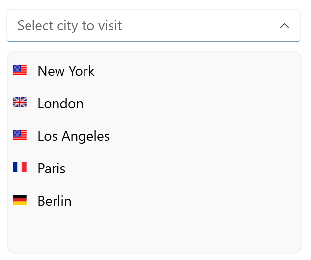
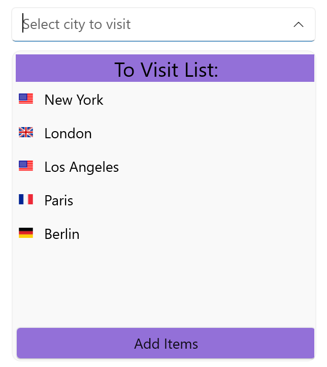
To illustrate all that, the following code shows how we can enhance our demo adding images of flags to every city, add population to the selected item, and add a header and footer:
<telerik:RadComboBox ItemsSource="{Binding Items}"
    DisplayMemberPath="Name"
    IsEditable="True"
    SearchMode="Contains"
    SearchTextPath="Name"
    Placeholder="Select city to visit"
    SelectionMode="Multiple"
    DropDownHeight="300"
    x:Name="comboBox">
  <telerik:RadComboBox.ItemTemplate>
    <DataTemplate>
      <telerik:RadBorder
          MinimumWidthRequest="300">
        <HorizontalStackLayout>
          <Image Source="{Binding Flag}" WidthRequest="20"  HeightRequest="10"  />
          <Label Text="{Binding Name}"
          Padding="8, 7, 0, 7"
          TextColor="Black"/>
        </HorizontalStackLayout>
      </telerik:RadBorder>
    </DataTemplate>
  </telerik:RadComboBox.ItemTemplate>
  <telerik:RadComboBox.SelectedItemTemplate>
    <DataTemplate>
      <telerik:RadBorder BorderColor="MediumPurple" BorderThickness="2"
          MinimumWidthRequest="200">
        <HorizontalStackLayout>
          <Label Text="{Binding Name}"
            Padding="8, 7, 0, 7"
            TextColor="Black"/>
          <Label Text="{Binding Population}"
            FontSize="12"
            Padding="8, 7, 0, 7"/>
        </HorizontalStackLayout>
      </telerik:RadBorder>
    </DataTemplate>
  </telerik:RadComboBox.SelectedItemTemplate>
  <telerik:RadComboBox.HeaderTemplate>
    <DataTemplate>
      <StackLayout BackgroundColor="MediumPurple">
        <Label Text="To Visit List!"
          FontSize="20"
          TextColor="Black"
          BackgroundColor="MediumPurple"
          VerticalOptions="Center"
          HorizontalOptions="Center"/>
      </StackLayout>
    </DataTemplate>
  </telerik:RadComboBox.HeaderTemplate>
  <telerik:RadComboBox.FooterTemplate>
    <DataTemplate>
      <StackLayout>
        <Button Text="Add Items"
          Clicked="Button_Clicked"
          BackgroundColor="MediumPurple"/>
      </StackLayout>
    </DataTemplate>
  </telerik:RadComboBox.FooterTemplate>
  <telerik:RadComboBox.TokenTemplate>
    <DataTemplate>
      <telerik:RadBorder BackgroundColor="MediumPurple"
        CornerRadius="10"
        Margin="2" Padding="8">
        <HorizontalStackLayout>
          <Image Source="{Binding Flag}" WidthRequest="20" HeightRequest="10"  />
          <Label Text="{Binding Name}" Padding="8, 7, 0, 7" TextColor="Black"/>
        </HorizontalStackLayout>
      </telerik:RadBorder>
    </DataTemplate>
  </telerik:RadComboBox.TokenTemplate>
</telerik:RadComboBox>
Migration from Xamarin
The ComboBox for .NET MAUI shares the same API with Telerik ComboBox for Xamarin, so no more changes then changing the namespace are needed if you plan such migration.
However, to stay up to date with the api changes you can refer to the migration documentation article.
More Resources
More examples illustrating the power of the Telerik UI for .NET MAUI Combobox can be found in Telerik SDK and Telerik Controls Samples. Additionally, you can grab the source code of Telerik .NET MAUI demo apps and take them for a spin!
More details about the API and using the component can be found in the Telerik documentation.
Try It Yourself
Telerik ComboBox is just one of the powerful and feature-rich components in the Telerik UI for .NET MAUI suite, built to help you develop outstanding cross-platform applications. Try it for free now, and if there is anything you need—do not hesitate to share your feedback and ideas with the Telerik team on Telerik Feedback Portal or Telerik Forums.

Rossitza Fakalieva
Rossitza Fakalieva is a Technical Manager, Microsoft MVP in Developer Technologies and a Director of the Bulgarian chapter of the global Women Who Code organization. She previously worked on the Telerik engineering team and defines herself as .NET enthusiast. She loves to empower others to grow in their career and in the tech field—by teaching, by delivering courses and presentations, and as part of her daily job.
Related Posts
Comments
All articles
Topics
Web MobileMobile
Desktop
Design
Productivity
People
