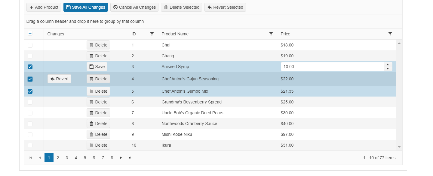
Telerik and Kendo UI Web April 2022 Update

Summarize with AI:
Find out what’s new this month with our Kendo UI and Telerik Web component libraries.
New Ocean Blue Swatch Aimed at Better Accessibility
With this latest update, the Telerik and Kendo UI teams researched how we could improve accessibility of all our components out of the box by making changes to the look and feel of the components. Specifically, we looked at the Telerik and Kendo UI Default theme to see how we could improve accessibility levels by focusing on aspects like contrast, which are very important in accessibility scenarios.
This research effort led to the new Telerik and Kendo UI Default Ocean Blue swatch. Rather than the traditional orange color of the Default theme, the Ocean Blue swatch offers blue as the primary color. The name might have given it away. 😉
The goal for this swatch is to let users immediately see a boost in accessibility compliance by using this swatch. While the Telerik and Kendo UI components already adhere to a high level of compliance, using this swatch will help improve accessibility compliance even further.
If you’re not familiar with the concept of a “swatch” for the themes, these are predefined and curated color combinations that our design and user experience teams have collaborated on to offer variations in the look and feel of our various themes.
This update is available in all our Telerik and Kendo UI web components except ASP.NET AJAX.
Now let’s get into what’s specific in each library with our April update.
Table of Contents
- Kendo UI for jQuery
- Kendo UI for Angular
- KendoReact
- Kendo UI for Vue
- Telerik UI for ASP.NET Core & MVC
- Telerik UI for Blazor
Kendo UI for jQuery Updates
jQuery TreeView: loadCompleted Event
The Kendo UI for jQuery TreeView component received the loadCompleted event, which triggers when data has finished loading in the TreeView component. We know this has been a highly requested addition to the jQuery TreeView in the past, so
we’re very happy to be able to deliver this today!
See the jQuery TreeView loadCompleted loaded event.
Various jQuery Samples: Migrate From LESS to Sass
As we announced in January this year, the LESS-based themes are going to officially be phased out by R1 2023 in favor of the Sass-based themes. As a part of this, we are actively migrating our own resources currently using LESS to use Sass instead. Over the last couple of months, we have been busy with migrating several of our readily available samples to rely on Sass over LESS.
See updated jQuery example apps and knowledge base articles.
Kendo UI for Angular Updates
New Component: Angular ListBox
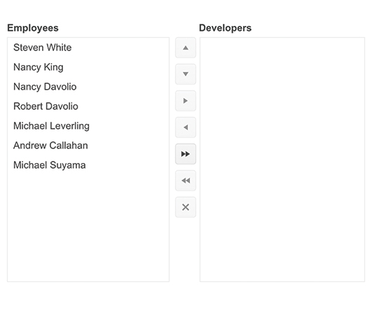
The new Kendo UI for Angular ListBox component gives developers a new way to display a list of items. The Angular ListBox lets users select, reorder, delete, and drag and drop items.
You can also combine as many ListBox components as you’d like, which lets users move items between each Angular ListBox. To help facilitate interacting with multiple ListBoxes, the component can render a button area with helpful buttons to rearrange items or move single, or multiple, items between the available ListBox instances.
See the Angular ListBox component.
All Kendo UI for Angular Packages: Preview of the Ivy Package Format
While Kendo UI for Angular has been compatible with Angular 13 since the initial launch of this version of Angular, we did still rely on ngcc to offer our UI components for use with Angular 13. Ever since this release, the Kendo UI for Angular
team has been busy with migrating all our UI component packages to the new Angular Package Format (APF).
For this update, we can officially announce that we will have migrated all Kendo UI for Angular packages to this new format with one catch: This new format is only available under our -develop branch, which we use to get feedback on any new
package or feature before officially launching anything.
Between now and the official R2 2022 release (May 2022), for anyone interested in testing out these Ivy formatted packages, you can follow these instructions for how to use a -develop version of our packages.
We would love to hear how this migration works for you and your team, so feel free to submit all feedback around this process by commenting below or using our support ticketing system.
Angular PanelBar: Additional Events
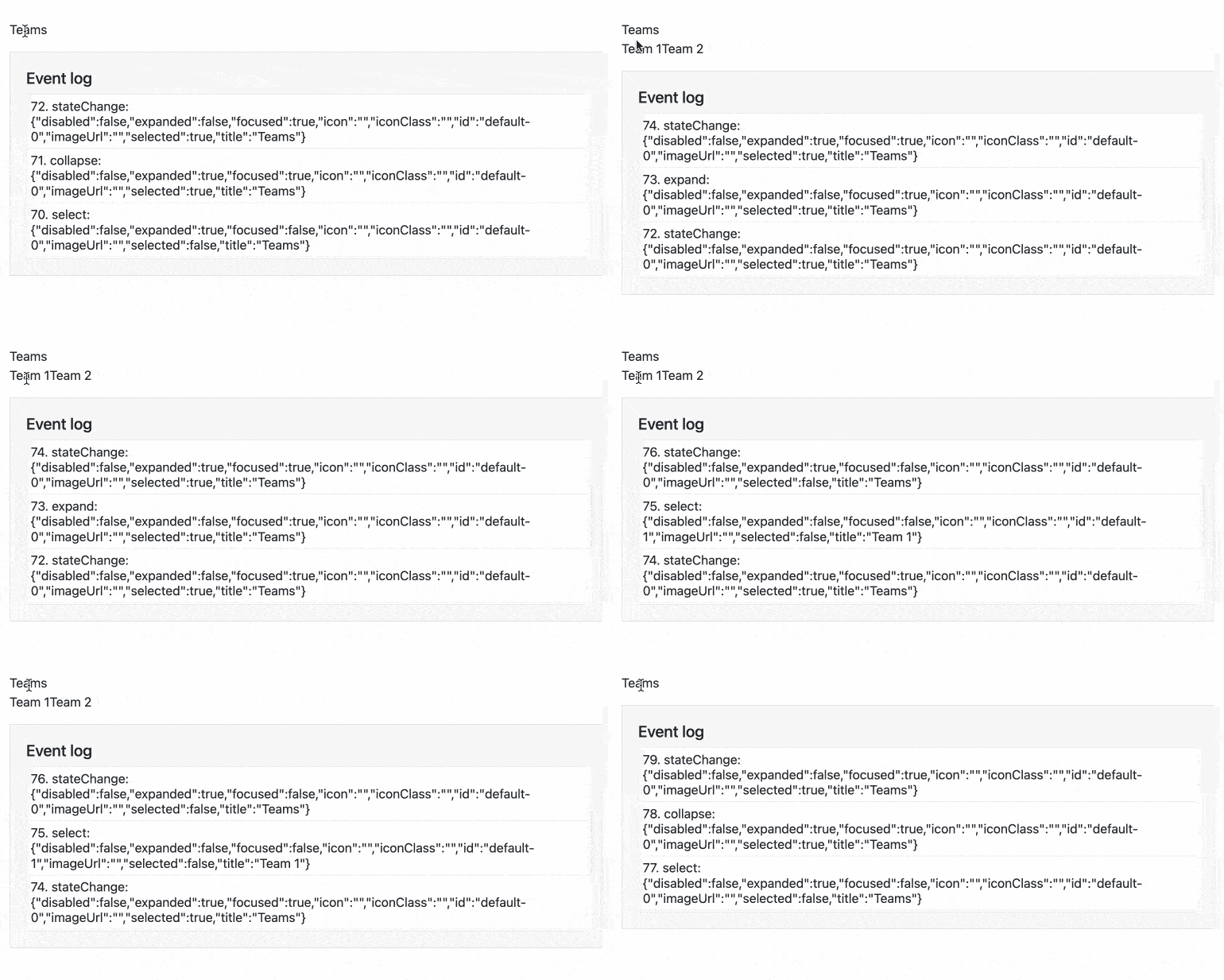
With this update, we focused on adding highly requested events for the Angular PanelBar component. Specifically, we added the following events:
select– Triggered when a PanelBar item is selectedexpand– Triggered when a PanelBar item is expandedcollapse– Triggered when a PanelBar is collapsed
Each of the above events are preventable to give flexibility when handling these events. For more details, you can refer to the Angular PanelBar API documentation.
Angular Conversational UI: Input Area Customization
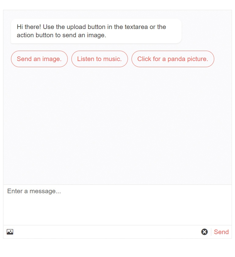
The Kendo UI for Angular Conversational UI component lets developers provide a UI for interacting with chatbots. With this update, we have allowed developers to move away from a single line message and instead provide users with a multi-line area for inputting text, or even fully customizing the chat area.
Specifically, developers can configure if the Angular Conversational UI component should use an input element (single-line), a textarea element (multi-line), or fully customize the input area using an ng-template.
See the Angular Conversational UI input area customization demo.
Angular Scheduler: Highlight Events in Real Time
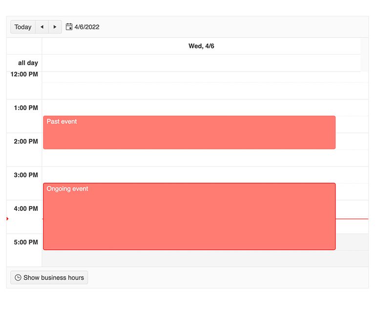
The Kendo UI for Angular Scheduler is often used as a daily driver for organizing events in a calendar interface. As there can be several events added from various sources, the Angular Scheduler can often be jam-packed with events. To help make important events stick out a bit more, we have added a feature that gives a visually distinct look to an event which is currently happening.
This highlight style is built in to the Kendo UI for Angular themes, and we also offer the ability to customize this look through CSS.
See the Angular Scheduler highlight events in real time demo.
KendoReact Updates
React 18 Support

React 18 was released a couple of weeks ago, and with this update to React we have made sure that KendoReact is compatible! For any user looking to update to React 18, you can simply update your references to the latest version to be up and running without any warnings.
If you’re curious what is new in React 18, we previously wrote about what is coming with this new version of React in this blog post.
See the KendoReact demos for examples using React 18.
Kendo UI for Vue Updates
New Component: Vue Splitter
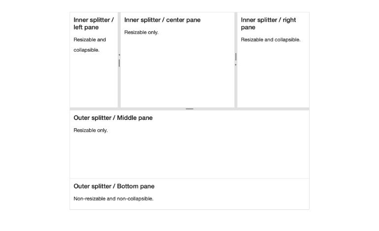
The first new native UI component added to Kendo UI for Vue is the Splitter component. The Vue Splitter lets developers create areas of their applications where users can freely resize sections to fit their perfect layout. These sections can be resized horizontally, vertically or both, and can be collapsed completely if need be.
See the native Vue Splitter component.
New Component: Vue PanelBar

The Kendo UI for Vue PanelBar component, also known as an accordion component, is a layout and navigation element that shows items in a set of collapsible panels. Each panel can also have sub-panels, giving developers the flexibility to create hierarchical and multi-level content that can be expanded and collapsed.
See the native Vue PanelBar demo.
Vue Scheduler Improvements: More Features Added
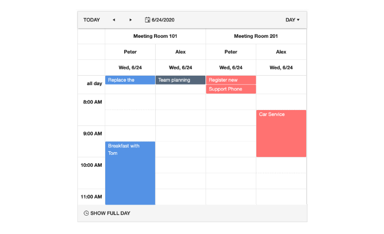
With the R1 2022 release, we introduced the Kendo UI for Vue Scheduler component, but it was missing some of the features that we consider essential for this type of UI component. Over the last few weeks, we spent time focusing on developing additional features in the Vue Scheduler to align the component with the other JavaScript-based Scheduler components found in the Kendo UI bundle.
Specifically, with this release we have added:
- Vertical grouping
- Custom items and events, slots, headers and footer elements
- Editing
- Localization
We hope that with this update you will have access to the most common features of the Kendo UI Scheduler, letting you take full advantage of this great component in your Vue apps.
See the native Vue Scheduler component.
New Vue Wizard Example
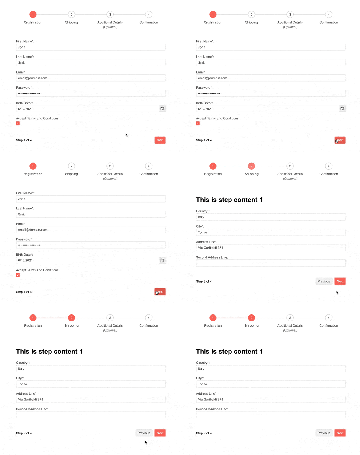
With this update, the Kendo UI for Vue team also created detailed examples showcasing how to use the Kendo UI for Vue Stepper and Form components to create a guided Wizard component which can be added to any Vue application. These examples show how to tackle aspects like navigating back and forth through the form, as well as validation either on a step-by-step basis or as a part of submitting the form on the last step.
See the native Vue Wizard documentation.
Telerik UI for ASP.NET Core & MVC Updates
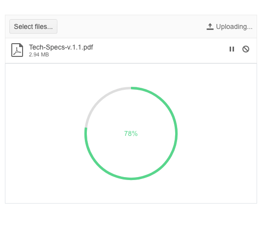
New CircularProgressBar UI Component
The new CircularProgressBar UI control gives developers a way to visualize the progress for a particular process as a circle. The component comes with:
- Option for indeterminate/infinite progress
- Center template, which allows you to display custom text or HTML in the circle’s center
- Colors feature, which allows rendering the indicator in different colors depending on the value
See the UI for ASP.NET Core CircularProgressBar demo.
See the UI for ASP.NET MVC CircularProgressBar demo.
Multiple New ColorPickers
As the features and complexity of the ColorPicker component grew over time, we needed to address this aspect and simplify, break down and provide granular functionality in several standalone color picker components. You can now take advantage of a specific color picker depending on your use case:
- ColorPalette when you need to display a predefined list of palettes
- ColorGradient when you need to show just a gradient view
- FlatColorPicker for a simplified need of ColorPicker without a popup
Below you can find more detailed information about the features available in each new standalone control.
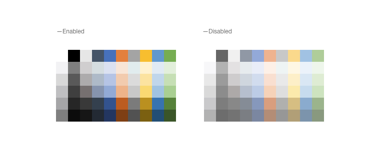
New ColorPalette UI Component
The ColorPalette component provides a set of predefined color sets that can be set with a single property and shown to your users. In case you need to adapt the standard color palette, you have the flexibility to provide your own set of colors (any valid CSS color) to the Telerik UI Color Palette component.
See the UI for ASP.NET Core ColorPalette demo.
See the UI for ASP.NET MVC ColorPalette demo.
New ColorGradient UI Component
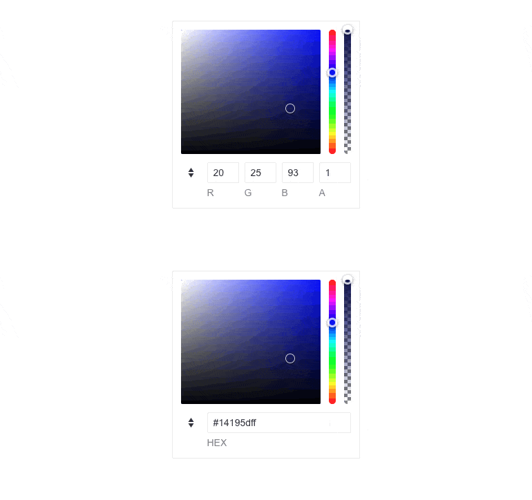
The new standalone ColorGradient UI component gives users a way to select a color via a visual gradient (earlier, this feature was only available as a part of the ColorPicker component). The ColorGradient includes a slider for hue and alpha, manual HEX and RGB inputs for pinpointing a desired color, and a contrast tool that analyzes the contrast ratio between two colors, visualizes it and outputs a pass/fail report for WCAG standards.
See the UI for ASP.NET Core ColorGradient demo.
See the UI for ASP.NET MVC ColorGradient demo.
New FlatColorPicker UI Component
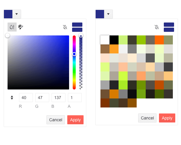
The new FlatColorPicker for ASP.NET Core and MVC is a powerful color editing tool which includes Palette and Gradient views. The component has a header and footer displaying various buttons for switching between views, applying or canceling changes, previewing or reverting, and more. You can easily customize them and render custom content using the available templates.
See the UI for ASP.NET Core FlatColorPicker demo.
See the UI for ASP.NET MVC FlatColorPicker demo.
Spreadsheet Enhancement: Dynamic Change of Size
With this item, we are addressing a popular item in the Feedback Portal and adding to the Spreadsheet UI component the capability to change the number of its rows and columns, and increase its size after loading. The new Resize method allows automatic sheet resizing on pasting more data than the current sheet size, plus flexible behavior when adding and deleting columns and rows from the toolbar.
See a demo of how the Telerik UI ASP.NET Core Spreadsheet resizes or check out the equivalent in UI for ASP.NET MVC Spreadsheet.
Telerik ASP.NET Core–Specific Updates
Compatibility With the Latest .NET 7 Preview 3
For those of you eager to try out the latest and greatest by Microsoft, we are happy to announce that the Telerik UI for ASP.NET Core suite is compatible with the latest .NET 7 Preview 3.
TagHelper Improvements in Demos and Documentation
We are continuing our efforts to expand the available TagHelper code snippets in both component demos and documentation. In the current release, we managed to improve the examples in over 20 ASP.NET Core components and multiple documentation articles—DropDownList, DateTimePicker, Editor, TreeView and more. As promised, this effort will continue for a few more releases until we have complete parity between the HTML and TagHelpers examples.
Telerik UI for Blazor Updates
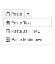
New Blazor Split Button Component
The new Telerik UI for Blazor SplitButton will allow users to execute a default action or to choose a predefined action from a dropdown list. The SplitButton comes with multiple out-of-the box configuration options for its visual appearance, which eliminates the need for custom CSS.
You can easily add icons to the main and secondary items, and customize colors, borders, shape and size. Like the rest of the Telerik UI components, the Split Button includes built-in keyboard navigation.
Try out and run the new SplitButton UI component in browser with Blazor REPL.
New Pager Feature: Responsiveness and Adaptability
The Blazor Pager component can be easily adapted to various screen sizes thanks to the built-in responsive breakpoints. The adaptiveness of the Pager can be easily enabled through the Adaptive parameter, which is exposed in the PagerSettings of the components that integrate the pager—Grid, ListView and TreeList.

New Toolbar Feature: Responsiveness and Adaptability
The Blazor Toolbar is another UI component that received an Adaptive parameter. By setting it to true, the Toolbar container becomes adaptive and hides the overflowing items in a popup. You have the further option to specify which items need to move to the overflow popup and which should remain always visible via the Overflow parameter of the ToolBar items.

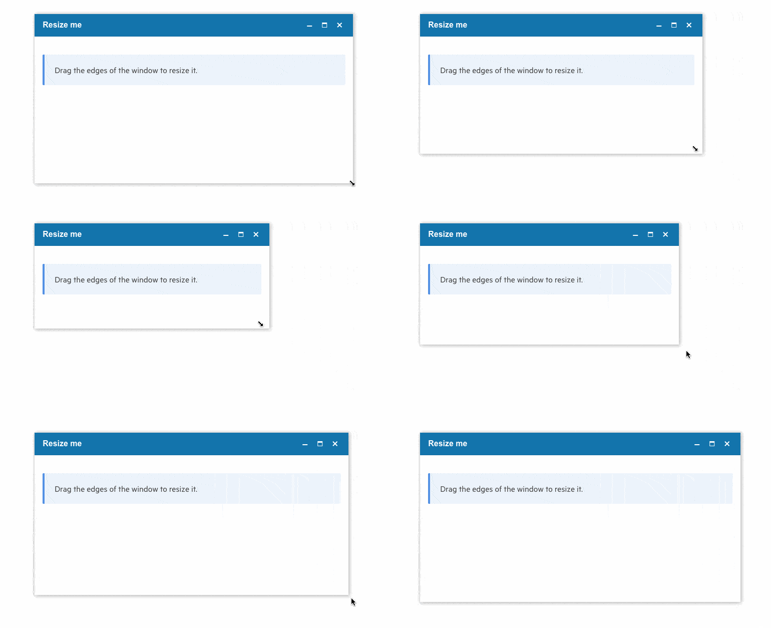
New Window Feature: Resizable
With this feature, we are responding to a popular request in the Telerik UI for Blazor Feedback Portal.
By setting the new Resizable property to true, you can enable users to drag the Window component’s corners and resize it as needed.
See a demo of how to resize the Telerik Blazor Window UI Component.
Debounce Delay Parameter in Multiple UI Components
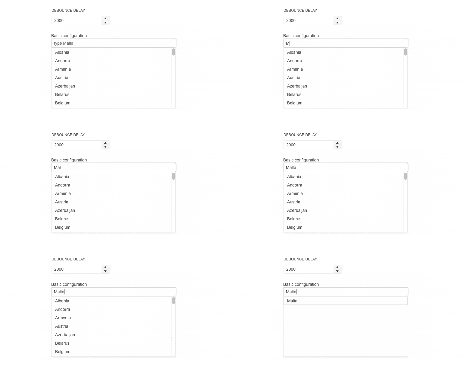
In the current 3.2.0 release, we added a DebounceDelay parameter in the following Telerik UI for Blazor components that adopt an input:
- AutoComplete
- ComboBox
- DateInput
- DatePicker
- DateRangePicker
- DateTimePicker
- MultiSelect
- NumericTextBox
- TimePicker
The DebounceDelay parameter allows control over the response to the change of values, specifically when you need to add a predefined time delay before making a request or responding to a user action.
See an example of the DebounceDelay property when performing filtering in Blazor MultiSelect.
New Parameters: Button & Form Components
Another item we addressed from the Telerik Blazor user voice portal is the Form parameter in the Telerik Button UI component. The new parameter allows linking a form to a submit button, when the button is rendered outside the form and ensures the same behavior as if the submit button is inside the form.
We have also added a new Id parameter to the Form Component so that it can be linked to submit buttons outside it and assure integration with the new button parameter.
New NumericTextBox Parameters
Again, based on your feedback, we added an InputMode and AutoComplete parameters to the Blazor NumericTextBox. The InputMode param improves the user experience by showing numeric-only keypads on virtual keyboards. The AutoComplete parameter to the NumericTextBox allows developers to disable browser suggestions of previous values provided by the user.
New Data Grid and TreeList SearchBox Parameters
You can now customize the SearchBox within the Blazor Data Grid and TreeList components by taking advantage of the two new exposed parameters Width and Placeholder.
Accessibility Enhancements
We are continuously putting effort into improving the accessibility level of the Telerik UI for Blazor components, and in this release we added several items that address different aspects. As the list is long, we won’t cover all one by
one—just mentioning here that clicking on the associated label of a DropDownList now focuses the component (works with both Blazor Floating Label component and standalone HTML <label> tag). You can review the complete list of A11Y items in the release history of 3.2.0.
Stay Tuned
May will bring R2 2022, so stay tuned for more updates coming soon!
This post was co-authored by Maria Veledinova.

Carl Bergenhem
Carl Bergenhem was the Product Manager for Kendo UI.

