Telerik & Kendo UI March 2022 Update

Summarize with AI:
Check out what’s new in March 2022 for our Kendo UI and Telerik UI web components, plus .NET MAUI.
In this summary blog post, we cover what the Kendo UI and Telerik UI web components teams have been working on over the last few weeks since the R1 2022 release in January. This update brings brand-new components, features, Visual Studio Code enhancements, and multiple improvements across all Telerik and Kendo UI web and .NET MAUI. Read ahead to find out what’s new in each of the new UI library releases.
Table of Contents
- Telerik UI for Blazor
- Telerik UI for ASP.NET Core & Telerik UI for ASP.NET MVC
- Telerik UI for ASP.NET AJAX
- Telerik UI for .NET MAUI
- Kendo UI for Angular
- Kendo UI for Vue
- KendoReact
- Kendo UI for jQuery
You can also hear more about our recent updates for our other mobile and desktop products (including Telerik UI for WinUI, WPF, WinForms and Xamarin), Telerik Reporting and Telerik Report Server and Telerik Test Studio.
Telerik UI for Blazor
With the current 3.1.0 release of Telerik UI for Blazor, we are happy to share that we bring two new UI components—Filter and Floating Label—multiple features and enhancements in the Blazor Gantt, Data Grid, TreeList, Scheduler and more. Let’s dive in and review all the updates.
Filter Component
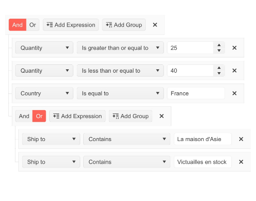
The new Blazor Filter component allows users to build filter expressions using a point-and-click approach. The filtering rules can contain multiple logical operators and expressions/expression groups which can be applied to any data-bound component such as Grid, ListView and TreeList. Like the rest of Telerik Blazor UI components, the Filter comes with built-in accessibility, keyboard navigation, localization and professionally styled themes.
Try out and run the new Filter UI component in browser with Blazor REPL.
Floating Label Component
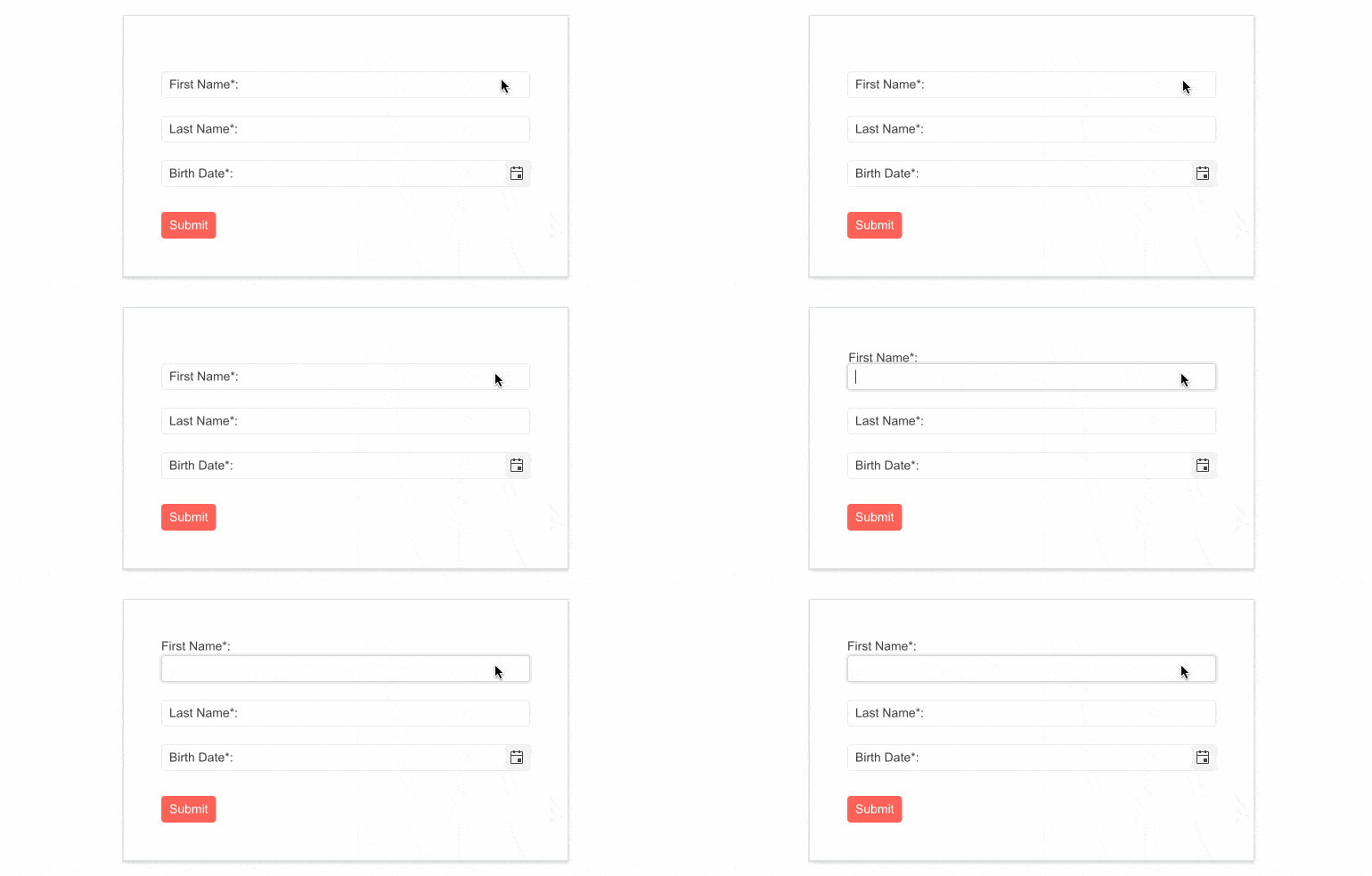
The Telerik Blazor Floating Label component will let you take advantage of floating labels in focusable Telerik input components. The component behaves similarly to the HTML <label> element and adds features on top such as animation, association with non-form elements, and combination with the input’s placeholder. The list of focusable input Telerik components where you can provide floating label functionality includes NumericTextBox, TextBox, TextArea, DateTime Inputs & Pickers, DropDownList, ComboBox, AutoComplete, MultiSelect and MaskedTextBox.
Try out and run the new FloatingLabel UI component in the browser with Blazor REPL.
Gantt Component Enhancements
In the current 3.1.0 release of Telerik UI for Blazor, we incorporated customer feedback and dedicated efforts to expanding and improving the Blazor Gantt component.
EditorType Parameter
The Blazor Gantt UI component now exposes an EditorType parameter that provides a simple way to change the task default field editors. You have the flexibility to choose between DatePicker or DateTimePicker for the DateTime type, and TextBox or TextArea for the string fields.
Custom Content with Templates
The templating options in the Blazor Gantt grew, and the component now allows you to render custom content and formatting within the TreeList and Timeline parts. You can add images or custom styling to each of the project tasks, render specific content in the column headers, or define custom editors via templates. Additionally, you can take advantage of custom content in the tasks visualized in the Gantt timeline and their tooltip.
See how to render custom content with Blazor Gantt templates.
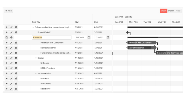
Gantt Editing Modes
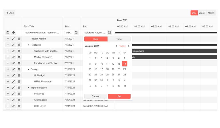
Gantt editing is another functionality that we expanded with this release. In addition to the InCell and Popup editing in the timeline, users can now edit tasks using the following methods:
- Popup Editing – clicking a command button opens a popup with options to edit the starting task details
- InLine Editing – an entire Gantt row is set to edit mode via a command button
See a demo of Blazor Gantt inline and popup editing options.
Gantt Events
We exposed three events in the Gantt component, so you can take advantage of and implement custom logic for its tasks:
- OnEdit – raised when a Gantt item is about to be edited (includes double-clicking on a task in the timeline or edit-event equivalent in the tree list part)
- OnExpand & OnCollapse – raised when a task is expanded/collapsed
Customize Date Format of Timeline Headers
For each of the Blazor Gantt views (Day, Week, Month and Year) you can now customize the date format of major and minor slot headers in the timeline part of the component.
Zoom to Fit
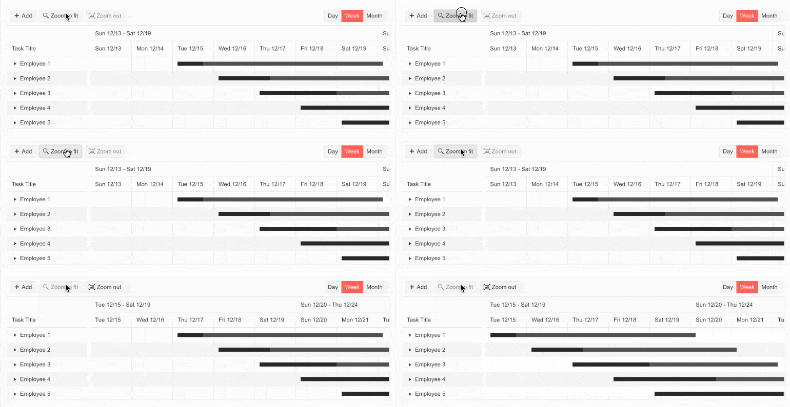
The Gantt date range visualization in the timeline can be tricky. That’s why we shipped a new feature that lets you have greater control over the date range alignment. For each of the views provided by the Gantt, you have the flexibility to pick the option for start/end ranges how alignment should work—aligned with the major or minor date slots. For example, if you need to make the Gantt Month view to be calculated based on the start of a week (instead of the default start of the month), you can use the RangeSnapTo parameter to MinorSlot.
See an example of the Blazor Gantt zoom to fit feature.
Custom Popup Editing Window
The Blazor Gantt component exposes multiple settings for its popup editor. You can set the (max) width, (max) height, CSS class and orientation of the window and customize the built-in editing look of tasks.
Grid Component Enhancements
The Data Grid focus in the current release was about customization. We shipped multiple features related to customizing default filters, editors, popup editing window, and a new Rebind method.
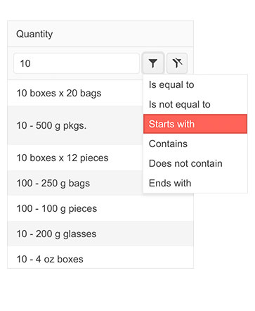
Custom Default Filter
In addition to using a filter template, you have at hand a couple of parameters that let you customize the built-in filtering in the Blazor Data Grid component. You can set the default filter operator and control whether the filter dropdown and clear buttons are visible. The configuration of the ShowFilterCellButtons and DefaultFilterOperator parameters is done within the GridColum tag.
Custom Filter Editor
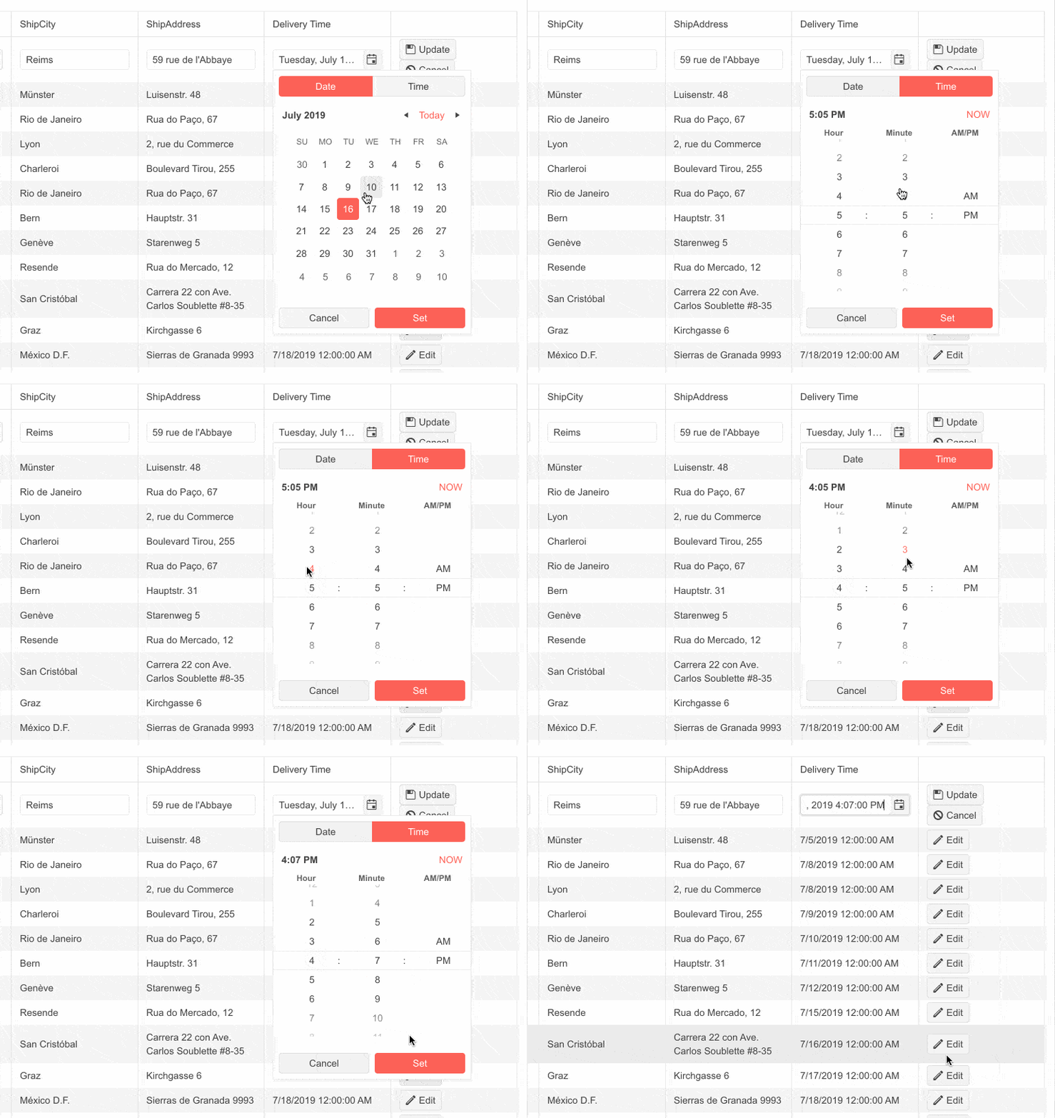
You can customize the filter editor rendered within the FilterRow, FilterMenu and ColumnMenu within the Blazor Data Grid component. Using the FilterEditorType parameter within the GridColumn tag, you can easily set it and render Time/DateTime picker rather than the default Date picker.
See an example of the custom filter editor in the Blazor Data Grid.
Custom Editors via EditorType Parameter
The Blazor Data Grid component exposes an EditorType parameter which provides a simple way to change the default field editors without using templates. To do so, simply provide your preferred editor in the GridColumn tag. You have the flexibility to choose between DatePicker or DateTimePicker for the DateTime type, TextBox or TextArea for the string fields, and Checkbox or Switch for the Booleans.
See how to customize your editors in Blazor Data Grid.
Custom Popup Editing Window
The Blazor Data Grid component exposes multiple settings for its popup editor. You can set the (max) width, (max) height and CSS class. In addition, we provided a GridPopupEditFormSettings tag that allows you to configure the orientation of the form (either horizontal or vertical), the columns and column spacing layout parameters of the form, and the horizontal alignment of the Buttons in the form through ButtonsLayout.
See an example of custom popup editing in Blazor Data Grid.
Rebind Method
You can refresh the Grid data by using the Rebind method—with just one call you can invoke the processing of data and refreshed rendering. If you have manually defined the OnRead event, then the business logic defined in its event handler will be executed.
Check out an example of how the Rebind method works in the context of the Blazor Grid component.
TreeList Component Enhancements
TreeList Events
The Blazor TreeList component exposes multiple events that let you handle programmatic logic. These include data management events like OnCreate, OnUpdate and OnDelete; visibility events like OnExpand and OnCollapse; action events like OnRowClick, OnRowDoubleClick, OnRowContextMenu; and more.
The full list and details about the condition under which they are triggered are available in the Blazor TreeList documentation.
Custom Editing and Editors
Ensuring feature parity between the Blazor DataGrid and TreeList, we shipped the same set of editors and editing customizations. These include EditorType; FilterEditorType, DefaultFilterOperator and ShowFilterCellButtons parameters in the TreeList; and custom popup editing window via the TreeListPopupEditSettings tag.
Scheduler Component Enhancements
Custom Popup Editing Window
The Blazor Scheduler component now exposes multiple settings for its popup editor in the dedicated SchedulerPopupEditSettings tag. You can set the (max) width, (max) height and CSS class. In addition, we provided a SchedulerPopupEditFormSettings tag that allows you to configure the orientation of the form (either horizontal or vertical), the columns, and column spacing layout parameters of the form, and the horizontal alignment of the Buttons in the form through ButtonsLayout.
Form Component Enhancements
The Blazor Form UI component also now exposes an EditorType parameter that provides a simple way to change the default field editors. You have the flexibility to choose between DatePicker or DateTimePicker for the DateTime type, TextBox or TextArea for the string fields, and Checkbox or Switch for the Booleans.
See how to override the default field editors in the Blazor Form component.
.jpg?sfvrsn=807d9fe2_0)
Editor Component Enhancements
Allow Video Nested Source Tags
In the 3.0.0 release, we shipped a feature related to inserting media tags in the Blazor Editor component, and, listening to your feedback, we quickly added the option for using nested source tags.
Chart & StockChart Enhancements
Plot Area Customization
The Blazor Chart & StockChart components now allow further customization of the plot area borders, margin and padding. You can set the border color by passing a valid CSS color string, including HEX and RGB, set the position to top, right or left, and more.
Series Gradient
Both the Chart & StockChart components bring new gradient settings for the chart series.
Telerik REPL for Blazor
In this release, we were focused on making the Blazor REPL code runner faster and more performant. The REPL tool got a significant performance boost in two categories.
Initial Load Performance
We were able to decrease the payload size by more than 60%, leveraging the better compression and optimal usage of the linker. These improvements result in around 40% faster initial load of the app.
Running Blazor Code Snippets
Telerik REPL for Blazor now saves the precompiled result of the snippets that are generated in the tool. This results in a zero-compilation time when running these new snippet URLs in the tool.
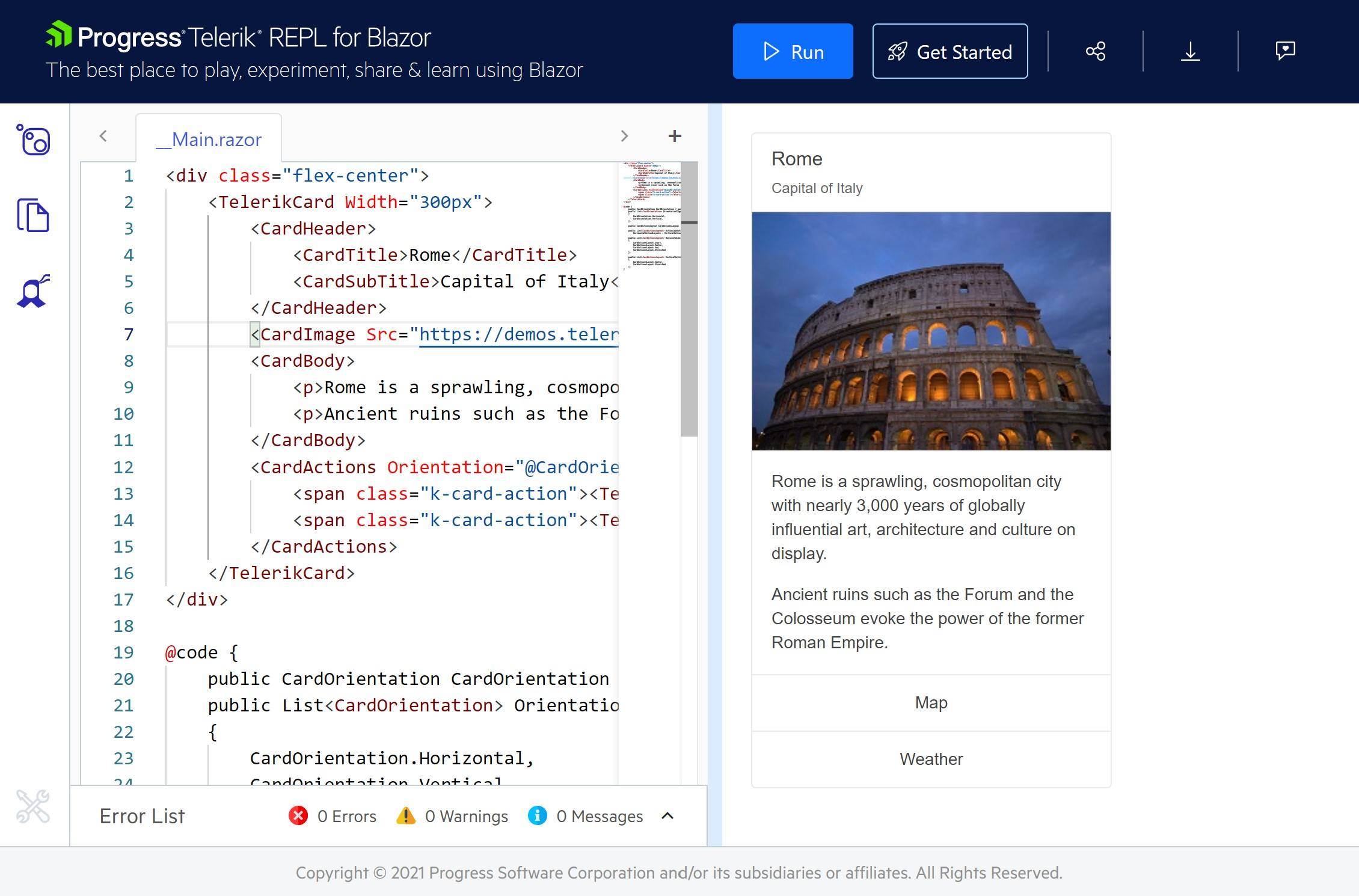
Try out the improvements in the Blazor REPL code runner and share your feedback with us on how to make it better and more useful to you.
Signed NuGet Packages
While we have been providing signed product DLL files for quite some time, we wanted to take security to the next level and thus introduced signed NuGet packages, starting with version 3.0.0 of Telerik UI for Blazor. This will give you the possibility to verify the signed publisher (using dotnet nuget verify) and ensure that the package was not replaced through the network while being downloaded.
Telerik UI for ASP.NET Core & Telerik UI for ASP.NET MVC
ASP.NET Core Code Snippets in Visual Studio Code
With the growing interest and usage of Visual Studio Code, we introduced the Telerik Visual Studio Code Extension for ASP.NET Core about a year ago and we continuously add new features and templates to it with the goal of helping ASP.NET Core developers set up and build apps faster.
With the current March update, we are happy to introduce a new productivity feature in the extension—code snippets for fast UI component reference and configuration. You can now take advantage of the dozens of code snippets that can be easily invoked in the IDE by typing shortcut “tc” (short for Telerik ASP.NET Core) or directly the name of the component you need to plug. For example, typing “grid” or just “gr” will conveniently show a dropdown with the available snippet templates you can insert in code. Then, using a tab sequence, you can fill out component properties, options, model and controller actions.
With the first release, we shipped code snippets for the majority of Telerik UI for ASP.NET Core components—the Data Grid, Autocomplete, Date and Time Pickers, Form, Textbox, Upload, Window and more. The good news is that the snippets are available for both flavors of the UI components for ASP.NET Core HTML and TAG Helpers. Our goal is to continue this effort and, with the next couple of product releases, to deliver 100% coverage for the snippets.
Try out Telerik Visual Studio Code Extension for ASP.NET Core.
TAG Helpers Improvements
Telerik UI for ASP.NET Core offers two flavors for initializing and configuring the components—HTML and TAG Helpers. In 2021 we received a lot of feedback regarding the need for more TAG Helper demos and documentation, and we took it to heart. Starting in January and continuing through 2022 we are going to add more taghelper code examples and documentation, so that you can easily reference them in your work.
With the current release, you can now easily switch the component demos between HTML and TAG Helper View. Please note that there is still some work involved to ensure complete parity between the two, but the majority of the most-used components are already covered.
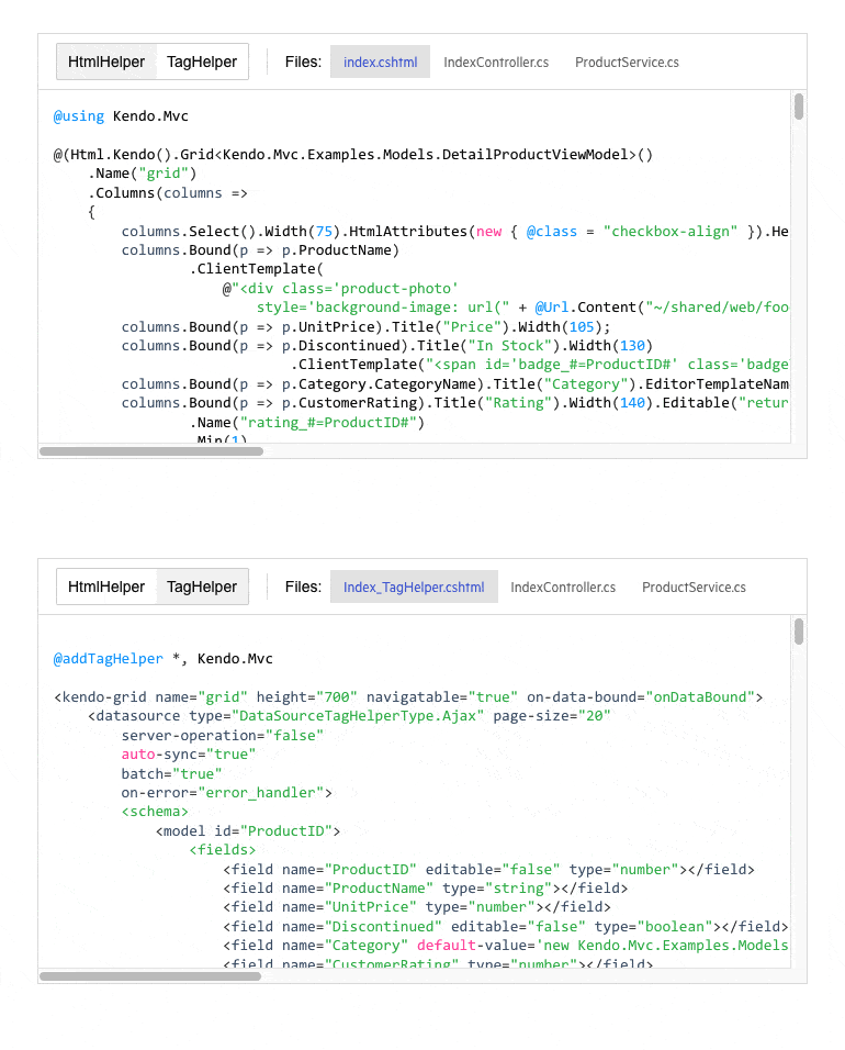
Another improvement that is underway is unifying the documentation for HTML and TAG helpers, so that it is easier for you to browse, search and copy the respective code. We aim to deliver the same journey across demos and documentation to let you easily switch between HTML/TAG helper code examples.
Compatibility With .NET 7 Preview 1
Telerik UI for ASP.NET Core components are compatible with .NET 7 Preview 1, so anyone eager to experiment with the latest and greatest from .NET can plug in and work with the UI components seamlessly.
Updated VPAT Document
We have updated our existing Voluntary Product Accessibility Template (VPAT) for Telerik UI for ASP.NET Core and UI for ASP.NET MVC to follow the latest version of this document and have updated it according to the latest accessibility improvements that have been made to our UI components.
Multiple Improvements in Existing UI Components
The Telerik teams have worked toward addressing features and improvements for existing UI components within our ASP.NET Core and MVC libraries. To see the full list of covered items, I recommend heading over to the UI for ASP.NET Core and UI for ASP.NET MVC release notes to see the details of everything that has been added with this update.
Telerik UI for ASP.NET AJAX
Telerik UI for ASP.NET AJAX brings nearly 40 improvements across the library, and a majority of them are based on your feedback. One of the new features worth mentioning originates from the UI for ASP.NET AJAX Feedback Portal and provides a visual indicator for unsorted columns in the RadGrid column header.
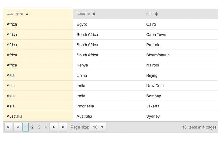
As the full list is too long to cover in this blog post, you can refer to the full release content in the product release history.
Telerik UI for .NET MAUI
The latest Telerik UI for .NET MAUI release, 0.5.0, is here! It comes with Preview 13 support, a new Visual Studio for Windows extension and project template, handler implementation for our RadButton and improvements in the DataGrid control.
Support for .NET MAUI Preview 13
As always, we make sure that all our existing controls are compatible with the latest preview from Microsoft. As .NET MAUI is smoothly sailing toward a GA this spring, the previews are focusing more on stability. However, Preview 13 comes with many new capabilities like Label.FormattedText, many enhancements related to RadioButton and SwipeView, and more!
You can check the Microsoft release blog post for more information on what’s new in the 13th preview of .NET Multi-platform App UI.
New Visual Studio Extension
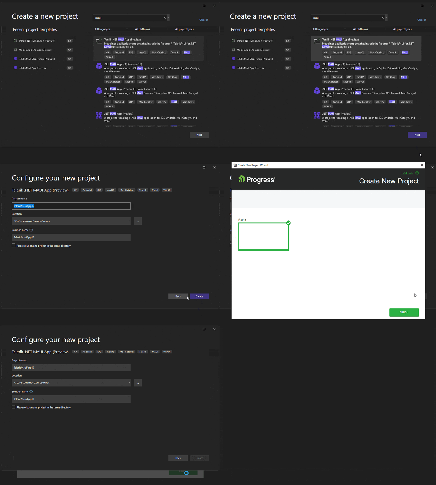
I am happy to share that we released new Visual Studio Extension for Telerik UI for .NET MAUI. It is an integration package that will significantly increase your productivity when creating .NET MAUI projects in Visual Studio for Windows.
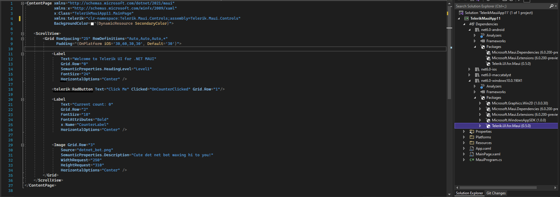
If you create new .NET MAUI applications using the new Visual Studio Extension, everything will be configured automatically for you.
As you can see, the Telerik NuGet package is added automatically for you. Moreover, it wires up the UseTelerik() extension method into MauiProgram.cs file.
To get started with the Visual Studio Extensions for Telerik UI for .NET MAUI, check out our product documentation.
New to Telerik UI for .NET MAUI? Try It & Share Your Feedback
If you are new to Telerik UI for .NET MAUI, you can learn more about it via the product page. The Telerik UI for .NET MAUI controls are currently in preview and they are free to experiment with, so don’t wait—jump on the cross-platform development bandwagon!
Kendo UI for Angular
New Angular GridLayout Component
The first new component added to Kendo UI for Angular is the new GridLayout component. The Angular GridLayout allows developers to implement a CSS grid layout without having to write any additional CSS. The component provides a declarative way for Angular developers to define columns and rows within their application’s layout. This will provide a very effective way to create a structured layout for your entire Angular app, or just a single page.
See the Angular GridLayout demo.
New Angular StackLayout Component
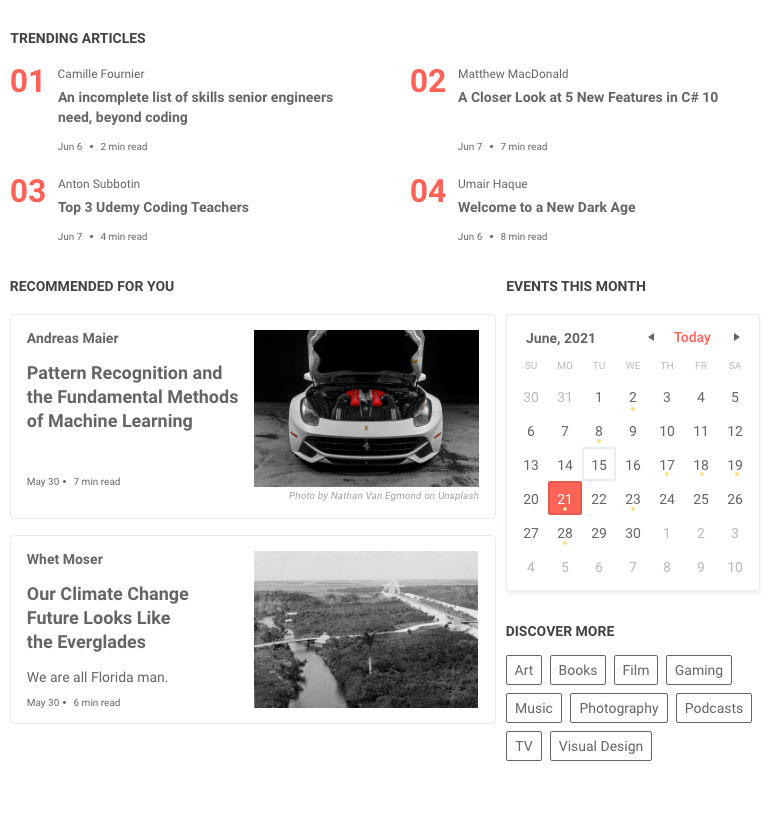
The first new component added to Kendo UI for Angular is the new GridLayout component. The Angular GridLayout allows developers to implement a CSS grid layout without having to write any additional CSS. The component provides a declarative way for Angular developers to define columns and rows within their application’s layout. This will provide a very effective way to create a structured layout for your entire Angular app, or just a single page.
See the Angular StackLayout demo.

Grid: External Filtering Example
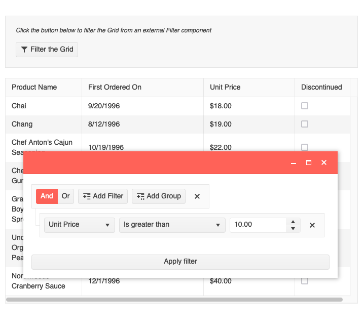
Expanding on our ever-growing list of features and documentation articles for the Kendo UI for Angular Data Grid, with this update we have added a new example showcasing how to create an external filter user experience which then filters the data within a data table. The example will show how to take elements outside of the Angular Data Grid and structure a filter expression to be used for filtering purposes. This particular example uses the Kendo UI for Angular Filter component, but the logic can be reused for custom filtering UX requirements as well.
See the Angular Grid External Filtering example.
Grid: Loading Template
The Kendo UI for Angular Data Grid already has a built-in loading indicator to give users a visual element representing that data is loading. This update builds upon the already great loading indicator and allows developers to provide their own custom component to be displayed when data is loading. This is exposed through a standard `ng-template`, which gives Angular developers an intuitive way to provide their own loading indicator components.
See the Angular Grid Loading Template demo.
Grid: No Records Template
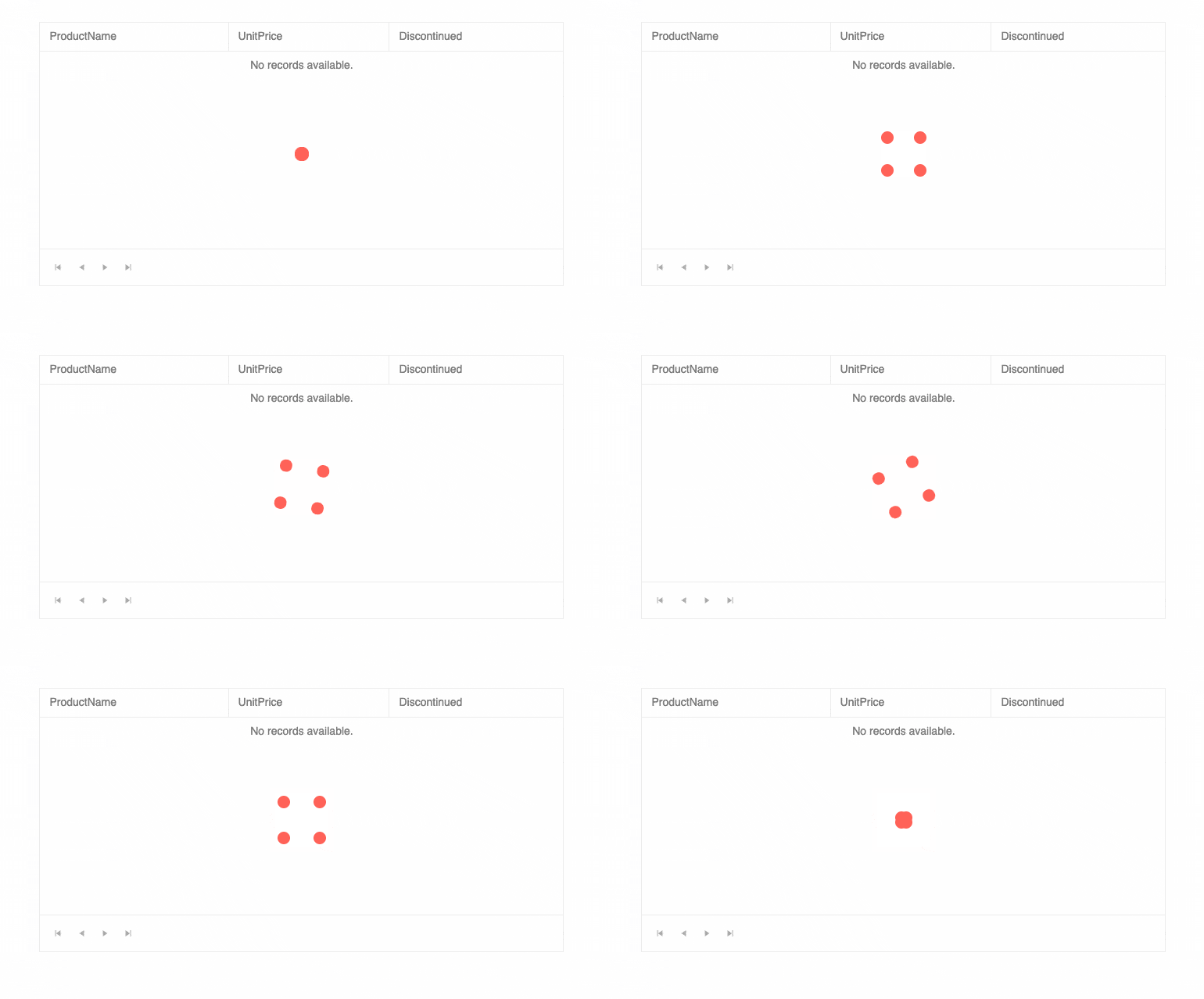
Speaking of templates within the Kendo UI for Angular Grid, with this update the team was also able to offer support for using a `ng-template` to customize the look and feel of the “No Records” message. This message appears when there is currently no data bound to the Angular Data Grid.
The underlying feature has been available for a little while now, but this update provides more documentation and resources to help developers use this part of the Kendo UI for Angular Grid.
See the Angular Grid No Records Template demo.

Grid: Sort Multiple Columns using Modifier Key + Click
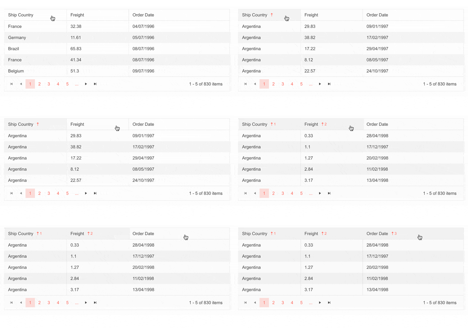
With this update the Kendo UI for Angular Data Grid has also added a new quality-of-life improvement around sorting multiple columns. When this new feature is enabled, sorting across multiple columns can only be achieved by holding a modifier key like CTRL, CMD, ALT or Shift, and clicking on the column header.
Clicking on a column without a modifier pressed will unsort any previously sorted columns and just sort on the single column that was just interacted with. Previously, the only way to remove sorting from a column would be to click on a header enough times to remove the sort order.
Which modifier key that should be used here can be set through a single configuration option, so setup is a breeze.
See Angular Grid Multi-Sort Columns demo.
Grid: Updated Performance Article
Performance is the name of the game when it comes to data tables, and the Kendo UI for Angular Data Grid certainly is one of the fastest data grids available for Angular developers. To showcase this, we have updated our performance documentation article to highlight a sample project that users can download locally and see the performance of the Kendo UI for Angular Data Grid with large sets of data, which includes thousands of rows and columns. I highly recommend taking the source code of this project and running it locally for any benchmarking purposes.
See the Angular Data Grid Performance article.
Editor: Caret Color Corresponds to Font Color
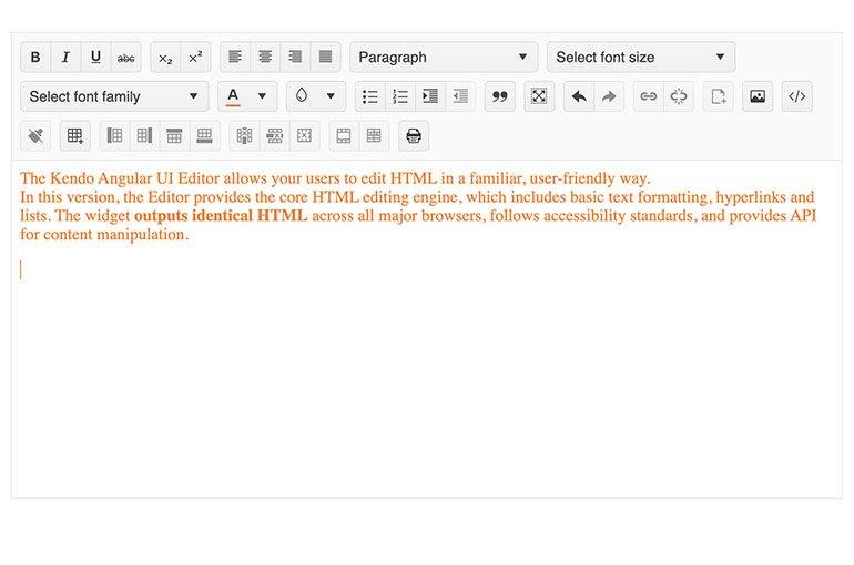
The Angular Editor component also received some love with this update. Specifically, the Editor will now automatically update the color of the caret depending on the color of text. To see this in action, update the color of text to something different than the default and click inside of the text—you’ll see the caret adapt to the color of the text.
See the Angular Editor Tools demo.
Kendo UI for Vue
New Native Scheduler Component
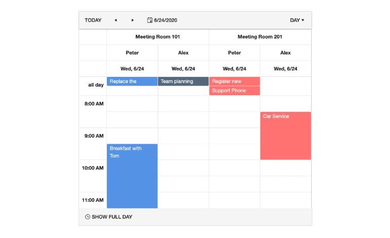
Over the last few weeks, the Kendo UI for Vue team has been busy with implementing the native Vue Scheduler component. This powerful UI component brings the user experience of Google Calendar or the calendar tab in Outlook to any Vue application—potentially with a single line of code. Developers can, of course, data bind to the Vue Scheduler component to show existing events, and users can easily create new events, update existing ones or remove them from the Scheduler interface.
For this initial version of the Scheduler, we have targeted a smaller set of features compared to other Kendo UI Scheduler components, but we will rapidly be adding more features over the upcoming weeks.
See the native Vue Scheduler component.
All Vue Components: Source Code Now Available
While the Kendo UI for Vue team has been hard at work delivering huge sets of native UI components for Vue with every release over the past year or so, there has been one aspect missing from the library: Source code available on demand. However, with this update this is no longer the case, as every license of Kendo UI for Vue will now also ship with the source code.
Currently this source code is available for folks to learn how we build the Kendo UI for Vue components. Over the next few weeks, we will also work on releasing packages that will help anyone build the Kendo UI for Vue components on their own machines.
Vue Grid: OData CRUD Examples
Over the last couple of weeks, the Kendo UI for Vue Data Grid has added more documentation around data binding to OData endpoints. These examples dive into not just the initial data binding (reading)—they cover the rest of the CRUD operations including Create, Update and Delete.
For more information, see the Vue Grid OData CRUD examples here.
KendoReact
Grid: Updated Drag and Drop
With R1 2022, KendoReact introduced a new and improved set of tools around adding drag-and-drop capabilities to any React application or UI component. Since then, the team has been hard at work using this new drag-and-drop functionality to provide new and improved ways to rearrange rows within the KendoReact Data Grid. This opens up additional scenarios for dragging and dropping that we can enable within the React Data Grid, so keep an eye out for more drag and drop examples to come!
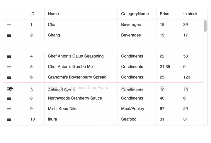
There are other behind-the-scenes improvements that come from this update, but the two scenarios above are the two most popular uses of drag and drop within the React Data Grid.
See the React Data Grid drag and drop demo.
Various Components: 27+ Improvements Added Based on Customer Feedback
A big aspect of what the KendoReact team is working on over the next couple of months is addressing features and improvements for existing React UI components within our library. As a part of this effort, over the last six weeks the team has been able to address over 27 improvements and features in existing components. There are too many to list in this blog post, so I recommend heading over to the KendoReact changelog to see the details of everything that has been added with this update.
All Components: Updated Getting Started Pages
Over the last couple of weeks, the KendoReact team has also been busy with reviewing and updating all of the Getting Started articles that we offer for individual components and packages. As a part of this effort, we have been able to make our Getting Started pages easier to follow to help any dev get up and running more quickly.
See the KendoReact Data Grid demo for an example.
Kendo UI for jQuery
New jQuery ColorGradient Component
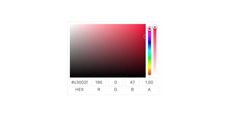
With this update, we are happy to showcase the Kendo UI for jQuery ColorGradient component. This new component gives users a way to select a color using an intuitive user experience that uses a visual gradient. Previously, this feature was only available as a part of the ColorPicker component, but with this update the gradient-specific user experience has been extracted to a standalone component.
See the jQuery ColorGradient demo.
New jQuery CircularProgressBar Component
The new Kendo UI for jQuery CircularProgressBar gives developers another way to show progress for a particular process. The name gives it away, but the unique user experience of this component is that the progress is showcased as a circle, with one color representing the current progress and another representing the remaining progress to be finished.
See the jQuery CircularProgressBar demo.
ColorPickers: Organizing Various Kendo UI ColorPickers
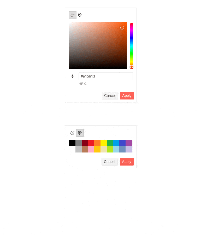
As a few of you may have noticed, there are a lot of different ways to offer color selection to your users when you work with Kendo UI for jQuery. While this is powerful, it can be a little bit confusing or even daunting to know when to use what type of ColorPicker. To make this a little easier, we have taken steps to separate the different ColorPicker components within our docs and demos to show how components like the ColorPicker, FlatColorPicker and the new ColorGradient component provide different user experiences and help you decide which component should be used and when.
See Kendo UI for jQuery demos for more information.
Updated VPAT Document
A Voluntary Product Accessibility Template (VPAT) is a document format recommended by the Section 508 standards that helps organizations self-audit and later report on their compliance when it comes to accessibility standards set within Section 508. Over the last few weeks, we have updated our existing VPAT for Kendo UI for jQuery to follow the latest version of this document and have updated it according to the latest accessibility improvements that have been made to our UI components.

Maria Ivanova
Maria Ivanova is a Manager of Product Management at Progress, for Telerik and Kendo UI components and developer tooling. She joined the company in 2019 as a Product Manager for Telerik UI web components and is passionate about developing impactful and innovative software products. Maria believes that to create great products, it's important to challenge the status quo, closely collaborate with customers, and embrace a spirit of experimentation.

.jpg?sfvrsn=a93c3c4f_0)
.jpg?sfvrsn=26cdac73_0)
