Telerik & Kendo UI December 2021 Update

Summarize with AI:
Check out what’s new this month in our Kendo UI and Telerik UI products.
If you’ve been paying attention since our R3 2021 update, we have had big news in October and November. Today, we’ll share even more goodies with you for our December update!
Table of Contents
- Telerik UI for Blazor
- Telerik UI for ASP.NET Core & Telerik UI for ASP.NET MVC
- Kendo UI for Angular
- Kendo UI for Vue
- KendoReact
- Kendo UI for jQuery
Telerik UI for Blazor
New Dialog UI Component
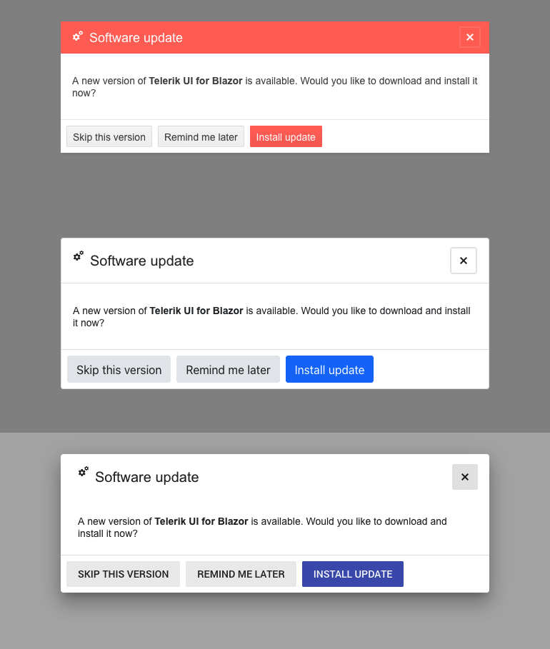
In addition to the existing predefined dialog options, we added a standalone Telerik Blazor Dialog UI component so you have an out-of-the-box solution for building both simple and complex UI popups.
The Dialog comes handy for displaying information to the user and provides multiple options for customization such as width, height, title, visibility, content and action button templates, close on overlay click and more.
Data Grid & TreeList Component Enhancements
Grid Export to Excel Customization Options
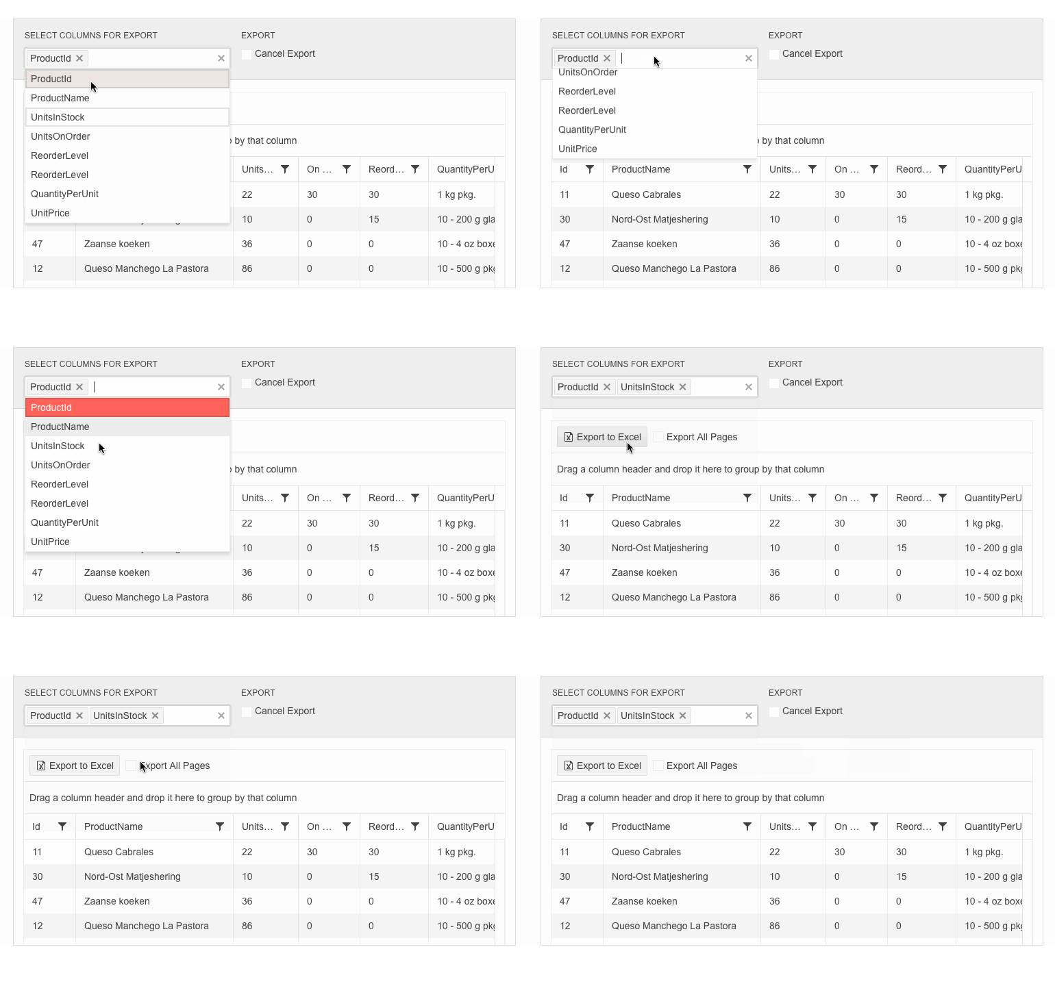
In the current release, we included a set of Excel export customization options for the Grid component. You can now define which data items or columns to be included in the exported file (via the OnBeforeExcelExport event), control the exported columns’ width, have seamless support for exporting enum values, and trigger Excel and CSV export programmatically (via the newly exposed methods in the API).
Data Grid & TreeList SearchBox Enhancements
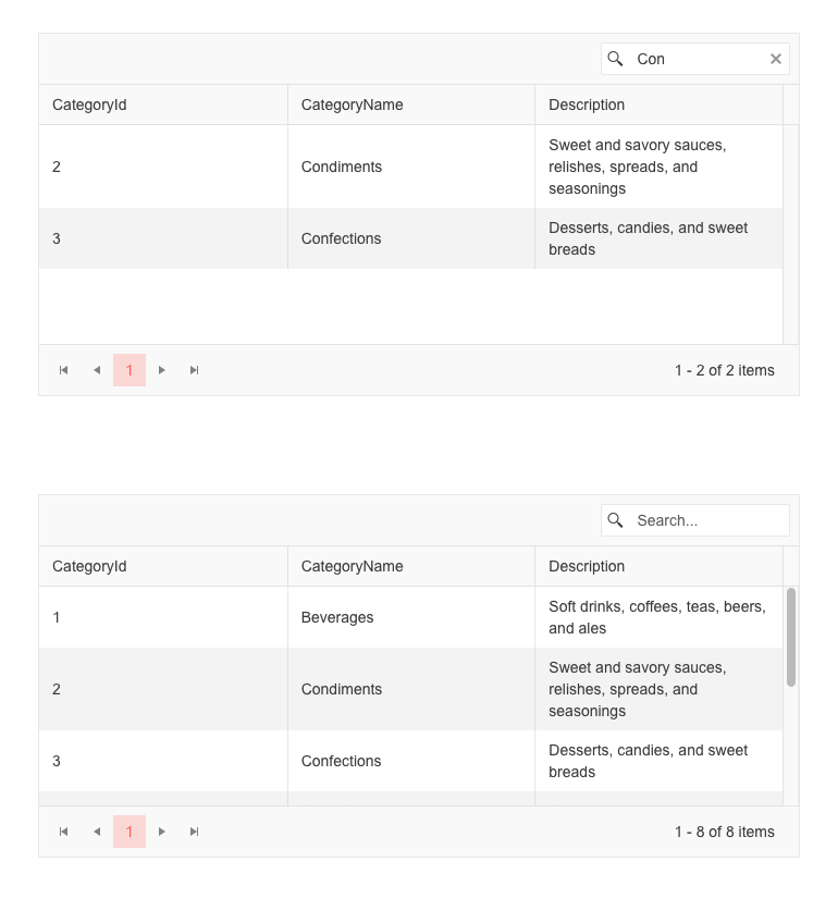
The data grid search box input and filter criteria can now be easily cleared up by using the X-icon in the box, Esc key or programmatically.
Data Grid & TreeList Enhanced Editing
We improved the UX of editing large Blazor data grids (including the ones with a high number of columns and rows and those with horizontal or vertical virtualization). Now, regardless of the position of an edited cell or where users are navigating to, the data grid ensures the particular cells are visible, on focus and selected so that they can work with them seamlessly.
The editing enhancement is also available for the TreeList component and can be viewed in the dedicated demos.
Data Grid & TreeList Enhanced Validation
In both the Telerik Blazor Grid and TreeList components, we added two features: disabling the built-in validation and exposing the option to developers to build a custom one (different than the default DataAnnotationValidator).
The two features are available with the GridValidationSettings/GridCustomValidatorTemplate tag for the Grid component, and with TreeListValidationSettings/TreeListCustomValidatorTemplate for the TreeList.
TabStrip UI Component Enhancements
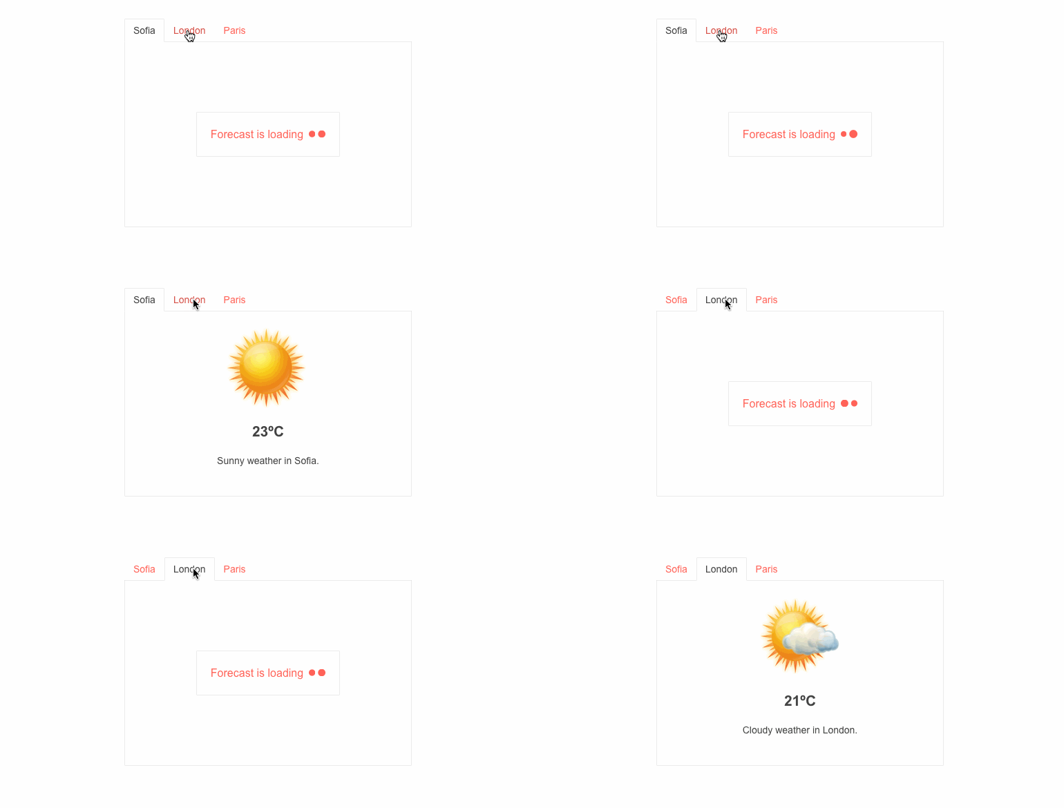
Another heavily used component in Blazor apps received a boost of features in the 2.30.0 release—the TabStrip! We exposed two new parameters: PersistTabContent, which determines whether the content of tabs is persisted when changing tabs, and Visible, which allows you to easily control the visibility of each of the tabs.
Validation Mode in Input Components
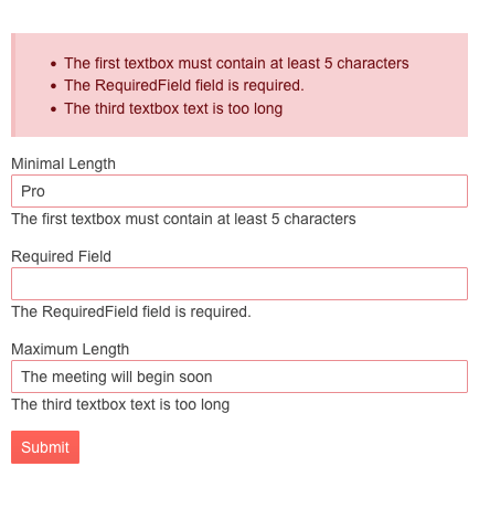
To make validation smooth and convenient for any use case, we introduced a new enum parameter ValidateOn in all Telerik Blazor input components, such as Date & Time Pickers, TextBox, Numeric TextBox, MaskedTextBox and TextArea. The ValidateOn parameter allows you to configure whether to trigger validation on change, blur or while typing, so with these out-of-the-box options, you can pick and set the best option for each scenario.
New Features in Charts
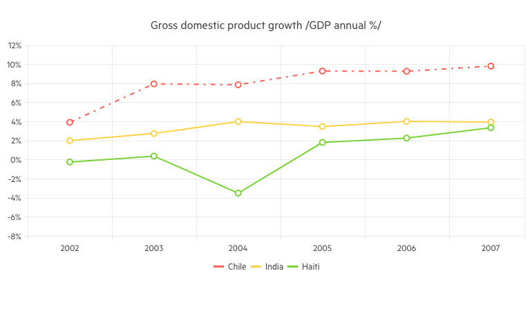
We exposed several chart properties requested via the dedicated Feedback Portal, which will allow you to easily customize the data visualization graphics. The new features for the Line Chart and Stock Chart components include configuration of the area background color and opacity, line width and dash type.
Telerik UI for ASP.NET Core & Telerik UI for ASP.NET MVC
Following November, which was all about the official support for .NET 6 and Visual Studio 2022, this month the Telerik .NET web family of products brings another set of new components, features and VS Code updates.
New PivotGrid Component
Last month, we announced the release of the new and improved PivotGrid UI component in our Kendo jQuery offering, and this month we are happy to share that it is available in our Telerik UI for ASP.NET Core & MVC libraries! While at the time of its initial release the PivotGridv2 may have fewer features and less functionality than the original PivotGrid, the plans are, in the next few releases, to continue to expand its functionality until it reaches full parity with the original (and even exceed it).
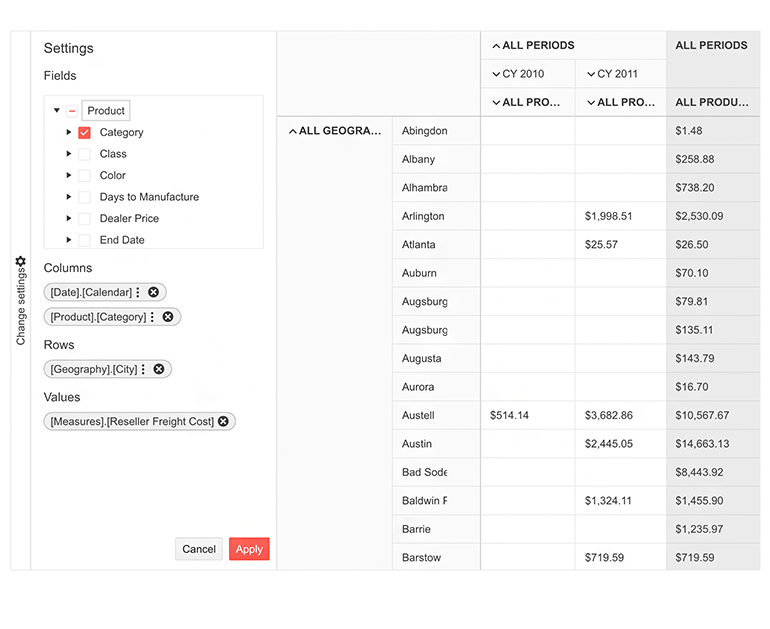
You can immediately take advantage of the new PivotGridv2, which was built from the ground up and has an updated design to ensure the performance and user experience are as good as they can be. If you are already using the existing PivotGrid, have no fear—nothing will change with this update. We will continue to keep both components existing side by side until we see evidence that most users have migrated to the new component.
Try out the new PivotGrid component and take a spin at the demos showing how to sort, filter, render custom content using templates, and export to PDF.
See the New Pivot Grid component demos for UI for ASP.NET Core or UI for ASP.NET MVC.
Data Grid UI Component Enhancements
As with almost every release, in the December update of Telerik UI we gave a little love to the Grid. You as a developer and your applications’ end users can enjoy the following new features:
Grid Multi-Column Sorting via CTRL + Click
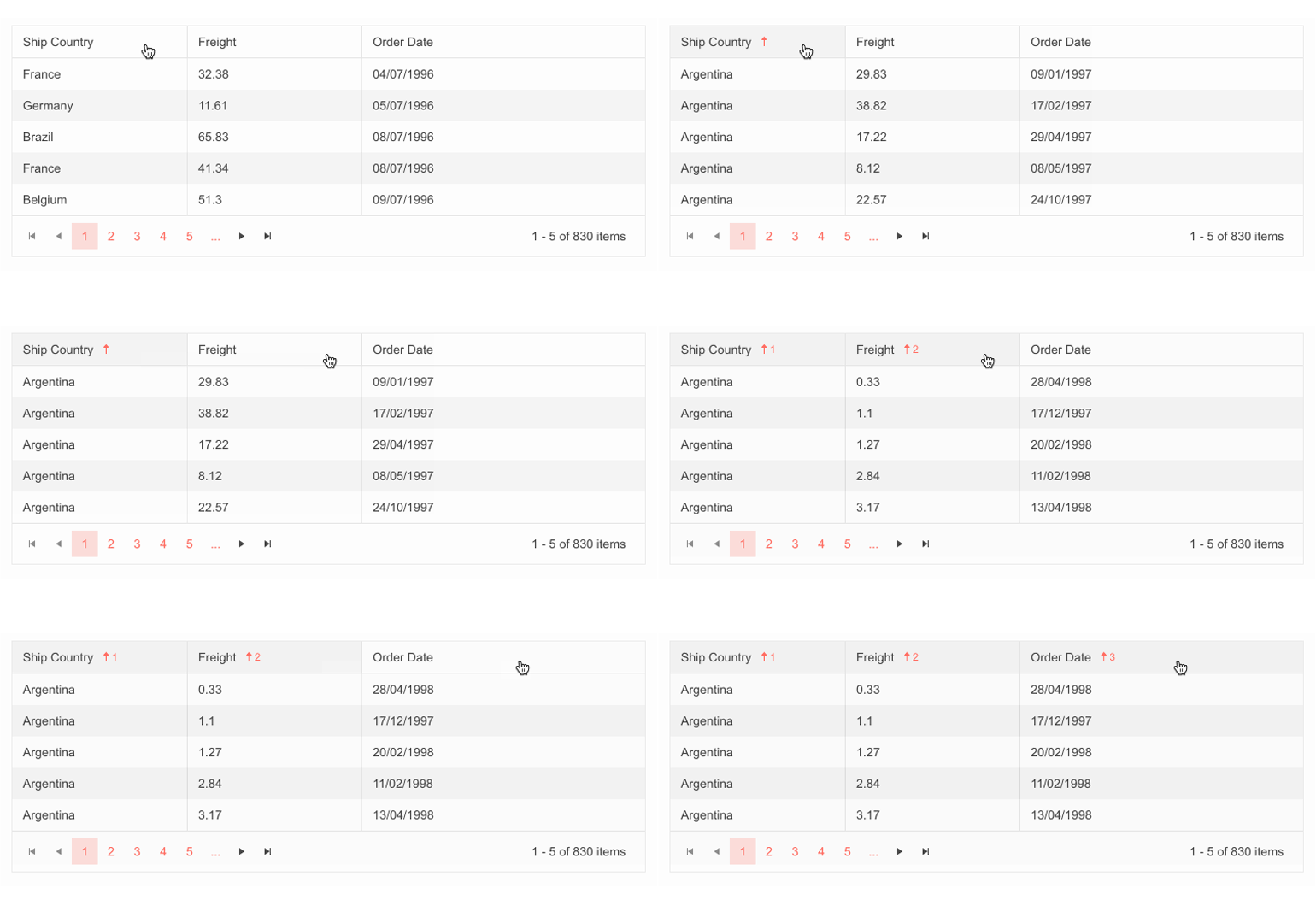
In this release, we expanded the sorting options for the Grid and added more ways to interact with it. End users can now perform sorting over multiple columns when pressing the CTRL button. When clicking on a column header without the CTRL button pressed, the Grid will revert to sorting by a single column.
For an in-depth look at the enhanced sorting, head on over to the Grid demo for ASP.NET Core and ASP.NET MVC.
Fit All Columns Width to Content
Using the new autoFitColumns method, you can render a sleek Grid with a minimum possible width for all or selected columns so that their underlying text fits nicely without empty spaces or wrapping.
Grid Rows Drag & Drop
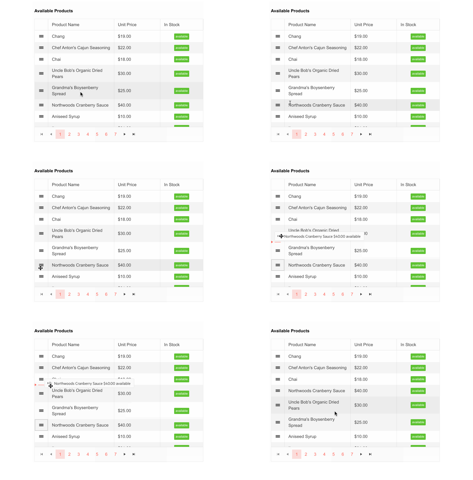
The MVC and Core data grids now provide built-in functionality that allows end users to reorder single and multiple rows by dragging and dropping them within the Grid and between two Grids.
Support for Non-String Fields in Grid’s Search Panel
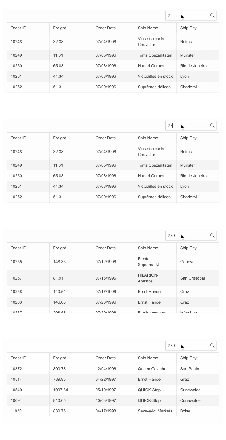
The Grid’s Search Panel now allows search and filtering for non-string column values.
Editor UI Component Enhancements
Undo & Redo Commands
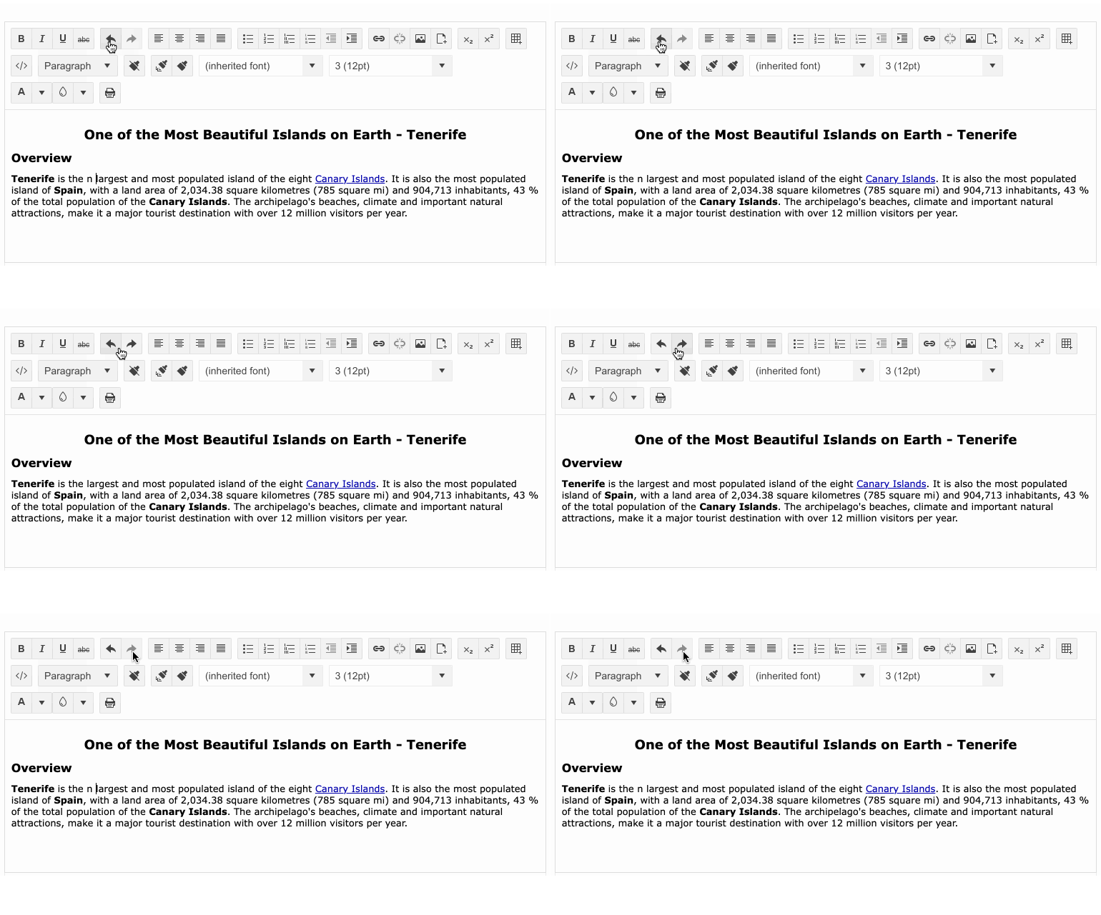
The Editor UI component for ASP.NET Core and MVC offers multiple tools for interacting with its content, such as rich-text and table formatting, and in this release we added the Undo and Redo built-in commands, further enhancing the component’s capabilities.
Visual Studio Code Extension Update
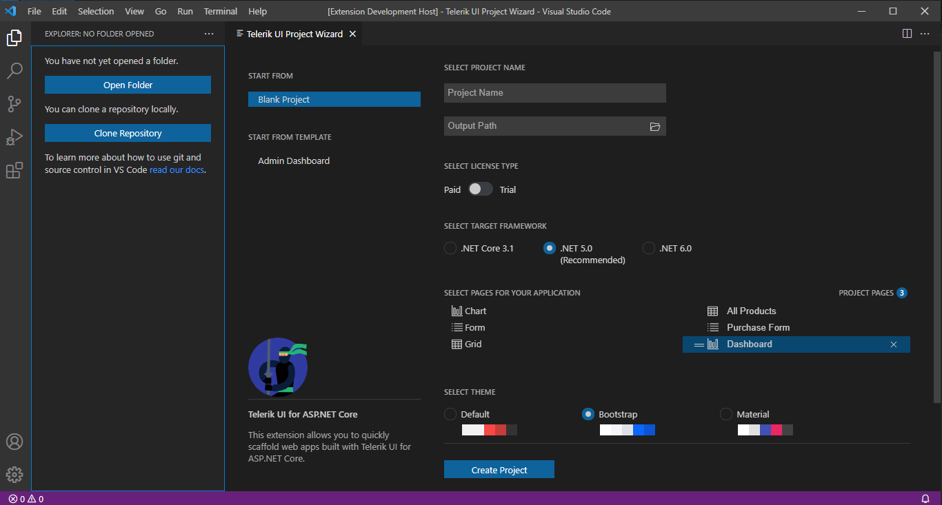
Telerik UI for ASP.NET Core brings a refreshed and improved Visual Studio Code extension! You can enjoy the updated UX, configure the .NET framework version (including .NET 6.0), and set project themes plus color swatches with a couple of clicks at project creation.
You can also jump-start a new project with predefined pages (Grid, Chart, Form and more) or the new Admin Dashboard project template with pre-built layout and functionality. Rearrange the layout as it fits your needs, and simply plug in your data and bind it to the components—including Grid, Tile Layout, Drawer, Calendar, Form, various Chart types, Card and more.
Kendo UI for Angular
New Components
Barcode Component
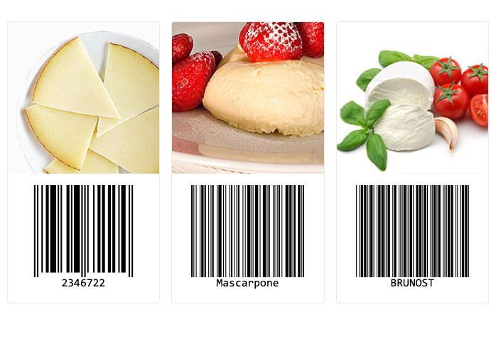
With this update, we are officially introducing the Kendo UI for Angular Barcode component. The name gives it away, but the main focus of this component is to create and render valid barcodes within your Angular applications.
The Angular Barcode comes with support for several 1D barcode types that can be defined through the available configuration options, and the barcodes can be rendered either as an SVG or Canvas element. Additionally, these Barcodes can be exported in PDF or PNG formats.
To see what you can do with the new Angular Barcode component, check out the Kendo UI for Angular Barcode documentation.
QR Code Component
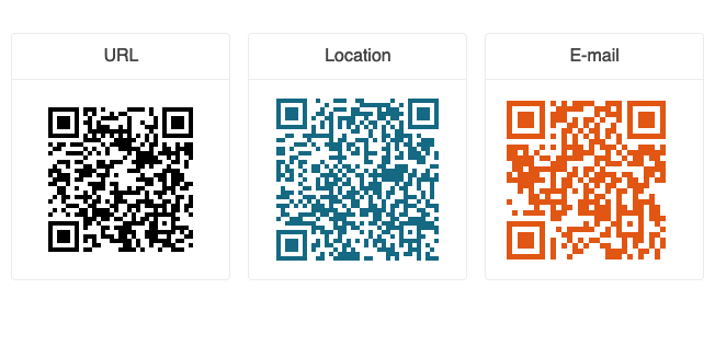
The new Kendo UI for Angular QR Code component makes adding any type of QR Code to your Angular applications a breeze. With built-in support for encoding and error correction, as well as the ability to add overlays for custom logos or QR Code types like the Swiss QR Code, this new Angular component should fit any QR code requirements you may have. These Angular QR Codes can be rendered both as SVG and Canvas elements, and can be exported to various formats like PDF or PNG.
Here’s a direct link to the Kendo UI for Angular QR Code component documentation.
Enhancements
Angular 13 Support
Angular 13 was released in the beginning of November 2021, and Kendo UI for Angular has had official support since Day Zero. If your team is looking to upgrade to the latest and greatest within the Angular framework, you can safely update your Kendo UI for Angular references.
Gantt: Editing
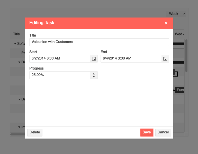
With the new editing capability, the Kendo UI for Angular Gantt continues to add high priority features that are needed in order to officially release v1 of the Gantt. With this editing feature, users can edit items directly in the TreeList part of the component using in-cell editing (individual cells are edited).
Additionally, the Gantt can be configured to use a built-in dialog to assist with editing, which can be accessed by interacting with the tasks rendered on the right-hand side of the component.
For more information, here’s a link to the Kendo UI for Angular Gantt Editing documentation section.
Gantt: Selection
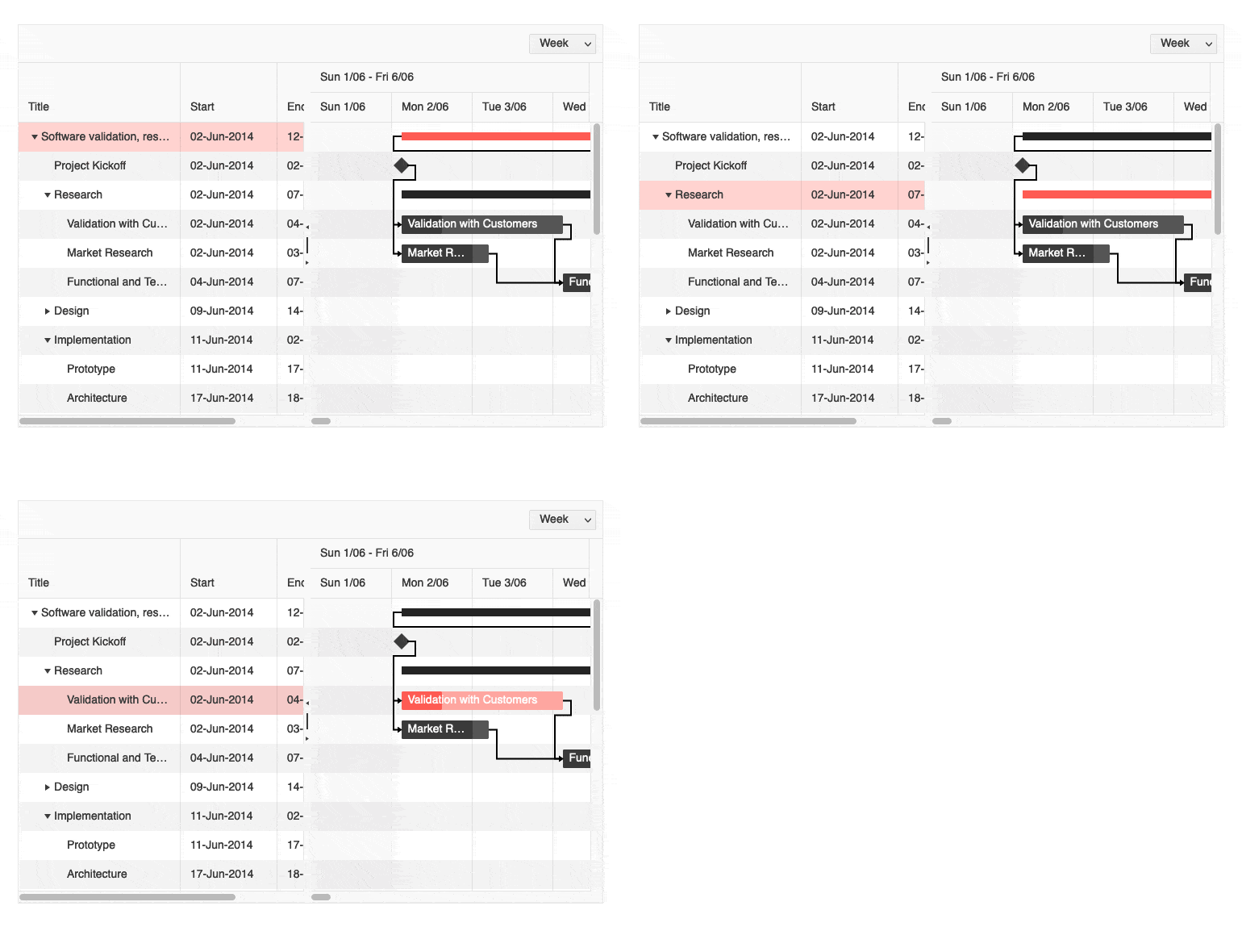
The Angular Gantt component also received the selection feature with this release. Selection works by interacting with the data structure on the left-hand side of the Gantt by selecting single rows or by clicking tasks on the right-hand side.
Here’s a quick link to the Kendo UI for Angular Gantt Selection docs and demos.
Editor: Select All & Print Tools
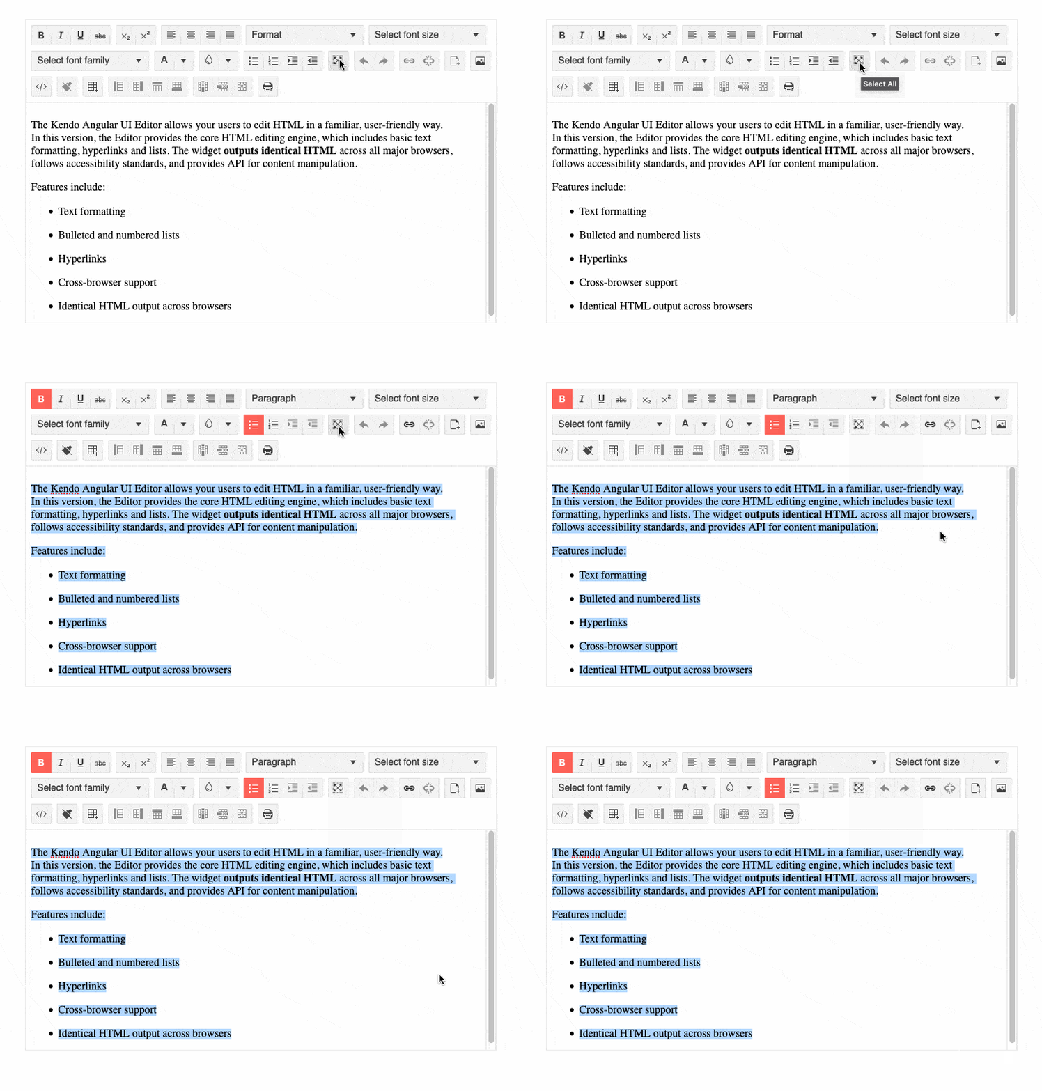
Adding to an already impressive list of tools available within the Kendo UI for Angular Editor, this latest release includes the Select All and Print tools.
The Select All tool, as the name indicates, is a convenient tool for users to be able to select all content within the Editor using a tool in the toolbar, which is a very intuitive way to interact with the Angular Editor.
The Print tool lets users print out just the content of the Editor via a built-in tool of the component itself. This simplifies the printing process, as the Editor itself will know how to print content and does not require developers to write their own logic around printing.
For everything related to selection, head on over to the Kendo UI for Angular Editor Selection documentation section.
Editor: Image Resizing
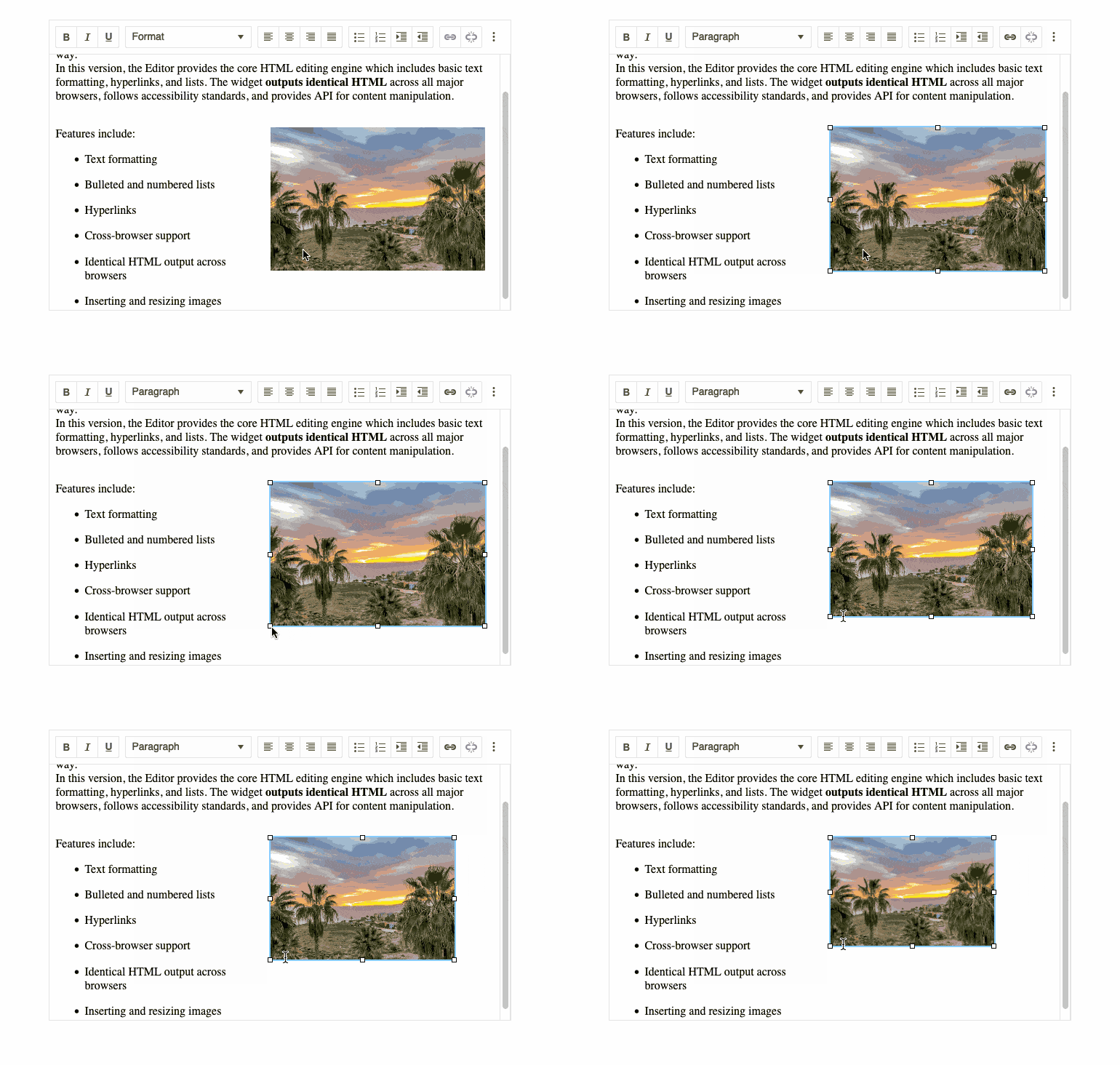
With this latest release, the Kendo UI for Angular Editor now supports the ability for images within the content area to be resized using drag handles. This is a big quality-of-life improvement to end users of the Editor as it gives an intuitive way to customize and interact with images within the Angular Editor.
To see image resizing in action, you can refer to the Kendo UI for Angular Editor Overview sample.
Chart: Improved Pan and Zoom
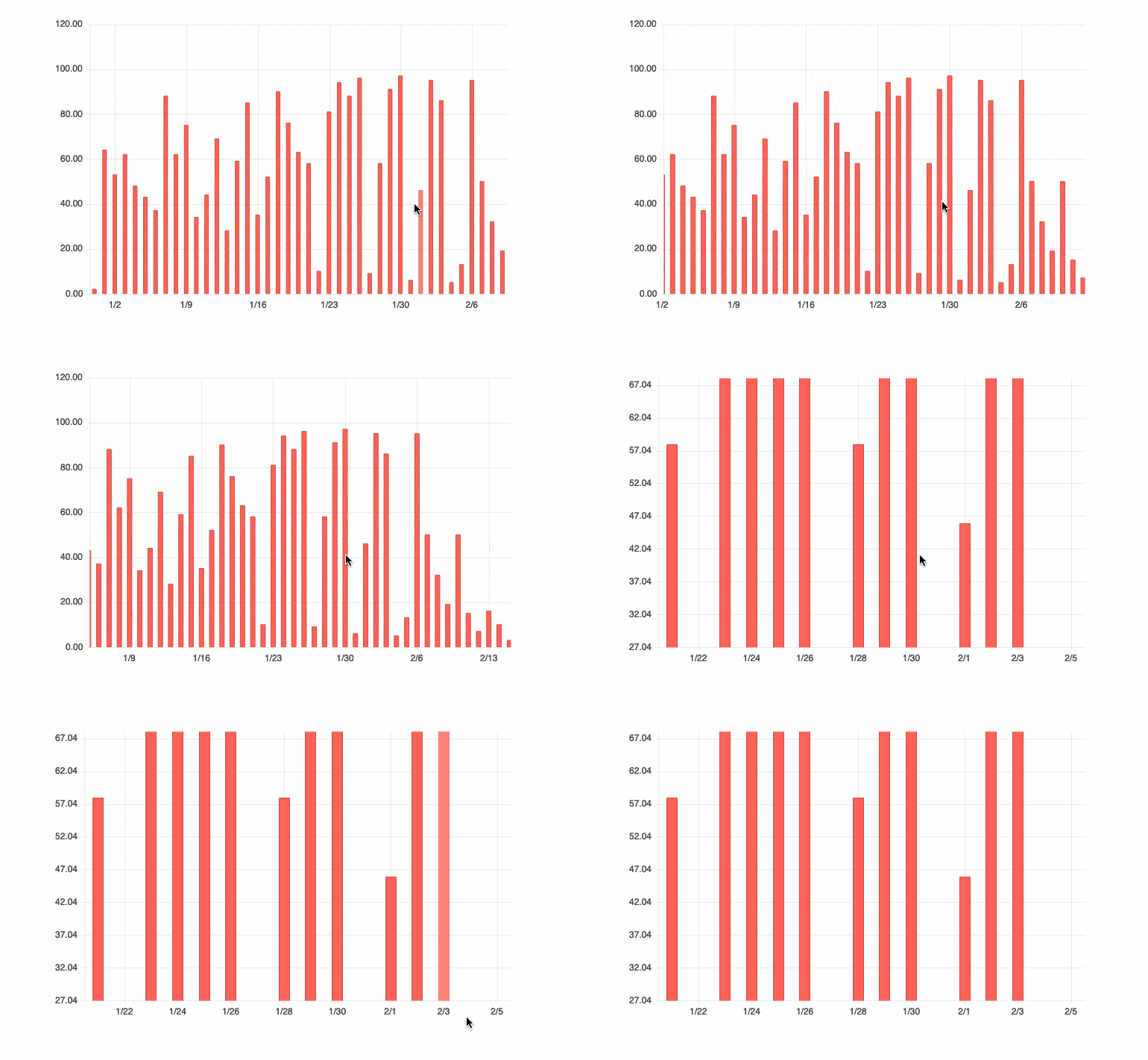
While panning and zooming have been a part of the Kendo UI for Angular Charts for some time, with this latest update we have improved the behavior and performance of these interactions. This should lead to a more intuitive and more responsive Angular chart overall without any additional configuration needed.
For an in-depth look at this improved feature, head on over to the Kendo UI for Angular Chart Panning and Zooming documentation section.
Switch: Custom Size and Long Labels

The Angular Switch component provides an intuitive and sleek user experience for toggling between two values. Most often used to represent On/Off or True/False states, there may be requirements where the text displayed to the user does not fit into those two scenarios.
With this release, we included a documentation article and an example showing how to customize the Kendo UI for Angular Switch component to fit custom dimensions and how it allows for longer labels to be displayed within the component. This also becomes very useful for internationalization, where localized messages have strings that exceed the default dimensions.
To see just how you can add custom sizes and longer labels to the Switch component, you can refer to the Kendo UI for Angular Switch documentation right here.
Scheduler: Current Time Marker
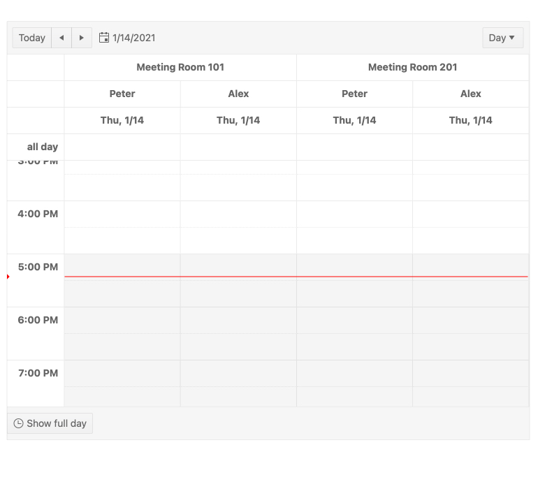
Many folks out there use the Kendo UI for Angular Scheduler to not just schedule and manage events but also manage their daily calendars. This means the Angular Scheduler component is often the go-to tool for planning a day and knowing exactly when events are happening. A big quality-of-life feature is the Current Time Marker, which renders a distinct line across the event area of the Scheduler to indicate the current time.
While this has been available within the Angular Scheduler already, it was a bit of a hidden feature. So, with this update, we have thoroughly documented this feature to make it easier to find and enable the Current Time Marker.
Here’s a quick link to the Kendo UI for Angular Scheduler component documentation, where you can see this and more in action.
Kendo UI for Vue
New Components
ProgressBar Component

The new Kendo UI for Vue ProgressBar component provides a 100% native Vue UI component for displaying any time of progress. This component renders as a bar that can then be filled in order to show progress toward the completion of a process. Both the values of the completed process as well as the progress can be bound to individual variables. The Vue ProgressBar can be displayed in a vertical or horizontal fashion, and supports both left-to-right as well as a right-to-left direction for filling the ProgressBar.
For more information, you can refer to the Kendo UI for Vue ProgressBar documentation section.
Loader Component

With the new Kendo UI for Vue Loader component, developers have a visually pleasing way to show that any portion of their Vue app is busy. This component can be used to show a loading indicator for a nice experience when data is loading in other Kendo UI components, or can be set for any other Vue components.
Head on over to the Kendo UI for Vue Loader component documentation for more information.
Drawer Component
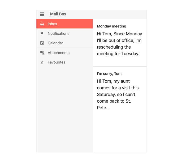
With this release, we added the Kendo UI for Vue Drawer component, which can be used as the side navigation element of any desktop or mobile component. This native Vue Drawer component can be configured to always be displayed, or hidden behind a hamburger menu and expand only when the user clicks on a specific button.
To see more about this component and how you can add it to your Vue apps, check out the Kendo UI for Vue Drawer component docs and demos.
Stepper Component

The Kendo UI for Vue Stepper can be used to visualize the progress through a process by dividing said process into steps. Each step can contain any type of Vue components, so developers have full control of the content displayed for each step.
Additionally, developers can customize the look and feel of each step in the Stepper, can control whether or not to have a strict linear flow, and set validation to be done at each step before moving to the next step.
Here’s a quick link to the Kendo UI for Vue Stepper documentation.
DateRangePicker Component
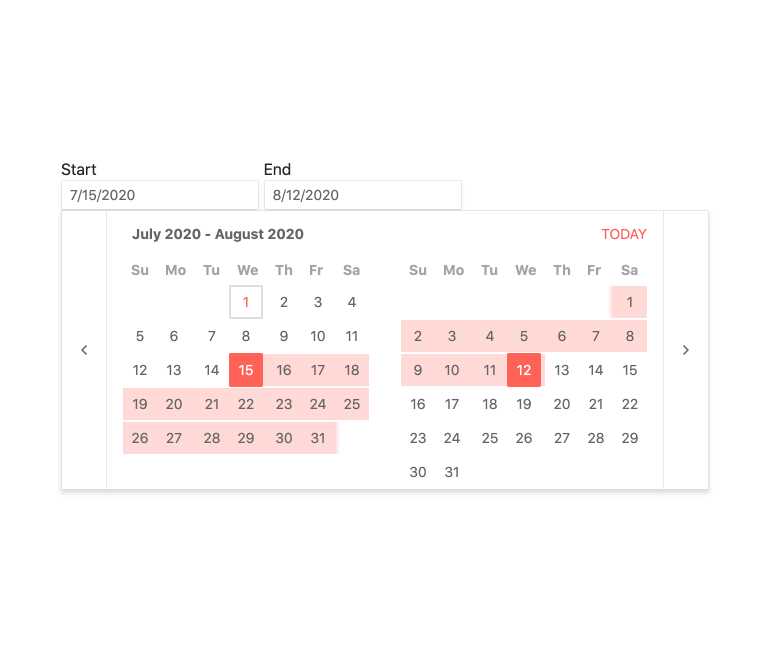 When users need to select a start and end date through a dropdown and picker interface, the new Kendo UI for Vue DateRangePicker is perfect. Through a component, users are met with two calendar elements side by side, where they can select a start and end date. The value of the range can easily be extracted from the component, letting developers act upon the range that users have selected.
For those interested, here’s a direct link to the Kendo UI for Vue DateRangePicker component documentation.
KendoReact
New Components
FlatColorPicker Component
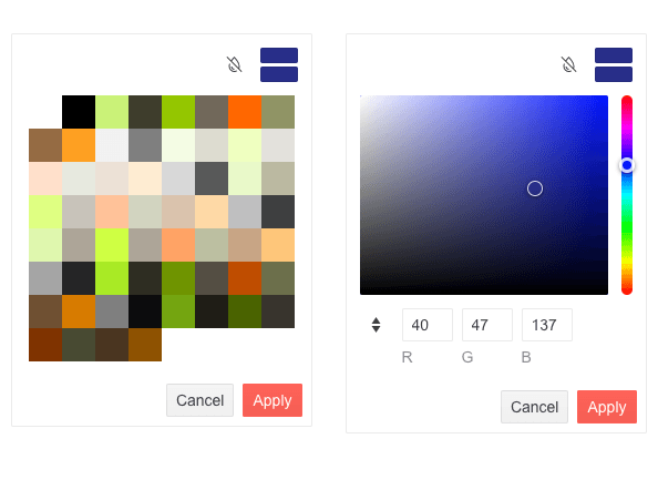
The new KendoReact FlatColorPicker component adds to the already numerous ways the UI library lets users select a color within React applications. This component differs from the React ColorPicker component by not being rendered within a popup or dropdown—instead the entire component is immediately rendered to the page.
To see more information, head on over to the KendoReact FlatColorPicker component documentation.
Drag & Drop Utilities
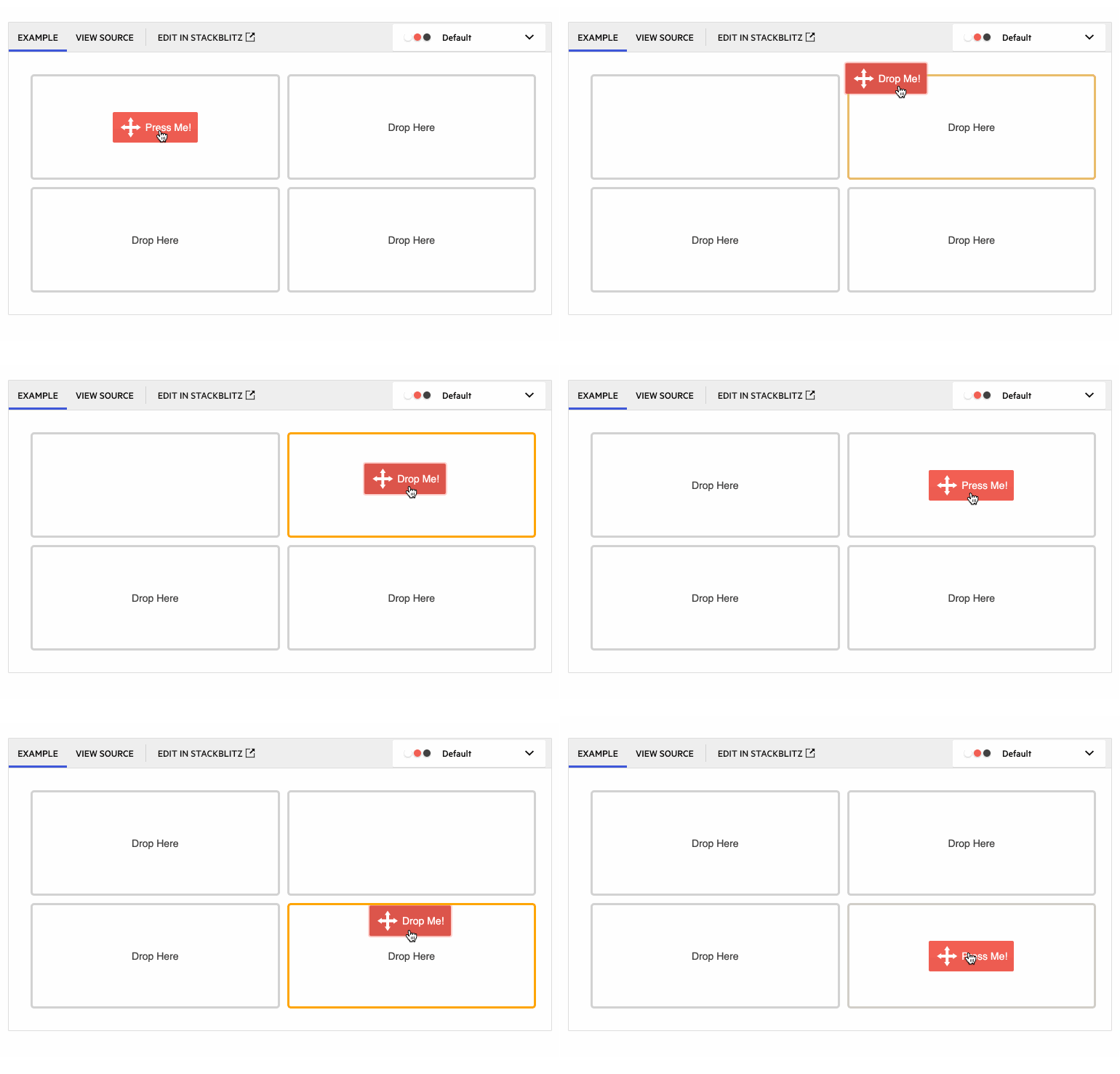
With this update, we took a good and hard look at what KendoReact can offer developers to help with adding drag-and-drop capabilities to their React applications, and we came up with an entirely new set of components and hooks that can be used to add this drag-and-drop interactivity.
These new features include the new DragAndDrop, Draggable and Droppable React components as well as the useDraggable and useDroppable hooks. Using these components in combination will let React developers achieve any and all requirements for drag-and-drop capabilities in their apps.
For more information on how to add drag and drop to your React apps, head on over to the KendoReact Drag & Drop documentation section.
Enhancements
ColorPicker: New Design
With this update, the KendoReact ColorPicker component received a new and improved design. The React ColorPicker component was one of the earlier UI components added to KendoReact, and since its initial release we have received a lot of feedback around this component. With all this feedback, we took the time to update the design and rendering of the ColorPicker.
These changes include brand-new design with new UI elements and features. Specifically these features include the ability to switch from Gradient to Palette view within the same ColorPicker instance, a new color preview where you can easily compare old and new colors, and toggleable HEX and RGB inputs with opacity support.
You can see the new design in action by heading over to the KendoReact ColorPicker docs.
Grid: Column Virtualization with Multi-Column Headers
A big feature that was added to the KendoReact Data Grid with this update is the ability to have multi-column headers when virtualizing our React data table. Previously these two features did not work that well together, but with the 4.10.0 update, they can be seamlessly enabled in the same component.
For more information about using Multi-Column Headers with the Data Table, head on over to the KendoReact Data Grid documentation.
Sample Project: Full-Stack App Using the KendoReact Grid & ASP.NET Core
The KendoReact Data Table is an advanced component where the capabilities around displaying, updating and reorganizing data on the client are virtually endless. With these capabilities comes a lot of potential complexity, and one area that has not been fully documented is how to deal with the React Table requests on the server.
That is all about to change with this update, as we are introducing a full-stack sample application with the KendoReact Data Grid on the frontend and ASP.NET Core on the backend. Our hope is that developers will be able to reference this example when building their own applications, helping reduce the complexity of server communication with the Data Table component.
To check out this full-stack app with React and ASP.NET Core, head on over to the KendoReact Sample Application repository.
Sample Project: Full-Stack App Using the KendoReact Grid & Node.js
Like the item above, this full-stack application focuses on common features and interactions within the KendoReact Grid and how to handle these requests on the server side of things. This sample uses React on the frontend and Node.js (using Express.js specifically) on the backend, giving developers more hands-on examples for implementing one of the more powerful UI components in the KendoReact library.
For the source code to this React and Node.js full-stack app, you can check out the KendoReact Sample Application repository right here.
Various Components: Context Provider for Default Props
This feature may not be applicable to all KendoReact users, but it is still very exciting news to share. First for some context.
In general, KendoReact components are built using other KendoReact components—something that becomes very apparent when using more advanced components like the React Data Table. As we build these components, they can have multiple layers of these nested components which, if you are looking to customize a component extensively, can become difficult to manage as a KendoReact user.
To make the KendoReact components easier to customize when needed, we have been working with exposing React.Context to override properties of a deeply nested component. For this update, we have introduced the Props Context to the DateInputs, Inputs and DropDown packages. With this larger set of UI components supporting the new Props Context, we want to gather feedback from our users and understand how we can help extend this functionality to other packages and components in the future, so feel free to try this new feature out and let us know what you think!
For a direct link, you can refer to the DateInputs Prop Context article, the Inputs Prop Context article and the DropDown Props Context article in our documentation.
TileLayout: Define Keys to Avoid Re-Rendering
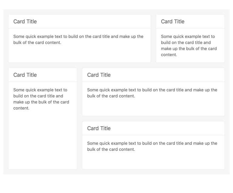
The KendoReact TileLayout component is quickly becoming one of our more popular UI components, and with this popularity comes a lot of feedback. With this latest update, we are introducing built-in use of keys to help avoid re-rendering the TileLayout component when interacting with the items collection of the component. This will help improve the performance of this component out of the box, so many of your TileLayout users will see improvements just from upgrading to the latest and greatest package.
While this feature may be more of an under-the-hood update, you can get more information from the KendoReact TileLayout component docs.
TreeView: Custom Renderers
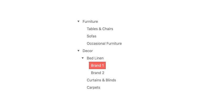
Custom renderers let developers pass in their own React component to be in charge of rendering for a particular portion of a KendoReact UI component. With this release, the KendoReact TreeView now lets users pass in a custom component which will be in charge of rendering every node throughout the TreeView. This will give developers the ultimate flexibility and will ensure that the React TreeView can fit any design requirements.
To see how you can take advantage of the new custom renderer, head on over to the KendoReact TreeView Customization docs.
Menu: Custom Renderers
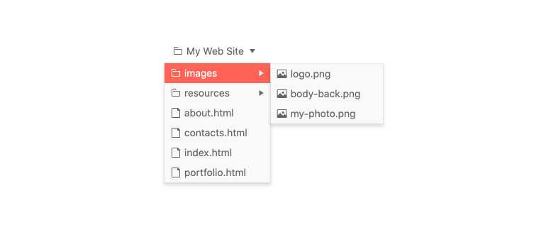
The KendoReact Menu now officially supports a custom component to be in control over the look and feel of each menu, also called a custom renderer. This makes the KendoReact Menu component even more flexible and will help with implementing specific design and UX requirements with the menu component.
To see more about custom renderers in menus, head on over to the KendoReact Menu documentation.
PanelBar: Controlled Mode & Tab Mounted Options
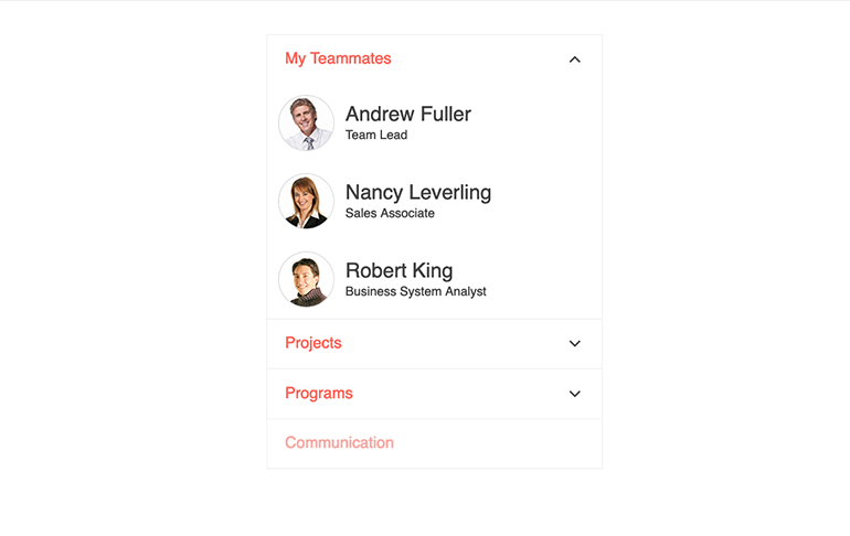
The KendoReact PanelBar also received some updates with this release. Specifically, the KendoReact team added support for controlled mode, letting developers fully control the state of the PanelBar instead of relying purely on the uncontrolled mode.
Additionally, the team added more options around the PanelBar’s lifecycle—specifically when the tab has been mounted. This gives more opportunities for developers to customize and interact with the React PanelBar component.
Check out the KendoReact PanelBar component documentation here.
Editor: Improved Selection
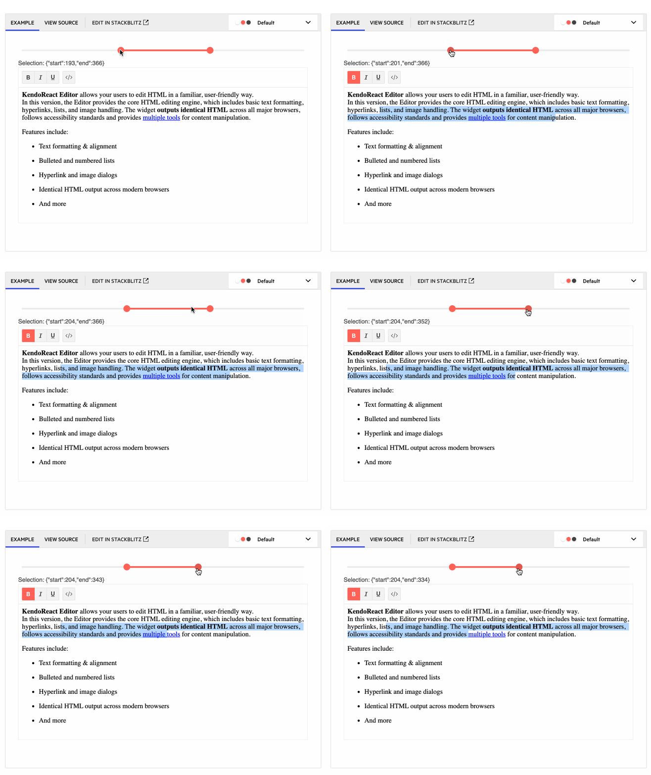
With this update, the KendoReact Editor has added ways for developers to interact with whatever selection users have made within the React Editor’s content. This will allow for scenarios like automatically extracting the HTML from the Editor’s content upon selection, or extracting content when a user presses a button.
Here’s a direct link to the KendoReact Editor Selection documentation section.
Editor: Editor Resizing
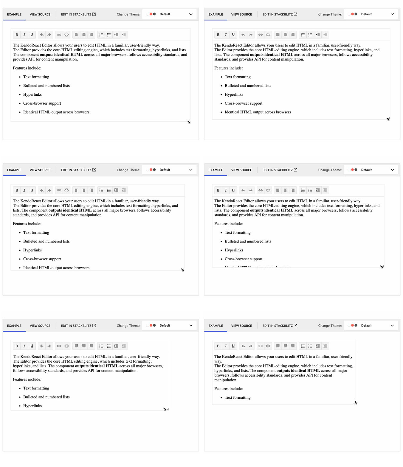
The KendoReact Editor can now allow users to resize the Editor once it has been rendered. Previously the Editor had a static height and width, but with this new resizing feature enabled, users will now see a drag handle when hovering over the edges of the component, giving them an intuitive user experience for resizing the Editor.
For more information, check out the KendoReact Editor Resizing sample.
Editor: Image Resizing
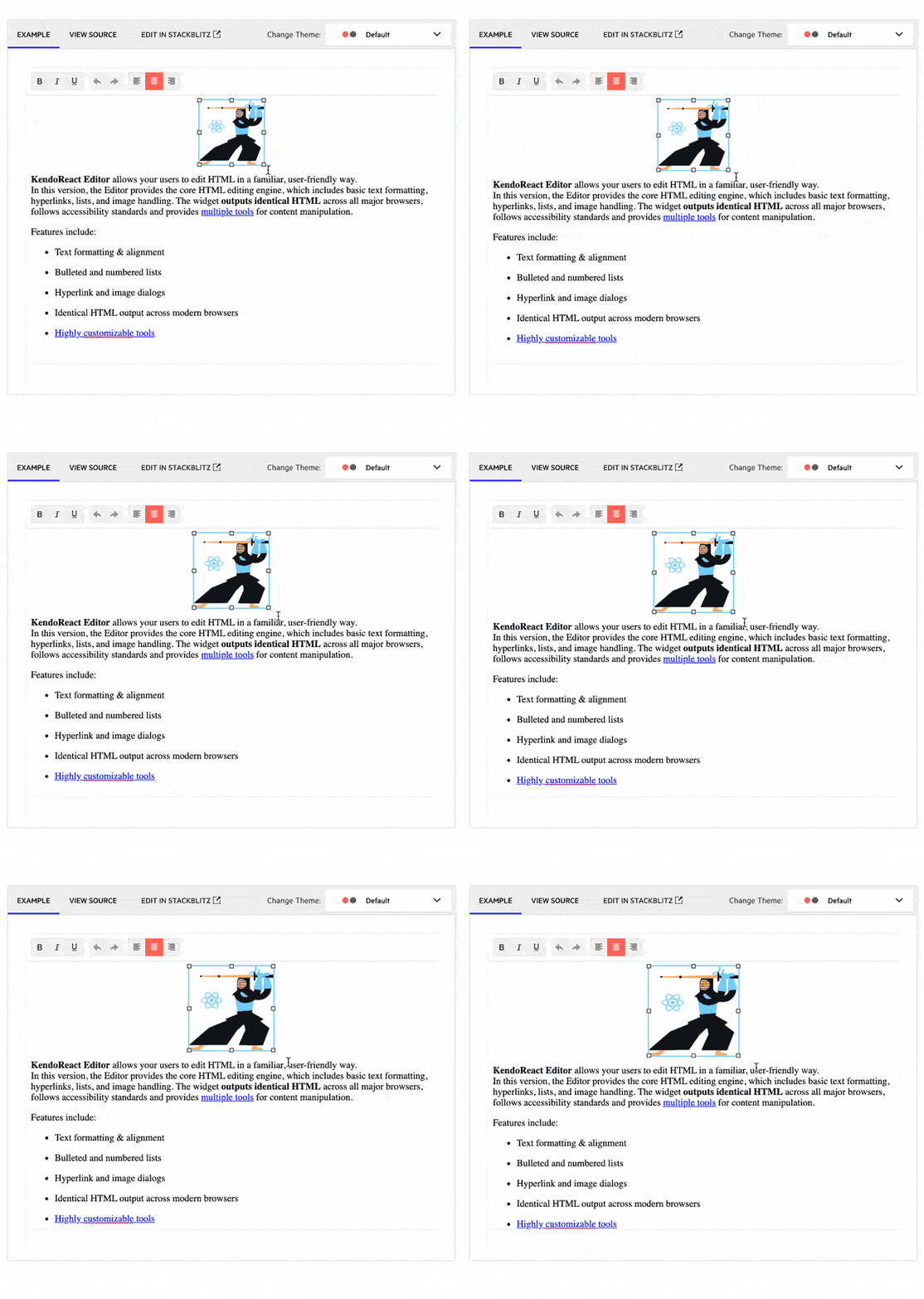
Another update that the KendoReact Editor received with this update is for images in the Editor’s content to be resized. When this feature is enabled, users can click on an image to see a border with drag indicators, letting the user resize images to their heart’s content using a very natural user experience.
To see more about resizing images in the Editor, you can refer to the KendoReact Editor Image Resizing sample.
Kendo UI for jQuery
Enhancements
Editor: Undo & Redo Support

As of this update, the Kendo UI for jQuery Editor now offers the ability for users to undo or redo changes to the content of the Editor component. This feature previously relied upon the browser’s built-in functionality for remembering content, which was not always reliable. With this update, the “stack” containing the changes is built into the jQuery Editor, which will be super helpful to users managing their content. This feature will also be available as a tool within the Editor toolbar to give physical buttons that users can interact with to undo or redo changes to content.
To see more about the Undo and Redo feature in the Editor, you can refer to the Kendo UI for jQuery Editor demos.
Stay Tuned
We will be bringing even more to our products next month when we will see the official R1 2022 release! In the meantime, if you have any ideas for a new component or new features you would like to see added, feel free to add them to our public feedback portals. Happy Holidays!

Carl Bergenhem
Carl Bergenhem was the Product Manager for Kendo UI.

