
Telerik & Kendo UI July 2023 Update

Summarize with AI:
See a highlight of what’s new this summer in the Progress Telerik and Kendo UI component libraries.
Table of Contents
- Common Release Items
- Kendo UI for jQuery
- Kendo UI for Angular
- KendoReact
- Kendo UI for Vue
- Telerik UI for Blazor
- Telerik UI for NET Core and MVC
- Telerik UI for ASP.NET AJAX
- Telerik UI for .NET MAUI
- Telerik UI for WinForms
- Telerik Reporting & Telerik Report Server
Common Release Items
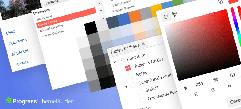
10 New Components Available for Styling in ThemeBuilder
We significantly extended the number of components you can style in ThemeBuilder. Now you can style every element in the following components faster than ever before:
- FloatingActionButton
- ColorGradient
- FlatColorPicker
- ColorPalette
- ColorPicker
- MultiSelectTree
- MultiColumnComboBox
- ExpansionPanel
- ListBox
- BottomNavigation
New and Improved Demos for Inputs, Selects and Picker Components
We have reimagined the demos for our form components by presenting them in expanded real-world form scenarios and making them responsive. That lets you see how they can enhance all your forms and make creating multiple forms a breeze with a mobile-friendly responsive layout.
Check out the new demos for all Kendo UI Flavors:
- New DateRangePicker Demo for Kendo UI for jQuery
- New DateRange Demo for Kendo UI for Angular
- New DateRangePicker Demo for KendoReact
Compatibility with .NET 8 Preview 5 and .NET 8 Preview 6

The Telerik UI for Blazor and ASP.NET Core libraries are now compatible with Microsoft’s .NET 8 Preview 5 (released in mid-June) and Microsoft’s .NET 8 Preview 6 (released in mid-July). This exciting development enables developers to leverage the innovative features and performance enhancements of .NET 8 while harnessing the robust UI components offered by Telerik.
There are several exciting posts you should check out as well:
- ASP.NET Core brings an improved startup debugging experience, Blazor enhancements, and metrics in the Preview 6 release.
- C# 12 adds three new features for .NET 8 Preview 6: interceptors, inline arrays and enhancements to the nameof expression.
Kendo UI for jQuery
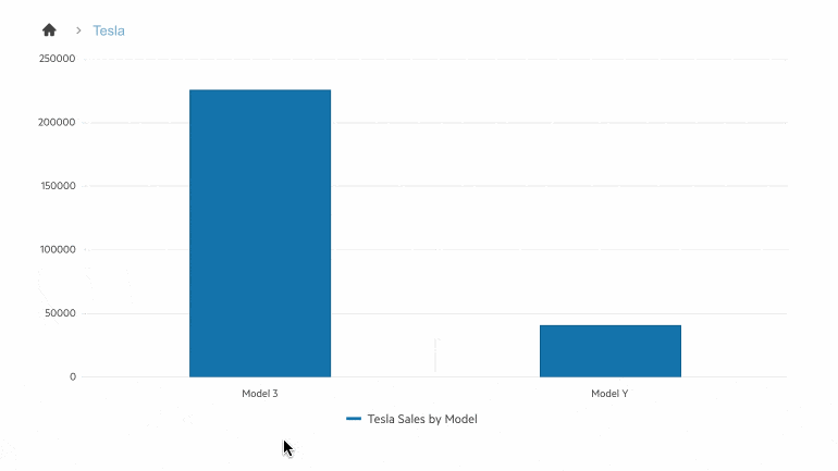
Drill Down Support for Charts
Access new information by clicking on any series of the Kendo UI for jQuery Chart, allowing you to inspect the entire data structure effortlessly. Explore and analyze data like never before with this powerful new feature. Elevate your insights and take your charting experience to a whole new level!
See a demo of the Kendo UI for jQuery Chart DrillDown feature.
Accessibility Improvements for TreeList, Gantt, PivotGrid, Filter and Draggable Alternatives
Keyboard Navigation Improvements
At our core, we’re committed to making our components accessible to all users by adhering to the latest guidelines. In this update, we’ve taken substantial steps to improve keyboard navigation for the TreeList, Gantt, PivotGrid and Filter components. Users can effortlessly unlock the full array of features using just their keyboards. Experience a more inclusive and efficient user journey today!
- Kendo UI for jQuery TreeList keyboard navigation demo
- Kendo UI for jQuery Gantt keyboard navigation demo
- Kendo UI for jQuery PivotGrid keyboard navigation demo
- Kendo UI for jQuery Filter keyboard navigation demo
Kendo UI jQuery Grid Draggable Interaction Alternatives
We’re happy to announce a significant enhancement to our Grid component, offering users a more accessible experience with single pointer operations. This addition aligns perfectly with the upcoming WCAG 2.2. compliance, ensuring our commitment to accessibility remains unwavering. Embrace the power of seamless navigation and inclusivity with this update!
Check out the new Kendo UI for jQuery Gird interaction alternatives demo.
Kendo UI for Angular
Gantt Date Formatting in Timeline Headers
We are introducing a new enhancement to our Gantt components: the ability to customize the date format in the Timeline Header. With this latest feature in Kendo UI for Angular, developers can personalize the application according to end users’ preferred date formats.
-oceanblue.png?sfvrsn=3a59be4b_3)
See a demo of the Gantt date formatting in Timeline header.
TreeView Conditional Checkboxes
We’re excited to bring you a powerful new feature that allows you to display checkboxes based on your needs selectively. No more unnecessary checkboxes—now you have complete control over which items need a checkbox. Tailor the TreeView component perfectly, aligning it precisely with your unique requirements.
-oceanblue.gif?sfvrsn=ad350e8e_3)
See demo of Kendo UI for Angular TreeView with conditional checkboxes.
Accessibility Improvements for Switch
We’re dedicated to providing top-notch accessibility, and to achieve this, we’ve implemented the latest changes to the Switch component’s accessibility specification. By staying up-to-date with the highest accessibility standards, we guarantee an inclusive experience for all our users.
KendoReact
Drill Down Support for Charts
Delve deeper with our Chart component’s new drill down functionality. Click on any series to unlock a ton of additional information and comprehensively understand the data’s structure. Seamlessly inspect and explore more data inside the KendoReact Chart component.
See a demo of the KendoReact Chart DrillDown feature.
Timeline Support for Horizontal Mode
We released the Timeline component a month ago with vertical mode support and are expanding it by adding a horizontal mode.
You have the incredible flexibility to showcase all your events horizontally, allowing seamless arrangement and optimal use of page space. Discover new possibilities and elevate your timeline presentation.
Check out the new KendoReact Timeline horizontal mode demo.
New Table and Cell Configurators for the Editor Component
With our latest update, you have seamless control over your table design and accessibility options within the Editor. Different new and powerful configuration dialogs will open based on what you have selected in the table. Discover the power of our new features:
- Table wizard with multiple options for easy table creation
- Enhanced accessibility tab for optimized table accessibility
- The cell properties dialog for customized cell settings, individually or globally
Explore all new configuration options in the Editor table editing demo.
Support for Multiple Drawers
We have expanded our examples for the Drawer component to showcase how to display multiple Drawer components on the same page. That can boost your application’s UI and make it more compact and user-friendly. Whether you need one on the left and another on the right, that is now possible.
-oceanblue.png?sfvrsn=d0b35f32_3)
See a demo of multiple KendoReact Drawer components in the same page.
Kendo UI for Vue
New ActionSheet component
Popularized by iOS and Android, this powerful component provides actionable items in a sleek menu that animates from the bottom of the page. Enhance your mobile and desktop web apps by giving users additional action choices with a button click or similar interaction.
The Kendo UI for Vue ActionSheet component comes with multiple features to customize its items like:
- Setting titles and descriptions
- Adding icons to the items
- Disabling some of the items conditionally
- Grouping the items based on different criteria and more
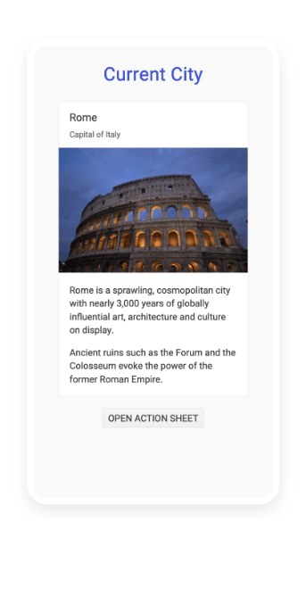
To see more from the Kendo UI for Vue ActionSheet component, check out the ActionSheet demos.
Telerik UI for Blazor
PivotGrid Enhancements
In our recent R2 2023 Release, we introduced the much-anticipated Telerik UI for Blazor PivotGrid component. The response and feedback from our community was impressive. Your input has been invaluable in shaping this update.
See the updated Telerik UI for Blazor PivotGrid demo.
Width of Column and Row Headers
Achieve the perfect layout for your PivotGrid Blazor applications by taking full control over the width of columns and row headers.
- ColumnHeadersWidth: specifies the width of the column headers
- RowHeadersWidth: specifies the width of the row header
HeaderClass for Column, Row and Measure Cells
Style the presentation of your PivotGrid Blazor applications by applying CSS to column, row and measure headers.
- PivotGridRow.HeaderClass: specifies the class for the row header
- PivotGridColumn.HeaderClass: specifies the class for the row header
- PivotGridMeasure.HeaderClass: specifies the class for the row header
Title of Column, Row and Measure Cells
Improve the readability of your PivotGrid Blazor applications by displaying a meaningful title (caption) for column, row and measure headers.
- PivotGridRow.Title: specifies the title for the row header
- PivotGridColumn.Title: specifies the title for the row header
- PivotGridMeasure.Title: specifies the title for the measure
Stay tuned for the next batch of PivotGrid improvements!
New Range Area Chart Component
Announcing the latest addition to our Telerik UI for Blazor Chart suite—the Range Area Chart component.
The Blazor Range Area Chart is well-suited for presenting continuous lines that connect data points defined by the values of its items, making it ideal for visualizing quantitative data.
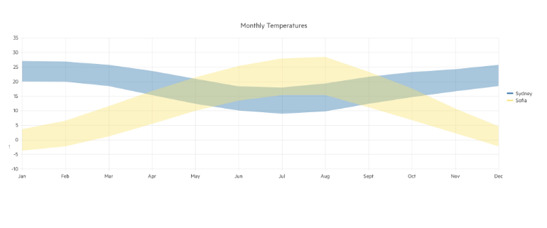
Check out the Telerik UI for Blazor Range Area Chart demo.
New Range Bar Chart Component
We have enriched our Telerik UI for Blazor Charts suite with a new addition—the Range Bar Chart component.
The Blazor Range Bar Chart proves valuable for showcasing data as horizontal bars, where their lengths and positions correspond to their respective values. It becomes particularly useful when you need to compare multiple sets of data side by side.
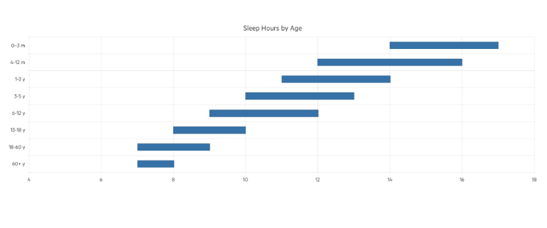
Check out the Telerik UI for Blazor Range Bar Chart demo.
Charts Pan & Zoom
We have now made our Charts a lot more interactive—through a simple configuration, you can enable pan and zoom features, making your charting experience even more engaging and intuitive.
See the Telerik UI for Blazor Chart Pan and Zoom demo
Grid Enhancements
We continuously enhance our Grid component to ensure it remains the market leader. Be sure to check the latest improvements below.
Templates for Filter Menu Buttons
Our latest update provides users with the flexibility to customize Filter Menu buttons using Templates. For example, you can now:
- Customize button appearance (e.g., add icons, enable/disable based on conditions).
- Alter markup options (e.g., add a third button for preset filters or remove the clear button).
- Execute additional logic (e.g., show confirmation dialog on clear, focus on filter after execution).
See the Telerik UI for Blazor Grid Filter Menu Buttons Template demo.
Use FilterRow and ColumnMenu Together
The Telerik UI for Blazor grid Grid now supports using FIlterRow and Column menu together. This enhancement will primarily cater to a use case where end clients prefer the filter row’s user experience but still require certain functionalities from the Column Menu, like toggling columns and other related actions.
See the Telerik UI for Blazor DataGrid Column Menu and FilterRow configuration demo.
Multiple Component Enhancements
- ReadOnly Parameter: We have introduced a new ReadOnly parameter to control the readonly state of an input. The property parameter is now present in Telerik UI for Blazor AutoComplete, ComboBox, DateInput, DatePicker, DateRangePicker, DateTimePicker, DropDownList, MaskedTextBox, MultiColumnComboBox, MultiSelect, NumericTextBox, TextArea, Editor, TextBox and TimePicker.
- DropDownList FilterPlaceholder: New FilterPlaceholder parameter to enable setting a placeholder for the filter input in the popup.
- TextArea Rows and Columns: Customize the layout of a TextArea through the newly introduced Rows and Cols parameters.
- Initial files in Blazor Upload and FileSelect: Set initial files, previously uploaded to the remote endpoint, ensuring a better user experience.
Telerik UI for NET Core and MVC
New DrillDown Charts Component
The Telerik UI for ASP.NET MVC and Core Charts now allows users to explore data using a drill-down feature.
By clicking on a point (e.g., bar, pie segment), users can navigate to a different view, presenting more detailed data about the selected item, like a breakdown by product within the chosen category.
See the Telerik UI for ASP.NET Core Charts DrillDown demo.
Scheduler Customer Toolbar
You can now customize The Telerik UI for ASP.NET Core and MVC Scheduler component through an intuitive configuration option. For example, you can easily reorder the toolbar items or add custom items within the toolbar. Simply define the buttons, their order and the associated functionalities, and the Scheduler component will reflect your custom Toolbar configuration.
See the Telerik UI for ASP.NET Core Scheduler Custom Toolbar demo.
Telerik UI for ASP.NET AJAX
We prioritize product quality and consistently strive to enhance our components by delivering incremental improvements. Recently, we have sent out the latest set of fixes to Telerik UI for ASP.NET AJAX, addressing various issues in components such as RadMultiSelect, PdfViewer and CircularGauge.
Telerik UI for .NET MAUI
Unlocking the Potential of Row Details in DataGrid
Imagine a situation where you need to display a list of products in your application. A typical row could include basic information such as the order ID, date, shipped date and estimated date. However, what if you want to present additional details like shipping address, customer or assignee information without cluttering your grid?
This is where the Telerik UI for .NET MAUI Row Details feature shines. It allows you to keep your grid clean and straightforward while providing an option to access more detailed information on demand. It enhances the user experience by making your application interface more interactive and less cluttered.
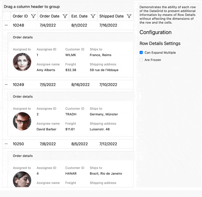
For more information on getting started with this feature of the DataGrid, visit the documentation.
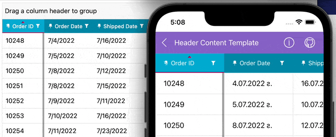
DataGrid: New Header Cell Hover Effect
The hover effect of the DataGrid’s Header Cell is a feature that changes the appearance of a column header cell in the DataGrid when the mouse pointer hovers over it. This interactive visual cue allows users to understand that they can interact with the header cell, offering potential actions like sorting or filtering data, or indicating that the column can be repositioned by dragging.
Moreover, you can customize header cells to better represent the data they’re associated with, making your grid more intuitive and visually appealing.
Whether you want to include an icon with the header text, change the sorted state of the header, or add additional visual elements, the HeaderContentTemplate provides the flexibility to do it all.
Here is a simple example:
If you are interested in exploring a comprehensive demonstration, you can download the complete demo applications of UI for .NET MAUI. These applications will provide you with an extensive view of all the available features and possibilities of our components.
New Video Onboarding
We are happy to announce that we have released a new video training course for UI for .NET MAUI! It was developed to help you get started with the Telerik UI for .NET MAUI components and features. First, it will get you started with the .NET MAUI framework itself, including an overview, installation, and basic component creation. Then, you will implement a sample application with our .NET MAUI components step by step and learn about their features.
If you wish to learn more, you can check this Video Onboarding article or you can continue directly to the video onboarding by enrolling in the training from the Virtual Classroom. It is available to both active trial users and active license holders!
Telerik UI for WinForms
The R2 2023 SP1 release of Telerik UI for WinForms comes with a modern legend feature to the brand-new Heat Map control, redesigned examples in demo application, fresh new look of Visual Style Builder and various other improvements.
Heat Map Legend
The legend is a great addition to the freshly released Heat Map Control in the R2 2023 release. Technically speaking, the legend relates the color spectrum of the heat map cells to their corresponding numeric values. It is a feature that allows the end user to easily interpret and operate through the control’s color palette.
The legend is fully customizable—by default, the control automatically creates items based on the current definition and colorizer, and in addition to this you can also modify them or create your custom legend items.
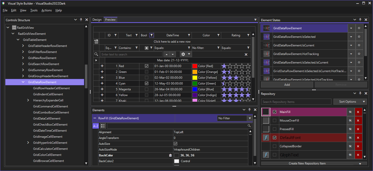
Visual Style Builder
We refreshed the default look of the VisualStyleBuilder tool with the latest addition to the Telerik UI for WinForms themes collection: the Visual Studio 2022 Dark theme.
Demo Application
We redesigned a considerable amount of the PDF Processing examples: You can check them out in PDF Processing section of the Demo Application.
Fixes and Improvements
Quality, efficiency and user satisfaction are the keystones of our commitment. We continuously strive to improve and perfect our products, making them more robust and reliable for our valued customers.
Today, we’re excited to announce that we’ve made numerous bug fixes (more than 120) across our desktop and mobile suites and our document processing libraries, providing an enhanced, seamless user experience.
See the detailed list of the What’s New items to learn more:
- Telerik UI for WPF
- Telerik UI for WinUI
- Telerik UI for WinForms
- Telerik UI for Xamarin
- Telerik UI for .NET MAUI
Telerik Reporting & Telerik Report Server
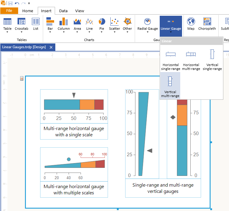
Radial Gauge was released in R2 2023 to enable displaying the important business KPIs in a visual manner. We received feedback that its public API may be improved, and we listened. Now all the scalar properties of the model represent units relative to the item’s size, so its content resizes gradually when the item gets resized.
More importantly, we also introduce a Linear gauge item so that these KPIs can be represented in any possible visual manner.
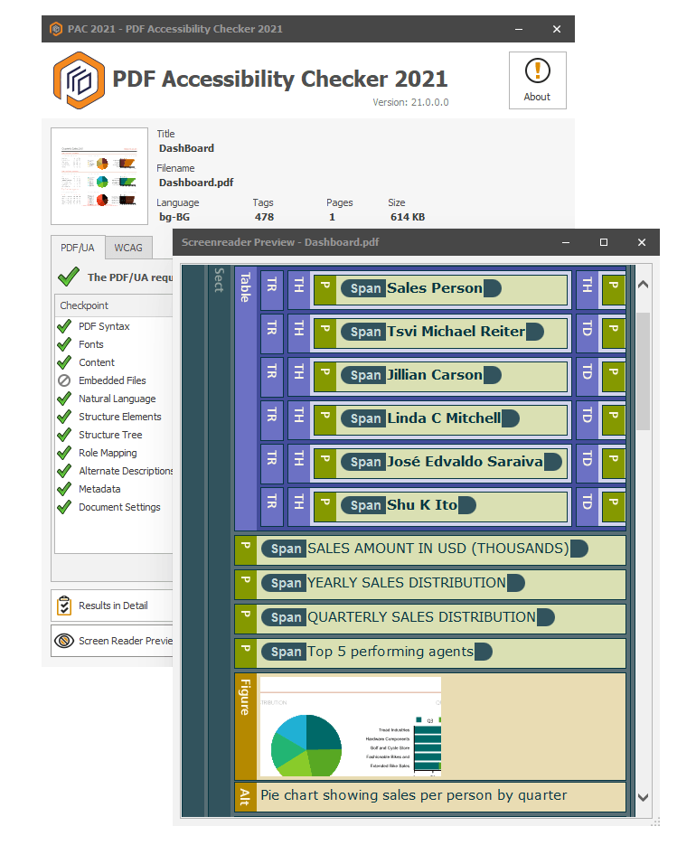
We continue to build on our PDF accessibility functionality introducing various improvements so that assistive technologies work even better. Check out the full list in the release notes.
Again based on user feedback, we exposed the evaluated report parameters in the client APIs of Blazor, React, Angular and HTML5 report viewers, which allows for implementing more custom behavior scenarios.
For the full list of fixes and improvements, visit the corresponding Release Notes article.

Stefan Mariyanov
After working as a Technical Support Engineer in three different Kendo UI teams, Stefan Mariyanov is currently a Product Manager for Progress ThemeBuilder. He loves working to helping customers achieve their goals—also having served in different customer-facing jobs before joining Progress. He believes great ideas come from truly listening to customer feedback. Stefan is passionate about new technologies and all of the amazing ways they can make our lives better and more interesting. In his free time, he likes traveling around the real world to explore different cultures and fighting evil forces in the virtual worlds of video games.
Related Posts
Comments
All articles
Topics
Web MobileMobile
Desktop
Design
Productivity
People
