
Implementing the 5 Key Principles for Creating Effective UIs—Part 1
 by Peter Vogel

Summarize with AI:
How to know if your app’s user experience is effective: Do your users know what to do next? Here are the five design principles to ensure that answer is yes. Part 1 discusses consistency and design patterns.
There’s only one practical way to measure how effective your application’s user experience is and that’s to ask the question: “Do my users always know what they have to do next to achieve their goals?” When the answer is “yes”—even if the user’s goal is just “Get this order finished and go home”—then your users are getting something that’s still surprisingly rare: A user interface that works for them.
If the answer is “No,” then you’re incurring some real costs—in extra user errors, slow manual processes and time lost in training (though that “training” often isn’t officially recognized because it’s either being performed by other, more experienced users or by individual users training themselves by fighting through the application). If your application is external-facing, then those ineffective UIs are either damaging relationships with your business partners or costing you customers. Maybe both.
To put it another way: In the end, only the user’s opinion about the UX you’re providing matters and they’ll only consider that they’re have good experience if your UI helps them meet their goals.
It also means that the criteria for assessing an application’s UX aren’t constant across all applications but, instead, depend on your users: their goals, how they think about the problem your UI solves, and the history/experience with other applications that they bring to the table.
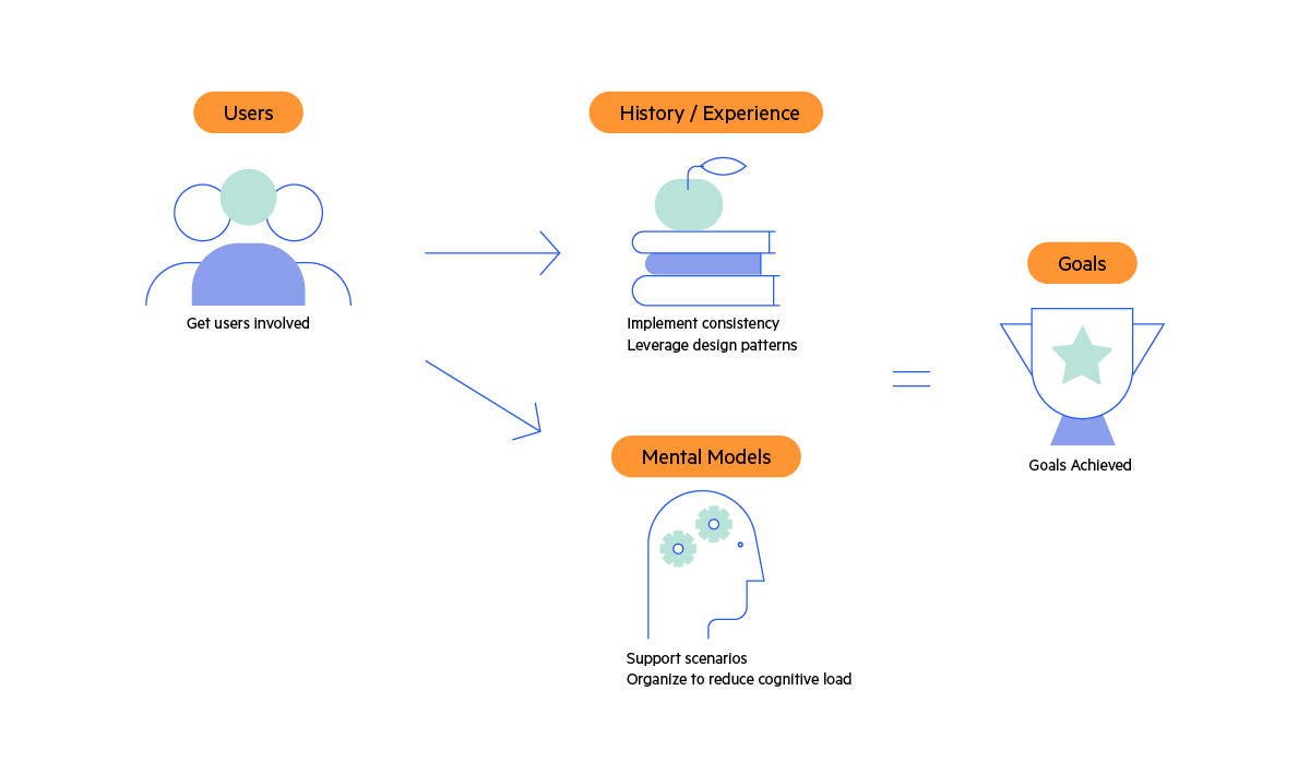
Your users’ UX needs are driven by their goals, experience and mental models. The five principles let you build on that to deliver a UX that works for your users.
But, having said that, there are five principles you should apply across every UI that ensure you will create an effective UX for your users:
- Consistency—do it the same way everywhere and every time
- Leverage design patterns
- Support the users’ scenario
- Organize your UIs
- Test your UI … and get your users involved early
This idea of “fundamental UI principles” is the basis of design systems like Google’s Material and Microsoft’s Fluent systems (after all, a “design system” only makes sense when there’s something that is, or should be, part of every UI). That applying these principles will also save your organization money (and save it in multiple ways) is just icing on the cake.
But, still, these are only principles: You’ll need to customize implementing these principles to meet both your users’ goals and the specific needs of your application. To keep this discussion useful, then, here are also some concrete examples both of what those principles look like in action and how to customize them both for your users and your applications.
The First Principle: Consistency
Realtors have a joke about the three most important things to home buyers: They are “location, location and … location.” The equivalent “joke” for UI designers is: “The three most important things to end users in a UI are consistency, consistency and … consistency.” In a very real sense, users don’t really care what you do, as long as you do it the same way everywhere and every time.
Windows is a good example. If you’ve ever taught someone how to use Windows, you know Windows isn’t necessarily “intuitive.” What Windows does do, however, is enforce consistency on the applications that run on it. If you know how to print something in one Windows application, you know how to do it in any Windows application.
The first step in ensuring consistency is to apply a common look and feel across all your applications (call it your “theme”). While making similar items look alike is the primary goal when selecting a theme, you also need your theme to give you the ability to highlight UI items you want to stand out: to make different things look different.
Progress Telerik themes provide a common look and feel across server-side (ASP.NET), desktop (WPF) and client-side (React, Angular, Vue or just plain old JavaScript/jQuery) apps.
The payoff for having a common theme is that it lets you invoke your users’ “prospective memory”: the paradoxical ability for users to remember, based on past interactions, how to perform a future action.
Prospective memory is actually something you know very well—it’s the reason that you can pull out of your driveway in the morning without thinking about it … and still automatically hit the brakes when another car appears unexpectedly. In UI terms, it means your users can instantly (and almost unconsciously) start moving their mouse toward a primary button in the UI while they’re still digesting the information being displayed.
Having a consistent theme across all your applications also lowers development costs because developers don’t have to think about how to style their applications. You want, for example, to both ensure that error messages look the same on every platform and have those messages be instantly noticed by users (you want to invoke the Von Restorff effect which says that UI elements that look different from other elements are more likely to be noticed). That’s easier for developers to achieve if a consistent error message style is built into your standard theme.
Third-Party Themes
While you can roll your own theme, there are at least two good reasons to adapt someone else’s theme. First, and most obviously, adapting an existing theme to meet your needs involves less work than building your own theme. The second benefit goes back to building your users’ prospective memories: Adopting a popular third-party theme means that every other site in the world that’s using that theme is training your users’ prospective memory for you.
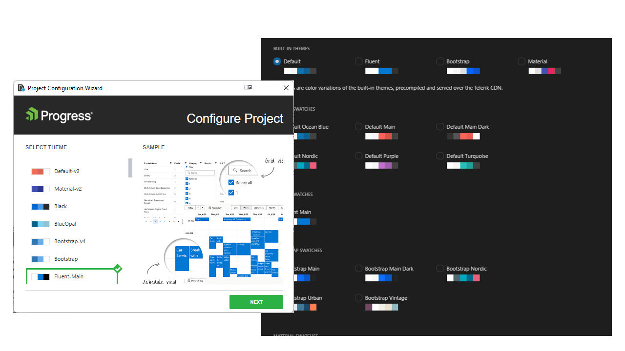
Telerik extensions to Visual Studio and Visual Studio Code let you select themes (and variations on themes, called “swatches”) to be applied to your application’s UI based on, for example, the Bootstrap, Material and
Fluent design systems.
But, as the word “adapt” suggests, you’ll certainly need to modify the theme you pick to make it compatible with your organization’s branding. So, when picking a theme, you want to pick one that comes with a toolset that makes it easy to tweak that theme.
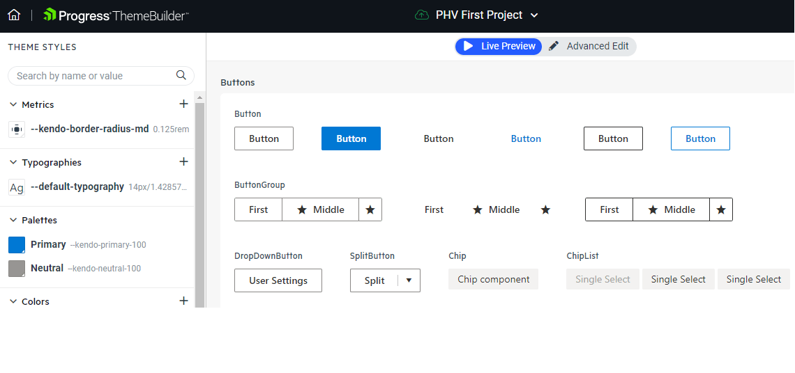
Progress ThemeBuilder lets you build your own themes, using one of the Telerik base themes
or your own theme.
Furthermore, your organization’s theme is going to evolve over time. To support changing your theme over time, you also want a UI design tool that can both leverage the theme you select and let you evolve that theme over time.
Progress Telerik and Kendo UI provide UI design kits for working with Figma, a web-based application that supports multiple stakeholders collaborating on UX design.
The Second Principle: Leverage Design Patterns
Of course, consistency goes beyond the look and feel of your apps to also include how your users interact with your applications.
Before reading any further, try this experiment: Go to a website for some large multinational retail company that has been successful on the web (Amazon leaps to mind). On that site, look for some original, unique UI component that you’ve never seen on any other site.
Spoiler alert: You won’t find one. The reason is simple: Successful UIs are all about helping users achieve their goals … and no user has “figuring out this application’s UI” as one of their goals.
Really, a user interface is like a joke—if you have to explain it, it wasn’t very good. Jakob Nielsen’s First Law of Internet Experience provides the answer here: Users spend most of their time on other sites and, when your site works like those “other” sites, users come to your site already trained—they already “get” the joke.
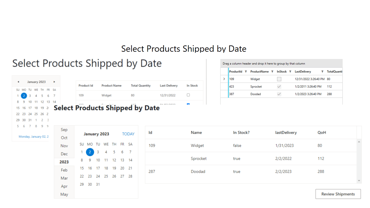
Those UI elements that your users already know are referred to as “UI design patterns.” And, again, you’re familiar with this concept: You (and users all over the world) automatically know how to interact with an online scheduler, provided it looks something like one of these:
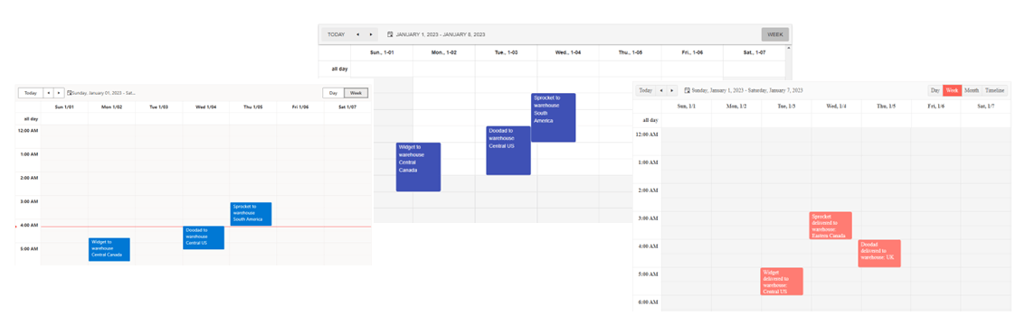
Various Telerik/Kendo UI scheduling controls implement a UI that every one of your users already knows how to use (these examples are from ASP.NET,
Blazor and Angular applications).
While you may not know about Raymond Loewey, his MAYA principle (Most Advanced, Yet Acceptable) is your best guide here. You interact with Loewey’s designs every day because Loewey designed everything from the shape of a Coca-Cola bottle through to the company logos for Shell, Greyhound and the U.S. Postal Service. Loewey’s secret for well accepted designs (designs that have survived for, literally, decades) was to wrap anything new in something familiar. You want to wrap your application in a UI that looks familiar to your users (and still look like something new).
Spotify learned about the MAYA principle when they first rolled out their Discover Weekly feature. Spotify’s original intent was to provide their users with a list of nothing but new music. However, an initial bug let some familiar songs appear in the original Discover Weekly lists.
Spotify “fixed” the bug so that those familiar songs were eliminated from the list. The result? User interaction with Discover Weekly dropped off dramatically. Spotify then revised the algorithm to always include at least some songs the user was familiar with. Now, Discover Weekly is one of Spotify’s most popular features.
It’s easy to harvest the UI design patterns your application needs: Look at other organization’s sites that have users with goals to similar your users and then—without violating copyright—“steal from the best.” For more depth/direction, you can find curated guidance and direction at the UI patterns site. Mobile-specific patterns are covered on the pttrns site (though the pttrns site requires a membership).
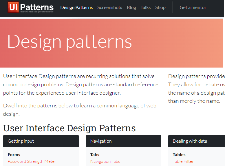
The UI Patterns Site provides not only holds a set of curated patterns but also has downloadable document of what they consider to be the most “persuasive patterns.”
Design patterns leverage your users’ prospective memory in a way similar to having a consistent theme. With design patterns, though, the effect is referred to as “feed forward” to reflect how familiar patterns lead users on to do “the next right thing.”
Applying design patterns not only aids users but also lowers costs due to reduced errors, lower (or zero) training costs and improved productivity due to faster response times.
In the Next Post
Stay tuned to keep reading. Next, we’ll dive into the importance of supporting the users’ scenario. And then we will get into how to organize and test your UIs.
Try DevCraft Today
Get started with a Progress Telerik DevCraft Trial today! The DevCraft suite is the most powerful collection of Telerik .NET and Kendo UI JavaScript developer tools. It includes modern, feature-rich, professionally designed UI components for web, desktop and mobile applications; embedded reporting and report management solutions; document processing libraries; and automated testing and mocking tools.
DevCraft will arm your developers with everything needed to deliver outstanding applications in less time and with less effort, and with consistent theming across your applications.
With award-winning technical support delivered by the developers who built the products and a ton of resources and trainings, you can rest assured that you have a stable provider to rely on for your everyday challenges along your software development journey.
Peter Vogel
Peter Vogel is both the author of the Coding Azure series and the instructor for Coding Azure in the Classroom. Peter’s company provides full-stack development from UX design through object modeling to database design. Peter holds multiple certifications in Azure administration, architecture, development and security and is a Microsoft Certified Trainer.
Related Posts
Comments
All articles
Topics
Web MobileMobile
Desktop
Design
Productivity
People
