
Implementing the 5 Key Principles for Creating Effective UIs—Part 2
 by Peter Vogel

Summarize with AI:
How to know if your app’s user experience is effective: Do your users know what to do next? Part 2 explains how to support the users’ scenario so they do.
While every user interface you create will have different needs and target users, these five principles will help you to create the right UI this time:
- Be consistent
- Leverage design patterns
- Support the users’ scenario
- Organize your UIs
- Test your UI … and get your users involved early
We’ll pick up where we left off the first post in this series.
The Third Principle: Support the Users’ Scenario
Effective UIs do more than just guide users’ hand movements, though: Your users also have expectations around how they will achieve the goals your UX supports. You can think of these expectations as your users’ “mental model”—how your users think about the problem and map what they expect to your application’s UIs.
You have two choices around dealing with your users’ mental model: Your UI can support your users’ model or you can provide a new one.
If you do want to give your users a new way of achieving their goals, remember that MAYA applies here, also. (That’s Raymond Loewey’s Most Advanced, Yet Acceptable principle, in case you missed it in Part 1.) If you want to replace your users’ mental model, then your new process will have to provide something your users value enough that it will overcome their resistance to adopting something new.
And this resistance isn’t entirely unfair on your users’ part: Users recognize that there are real costs associated with adopting a new mental model (time spent in training, making errors and experimentation, for example). For external-facing apps, where users have other options than using your application, your new mental model can result in losing customers or business partners to your competitors just because your competitors’ UIs work the way your customers/partners expect.
Bottom line: If you want to get users to adopt your new mental model, you’ll need to convince your potential users that your UX will help them meet their goals in a way that your users will value more than the “old fashioned” applications will. There is a way to do this successfully, but you need to understand design patterns first.
Understanding the Scenario
Once you’ve decided on the model your UX will support, you can map out the series of UIs your users will interact with in achieving their goals (your users’ “scenario”). Those scenarios will vary depending on your users.
Consider two scenarios for “buying things”: customers buying products at a retail outlet and customers buying investment products through a financial consultant. If your application is targeting retail customers, then the scenario your users expect is that they will:
- Find the products they’re looking for
- Add those products to their list of purchases (the “shopping cart” pattern)
- Provide the information to pay for and get the products home
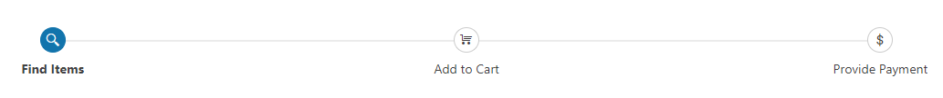
A typical shopping cart flow, implemented using the Stepper control in Progress Kendo UI for Vue.
The scenario is different if you’re targeting customers buying investment products through a financial consultant. In that scenario, even though the end result is still the user “buying something,” the mental model is “getting expert advice.” In this scenario:
- The customer provides information about themselves.
- The consultant finds products for the customer/client to purchase.
- The customer/client agrees.
- The products are assigned to the customer/client.
Even the payment process follows a different scenario: In the investment products scenario, payment often flows from the customer to the investment provider, with the consultant receiving a commission from the provider, not the customer.

A typical consulting flow, again implemented using the Kendo UI for Vue Stepper component.
By the way, this kind of scenario-based design process can lead to new ways to structure your UX by swapping the design patterns from mental model that your users are comfortable with into a different scenario.
Self-serve investment sites, for example, treat the “getting expert advice” scenario like the “buying things” scenario to help users apply a familiar design pattern (the shopping cart) to a new experience (making investments). This is, of course, just another example of the MAYA principle of implementing “advanced” experiences by leveraging what your user already accepts.
Supporting Scenarios
Your next step is to build the UI (or series of UIs) that support the mental model you’ve decided to support. In applications with a narrow focus (many smartphone apps, for example) that UI may be a single screen. Don’t mistake the single screen design—the “a user can do anything they want from this screen” design—as your ideal design pattern, though.
To understand why a single UI isn’t optimal, imagine that you’re creating a jigsaw puzzle for a customer. That customer won’t think you’re adding value if you start to throw in “extra” pieces from different puzzles into the box. People who put together jigsaw puzzles don’t want to create “any puzzle”—for any particular puzzle, those people want to create the picture on the box.
Similarly, users never want to “do anything”—at any particular time, your users want to perform some particular task. As with the jigsaw puzzle, you’re not “adding value” if you add elements to your users’ UI that users have to ignore when performing the particular task they’re interested in. In fact, those “extra pieces” are what users are usually referring to when they say a UI is “too cluttered”: You have put elements on the screen that are irrelevant to the user’s current task.
Avoiding the “one screen” design means that, often, a key part of your UX is helping your user navigate through a series of UIs focused on part of the current “particular task.” As a result, your UX will need to support your user doing two things:
- Finding the initial UI they need (the “first step” in their mental model)
- Navigating through the various UIs that let them achieve their goals
Where the series of UIs is long (more than two or three screens) or where a process is time consuming, consider providing a stepper or progress bar to exploit the goal-gradient effect. The goal-gradient effect says that people are motivated by how close to the end they are, not by how far they’ve come. A stepper or progress bar that (eventually) shows that the end of the process is near automatically enhances the user’s experience.
Again, the user’s mental model that you’re trying to reflect or mold matters here. If the user thinks of the process as a single, homogenous process that has to be “waited” through, a single bar is the best UI choice; if the user sees the process as broken into steps, a bar that’s reflects those steps will make more sense to the user; for a repetitive process that will be performed multiple times, a circle that can be redrawn communicates that to the user.
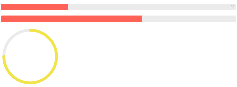
Progress bars can come in a variety of formats to support the message you’re trying to communicate. These three example (basic, chunked and circular) are from Progress Kendo UI for Angular components.
Menus and Navigation
The typical design pattern for helping users find that initial UI is a menu. To build an effective menu, you first need to determine what terms/icons your users will be looking in your menu items (you can draw on your users’ mental model for those terms). Depending on the number of menu items, a single list of menu items may be all that you need.
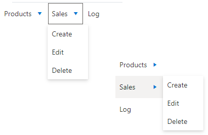
The Menu component from Progress KendoReact supports traditional dropdown menus and can be easily swapped from horizontal to vertical layouts.
However, where the number of menu items is large (i.e., more than a half-dozen), you’ll want to create menu groups to narrow the user’s search when looking for the “initial UI.”
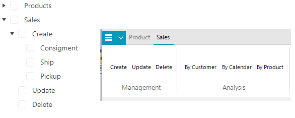
TreeView controls provide a way of organizing hierarchical navigation structures while “Microsoft ribbon-style” menus support complex desktop environments (these examples use Kendo UI for Angular TreeView and the RibbonBar from the Telerik UI for WinForms library).
The techniques involved in wayfinding, which describes how people find their way to a location, can help you here. For example, when people start out on a journey, they first want directions to get to the general vicinity of their final destination (e.g., “How do I get to Cincinnati?”)—those are your menu groups. When people get close to their destination, they want more specific instructions (“How do I get to Skyline Chili?”)—those are your menu items.
This is also the way Disney World supports their visitors: Direction signs at Disney World point to specific attractions, but only for those attractions in the customer’s immediate vicinity (e.g., “Dumbo’s Wild Ride”). For most distant attractions, the signs just point to the general area (e.g., “Adventureland”).
Even if your number of menu items is small, if items are grouped together in your users’ mental model, then you should consider creating menu groups that reflect that model. This may just mean organizing menu items on a single line into groups with captions.
As with the menu items themselves, when creating menu groups, it’s critical that you draw on your users’ mental model to pick the terms/icons you’ll use to identify your groups.
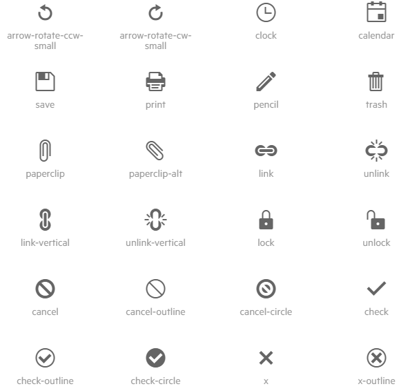
Progress Telerik provides a rich store of widely recognized icons that you can use in your applications (these are from the icons available for Blazor applications).
Navigating Through the Scenario
Since many goals will require the user to interact with several UIs, individual UIs are going to need links or buttons that lead to the “next UI” in the user’s mental model. Without those links between the UIs that make up a process, users are forced to return to the application’s main menu to search for the “next UI.”
Design patterns apply here, also. On webpages, for example, users typically regard links, menu choices and clickable icons as “navigation” items and don’t expect, when they click those elements, for any action to be taken (other than displaying a new page).
You can also leverage design patterns in deciding where to put your menus on a website. Users expect menu bars close to the top or bottom of the page to be static and remain unchanged as the user moves around the site. Users expect menu bars further within the page (or menus down the left side of the page when there’s a bar across the top of the page) to change as the user moves from one subsite to another subsite within the main site.
On the other hand, users typically regard buttons on a webpage as performing some action (saving the data in the current UI, for example). If a button does perform any navigation, then users see it as an “add-on” performed after the action is complete (displaying a success screen, for example).
In the Next Post
Next time, we’ll finish up the list of five design principles for ensuring your users always know what to do next—bullet-proofing your UX. The final two principles are organizing your UIs and testing your UIs, with user involvement.
Try DevCraft Today
Get started with a Progress Telerik DevCraft Trial today! The DevCraft suite is the most powerful collection of Telerik .NET and Kendo UI JavaScript developer tools. It includes modern, feature-rich, professionally designed UI components for web, desktop and mobile applications; embedded reporting and report management solutions; document processing libraries; and automated testing and mocking tools.
DevCraft will arm your developers with everything needed to deliver outstanding applications in less time and with less effort, and with consistent theming across your applications.
With award-winning technical support delivered by the developers who built the products and a ton of resources and trainings, you can rest assured that you have a stable provider to rely on for your everyday challenges along your software development journey.
Peter Vogel
Peter Vogel is both the author of the Coding Azure series and the instructor for Coding Azure in the Classroom. Peter’s company provides full-stack development from UX design through object modeling to database design. Peter holds multiple certifications in Azure administration, architecture, development and security and is a Microsoft Certified Trainer.
Related Posts
Comments
All articles
Topics
Web MobileMobile
Desktop
Design
Productivity
People
