Navigating Easily in PDF Documents with New Bookmarks Support in RadPdfViewer for WPF

Summarize with AI:
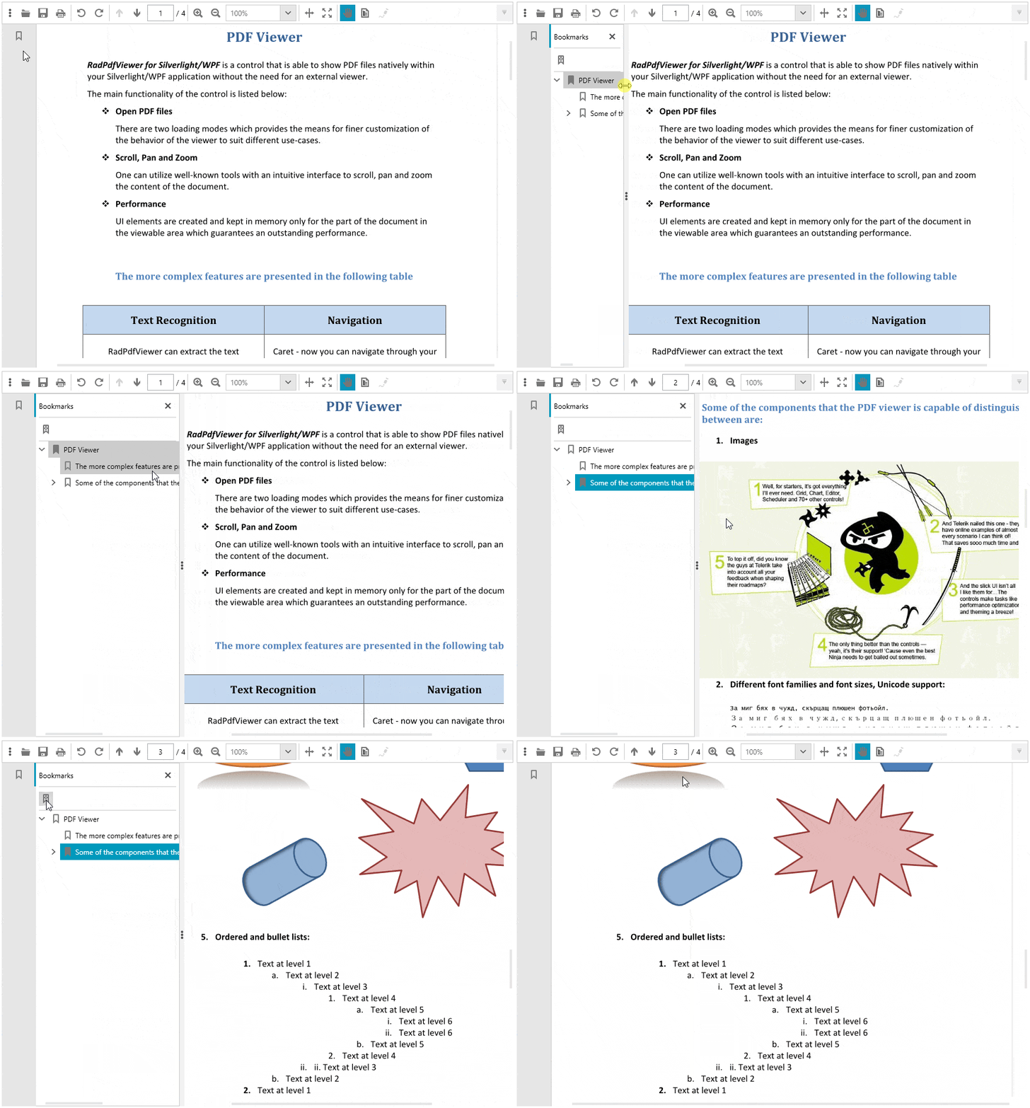
With the R3 2018 release we are happy to announce the support of PDF bookmarks in RadPdfViewer, part of the Telerik UI for WPF suite. Bookmarks are represented as a visual table-of-contents and are visualized on document load when there are any present in the document. Bookmarks provide a much better user experience navigating large PDF documents by pointing to a targeted destination on click. Also, you can use the “Find current bookmark” functionality which conveniently selects the bookmark that is currently in the view. An example can be seen below:

Bookmarks UI Components
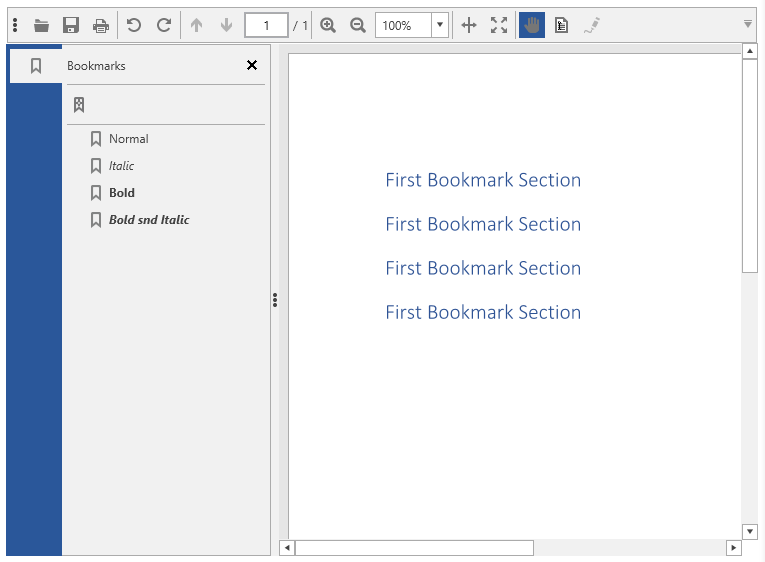
PDF bookmarks are visualized in RadPdfViewer using the RadPdfViewerNavigationPane. This is a control representing an area which can display different panels, including bookmarks. It is designed to be extended in the future and contain other document-level navigation features, such as thumbnails or attachments. The RadPdfViewerNavigationPane exposes the PaneWidth property which sets the initial value of the pane’s width. The end-users can resize the pane’s width by dragging the splitter resided on the right side of the control.
<Grid> <Grid.ColumnDefinitions> <ColumnDefinition Width="Auto" /> <ColumnDefinition /> </Grid.ColumnDefinitions> <telerik:RadPdfViewerNavigationPane RadPdfViewer="{Binding ElementName=pdfViewer, Mode=OneTime}" PaneWidth="300" /> <telerik:RadPdfViewer Grid.Column="1" x:Name="pdfViewer" DataContext="{Binding ElementName=pdfViewer, Path=CommandDescriptors}" /></Grid>Commands
The following commands are available in the RadPdfViewer.CommandDescriptors property. They are executed when the end-users interact with the bookmarks panel:
- ActivateBookmarkItemCommand – It’s executed when an end-user clicks on a bookmark item. As a result the RadPdfViewer “jumps” to the destination in the PDF document or invokes a link pointing to a web resource.
- SyncCurrentBookmarkItemCommand – Finds the bookmark item related to the RadPdfViewer’s current page and marks it as selected in the UI. We are proud with our sync-to-current bookmark implementation, since it resembles the behavior of one of the big vendors of the market for PDF viewers but performs more than 20 times faster for large documents. For example, documents containing 5000 bookmarks are synced with RadPdfViewer for approximately half of a second. The RadTreeView control integrated in the bookmarks panel plays a key role in the improved performance. Moreover, our sync selects the most nested bookmark item related to the current page. This nuance in the behavior is very useful when navigating in documents with deeply nested bookmark hierarchies and is not implemented by all PDF Viewers supporting the functionality, especially with this exceptional performance.
The commands can be invoked from code as follows:
this.pdfViewer.CommandDescriptors.SyncCurrentBookmarkItemCommandDescriptor.Command.Execute(null);PDF Document Preferences
The PDF model defines certain document preferences which determine how the bookmarks should be displayed. These preferences are included in the document, when it is created or modified, and apply each time it is rendered in the viewer. For example, a preference for the bookmarks panel can be set to be initially expanded or collapsed after the document is loaded, or a preference defining the styling of the bookmarks item text can be defined. With the support of PDF bookmarks in Telerik UI for WPF the following properties are added:
Document Page Mode
This property of the RadFixedDocument class specifies how the document should be initially displayed when opened:
- UseNone – Specifies that the bookmarks panel should be collapsed by default.
- UseBookmarks – Specifies that the bookmarks panel should be expanded by default.
Bookmark Text Style
This property of the BookmarkItem class specifies the style characteristics for displaying the bookmark text. The available options are:
- Normal
- Italic
- Bold

The bookmarks panel is integrated with all themes provided by the Telerik UI for WPF suite. This includes the newly introduced Crystal theme which brings the Mac OS look and feel to your WPF apps. As with our other recent WPF themes, you can easily customize the theme colors to suit your taste with the Color Theme Generator for WPF.
What’s Coming Next
We are working hard to deliver the support for bookmarks in Telerik UI for Winforms suite for the next R1 2019 release, expected at the beginning of the next year. You can find more information about what is coming in 2019 in the Telerik UI for WPF Roadmap and Telerik UI for Winforms Roadmap.
If you are new to Telerik UI for WPF, or this is the first time you are hearing about the suite, you can check out the webpages for WPF, download a trial to try them out for yourself and visit the documentation to get a hang of how they work.

Georgi Georgiev
Georgi Georgiev was a software developer on the Telerik Document Processing team located in Sofia, Bulgaria.
