Meet the World’s First Mobile HTML Editor
Summarize with AI:
RadEditor just got a new mobile rendering in the Q2 2015 release. The Telerik Editor for ASP.NET AJAX is the first and only fully functional HTML WYSIWYG editor that is so mobile friendly. Its new UI is inspired by leading native apps like MS Word Mobile and Google Docs Mobile and offers touch-optimized buttons, dropdowns, dialogs and overall UX.
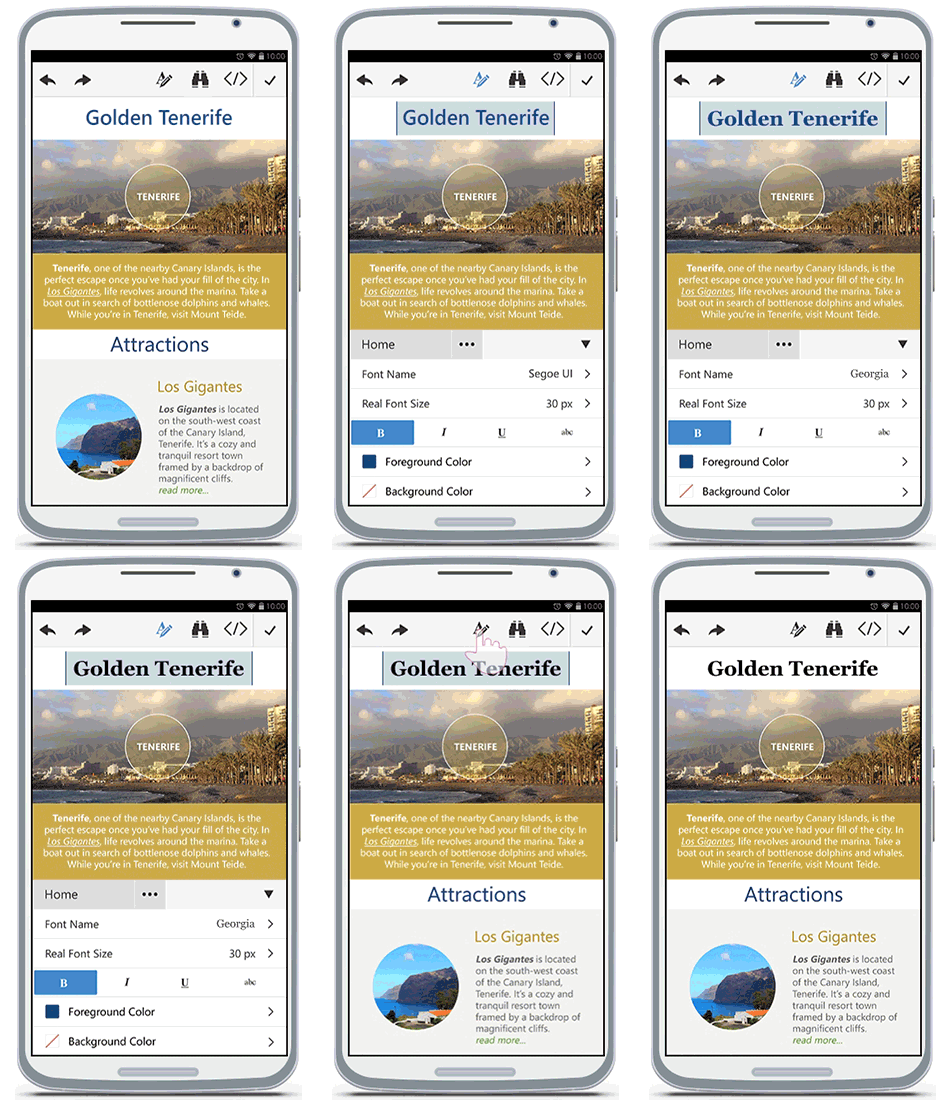
Usually, a mobile version of a tool is trimmed down to the bare minimum that can run on such a small screen and weak hardware. This is not the case with the Editor control. We brought the entire desktop toolset to your mobile device.
That’s not all! While this layout targets phone devices, you can use it anywhere (tablets, phablets or hybrid laptops), because the interface is fully responsive and the toolbar is fully customizable.
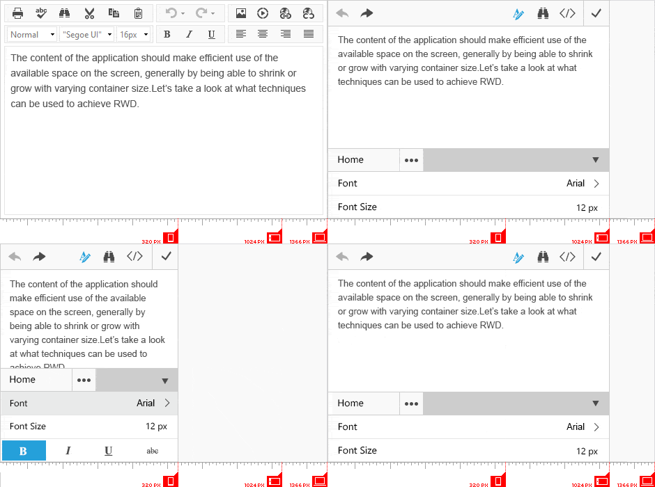
Even More Reasons to Want the Mobile Editor Layout
Let’s look at a few scenarios that are a perfect fit for the mobile editor:
- You have a CMS of some sort: Your users can edit anywhere, anytime, on any device. Even creating a new article/page is possible, even though we expect editing and polishing of existing content to be the primary use case.
- Improving your blog for your readers and followers: Everyone can now comment with ease.
- Improving your blog for your writers: You can save ideas that come to you anywhere from your mobile phone. You can also add those final touches on your new article while you are commuting and save precious time.
- Forums: Those email notifications from the threads you track can now lead to a mobile-friendly page for posting your response (quite like StackOverflow’s native app. Cool, right?).
- Notes for your industry: Coworkers and employees can create and store notes, recommendations, issues on the go. Doctors can update patient statuses during visitations. This mobility is at their fingertips--literally.
I’m On Board! How Do I Get That?
Easy as pie:
- Upgrade to the Q2 2015 or later release
- Add this meta tag to the page:
<metaname="viewport"content="width=device-width, initial-scale=1"/> - Set the RenderMode property of the Editor to Mobile (or Auto)
<telerik:RadEditorID="RadEditor1"runat="server"RenderMode="Mobile"></telerik:RadEditor>
Even More UX Goodies
There are a few features I feel obliged to highlight:
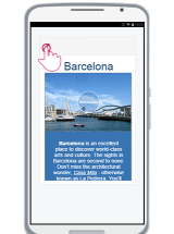
- Initially, you only see a pencil above the content that will be edited to avoid clutter. Tap that button or anywhere in the content to start editing:
- To show the keyboard tap in the content. To toggle the formatting tools at the bottom instead of the keyboard, use the dedicated button. You can now use the toolbar and format the content as you like. If you missed the gif animation at the top that shows how you can do that, now is a great time to scroll up and bask in its glory.
- Tabs are contextual. This means that the editor knows what you have selected and will show you the toolbar for that specific element:
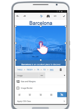
You can read the entire list in the Phone Layout End User Experience article. There is so much more to discover—dialogs are more immersive, their layout is changed to show the core features without clutter, Find and Replace is brand new, as well.
Give It a Try
Scan this QR code with your device and it will take you there:
Let Us Know What You Want Next
As usual, we want to hear what you wish to see implemented and improved in the control so we can make it more useful for you. Give us a shout in the comments, open a ticket or write in our Feedback Portal. The current plans include a tablet-oriented layout, and we'd love to hear more ideas.

Marin Bratanov
Marin Bratanov was a Principal Technical Support Engineer in the Blazor division.

