Meet Telerik UI for WPF's New Family Member—HyperlinkButton

Summarize with AI:
Buttons are everywhere and represent the most fundamental part of any WPF application, serving a variety of use cases. Let's learn all about the new hyperlink button control in Telerik UI for WPF.
The Telerik UI for WPF suite provides a variety of buttons for developers to use in building their desktop applications, yet something was missing - a way to easily add a hyperlink to a button. The good news is, the RadButtons family just got a new member – the HyperlinkButton. No, it's not the stork that is responsible - it's the Telerik UI for WPF R1 2019 Release that brought this finishing touch to your WPF apps.

Where is the Hyperlink Button in WPF?
In short - there is no such control in the WPF framework.
If you are one of those people, searching for this "missing link", well I recently did some digging into that myself and followed the below research process:
- Sources: the best-known communities for computer programmers
- Topic: where is the link button in WPF
- Answers Found: a tremendous volume and variety!
There were tons of people looking for such a small, yet it turns out essential, part to put the finishing touches on their WPF applications. They wondered what the control's name was, how to style the existing Button to display it as a hyperlink, and so on.
One commenter even wrote something like Did you try googling it? You would have gotten thousands of hits. P.S. to make his point, “gotten” was written with a larger font size and bolded!
It may sound funny, but the problem exists. There isn’t a straightforward, quick and easy way to have a hyperlink button in your WPF application.
Well, there wasn’t.
Discover the Brand New RadHyperlinkButton
RadButtons - a well-known part of Telerik UI for WPF - define a set of fully customizable button controls, which are feature rich and modern. Most of all, they are a strong weapon that helps in building complex and flawless user interfaces.

Cheers to that! No more need to lookup custom control templates for Button’s style, or to create a custom one, then use a bunch of other controls, plus complex bindings and triggers to get to the desired point.
WPF’s Hyperlink element (defined in System.Windows.Documents namespace) is an inline-level content element that is used to add a hyperlink to FlowDocument content. Until now, you were able to add hyperlink support to any Inline element.
If you want to have the awesome RadButton functionality and extend it with Hyperlink capabilities, well you hit the jackpot.
There are several things that you need to know about the brand new link button.
Hosting & Getting Started
One of the main advantages of HyperlinkButton is that it inherits from RadButton class, which simply means that it:
- Supports all features of RadButton
- Can be hosted in any UI element depending on your needs and imagination
- Can become a part of your app in a single line of XAML code
<telerik:RadHyperlinkButtonContent="Link"NavigateUri="https://www.telerik.com"TargetName="_blank"/>
Navigation
One of the most common properties for utilizing the control is the NavigateUri property, which is intended to be used for navigating to the needed Uri when the control is clicked.
One thing that is worth noticing is that the RadHyperlinkButton saves you the trouble of handling navigation yourself, while navigation can only occur for Hyperlink if either its direct or indirect parent is a navigation host.
Content
Another essential part of the control is the Content property, which sets the content that will be visualized by the control. The sky is the limit here. Literally.
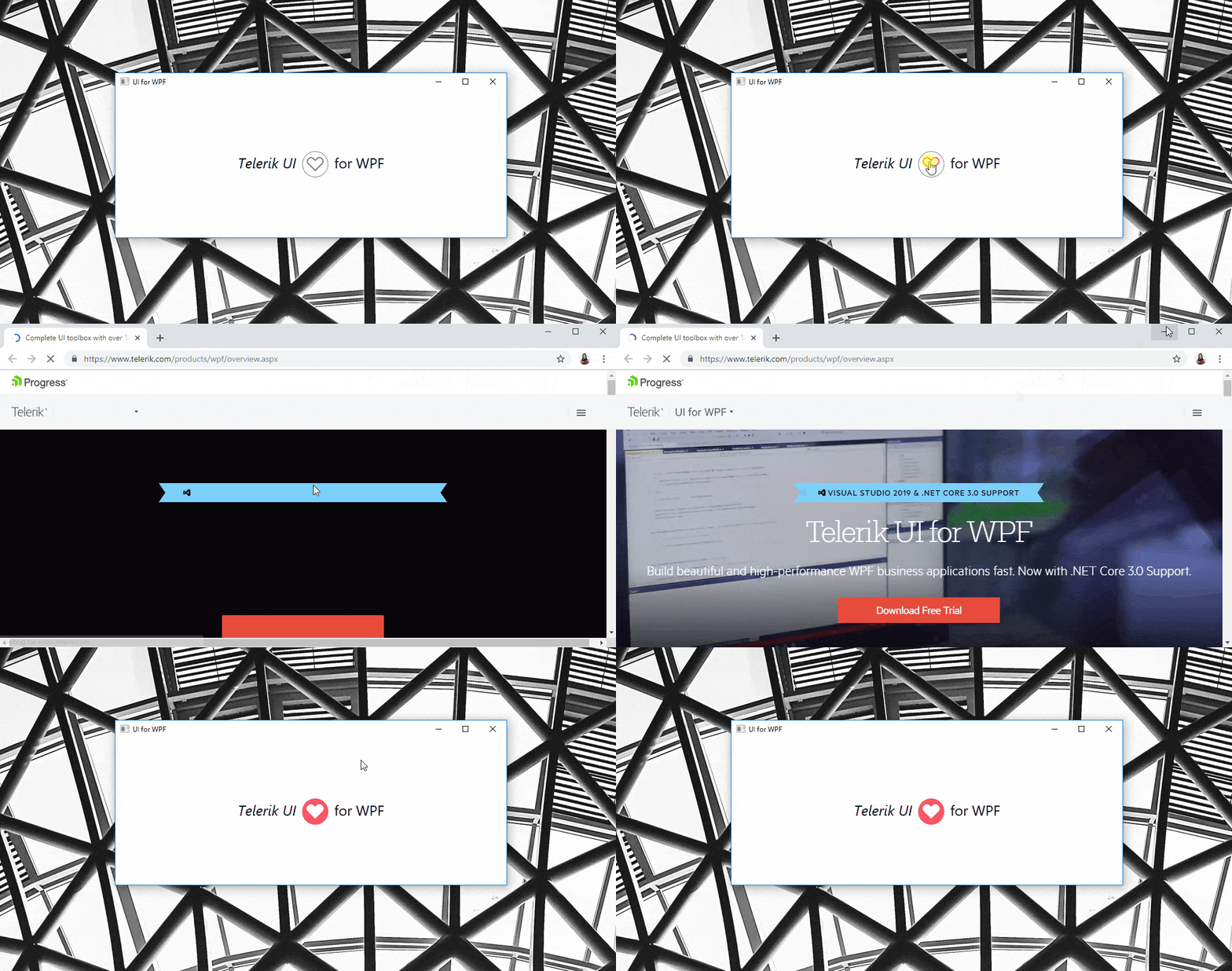
The Content can be set to an Image, for example. In such a setup the link will be opened when the user clicks on the Image. It can be set to Glyph as well, by setting the ContentTemplate property of the control to, for example:
<DataTemplatex:Key="hbContentTemplate"><telerik:RadGlyphGlyph=""FontSize="32"Margin="5"/></DataTemplate>
... and then you can swap it with another glyph when the link is visited, like so:
<DataTemplatex:Key="hbVisitedContentTemplate"><telerik:RadGlyphGlyph=""FontSize="32"Margin="5"Foreground="White"/></DataTemplate>
And the result is:

Visual States
The RadHyperlinkButton comes with the full variety of Telerik UI for WPF’s themes (and all their different color variations) which you can apply to your application.
When Hovered or Visited, the control will be underlined, and when disabled – it will have the theme’s specific opacity value to deliver a consistent look and feel for your WPF app.

A great advantage here is that the control implements a VisitedForeground property with the help of which you are in total control of the foreground that the control will have when the link is visited. Information on whether the link is visited is also available through its IsVisited Boolean property, which might be useful.
Try the Latest Telerik UI for WPF Yourself
If you are looking for great flexibility and flawless theme-aware UI, you may want to take advantage of the latest awesome additions to the more than 130+ ready-made Telerik UI for WPF components, like RadNavigationView.
Get yourself a free trial of Telerik UI for WPF today and start developing your apps easier, better, faster.
Share Your Feedback
Let’s continue to build the future of Telerik UI for WPF together, a.k.a. don’t forget to share your thoughts as a comment below or let us know if you have any suggestions and/or need any features/controls by visiting our revamped Feedback portals about UI for WPF/Silverlight and Document Processing Libraries.

Viktoria Grozdancheva
Viktoria is a Senior Front-end Developer with 5+ years of experience designing and building modern UI for desktop and mobile platforms on Microsoft/Telerik technology stacks. Her spare time is dedicated to friends and family and discovering new pieces of the world. Find her on Twitter and LinkedIn.
