One HamburgerMenu, Please—Modern Navigation for Your WPF App

Summarize with AI:
WPF application developers rejoice! You can have an intuitive and modern navigation in your application - look no further than the NavigationView (HamburgerMenu) in Telerik UI for WPF. Learn all about this powerful navigation control below.
I recently heard the term “conscious control,” and asked myself, "what does this mean, do controls have actual consciousness (duh!)?" However, that was just for a few seconds.
They are actually controls that can adapt to different window sizes layouts, which is essential for apps that scale across various devices and dimensions. To create conscious controls, you can either code your own adaptive UI to optimize for different screen sizes, or you could save yourselves a considerable amount of time and simply use the new NavigationView (HamburgerMenu) control, which arrived in Telerik UI for WPF in R1 2019.
In case you missed our new release, the NavigationView is just a small (but essential) part of it. Let's have a minute of glory for the new DiagramRibbon and HyperlinkButton controls, the support of Charts for RadSpreadsheet and RadSpreadProcessing and last, but not least - .Net Core 3 and VS 2019 support!
Now, let’s not forget who the “star” of the show is. That’s right – the brand new NavigationView.
Does your app need to:
- Provide a consistent navigational experience
- Preserve screen real estate on smaller windows
- Organize access to many navigation categories
If the answer to at least one of the following key points is YES, then this is the right control.
For more information on how to create a sample application that contains a RadNavigationView (HamburgerMenu) control, jump into its Getting Started article.
Anatomy
Reading this title, you thought for a second of Grey’s Anatomy, didn’t you? Now let’s lift the curtain and look at the hamburger menu’s control layout.
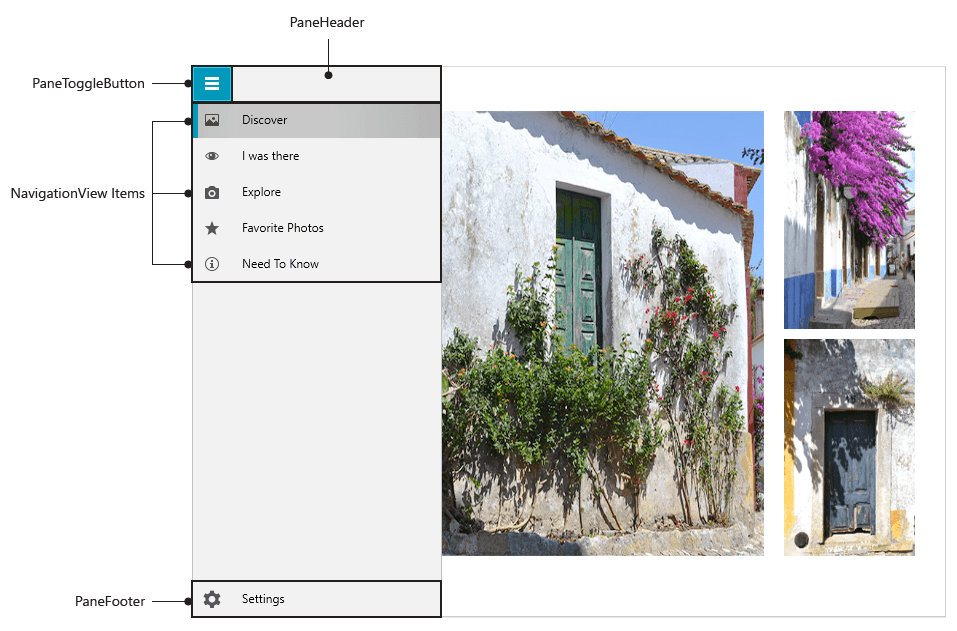
The recipe for the hamburger menu consists of:
- PaneHeader - the Header (or the top burger bun) of the NavigationView
- PaneToggleButton – the one that opens/closes the NavigationPane, which hosts the NavigationViewItems
- NavigationView Items – the most important “ingridients” of the HamburgerMenu, used for navigating to specific content, which can be populated statically or through databinding
- Pane Footer - the Footer (or the bottom burger bun) of a RadNavigationView

Adaptive Behavior
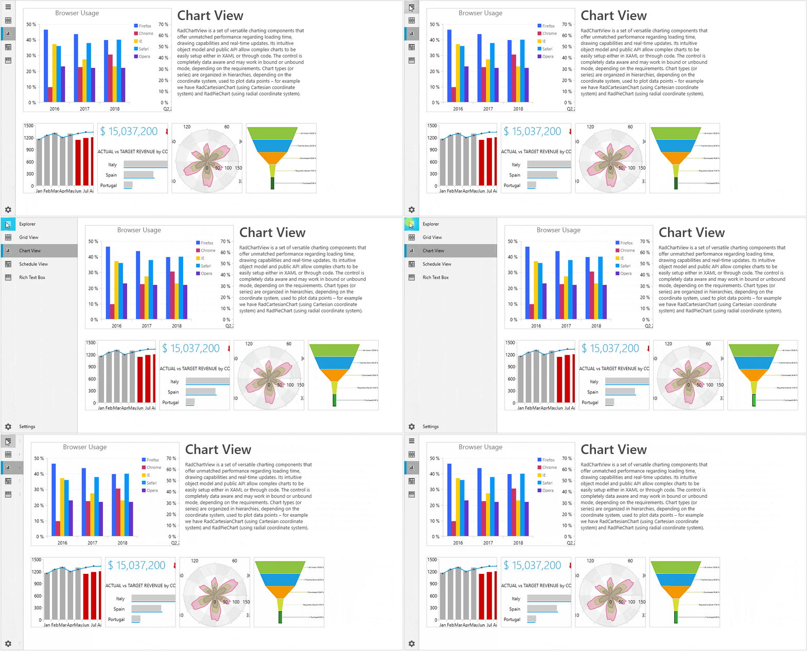
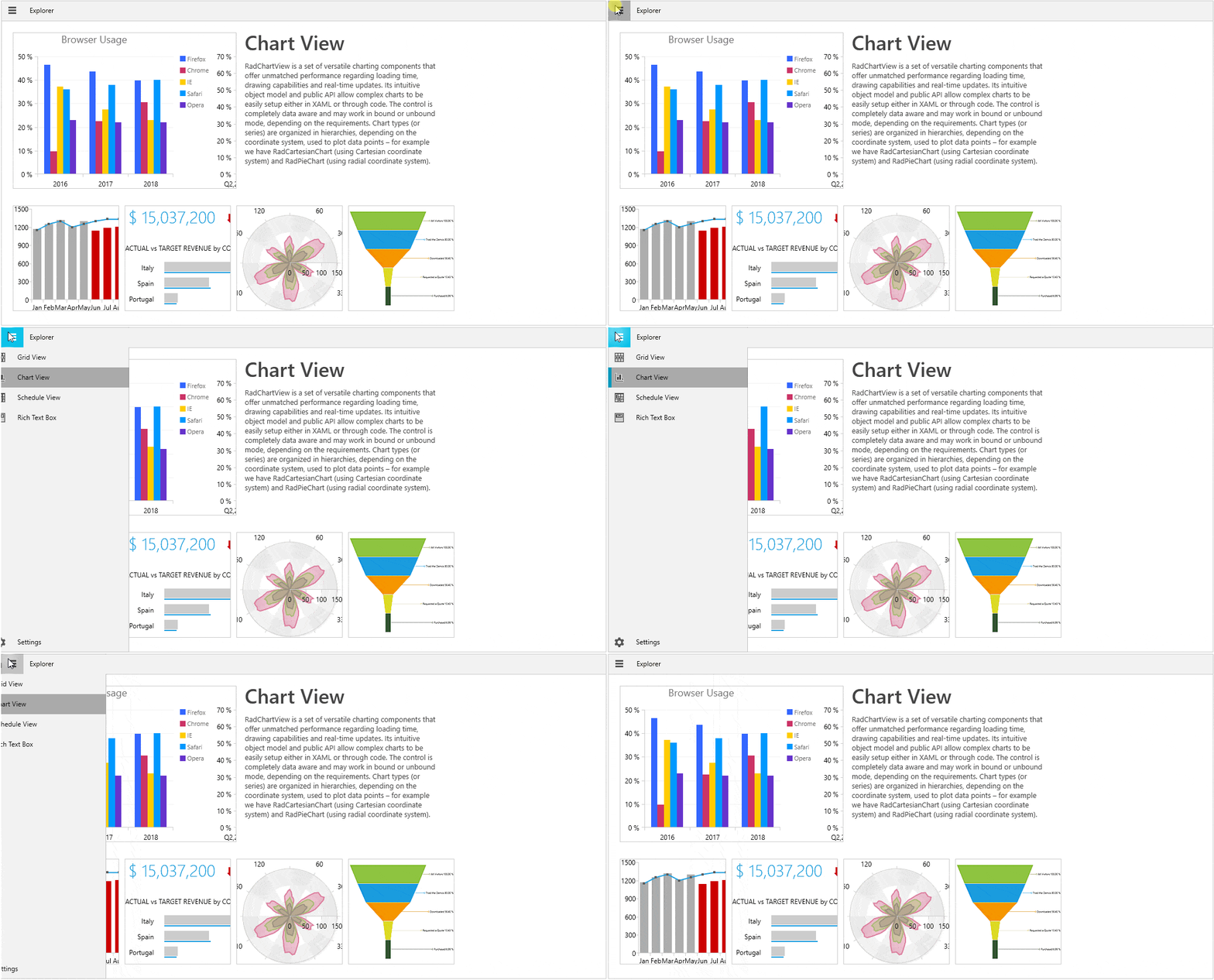
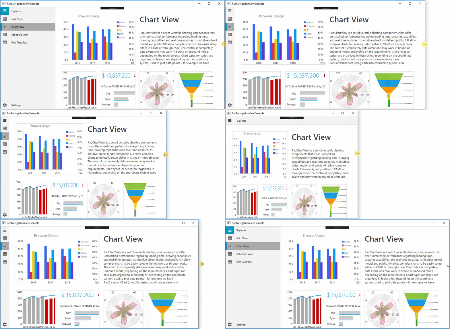
By default, the navigation view automatically changes its DisplayMode depending on the amount of available size. It has three display modes - Minimal, Compact and Expanded.
 Expanded mode – the pane stays open alongside the content
 Compact mode – the pane always shows as a narrow sliver
 Minimal mode – the pane shows/hides on PaneToggleButton click; the button remains fixed
By default, the control changes its DisplayMode when its size passes certain thresholds. The CompactModeThresholdWidth and ExpandedModeThresholdWidth properties specify the breakpoints at which the display mode changes. The default value for the compact one is 641 and the default value for the expanded - 1008. You can modify these values to customize the adaptive display mode behavior.

If you want to be in control of this adaptive behavior, you can do that. The only thing that you need to do is set the AutoChangeDisplayMode property to False:
- In Xaml:
<telerik:RadNavigationViewx:Name="navView"AutoChangeDisplayMode="False"/> - In Code:
this.navView.AutoChangeDisplayMode =false;
Flexible Customization
I love the power of customizable components! Who doesn’t? Many of the NavigationView’s parts are fully customizable.
Customizing the PaneToggleButton
You can customize the look and feel of the PaneToggleButton using PaneToggleButtonContent, PaneToggleButtonContentTemplate and PaneToggleButtonStyle properties. If you do not need it, you can just use the PaneToggleButtonVisibility property.
Customizing the Header/Footer
The list of properties that allow customizing the control’s header are: PaneHeader, PaneHeaderTemplate and PaneHeaderHeight.
The footer can be customized using the PaneFooter and PaneFooterTemplate properties.
Wait, there is more.
I forgot to mention that you can change the color of pane components at glance with PaneBackground, PaneHeaderBackground and PaneHeaderForeground properties.
Customizing the Items
The RadNavigationViewItems are fully customizable, too, especially their icons.
The Icon and IconTemplate properties are the key here. With the help of the IconTemplate, a single DataTemplate can be set to many RadNavigationViewItems. More information on how to set the Icon of an item to a RadGlyph or use the IconTemplate property in a databinding scenario can be found in this article.
As Selector and ItemsControl classes are part of RadNavigationView’s base classes, the following properties can also be used to style the control items: ItemTemplate, ItemTemplateSelector, ItemContainerStyle.
Customizing the Open/Close Animations
By default, RadNavigationView defines three animations named ResizePaneAnimation, MinimalPaneOpenAnimation and MinimalPaneCloseAnimation.
- ResizePaneAnimation - played when the DisplayMode of the RadNavigationView is either Compact or Expanded and the NavigationPane is opened or closed
- MinimalPaneOpenAnimation - played when the DisplayMode of the RadNavigationView is Minimal and the NavigationPane is closed
- MinimalPaneCloseAnimation - played when the DisplayMode of the RadNavigationView is Minimal and the NavigationPane is opened
This article demonstrates how you can customize these animations.
Events
Here is the list of most important events that you need to know when it comes to RadNavigationView:
- ItemClick - occurs each time an item in the menu gets clicked
- PaneOpened - occurs when the pane is open
- PaneClosed - occurs when the pane is closed
- SelectionChanged – occurs when the selection changes
All mentioned event handlers receive two arguments - the sender argument which contains the RadNavigationView (type - object, can be cast to the RadNavigationView type) and a RoutedEventArgs object.
Theming
There is no need to mention that the HamburgerMenu comes with the great and colorful variety of UI for WPF Themes Suite, right? And you remember that if the theme brushes are not colorful enough, we offer seamless color customization and fast palette creation with the help of the Color Theme Generator, don’t you?
Try It Out and Share Your Feedback
Enough talking. The Telerik R1 2019 Release is already live, so do not hesitate and give RadNavigationView a try right now by downloading the latest:
Wait, what? You are just hearing about Telerik UI for WPF for the first time? Well then, head over to the product page to explore the key features, various controls and themes ready for the taking.Feel more than welcome to share your thoughts as a comment below, or… wait! You can visit our revamped Feedback portals about UI for WPF/Silverlight and Document Processing Libraries and let us know if you have any suggestions or if you need any particular features/controls.

Viktoria Grozdancheva
Viktoria is a Senior Front-end Developer with 5+ years of experience designing and building modern UI for desktop and mobile platforms on Microsoft/Telerik technology stacks. Her spare time is dedicated to friends and family and discovering new pieces of the world. Find her on Twitter and LinkedIn.
