Low-Code Data Grids With Blazor

Summarize with AI:
Data grids are the gold standard for displaying large amounts of data in business applications. The Telerik UI for Blazor grid is built specifically for this task by incorporating a wealth of features, most of which can be enabled in a simple and intuitive way through low-code options.
As someone who has used Blazor extensively for several years now, I have found Blazor to be a productive development platform. The benefits of the strongly typed C# language enable techniques that can reduce the amount of code required to accomplish repetitive tasks.
In this article we’ll explore the idea of using a data model to reduce the amount of user interface (UI) code that needs to be written by the enabling auto generation feature on the Telerik UI for Blazor data grid.
How Is this Low-Code?
“Low-code” is an industry term with a broad definition. Typically we see the term “low-code” used in the context of a drag-and-drop designer or a proprietary app development tool that enables technical professionals to create apps.
However, low-code development techniques can help professional developers be more efficient with repetitive tasks, or bridge the gap between development contexts such as backend and UI systems. In the following examples we’ll augment the need for UI code by using data annotations. By using data annotations, a backend developer can be more productive by writing less code in a familiar environment.
By using data annotations, a backend developer can be more productive by writing less code in a familiar environment.
Blazor Data Grid
Data grids are the gold standard for displaying large amounts of data in business applications. The Telerik UI for Blazor grid is built specifically for this task by incorporating a wealth of features, most of which can be enabled in a simple and intuitive way. Let’s begin by taking a look at an example written with Razor and HTML markup.
In the code example below, the grid is constructed of multiple HTML-like elements that define the grid columns, data formats, data source and grid features.
<TelerikGrid Data="@forecasts">
    <GridColumns>
        <GridColumn Field="Date" DisplayFormat="{0:dddd, dd MMM yyyy}" />
        <GridColumn Field="TemperatureC" Title="High Temp. C" DisplayFormat="{0:N1}" />
        <GridColumn Field="TemperatureCLow" Title="Low Temp. C" DisplayFormat="{0:N1}" />
        <GridColumn Field="TemperatureF" Title="High Temp. F" DisplayFormat="{0:N1}" />
        <GridColumn Field="TemperatureFLow" Title="Low Temp. F" DisplayFormat="{0:N1}" />
        <GridColumn Field="Summary" />
    </GridColumns>
</TelerikGrid>
Let’s focus for a moment on the first line of markup and see where simple adjustments can make a big difference in how the grid operates. If we enable the following properties, we can greatly improve the usability of the component. In the following snippet we’ll enable paging, sorting, grouping and filtering by setting their respective properties.
<TelerikGrid Data="@forecasts"
             Pageable="true"
             Sortable="true"
             Groupable="true"
             FilterMode="GridFilterMode.FilterMenu" >
...
We’ve easily increased the value of this component for our users with some markup. Even with simple switches like these, it’s easy to imagine that a data grid with many features could quickly balloon into many lines of markup.
With that in mind, let’s focus in on the larger portion of the markup, where the grid columns are defined. The grid columns are responsible for the bulk of our markup as each individual data point must be defined along with the field, desired column title and formatting.
    <GridColumns>
        <GridColumn Field="Date" DisplayFormat="{0:dddd, dd MMM yyyy}" />
        <GridColumn Field="TemperatureC" Title="High Temp. C" DisplayFormat="{0:N1}" />
        <GridColumn Field="TemperatureCLow" Title="Low Temp. C" DisplayFormat="{0:N1}" />
        <GridColumn Field="TemperatureF" Title="High Temp. F" DisplayFormat="{0:N1}" />
        <GridColumn Field="TemperatureFLow" Title="Low Temp. F" DisplayFormat="{0:N1}" />
        <GridColumn Field="Summary" />
    </GridColumns>
This section of markup is repetitive and cumbersome to write. Thankfully, this can be greatly reduced with the AutoGenerateColumns feature of the Telerik Grid.
Auto Generating Data Grid Columns
When using the Telerik Grid, auto generation can greatly reduce or completely remove the need for explicit GridColumns defined in markup. Since Blazor uses .NET and our data models are strongly typed, the grid can infer information from the model. In addition, the Telerik Grid supports System.ComponentModel.DataAnnotations that provide metadata when applied to the model.
Before we get acquainted with the auto generation feature, let’s take a look at the model class used in the example. The sample below is the model without any annotations.
public class WeatherForecast
{
    public int Id { get; set; } // hidden
    public DateTime Date { get; set; }
    public double TemperatureC { get; set; }
    public double TemperatureCLow { get; set; }
    public double TemperatureF { get; set; }
    public double TemperatureFLow { get; set; }
    public string Summary { get; set; }
}
Using this model, each of the properties are mapped to a GridColumn component and additional Title and DisplayFormat properties are set to achieve the desired output. This pattern is followed for each data point shown in the grid.
/* An explicit grid column */
<GridColumn Field="TemperatureC" Title="High Temp. C" DisplayFormat="{0:N1}" />
Instead of defining each column, we can remove the GridColumns and its children completely from the markup and set the AutoGenerateColumns property on the parent grid component. When using auto generation, the TelerikGrid component may even be converted to a self-closing tag if no additional modifications are necessary. It’s quite possible to add a fully featured grid component with a single element.
<TelerikGrid Data="@forecasts"
             Pageable="true"
             Sortable="true"
             Groupable="true"
             FilterMode="GridFilterMode.FilterMenu"
             AutoGenerateColumns="true"/>
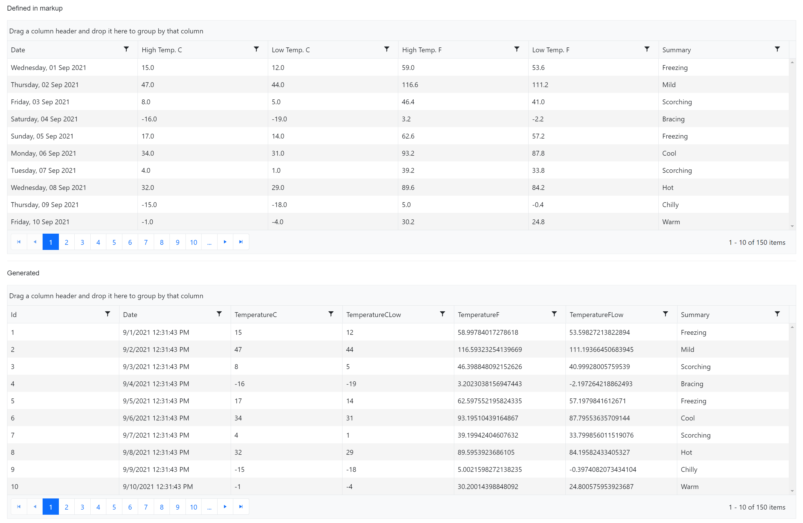
The grid uses the model to generate the output using the property names and types. Each property is mapped as-is using the property name as the grid column’s Title. In the image below, we can compare the markup-defined grid to the auto-generated grid and notice some differences.


With the auto-generated grid all properties are displayed, including the Id property, which is hidden in the markup-defined grid. The generated titles are not “human readable” on the generated grid, and the data formats are raw output of the data type. Thus far auto generation “works” but doesn’t quite match the desired user experience.
Adding a little metadata can fix most parity issues with auto generation. This is where the context shift can play an important role with developers. While we do need to write some code to complete the UI, a developer who is less comfortable with Razor and HTML markup may find working in the model familiar territory, therefore improving productivity.
Let’s revisit the model and add data annotations to instruct the data grid to properly generate the columns, titles and formatting. Each property in the model is decorated with a Display attribute to set the column name. Fields that require data formatting use the DisplayFormat annotation and use the same C# date format string that would have been defined in markup. Finally, any columns we wish to hide are given the Display attribute with AutoGenerateField set to false. The updated annotated model can be seen in the code sample below.
public class WeatherForecast
{
    [Display(AutoGenerateField = false)]
    public int Id { get; set; }
    [DisplayFormat(DataFormatString = "{0:dddd, dd MMM yyyy}")]
    public DateTime Date { get; set; }
    [Display(Name = "High Temp. C")]
    [DisplayFormat(DataFormatString = "{0:N1}")]
    public double TemperatureC { get; set; }
    [Display(Name = "Low Temp. C")]
    [DisplayFormat(DataFormatString = "{0:N1}")]
    public double TemperatureCLow { get; set; }
    [Display(Name = "High Temp. F")]
    [DisplayFormat(DataFormatString = "{0:N1}")]
    public double TemperatureF { get; set; }
    [Display(Name = "Low Temp. F")]
    [DisplayFormat(DataFormatString = "{0:N1}")]
    public double TemperatureFLow { get; set; }
    public string Summary { get; set; }
}
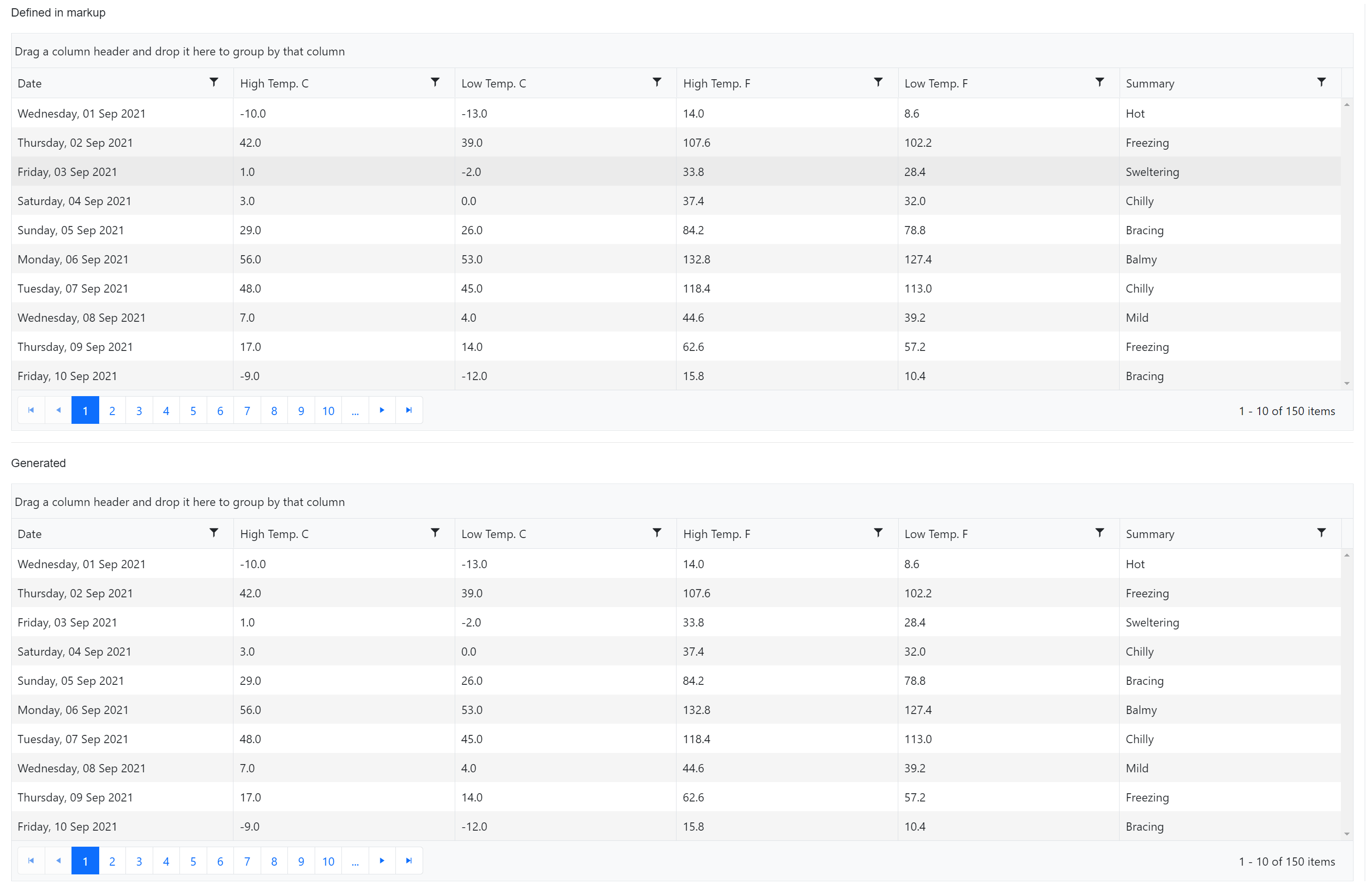
After annotating the model we can compare the markup-defined grid to the auto-generated one and see there are no longer any differences between the two.


The data grid is now completely auto generated from the model complete with formatting. In addition, the same model is used with the Telerik Grid’s auto-generated form if editing is enabled on the grid. If an external form is needed for modifying data, the Telerik Form also exhibits the same auto generation capabilities. In either form scenario, validation attributes can be used to generate form validation on the UI.
Customization
Often with low-code solutions developers are stuck at a crossroads when it comes to customization. Fortunately, with the Telerik Grid’s auto generation feature this isn’t a problem. The Telerik Grid provides a way of exposing the generated columns so developers can choose to mix and match generated columns with markup-defined columns. This technique can be applied to columns that need customization that can’t be accomplished with attributes such as templates.
In the example below, we return to the markup definition of the grid and expand the element to include the GridColumns component. Within the GridColumns we instruct the grid where to render the auto-generated columns by adding a GridAutoGeneratedColumns component. Any columns defined before or after will be displayed in addition to what is generated.
<TelerikGrid Data="@forecasts"
             Pageable="true"
             Sortable="true"
             Groupable="true"
             FilterMode="GridFilterMode.FilterMenu"
             AutoGenerateColumns="true">
    <GridColumns>
        <!-- Additional custom columns can go before -->
        <GridAutoGeneratedColumns />
        <!-- Additional custom columns can go below -->
    </GridColumns>
</TelerikGrid>
Next we can add our custom content. In this example we’ll complete the grid by including a custom column that displays an icon based on the data from the Summary field. A Template is used within a grid column and data is passed to a method for finding the icon which is rendered in the grid cell. To further customize the column, the FilterMenuType is set to a CheckboxList which is automatically bound to unique summary values in the data set.
<TelerikGrid Data="@forecasts"
             Pageable="true"
             Sortable="true"
             Groupable="true"
             FilterMode="GridFilterMode.FilterMenu"
             AutoGenerateColumns="true">
    <GridColumns>
        <GridColumn Field="Summary" Width="100px" Title="" FilterMenuType="FilterMenuType.CheckBoxList">
            <Template>
                <span>@GetIcon(((WeatherForecast)context).Summary)</span>
            </Template>
        </GridColumn>
        <!-- Additional custom columns can go before -->
        <GridAutoGeneratedColumns />
        <!-- Additional custom columns can go below -->
    </GridColumns>
</TelerikGrid>
The rendered grid below uses both auto-generated columns and a custom template column defined in markup. As we can see in the image below, the custom column shows icons based on the data as well as an Excel-like filter from data in the data set.


Conclusion
The Telerik UI for Blazor Grid is a powerful component with many features. We can easily enable UI functionality through simple properties, and further automate UI development with a low-code model first approach.
Through example we saw both a markup-defined grid and data-driven auto-generated grid. Each approach fills a unique role depending on the developer’s needs while providing flexibility to choose the right mix of low-code and customization.
The auto generation feature is meant to speed up UI development by taking a strongly typed model and using it to infer the UI. This means developers can spend less time writing repetitive boilerplate code and spend more time focused on delivering solutions. This feature is not limited to grid columns—grids with editing enabled will apply the same logic to auto generated forms. In addition, the Telerik Form and Tree List components have similar capabilities.
Do the auto generation features of Telerik UI for Blazor interest you? Get a free trial of Telerik UI for Blazor and find out. Also, let us know your thoughts in the comment section. We would love to hear feedback about how you're using auto generated columns. If you have ideas on how we can improve this feature please let us know in our Feedback Portal.

Ed Charbeneau
Ed
