
Level up Your UI with the New Telerik RadSvgImage Control for WPF

Summarize with AI:
The RadSvgImage component in Telerik UI for WPF empowers developers to seamlessly integrate vector-based graphics into their apps. Take a closer look!
In the much-anticipated R3 2023 release, Progress Telerik introduced the groundbreaking RadSvgImage control in UI for WPF. This innovative addition empowers developers to integrate vector-based graphics into their applications, elevating user experiences to a whole new level.
With the ability to scale images without sacrificing quality, the RadSvgImage control revolutionizes UI development in WPF. It’s particularly invaluable for crafting high DPI applications, prioritizing user satisfaction. The cornerstone of this advancement lies in Scalable Vector Graphics (SVG), an XML-based format that allows graphics to adapt seamlessly to all DPI settings.

Getting Started with RadSvgImage
Adding RadSvgImage to your project is a piece of cake! Just include a reference to the Telerik.Windows.Controls assembly, and you’re all set. It’s that simple! Displaying an SVG image as a standalone component is a breeze, as you can set the UriSource property like so:

<telerik:RadSvgImage UriSource="SVGIcon.svg" Width="128" Height="128"/>Keep in mind that RadSvgImage does not have a default size. If it’s placed in a panel that measures it with Infinity (e.g., in a StackPanel), you’ll need to specify a size for the SVG image to display properly. 🛠️
Want to spice things up? You can also roll with RadSvgImage as a markup extension, instead of setting it up as a separate component:

<Image Source="{telerik:RadSvgImageSource Source='SVGImage.svg'}"
       Width="128"
       Height="128"/>
Customizing Fill Colors
Check it out! You can totally swap out the fill color of your SVG image by tweaking the OverrideColor property:
Animations Made Easy
The RadSvgImage control has built-in animation support, allowing you to bring your SVG images to life. To apply an animation, utilize the animate, animateMotion and animateTransform elements inside the SVG’s XML.

<g>
   <animateTransform attributeName="transform" attributeType="XML" type="rotate" from="0" to="360" begin="0s" dur="12s" />
   <use xlink:href="#minuteHand" />
</g>
Applying Brushes to Elements
If you’ve ever wanted to fill up your SVG images with a splash of color, you’re in luck. All you need to do is dive into the CustomBrushes property. This little gem allows you to easily apply different
hues to elements within your SVGs. It’s like giving your graphics a personal touch! Just a heads up, the CustomBrushes property is a Dictionary<string, Brush>, which basically means it’s a nifty tool
for handling color variations.
Let’s dive into an example, shall we?
Say you have your SVG file ready. You can think of it as your canvas, waiting to come to life. Here’s a snippet:
<svg width="200" height="200" viewBox="130 130 200 200" fill="none" xmlns="http://www.w3.org/2000/svg"
xmlns:xlink="http://www.w3.org/1999/xlink" x="0px" y="0px"
enable-background="new 0 0 512 512" xml:space="preserve">
<defs>
<solidColor id="calendar-lines"/>
<solidColor id="calendar-datebgr"/>
<solidColor id="calendar-date"/>
</defs>
<path d="M14.5,39.8 L112.2,39.8 M14.5,55.8 L112.2,55.8 M14.5,71.8 L112.2,71.8 M14.5,87.8 L112.2,87.8 M14.5,103.8 L112.2,103.8 M22.8,31.9 L22.8,109.1 M39.0,31.9 L39.0,109.1 M55.2,31.9 L55.2,109.1 M71.5,31.9 L71.5,109.1 M87.7,31.9 L87.7,109.1 M103.9,31.9 L103.9,109.1 M116.6,1 L11.1,1 C5.8,1 1.5,5.2 1.5,10.5 L1.5,114.5 C1.5,119.7 5.8,124 11.1,124 L116.6,124 C121.9,124 126.3,119.7 126.3,114.5 L126.3,10.5 C126.3,5.2 121.9,1 116.6,1 z M1.0,21 L125.7,21"
fill="transparent"
transform="translate(170,166)"
stroke="url(#calendar-lines)" stroke-width="2" width="130" height="125" />
<rect x="224.977" y="222" width="32.4675" height="32" fill="url(#calendar-datebgr)"/>
<path d="M246.145 230.268C245.383 231.664 244.664 233.048 243.987 234.419C243.31 235.782 242.696 237.153 242.146 238.532C241.596 239.912 241.118 241.304 240.711 242.709C240.305 244.105 239.992 245.536 239.772 247H236.687C236.89 245.697 237.178 244.397 237.55 243.103C237.931 241.799 238.375 240.5 238.883 239.205C239.391 237.902 239.958 236.594 240.584 235.282C241.219 233.97 241.892 232.646 242.603 231.309H233.983V228.795H246.145V230.268Z"
fill="url(#calendar-date)" stroke="transparent" stroke-width="0"/>
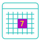
</svg>Now, you’ll want to create a custom Dictionary collection to define your colors.
public class CustomDictionary : Dictionary<string, Brush> { } It’s time to load up your custom Dictionary with some vibrant choices. Check this out:
<Grid.Resources>
    <local:CustomDictionary x:Key="CustomBrushesDictionary">
        <SolidColorBrush x:Key="calendar-lines" Color="#08BAB7"/>
        <SolidColorBrush x:Key="calendar-datebgr" Color="#b708ba"/>
        <SolidColorBrush x:Key="calendar-date" Color="Black"/>
    </local:CustomDictionary>
</Grid.Resources>
And finally, let’s bring it all together. Attach your RadSvgImage to the custom Dictionary using the CustomBrushes property. Watch your SVG image pop with personality!
 <Grid>
     <Grid.Resources>
         <local:CustomDictionary x:Key="CustomBrushesDictionary">
             <SolidColorBrush x:Key="calendar-lines" Color="#08BAB7"/>
             <SolidColorBrush x:Key="calendar-datebgr" Color="#B708BA"/>
             <SolidColorBrush x:Key="calendar-date" Color="#FBFF00"/>
         </local:CustomDictionary>
     </Grid.Resources>
     <telerik:RadSvgImage UriSource="/Images/SvgImage.svg" CustomBrushes="{StaticResource CustomBrushesDictionary}" Width="128" Height="128"/>
 </Grid>
Voila! Your RadSvgImage is now rocking custom colors and ready to shine. 🎨✨
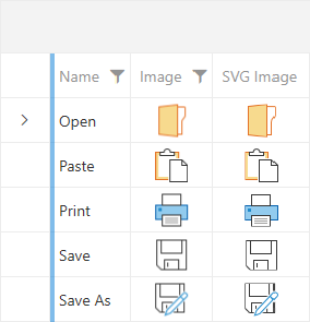
A Visual Comparison: SVG vs. PNG
The example below with RadGridView features two GridViewImageColumns, one using an SVG image and the other a PNG image. The difference is striking. While the PNG images are a little bit blurry, the SVG column retains its crisp clarity.
Conclusion
In summary, RadSvgImage control offers a versatile and powerful solution for seamlessly integrating high-quality vector graphics into your applications. Its flexibility, coupled with features like customizable colors and built-in animation support, opens up a world of possibilities for creating stunning user interfaces. In case you need more information about it, be sure to check the documentation, too.
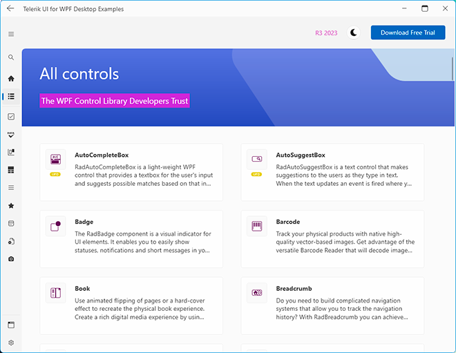
Be sure to visit our newly rebranded WPF demos for a deeper dive into the capabilities of RadControls, including a lot of examples showcasing the potential of SVG and other controls. Explore a wide range of scenarios and discover how RadControls can revolutionize your application development. From SVG integration to a host of other powerful features, these demos provide an invaluable resource for unlocking the full potential of your projects. Head over now and experience the future of UI development firsthand!
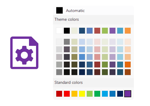
Also, don’t miss out on the Color Theme Generator. It’s a fantastic tool that allows you to preview all controls with different themes and colors, giving you a quick and easy way to find the perfect look for your application.
Try it out today and elevate your application’s visual experience!
Maria Hadzhieva
Maria Hadzhieva is a front-end developer on the Progress Telerik team.
Related Posts
Comments
All articles
Topics
Web MobileMobile
Desktop
Design
Productivity
People
