
Reach New Peaks in Your Data Storytelling with the WPF ChartView Histogram

Summarize with AI:
We are going to talk about data visualization where you can clearly see where the data peaks. So. Let’s begin.
We collect data to analyze everything from the weather, through the stock exchange and all the way to your gaming sessions. Reading the tens or hundreds of pieces of data manually and understanding the story they tell is a tiresome task, and definitely not an optimal solution.
The Progress Telerik UI for WPF RadChartView control comes in handy in these situations because it allows you to generate beautifully drawn chart visualizations—points, bars, lines and more. The charting suite is not the focus on the today’s topic, but it is an important piece of it. Let’s not waste any more time and get to the main character of this story—the new histogram visualization.
What is a Histogram?
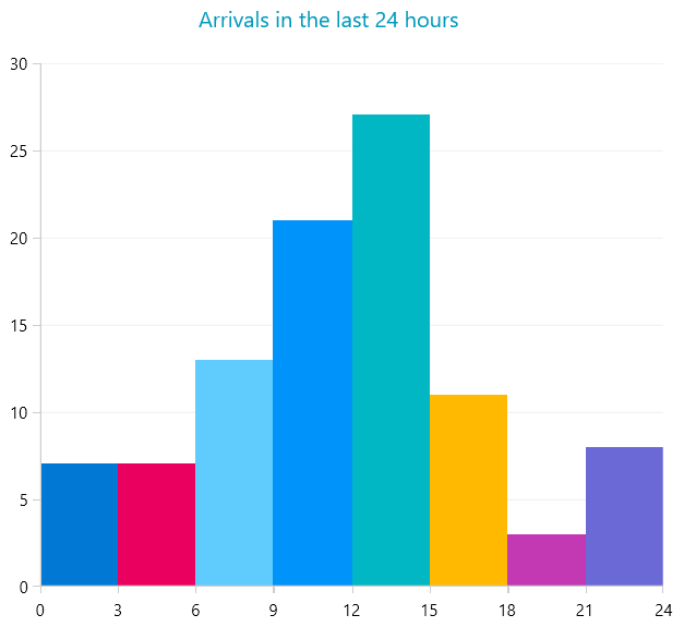
A histogram is consecutive bars chart where each bar’s width has a meaning on the horizontal axis. Most commonly, the histogram plot is used to show a frequency distribution.
The difference between a standard bar chart and a histogram is that the bar chart uses categories, compared to the histogram where each bar’s width has a numeric range.
Quit Talking and Start Coding
… almost. Just let me add few extra words on what Telerik offers.
The wind of the UI for WPF R1 2023 release brought a new visualization comrade to the RadChartView for WPF components suite—the ScatterRangeBarSeries. This series type allows you to create bars that have a numeric range on both axes—horizontal and vertical. But most importantly in our case, it allows us to create histogram charts.
The ScatterRangeBarSeries help documentation will guide you on how to set up the range bars plot, but the easiest way to get started here is to utilize the ChartHistogramSource.
The next example demonstrates how to set up a collection of numbers and assign a ChartHistogramSource as the ItemsSource of ScatterRangeBarSeries element.
Just a brief tip before we begin. If this is your first touch with Telerik UI for WPF, you can pause here and set up a project following the getting started tutorial in the help docs. After that, I assume the next lines of code are going to be a bit easier for testing.
<Grid>
	<telerik:ChartHistogramSource x:Name="histogramSource" Interval="3"/>
	<telerik:RadCartesianChart Palette="Windows11">
		<telerik:RadCartesianChart.Grid>
			<telerik:CartesianChartGrid MajorLinesVisibility="XY"/>
		</telerik:RadCartesianChart.Grid>
		<telerik:RadCartesianChart.VerticalAxis>
			<telerik:LinearAxis />
		</telerik:RadCartesianChart.VerticalAxis>
		<telerik:RadCartesianChart.HorizontalAxis>
			<telerik:LinearAxis MajorStep="{Binding ElementName=histogramSource, Path=ActualInterval}"
								Maximum="24"/>
		</telerik:RadCartesianChart.HorizontalAxis>
		<telerik:ScatterRangeBarSeries ItemsSource="{Binding ElementName=histogramSource}"/>
	</telerik:RadCartesianChart>
</Grid>
public MainWindow()
{
InitializeComponent();
var rnd = new Random(123456);
var caseResolutionTimes = new ObservableCollection<double>();
for (int resolutionTime = 0; resolutionTime <= 24; resolutionTime++)
{
int randomNumberOfCases = resolutionTime <= 8 || resolutionTime >= 15 ? rnd.Next(1, 5) : rnd.Next(1, 12);
for (int k = 0; k < randomNumberOfCases; k++)
{
caseResolutionTimes.Add(resolutionTime);
}
}
this.histogramSource.ItemsSource = caseResolutionTimes;
}
And oh, the magic!
In case the Interval property is not set, the bins interval is calculated automagically. This happens thanks to the Scott’s Normal Reference Rule formula.
Want to learn about the other histogram-related features? Then, stay with me in the next lines of this blog.
Swap the Axes
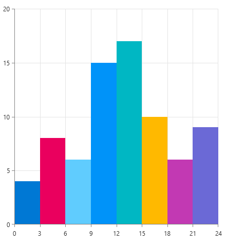
Maybe the standard vertical bars are not enough for you, and you desire to shake up the visualization a bit? Then, change the orientation of the bars. This is done via the Orientation property of ChartHistogramSource. Setting it to Vertical will apply the interval values on the vertical axis, thus orienting the bars horizontally.
<telerik:ChartHistogramSource x:Name="histogramSource" Orientation="Vertical">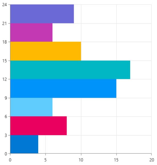
Aggregate Functions
If you need to adjust the result of each bar, instead of just counting the records in it, then the aggregate functions come in handy. You can choose between a set of built-in functions, like average, min, max, sum and more. Replacing the function requires overriding the GetValueAggregateFunction method of ChartHistogramSource.
public class CustomChartHistogramSource : ChartHistogramSource
{
        protected override ChartAggregateFunction GetValueAggregateFunction()
        {
                return new ChartAverageFunction();
        }
}
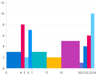
Different Sized Histograms
A bit niche scenario, but in case you need it, Telerik provides. For this scenario you can’t use the ChartHistogramSource, but with slightly more effort you can adjust the ScatterRangeBarSeries. I won’t go into details here, but in a nutshell, you can manually set all the ScatterRangeDataPoint properties manually. This approach can be explored in the Histogram example of the Telerik WPF Demos application.
Share Your Thoughts
I am afraid that we need to part ways here. I hope the new visualization component is going to do a good service to you. Give it a try and in case you come up with any feedback, please feel free to share it in the comments below. Or visit the Telerik UI for WPF Feedback Portal where you can post new suggestions.

Martin Ivanov
Martin Ivanov is a technical support engineer working alongside the developers on the Progress Telerik UI for WPF team in Sofia. He has been working on Telerik support resources since 2013, when he graduated Telerik Academy and joined the company. In his spare time, Martin loves to test new experiences and skills which varies from digital painting, dancing classes, playing video games to trying different sports and playing the guitar. Find him on LinkedIn if you want to chat.