Ready for a Round With the New CircularProgressBar

Summarize with AI:
Tracking of progress just got fancier with the new CircularProgressBar for WPF. Easy to be put into practice. Packed up with a lot of perks.
I am glad you landed on this blog. But first … coffee! Grab yourselves a cup, and I’ll grab mine.
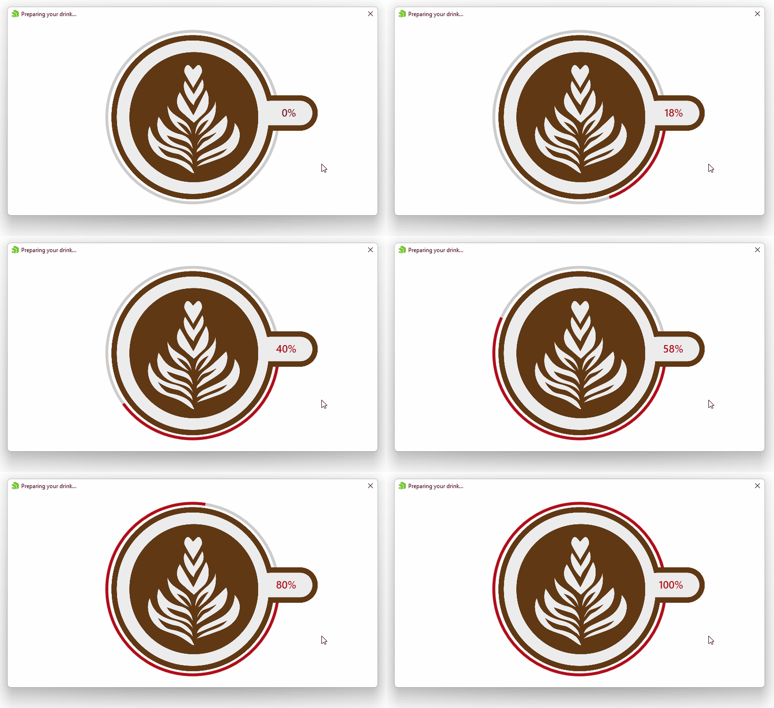
If the time you are reading my blog post is around wine or beer o’clock, do not worry—just make sure you got the right complement to it. Ready?
OK, now we are good to dive into the latest addition to the UI for WPF suite—the CircularProgressBar. It is part of the R3 2022 Release, but I am quite sure you can find it in the making of my ☕ cup above.
Indicate the Purpose of Indicators
Progress indicators express an unspecified wait time or display the length of a process. They inform users about the status of ongoing processes, be it loading an app, submitting a form or saving updates.
The two most popular types of progress indicators are linear and circular. And I assume you already figured the circular is the one we will be talking about today. Not only because it is cooler, but also because it is our fresh arrival.
The RadCircularProgressBar is designed to display the progress along a circular track in a clockwise direction. Let us put it into practice and then jump to its perks.
Put It Into Practice
I promise this will be brief.
The only thing you will need to take care of in advance is a fresh WPF app and a reference to the Telerik.Windows.Controls assembly. I bet you can do the rest with your eyes shut:
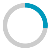
<telerik:RadCircularProgressBar Value="0.27" />Of course, you can do this in code-behind, too:
RadCircularProgressBar cpb = new RadCircularProgressBar() { Value = 0.27 };The result will be the same:
Progress With the CircularProgressBar
We learned that a circular progress bar is used to visualize the progress of work or an operation, now let’s check the ways of showing the different progress states.
Determinate
Determinate circular indicators fill the circular track with color, as the indicator moves from 0 to 360 degrees. They display how long a process will take and are recommended to be used when the process completion rate can be detected. The image from the previous section is an example of this state.
Indeterminate
Indeterminate circular indicators circle along the track. They express an unspecified amount of wait time and are recommended to be used when the progress isn’t detectable, or if it’s not necessary to indicate how long an activity will take.
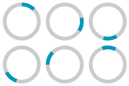
This mode can be activated by setting the IsIndeterminate property of the RadCircularProgressBar to True. It is animated and comes with the ability to determine the ratio of the progress indicator with the help of the IndeterminateIndicatorRatio property, as well as to customize the indeterminate animation. Learn how to do it in the following section of the online documentation. In the meantime, I will show you how the control looks by default while operating in this mode.
Segmented
RadCircularProgressBar allows you to split the progress track into multiple segments. Here, the Segments property determines the amount. And you are also empowered to control the density of the segments through the SegmentsDensity property. Oh, one more cool thing you can do is to round them by setting the UseRoundedSegments property.
Here is the look of a segmented circular progress bar—5 rounded segments with density of 0.75:

Hm, I already touched the customization capabilities of the component, but did not fully cover them. Or maybe I kept the even cooler stuff for the next section? Let’s find out.
Discover More Perks
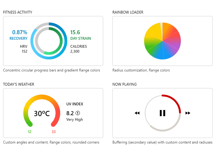
The following picture pretty much says it all, but we will examine it together. I know you like what you see, but to save you some time and wondering how it’s all made, be sure to check the CircularProgressBar samples in the demos application.
Customizable Content
The circular progress bar component can become complex enough through its content. Observe the above image—another circular progress indicator can be placed in the content area, or a button, or … well, simply anything meaningful for your needs.
Color Ranges
Ranges with different colors can be defined, and they can be a gradient, too. How? This way.
Secondary Progress Indicator
The CircularProgressBar allows for visualizing an additional progress indicator useful in scenarios where the primary indicator depends on the progress of the secondary one. The end user can visualize both the primary and secondary tasks’ progress simultaneously. To enable this perk, you need to set the SecondaryValue property. There is a separate color for the secondary progress, too, controlled by the SecondaryIndicatorFill property. Check the bottom right part of the previous image.
Radiuses and Angles
Don’t be scared, you will not need any protractors or advanced math skills. 🤓
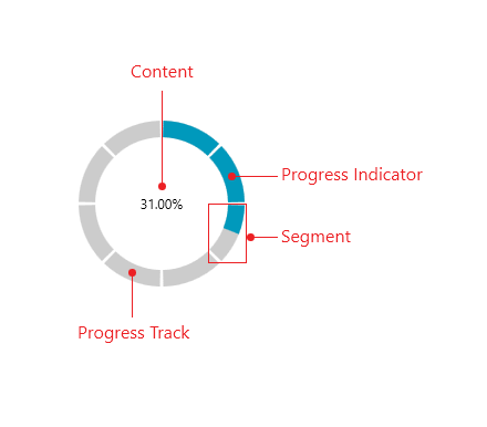
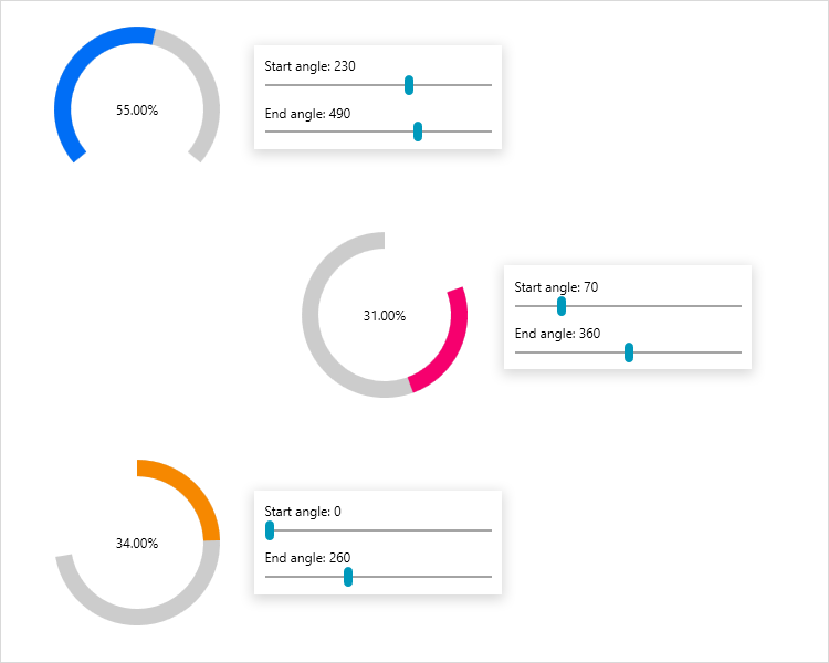
Having the visual structure of the circular progress bar in mind, just know that you can tune the inner and outer radiuses of the indicator and track parts, as well as the start and end angles of the component.
I really enjoy using the Configurator demo of the control. See what I did with it:
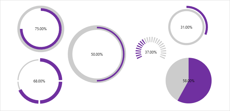
The above image demonstrates my experiments with the radiuses of the track and the indicator. And the next one—the different combinations of start and end angles.
Reach the Next Level
This is a specially dedicated section to encourage you to free your minds and experiment with this awesome component. I am certain that the circular progress bar can help your next WPF piece become a masterpiece. You can integrate it with the other types of progress bars we offer (e.g., the StepProgressBar) or any other member from the UI for WPF Suite.
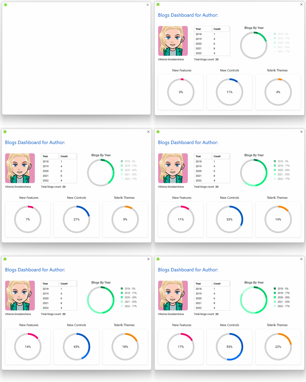
Sometimes it’s hard to find the starting point, but here is what I did. I thought of what I am doing right now—writing a blogpost. What is my blog showcasing—the circular progress bar control. And I came up with the idea of creating a super simple dashboard (without a single chart or gauge!) representing both things. Look at it. 😊
Take a Minute for Feedback
Thank you for taking the time to read my blog! I hope you enjoyed it and have a minute to drop your thoughts and impressions in the comment section below or head to the Feedback Portal for WPF.
Also, do not miss the chance to check the other goodies from the Telerik Desktop & Mobile R3 2022 Release and be sure to try out the latest:

Viktoria Grozdancheva
Viktoria is a Senior Front-end Developer with 5+ years of experience designing and building modern UI for desktop and mobile platforms on Microsoft/Telerik technology stacks. Her spare time is dedicated to friends and family and discovering new pieces of the world. Find her on Twitter and LinkedIn.

