
Discover the WPF WOW—World of Windows 11 (New Theme)

Summarize with AI:
Explore the interpretation of the Windows 11 visual evolution through the latest addition to the Telerik UI for WPF’s themes suite—the Windows 11 theme. Built-in Light and Dark color variations, Mica and Acrylic effects, switching variations based on the default OS app mode, an option to use the OS accent color and a lot more.
The R2 2022 Release of the Telerik Desktop and Mobile Components is here, and I cannot think of a better prelude to one of the most exciting additions to the Telerik WPF world—the Windows 11 theme. Just read the following quote from the awesome blog post about the Windows 11 OS:
Windows is more than just an operating system; it’s a fabric woven into our lives and in our work. It’s where we connect with people, it’s where we learn, work and play. Over time it’s remained familiar and adapted to us.
Is there a better inspiration than the visual revolution of the Windows OS to extend the UI for WPF’s theme suite? I cannot wait to learn the deets. Built-in Light and Dark color variations, Mica and Acrylic effects, switching variations based on the default OS app mode, an option to use the OS accent color, whoosh! 😵 If you are as psyched as I am for the Windows 11 theme, read on.
First Impression
This theme really knows how to give a good first impression. No, this is not nonsense. Hope these red-carpet shots earn your trust in my words.
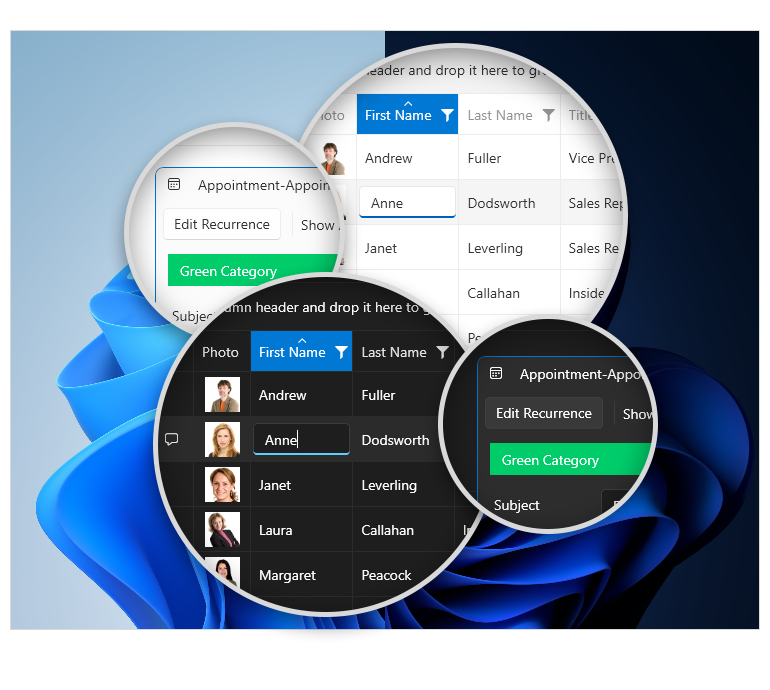
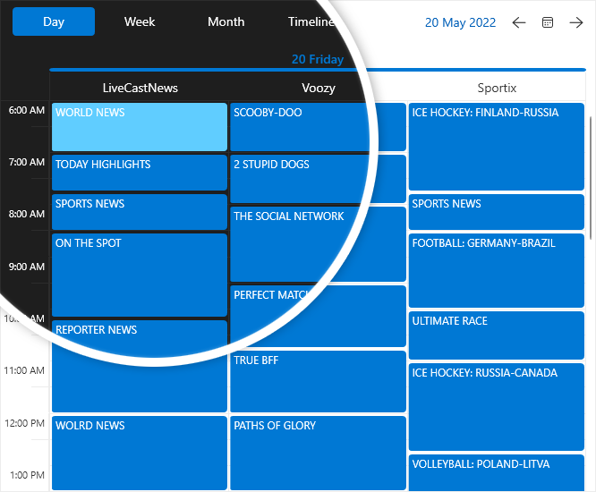
These left me eager to validate whether first impressions last. Let’s jump to the backstage.
True Colors
In this section, I will do my best to reveal the character of the Windows 11 theme. Sounds a little mystic, but I can guarantee that if the above shots did not lead to love at first sight, the second sight will surely make it happen.
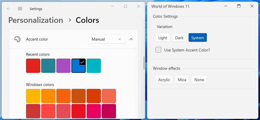
Color Variations
Color helps users focus on their tasks by indicating a visual hierarchy and structure between user interface elements. The Windows 11 colors are designed to provide a calming foundation, subtly enhancing user interactions, and emphasizing significant items only when necessary.
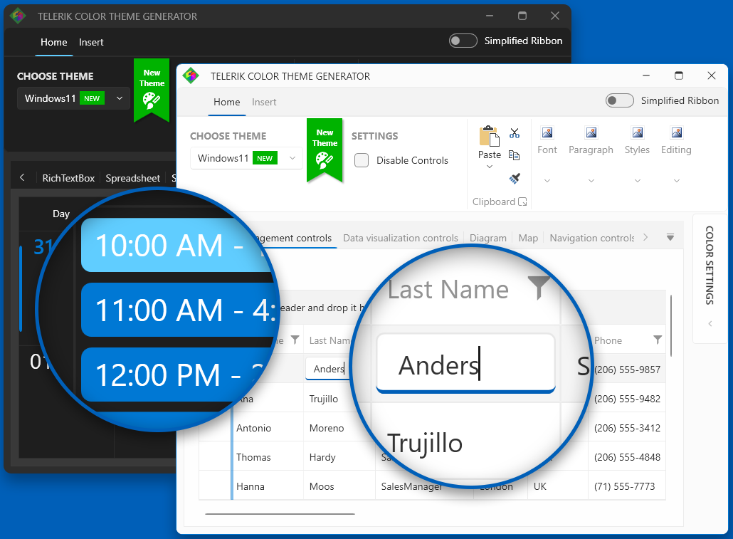
These colors are distributed as the Light and Dark built-in color variations. This is the first of UI for WPF’s themes that offers another, extraordinary color variation—the System one. It automatically decides whether to use the colors from the light or the dark variation of the theme depending on the system’s default app mode.
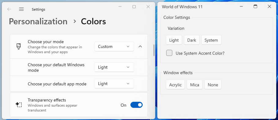
While we are on this topic, I want to share another cool thing about this theme—the ability to use the Windows color instead of the theme’s default accents. This is controlled via the UseSystemAccentColor property. I totally l-o-v-e this option and surely could spend hours choosing my favorite color!
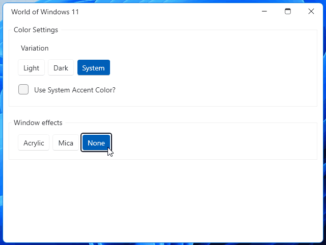
Window Effects
Enjoyment does not end here, it grows stronger. This theme offers out-of-the-box native look and feel of the Telerik WPF Window component when the app is running on Windows 11. How? With the OS’s famous materials. Materials are visual effects applied to UX surfaces that resemble real life artifacts. Windows 11 uses occluding materials—acrylic and mica.
Acrylic is a semi-transparent material that replicates the effect of frosted glass. In Windows 11, acrylic has been updated to be brighter and more translucent, allowing for a stronger contextual relationship with the visuals behind it.
Mica is a new opaque material introduced in Windows 11. Mica surfaces are subtly tinted with the user's desktop background color. This material also indicates window focus with active and inactive states as a built-in feature.
Both are mode aware—supporting both light and dark mode.
Not sure which one to choose and how to switch between them? Don’t worry, our development team has that covered. The answer is—using the new WindowEffectsHelper. The documentation article about this theme is awesome, by the way, and contains an example on how to make that change in the Setting the Material section.
Revamped Icons
For those of you who are familiar with Telerik glyphs, until the R2 2022 release, they used the TelerikWebUI font as a default one. The new release and the new theme brought a new glyph font—the TelerikFluentIcons. It contains a similar set of icons as the TelerikWebUI but with different visual appearance to better match the Windows 11 iconography. The glyphs have been redesigned to embrace a softer geometry and more modern metaphors.
Geometry
At the end of the previous sub-section, I mentioned geometry. It says nothing in particular, does it?
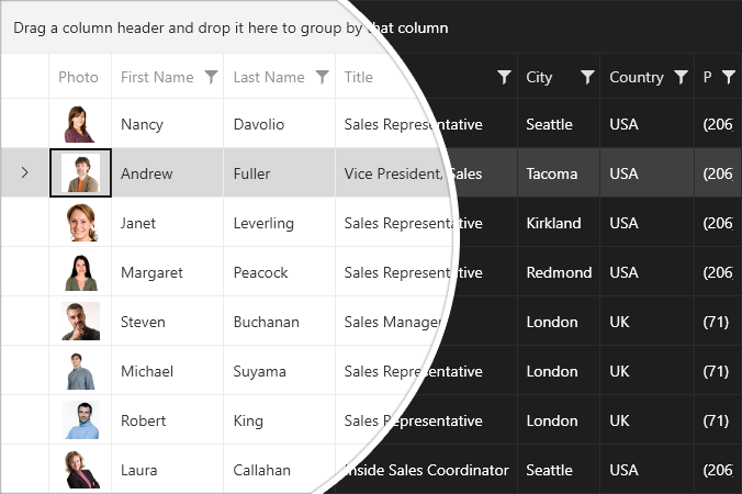
The Windows 11 geometry has been crafted to support modern app experiences. Progressively rounded corners, nested elements and consistent gutters combine to create a soft, calm and approachable effect that emphasizes unity of purpose and ease of use.
The theme applies rounded corners to all top-level app windows. The same applies to most common controls such as buttons, editors, etc. The most used corner radiuses are the theme palette’s CornerRadius and OverlayCornerRadius—4px and 8px respectively. Top-level containers such as app windows, popups and dialogs are rounded using an 8px corner radius. In-page elements such as buttons and list backplates are rounded using a 4px corner radius. Straight edges that intersect with other straight edges are not rounded. Window corners are not rounded when windows are maximized.
After getting to know each other, don’t you want to try the Windows 11 theme in your apps? I do. So, let’s see the possible ways to do it. Telerik-UI-for-WPF-themes medalists, you can skip that part.
Test Run
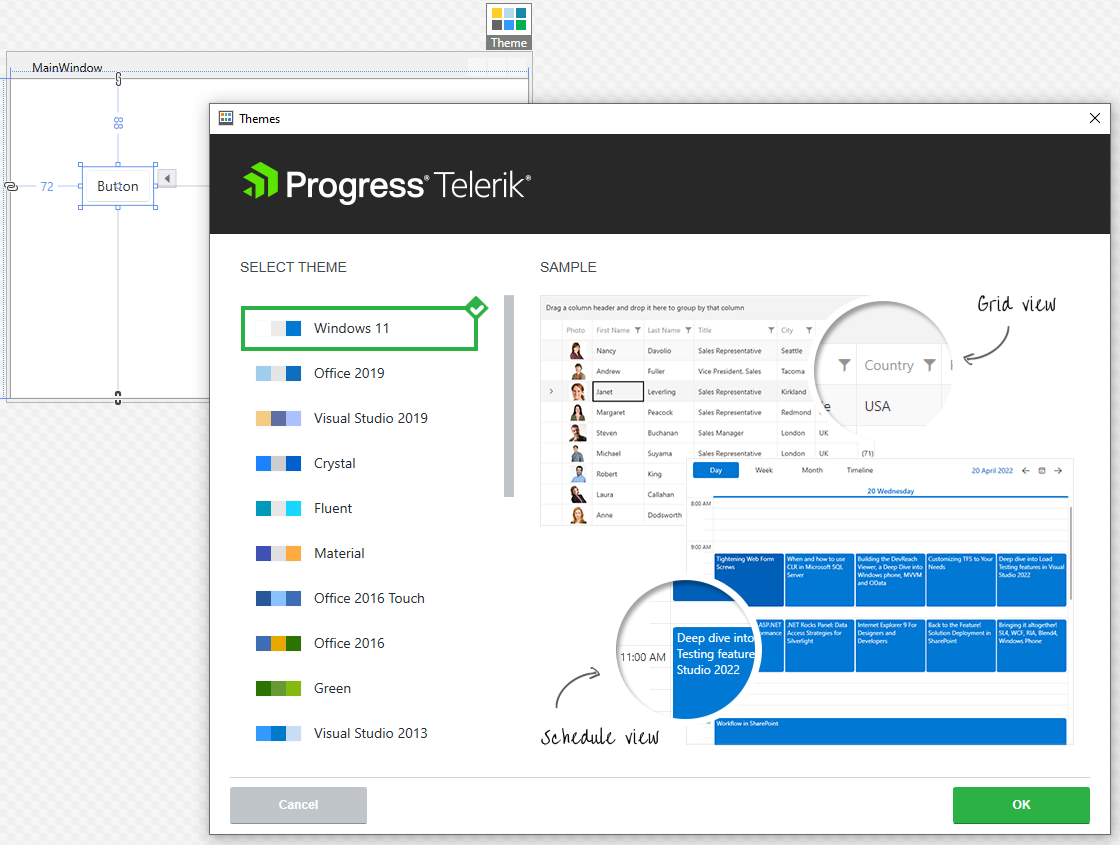
How to get the Windows 11 theme in a WPF app? Using either implicit styles (my preferred theming mechanism) or StyleManager. Common requirement for both options—an existing WPF application.
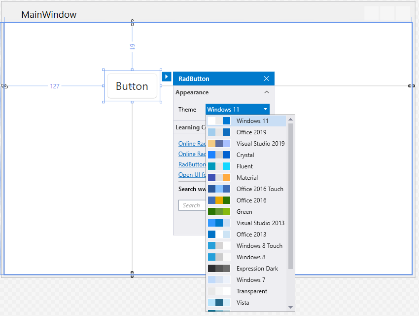
Choosing implicit styles, you only need to click on any Telerik WPF Control in the Design View. Then click on the Theme element and choose the Windows 11 theme from the available choices:
StyleManager offers two options—code-behind or using the Theme attached property:
public MainWindow()
{
    StyleManager.ApplicationTheme = new Windows11Theme();
    InitializeComponent();
}
<telerik:RadButton telerik:StyleManager.Theme="Windows11"/>Effortless. 👌 I believe you are ready for the next level—exploring the customization capabilities.
The ‘Customization’ Level
One of the design principles which guided the journey of making Windows 11 the best-in-class implementation of Fluent is to make it personal. When talking about the personal, there are two things that enhance it a lot.
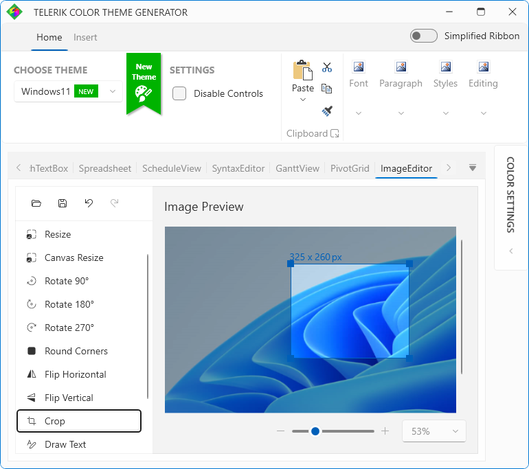
We offer the Color Theme Generator—a tool for interactive theme palette customization with live preview. You can try different shades, different tints, blend them as much as you desire. And when you’re finished with your little experiment, you can export the outcome.
Modifying the appearance of a specific basic control without altering its control template is also an option. The Theme Helper may come in handy for that. Its properties got extended this release especially for the design needs of this awesome theme.
For Windows 11, the background changes of a control for its mouse over state for example are made with the assistance of the ThemeHelper’s MouseOverBackgroundBrush property. The border brush changes use the existing ThemeHelper brushes. This does make the customization even easier, believe me. There is also a ready for copy example in the Theme Helper section of the theme’s documentation.
Gratitude and Feedback
Thanks for taking the time to read my blog! I hope you are curious to see the worth of the Windows 11 world and Telerik’s awesome interpretation of it as a WPF theme. Don’t forget to check its docs, too. Enjoy its calmness and precision by downloading the latest Telerik UI for WPF version from your Telerik account for existing users, or for newcomers:
You know that is just a small (yet essential and engaging) part of the R2 2022 release. Be sure to learn What’s New in R2 2022 With Telerik Desktop and Mobile Components. And 🙏 take a minute or two to help us build the things your app development will benefit most from. Share your honest feedback in the comment section below, or head to the Feedback Portal of the product(s) you use.
Stay tuned, Windows 11 for the Telerik ReportViewer is coming soon, too. 🥳

Viktoria Grozdancheva
Viktoria is a Senior Front-end Developer with 5+ years of experience designing and building modern UI for desktop and mobile platforms on Microsoft/Telerik technology stacks. Her spare time is dedicated to friends and family and discovering new pieces of the world. Find her on Twitter and LinkedIn.