Out Now—WPF Label Embedding

Summarize with AI:
Have a few minutes? Then simplify the information architecture of your user interface. Start using the embedded labels of Telerik UI for WPF’s textbox control.
Before kicking off this blog, I have been digging into the archives for any information on the past of the labels, their connection with text boxes and—mostly—the usage of both in the WPF world. Guess what I found? AB007 posted on Microsoft’s forums looking for help about a tricky assignment—to generate a custom control for a textbox which will show the label within the textbox itself.
I don't know if this was Agent Bond 007, but I know that the above is a question of present interest. You wished for it, logged it in our awesome Telerik UI for WPF Feedback Portal, and we made it.
James Bond got no time to die, but now it is our time to pry. Prying the latest secret of the Telerik UI for WPF’s textbox control begins in 3, 2,1. Go!
In the next sections of this blog, you will meet and greet the embedded label feature of the RadWatermarkTextBox control.
A Label’s Value
Label and a textbox control? These two are besties. Don’t tell me you haven’t seen them together!
I bet it won’t be hard to remember at least one data form you had to fill or (why not) build yourself. Either way, all forms would be hard or nearly impossible to exist without exactly those two controls I am talking about. What matters is that it would be even harder to understand what you must fill if it was not for the labels.
Not a big deal, you might think. A very big deal, I will say.
And it gets bigger with the size and complexity of the forms you create or use (or any other UI control that consists of many input fields). Any user interface containing lots of textboxes leads to both design and readability difficulties.
Less Is More
In the previous section, I might have touched a tender spot. 😬
Nowadays, crowded UIs are still a thing. Surely not my thing. If they are not yours, either, here is what you can do to make things better. Streamline your user interface by embedding the label text directly within the text box. Reduce the used visual elements by half (minimum!).
(Clicking the above image will open it in its full size.)
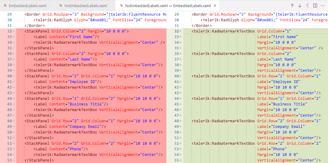
See? With the new embedded labels feature, you only need a single visual element, represented by the RadWatermarkTextBox. Otherwise, you need at least two—a label and an input control. And if you do not want them to overlap each other, you need an additional visual element, represented by whichever Panel inheritor (in our case—a StackPanel).
Curious how the above comparison looks?
(Clicking the above image will open it in its full size.)
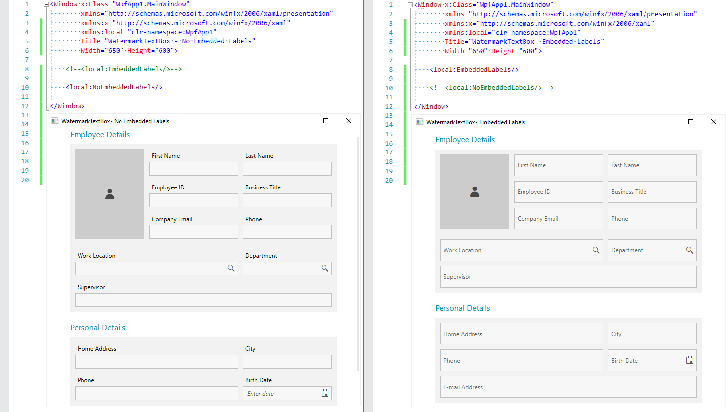
Embedded labels on the right versus fixed labels on the left. Yes, as a bonus to the more visual elements, the screen size was not enough to fit the last row of my form, so I got a vertical scrollbar. 🙄
Labeling Deep Dive
The last screenshot in the previous section already revealed the default look of the embedded labels, but there is more to read and see. So, shall we?
Put a Label on It
You might’ve already guessed how to put a label on UI for WPF’s textbox control. However …
Repetitio est mater studiorum.
(Repetition is the mother of learning.)
So, let us do it one more time (this one—officially).
<telerik:RadWatermarkTextBox Label="First Name" />Well, that was fast. And painless. Intuitive, too. Now what to do with it?
Learn How To Control It
The label displays as a watermark content (placeholder) when the RadWatermarkTextBox control is unfocused and the text is empty. When the control gets focus or any text is entered, the label is positioned on top of (floated) the text input area.

What if you don’t want that transition and only want to keep the label always positioned on top of the text area? Simply set the KeepLabelFloated property of the WatermarkTextBox to true:
<telerik:RadWatermarkTextBox Label="First Name " KeepLabelFloated="True
" />If you want it like this but also need to know the state of the label, you can use another handy property—IsLabelFloated.
If you do not find it attractive enough, feel free to add some sprinkle to it using the LabelStyle property.
Oh, one more thing. Did you notice that cute little animation which is responsible for floating the label once you start typing? And lands it back to the center whenever the focus is lost. This is done using the Telerik AnimationManager class.
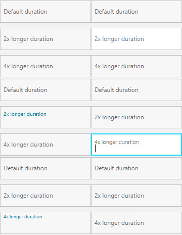
Since I like that animation, I will only play with its duration a little. But you can change it by setting the attached AnimationManager.AnimationSelector property to the RadWatermarkTextBox control. It allows overriding the two animation groups responsible for the animations that appear—the one for making the label float, and the one for making it return to the center of the text input.

How did I do that? I added the following AnimationSelectors to the Resources of my UserControl:
<UserControl.Resources><telerik:AnimationSelector x:Key="LabelAnimationSelector2xLonger ">
<telerik:AnimationGroup AnimationName="LabelFloatAnimation ">
<telerik:LabelPositionAnimation TargetElementName="PART_LabelVisualElement " Duration="00:00:00.350 " Direction="Out " />
<telerik:FontSizeAnimation TargetElementName="PART_LabelVisualElement " Duration="00:00:00.350 " Direction="Out " />
</telerik:AnimationGroup>
<telerik:AnimationGroup AnimationName="LabelCenterAnimation ">
<telerik:LabelPositionAnimation TargetElementName="PART_LabelVisualElement " Duration="00:00:00.350 " Direction="In " />
<telerik:FontSizeAnimation TargetElementName="PART_LabelVisualElement " Duration="00:00:00.350 " Direction="In " />
</telerik:AnimationGroup>
</telerik:AnimationSelector>
<telerik:AnimationSelector x:Key="LabelAnimationSelector4xLonger ">
<telerik:AnimationGroup AnimationName="LabelFloatAnimation ">
<telerik:LabelPositionAnimation TargetElementName="PART_LabelVisualElement " Duration="00:00:00.700 " Direction="Out " />
<telerik:FontSizeAnimation TargetElementName="PART_LabelVisualElement " Duration="00:00:00.700 " Direction="Out " />
</telerik:AnimationGroup>
<telerik:AnimationGroup AnimationName="LabelCenterAnimation ">
<telerik:LabelPositionAnimation TargetElementName="PART_LabelVisualElement " Duration="00:00:00.700 " Direction="In " />
<telerik:FontSizeAnimation TargetElementName="PART_LabelVisualElement " Duration="00:00:00.700 " Direction="In " />
</telerik:AnimationGroup>
</telerik:AnimationSelector>
</UserControl.Resources>And then I set them to my instances of a RadWatermarkTextBox:
<telerik:RadWatermarkTextBoxGrid.Row="1
" Grid.Column="1 "
Label="2x longer duration "
Margin="10 10 0 0 "
VerticalAlignment="Center "
telerik:AnimationManager.AnimationSelector="{StaticResource LabelAnimationSelector2xLonger} "/>
Get Even More of It
There is more? Mmhmm, that’s right. What if I told you that this feature can easily be turned on for other controls of the Telerik UI for WPF controls suite?
RadPasswordBox as an inheritor of the RadWatermarkTextBox control supports it, and there are numerous other controls among the suite that contain a watermark textbox in their default control templates. Yes, that means that they can easily benefit from an embedded label, too.
One more confession—I already showed that to you without drawing your attention to it. The first screenshot in this blog post contains a RadAutoSuggestBox and a RadDatePicker, too.
How to use the embedded label feature with them?
<telerik:RadDatePickerx:Name="BirthDatePicker "
Grid.Row="1
" Grid.Column="2 "
Margin="10 10 0 0 "
VerticalAlignment="Center
">
<telerik:RadDatePicker.Resources>
<!--The BasedOn is only needed for NoXaml binaries-->
<Style TargetType="telerik:RadWatermarkTextBox " BasedOn="{StaticResource RadWatermarkTextBoxStyle}
">
<Setter Property="Label " Value="Birth Date "/>
</Style>
</telerik:RadDatePicker.Resources>
</telerik:RadDatePicker>For the RadPasswordBox, no Style is needed—only setting the Label property. I have another idea for an example with it. Follow me.
<telerik:RadPasswordBox Label="Password "> <telerik:RadPasswordBox.LabelStyle>
<Style TargetType="telerik:Label " BasedOn="{StaticResource WatermarkTextBoxLabelStyle}
">
<Setter Property="ContentTemplate ">
<Setter.Value>
<DataTemplate>
<StackPanel Orientation="Horizontal ">
<telerik:RadGlyph Glyph=" "
Foreground="{telerik:FluentResource
ResourceKey=AccentBrush} "
FontSize="{Binding RelativeSource={RelativeSource
AncestorType=telerik:Label}, Path=FontSize} "/>
<TextBlock Text="{Binding} " Margin="5 0 0 0 "/>
</StackPanel>
</DataTemplate>
</Setter.Value>
</Setter>
</Style>
</telerik:RadPasswordBox.LabelStyle>
</telerik:RadPasswordBox>It turned out pretty good and smooth! See for yourself:

Label ‘Finale’ 🖐️
Thank you for taking the time to read my blog! Hope you enjoyed it, and I am sure that there is more to enjoy—make sure to check out the other goodies from the R1 2022 & R2 2022 releases of Telerik UI for WPF. If you have any feedback—don’t be shy to drop your thoughts and impressions in the comment section below.

Viktoria Grozdancheva
Viktoria is a Senior Front-end Developer with 5+ years of experience designing and building modern UI for desktop and mobile platforms on Microsoft/Telerik technology stacks. Her spare time is dedicated to friends and family and discovering new pieces of the world. Find her on Twitter and LinkedIn.


