What’s New in Telerik UI for WPF With R1 2022

Summarize with AI:
Check out everything that’s new in our Telerik UI for WPF R1 2022 release!
We are happy to announce the R1 2022 release of Telerik UI for WPF and Telerik UI for Silverlight! It brings .NET 6 support, a new StepProgressBar control and a ton of new cool features like embedded label for WatermarkTextBox, smooth zooming for the Map control, rounded corners for the Window components, Notes and conditional formatting support in Spreadsheet, two of the top requested features for PanelBar and more.
Let’s go together through all the new stuff this release.
.NET 6 Support & Updated Sample Applications
Back in November, Microsoft announced the GA of the fastest .NET ever—.NET 6. In case you missed it, we immediately released support for all our .NET suites. For this release, we upgraded all our WPF sample applications to support .NET 6. You can check them out and play around with them by simply installing the click once from the corresponding page:
If you would like to check out their source code as well—it is available in the downloads section in your Telerik account. 😊
StepProgressBar

Introducing RadStepProgressBar! This is our newest component that will allow you to easily visualize a multi-step process with a number of different steps and indicate progress between each step and overall. The component provides slick step selection animation and can be customized in various ways, allowing you to achieve a unique and modern look and feel. You can see some possible customizations below:
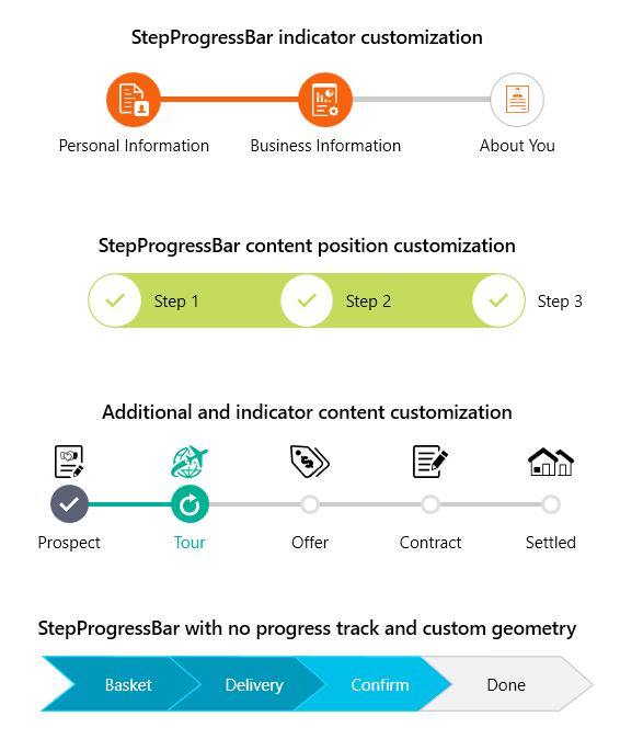
You can see this customizations in action in our WPF demos app.
Here is list with the key features of the component:
- Data binding support
- Orientations – vertical and horizontal
- Step selection through UI
- Step additional content
- Customizable visuals
- Theming support
It is really flexible cool control. 😊 For more details, please refer to the RadStepProgressBar documentation.
WatermarkTextBox: Embedded Label

Our TextBox control gets a modern embedded label feature. Using it, you can display additional information about the text field and, when the control gets focus, the label will be smoothly positioned above the input line using animation. Here is a list with the customization options of this feature:
- Custom label appearance – easily apply custom Label style
- Customizable animations – using AnimationManager you can easily adjust the animation per your requirements or even stop them if you wish
- Option to keep the label always on top
I hope you will make use of it! For more information, check out the Label article from our Watermark help documentation.
Map: Smooth Zooming
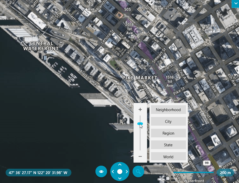
Until now, RadMap provided zooming by levels that are integer values—so, for example, you always need to zoom from level 5 to level 6. With this release, we are adding another precise zooming option with the new Zoom property. It is of type double, so you can easily zoom in to 5,5 (5.5) or any other value between levels 5 and 6 (for example) in order to provide a better experience for your users. We have also added the option to modify the zoom step of mouse-wheel zooming and of the slider in the UI—check out the ZoomStep property.
To see in action all the zoom related features of RadMap, check out the Zooming demo in the WPF Examples application. For more details, check out the Zooming article from RadMap documentation. Happy zooming! 🔍
PanelBar: Options To Resize and Scroll PanelBarItems
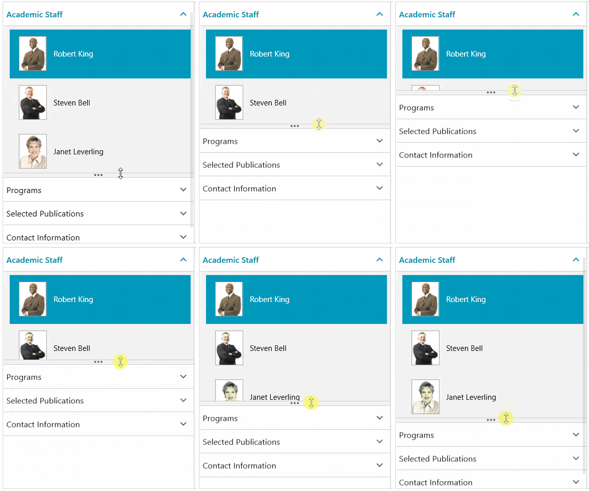
With this release, we are addressing two of the most desired PanelBar features. The first one is to add a way to resize the items—now this can be enabled by setting the IsResizingEnabled property of the control. By setting it to true, draggable splitters appear at the bottom of each expanded item, allowing you to modify the size through the UI. And you can also limit the resizing behavior by setting the desired expanded min and max lengths.
The second feature adds ScrollViewer in every item in order to allow a better way to display and interact with bigger content in the items. This can be enabled by simply setting the IsScrollViewerInsideItemsEnabled of the PanelBar to true. One last note: Both features work great together—see the GIF below:
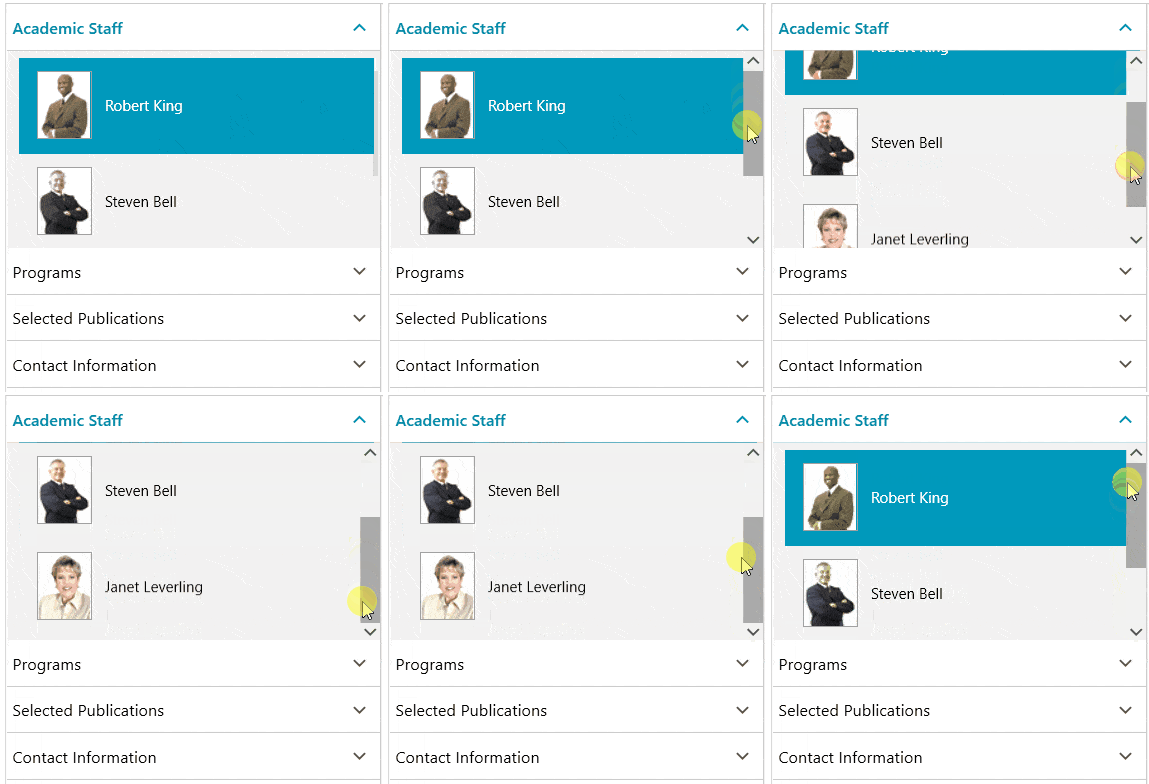
For more about the resizing and scrolling features, see the Resizing Items article from PanelBar help documentation.
Window: Rounded Corners (Win 11)
The latest Windows, v11, has been around for a few months now and you might know windows there have rounded corners. With this release, we are adding an easy way to achieve Windows 11 appearance with our Window controls as well. RadWindow, RadTabbedWindow, RadRibbonWindow and the Docking ToolWindow are getting a CornerRadius property to allow you to easily round their corners as desired. With the current implementation, you would need to manually apply the rounding when the app is running on Win11—however, we plan to implement a feature that will do it automatically for you on the latest Windows.
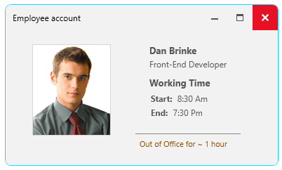
Let me know if you have any feedback about the feature. For more details on how to customize the appearance of RadWindow, check this section from our help documentation.
PivotGrid: Filtering TextBox for Distinct Values
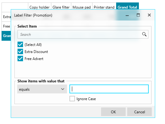
The Label Filter dialog of RadPivotFieldList now has the option to search through the display values. This is quite useful whenever there are hundreds or more items to filter. This search area will automatically appear in the dialog, so nothing to turn on here—cheers! 😊
SpreadProcessing: Conditional Formatting
This feature gives you the ability to format the cells depending on their value. There are multiple conditional formatting rules that are supported and can be used for this. You can apply various formatting options like changing fill and font and even create more complex rules with data bars, color scales and icon sets. You can see some examples in the screenshot below.
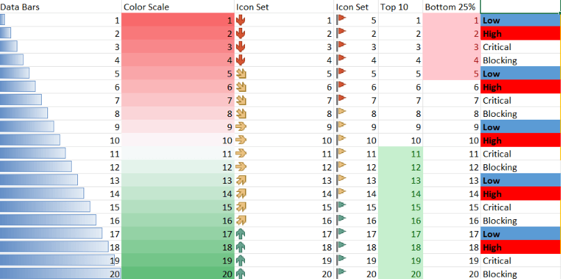
For more details, check out the Conditional Formatting section from our online help documentation.
Spreadsheet and SpreadProcessing: Notes Support
Notes are used for making notes or annotations about the data in a specific cell. You can easily work with Notes via the UI. You can add, remove, edit, resize, show or hide the Notes. This can be done from the button in the review tab or from the context menu.
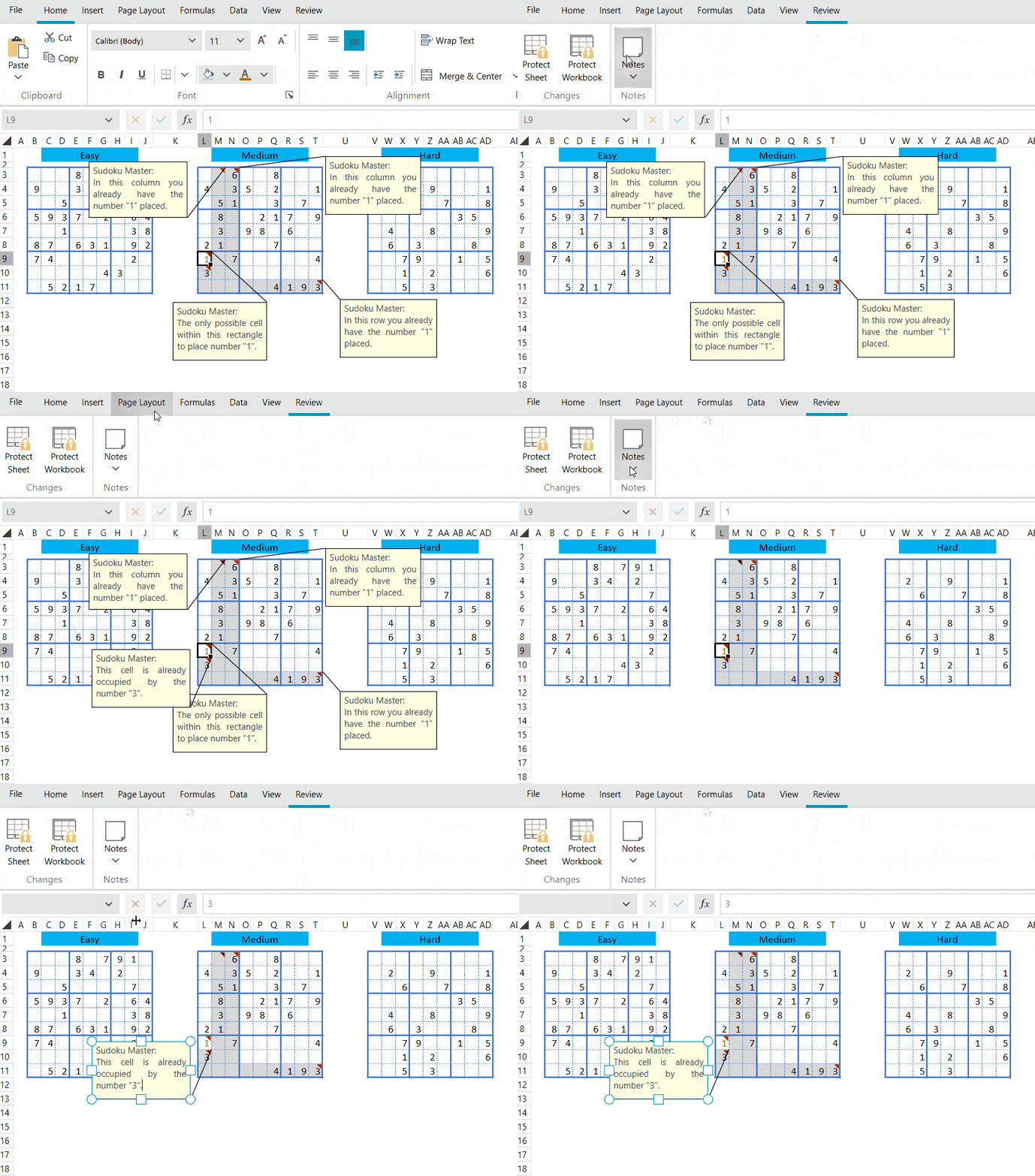
You can work with Notes in the code behind as well. Detailed information is available here: Notes.
WordsProcessing: Nested Mail Merge
This functionality allows you to perform mail merge with complex business objects. For example, your business object can contain a list of other objects and this functionality allows you to use the underlying objects when performing mail merge. In this case, a special field syntax with custom field modifiers (for example: GroupStart/GroupEnd) is used. More information about this feature is available here: Mail Merge.

Other Features
- Diagram: Support for exporting of large Diagrams.
- Menu: Option to easily change a checked icon.
- PdfViewer: Support for password-protected documents.
- BarcodeReader: Updated the control to use the new barcode engine. This adds support for reading all 1D barcodes and an option to choose specific barcodes to try to decode.
- WordsProcessing: Support for Table.Alignment when exporting to PDF.
- WordsProcessing: Added support for height of a table row when exporting to PDF.
- WordsProcessing: Export VerticalAlignment property of the table cells to PDF.
- WordsProcessing – DocxFormatProvider: Add support for hyperlinks on images.
Check Out the Detailed Release Notes
We have a lot more! To get an overview of all the latest features and improvements we’ve made, check out the release notes for the products below:
Telerik UI for WPF (Release Notes)
Telerik UI for Silverlight (Release Notes)
Sign Up for the Webinar
To see the new release in action, please join us on the Telerik R1 2022 webinar on Wednesday, February 2, 2022, 11:00 am ET – 1 pm ET.
Join Us on Twitch
Join the live demo sessions on Twitch to see the newly released components and features in action and get ideas on how to use them in your projects. Chat with the team and get your questions answered on the spot! The new WPF release will be covered on Monday, January 24 at 10:00 am ET.
Share Your Feedback
Feel free to drop us a comment below sharing your thoughts. Or visit our Feedback Portals about UI for WPF, Silverlight and Document Processing Libraries and let us know if you have any suggestions or if you need any particular features/controls.
Try out the latest:
In case you missed it, here are some of the updates from our last major release and previous Service Pack.

