What’s New in Telerik UI for WPF With R3 2021

Summarize with AI:
The R3 2021 release of Telerik UI for WPF and Telerik UI for Silverlight is here, and we’re excited to share it with you.
It brings new components—RadBadge, BoxPlot series for ChartView, standalone ExpressionParser as well as new High Contrast theme variation! RichTextBox gets support for shapes text, @mentions and non-breakable spaces. We are adding full Suggested Actions support for all WPF controls, and more!
Let’s go through all of these together. 😊
Badge Control
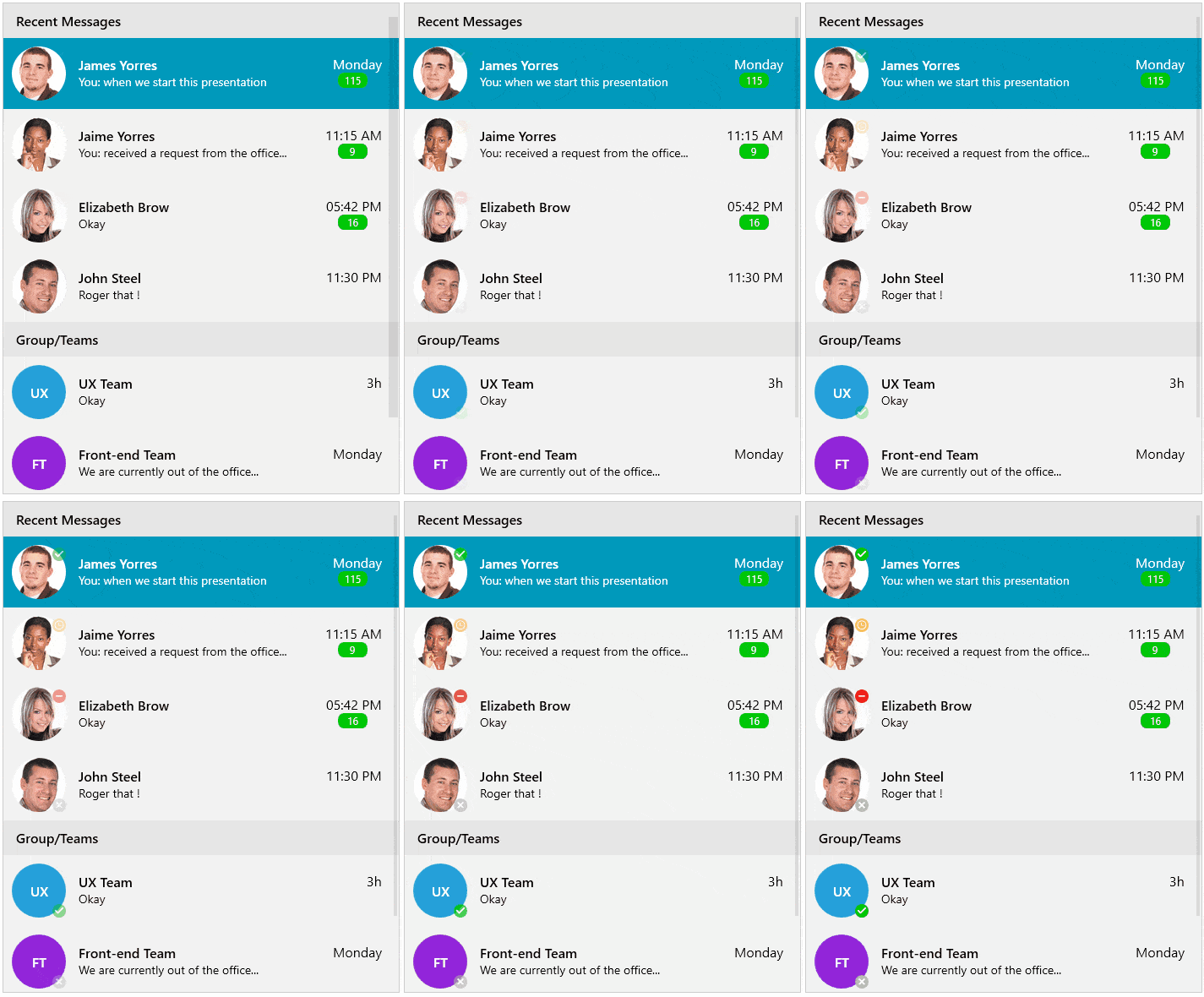
First things first! Announcing new RadBadge control! 📛 This control enables you to alert users and provide additional information about notifications, updates, changes, errors and anything else you might find useful.
You can quickly choose from the predefined badges or create your own to suit your application requirements. In both cases, the control provides you full flexibility to adjust the appearance to the overall look and feel of your app. You can see below how the predefined badges look:

And here are some of the main features of the control:
- Position: The control allows you to specify its position relative to the element it’s attached to.
- Badge Types: You can choose between various predefined badge types. Also, you have the option to apply a custom geometry to the control if none of the predefined types works for you.
- Animation: You can choose whether to have an Animation while displaying the badge.
- Flexible Customization: Allows you to change the Background, Geometry, BorderBrush and more.
It is a really cool, small control. 😊 For more details, please refer to the RadBadge documentation.
Standalone ExpressionParser
One of the most voted feature requests for the RadExpressionEditor component was the ability to parse expressions without displaying a graphical user interface.
We are pleased to announce that with the R3 2021 release we’ve introduced the RadExpressionEditor, which now enables you to do just that. It provides an intuitive API with which you can not only easily parse a given expression, but also handle any errors that may occur.
The following example demonstrates how to create the parser, parse an expression and handle the possible errors:
var expressionParser = new RadExpressionParser();try{ var lambdaExpression = expressionParser.Parse(“UnitPrice < 0.2E+2”); var result = lambdaExpression.Compile().DynamicInvoke().ToString();}catch (ExpressionParserException ex){ var errorMessages = string.Join("\n", ex.Errors.Select(er => er.Message));}The ExpressionParser provides most of the functionality of the RadExpressionEditor control such as the use of constants, lambdas, custom categories and functions as well as accessing the members of a given class.
So, do not waste another second and express yourself with the new RadExpressionParser! If you need help with getting started, read the respective article in our online documentation.
Office 2019 Theme: High Contrast
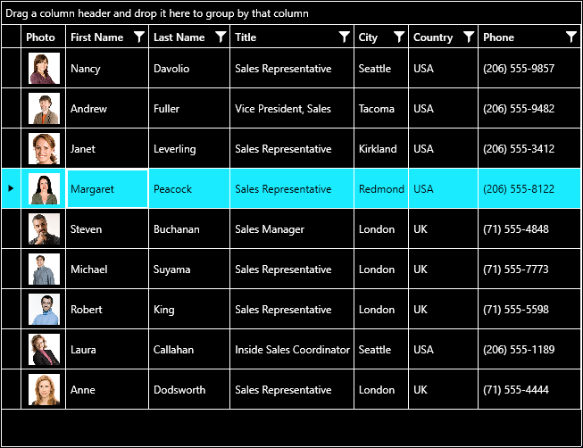
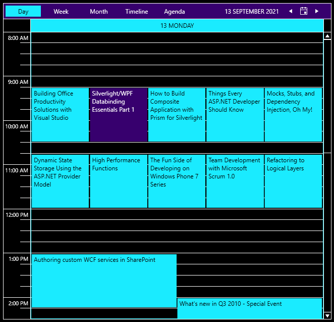
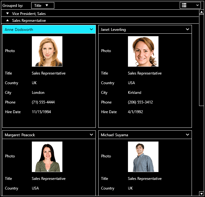
We are happy to announce that our latest Office2019 theme gets a built-in new HighContrast variation, which uses a color palette with contrasting colors to provide a better experience in your WPF application. Users with contrast issues can really benefit from using this theme variation, with colors that make controls much easier to see on screen. Below you can check how some of our controls look:
RadGridView:
RadScheduleView:
RadCardView:
You can see all the controls and play with the variations in the ColorThemeGenerator sample app. Also make sure to check the help article for the Office2019 theme.
ChartView: BoxPlot Series
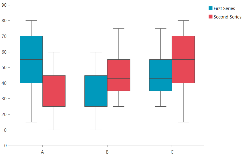
RadChartView now supports Box Plot series type! As the name suggests, this way of depicting data utilizes a plot with a box in the middle and shows groups of numerical data through their quartiles. The ChartView component now enables you to visualize each data point through a five-way segmented visual—minimum, maximum, lower quartile, upper quartile and median—which makes the data a lot more comprehensible.
For more details about the new series, check the BoxPlotSeries article from our help documentation.
Full SuggestedActions Support
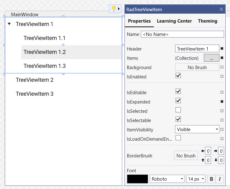
With the previous release, we added support for Suggested Actions in the XAML Designer for controls in controls binary. With this release, all controls from the Telerik UI for WPF suite now support suggested actions. Once enabled, the feature saves you time and effort by allowing you to click on a supported control and use the lightbulb to expand and interact with the Suggested Actions UI.
RichTextBox: Shapes Text Support
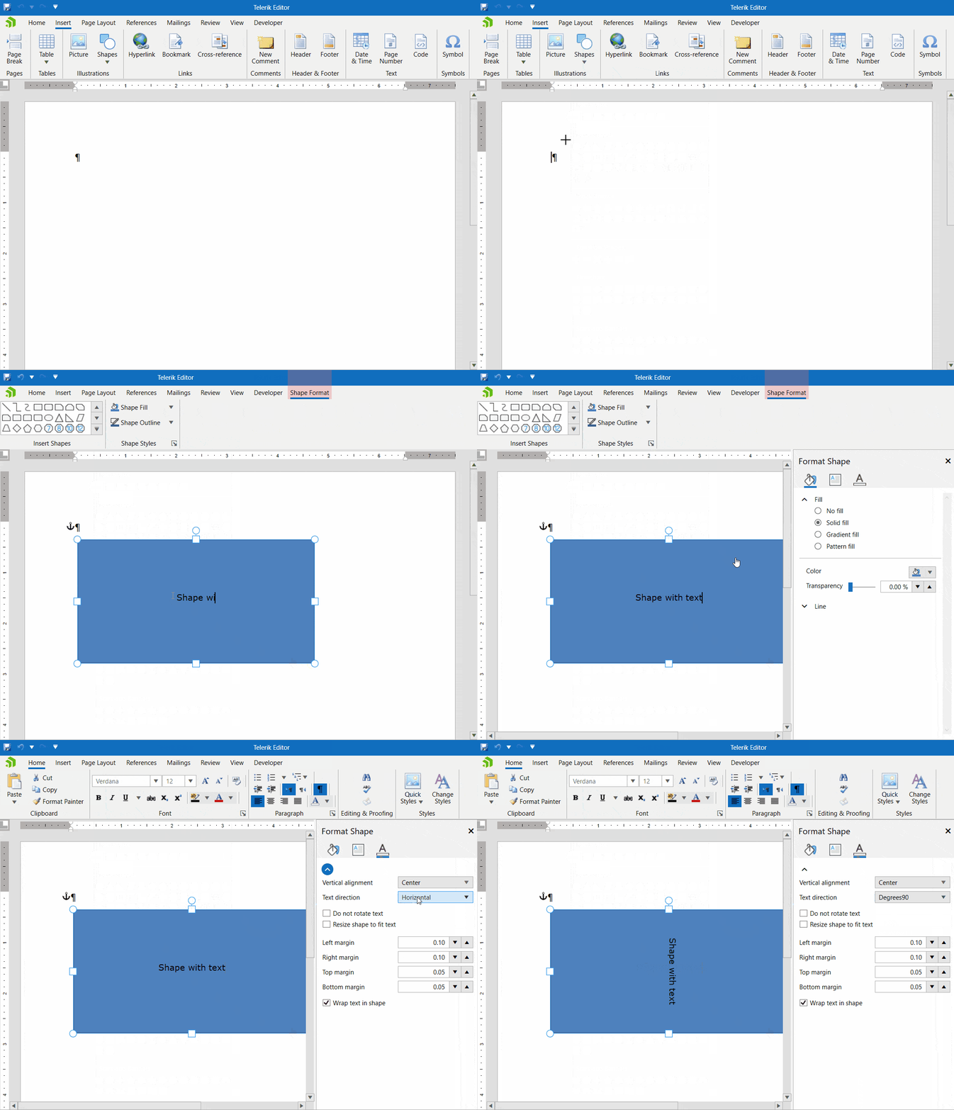
In the previous release, we introduced official support for Shapes in RadRichTextBox. Now we are adding the ability to add text to the shapes. There are different text settings that can be adjusted via the UI or in the code-behind. More information about this is available here: Shapes Text.
RichTextBox: Mentions
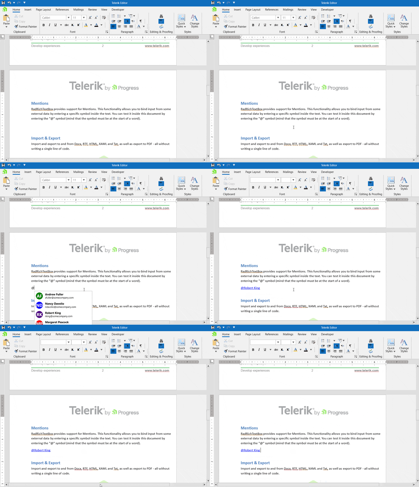
Mentions (Suggestions) allow you to show a popup when a specific symbol is typed and perform a custom action. You can use a default mentions provider or define a custom one. Multiple providers are also supported while they have different mention characters. Detailed information is available here: Mentions.
WordsProcessing: Replace Text With Document Elements
This was one of the most highly demanded features and is now supported out of the box. It allows you to search for specific text (placeholder) and replace it with one or more elements. You can use various elements like tables, images, paragraphs, multiline text and others. The following article shows how you can use this feature: Replace Elements.
RichTextBox: Support for Non-Breaking Spaces
The non-breaking spaces allow you to keep the words bound together on the same line. Words separated by a non-breaking space will always be on the same line when the layout of the document is calculated. You can insert such space with a shortcut (Ctrl+Shift+Space) or in the code-behind. More information is available in our documentation: Non-breaking space.
SpreadProcessing and Spreadsheet: Xlsm Format Support
An XLSM file is a macro-enabled spreadsheet created by Microsoft Excel for representing spreadsheets that support Macros and is one of the supported formats by RadSpreadProcessing and RadSpreadsheet. Currently, the Macros are only preserved during import and export. They cannot be executed or changed in the code. Here is how you can use this feature: XLSM provider.
PdfProcessing: Support for Documents With Invalid Cross-Reference Tables
During the years that the product has existed, we have encountered a large amount of PDF documents that do not comply with the PDF standard specification. In this release, we have handled several cases with such documents that were breaking the import process. Now you can import and repair such invalid documents.
SpreadStreamProcessing: PageSize and Other New Page Settings
The PageSetupExporter allows you to export the page settings for printing. You can set the page order, page size, page orientation, scale factor and other properties. Detailed information is available here: Page Setup Exporter.
SpreadStreamProcessing: Culture Independent Formats
Now you can easily choose from a large, predefined set of number, currency and date formats (mostly used in Excel as well). These formats are culture-specific, and the result will vary depending on the current culture of the operating system. More information is available here: Culture Specific Predefined Formats.
Other Features
- All Input Controls: New ValidationErrorTemplateHelper which allows showing the Validation ErrorTemplate when the control is currently focused
- Barcode: Support for the HorizontalContentAlignment and VerticalContentAlignment properties to control the alignment of the barcode
- Diagrams: HorizontalContentAlignment and VerticalContentAlignment support improvements for the RadDiagramTextShape (support in the non-editable content, the editable content and the edit TextBox)
- Diagrams: Added support for setting the ToolTip’s RadDiagramConnector property
- ExpressionEditor: Introduced the ExpressionError event when an error occurs while parsing an expression and populates the Errors property with the errors
- GridView: Introduced support of Selected Unfocused state for the GridViewCell element
- OutlookBar: OutlookBarItem now supports different image sizes when the control is in its minimized state; introduced IconMargin property
- PanelBar: Added expand/collapse animation support
- SpreadProcessing and Spreadsheet: Added support for changing a chart’s series color
Check Out the Detailed Release Notes
We have a lot more! To get an overview of all the latest features and improvements we’ve made, check out the release notes for the products below:
Sign Up for the Webinar
To see the new release in action, please join us on the Telerik R3 2021 webinar, on Wednesday, September 29, 2021 11:00 AM ET - 1 PM ET.
Twitch Session
We are also hosting a Twitch livestream to cover our .NET desktop product updates on Tuesday, September 21, at 10:00 am ET.
Share Your Feedback
Feel free to drop us a comment below sharing your thoughts. Or visit our Feedback Portal about UI for WPF, Silverlight and Document Processing Libraries and let us know if you have any suggestions or if you need any particular features/controls.
Try out the latest:
In case you missed it, here are some of the updates from our last major release and previous Service Pack.

