What’s New in R2 2021 SP for Telerik UI for WPF and Telerik UI for WinUI 0.3.0

Summarize with AI:
The latest release is now live! It brings over 70 improvements for Telerik UI for WPF as well as the latest .NET 6 Preview support! On the Telerik UI for WinUI side, we are adding few brand new components—DateTime Pickers, LoopingList and SegmentedControl.
Let’s dive in together to see what is new with this release.
What’s New in Telerik UI for WinUI 0.3.0
DateTimePicker(s)

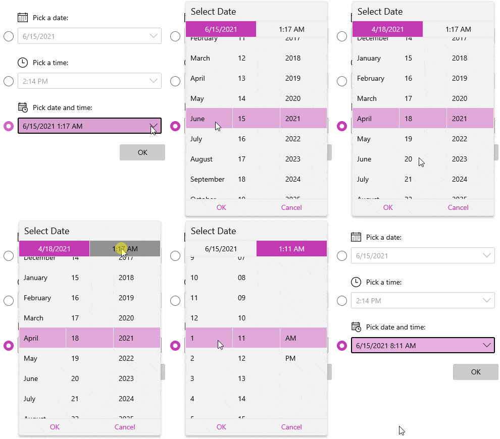
Welcome the first WinUI DateTimePicker component in the universe (really 😉). Select with ease a concrete date and time using a single beautiful WinUI component—RadDateTimePicker. Depending on the requirements, the control could be easily transformed into date or time only picker.
Here are the major features of the control:
- Input Modes: Easily change the behavior of the control—make it Date, Time or DateTimePicker.
- Display Modes: Display it inline or the standard way with a drop-down.
- Step: Configure the date/time amount used as interval for selectable options of the control.
- Order of the Components: Choose which components to show and in what order to appear.
- Header: Display specific header content for the user in the drop-down.
- Empty Content: Display content when there is no selected value.
- Min/Max Values: Choose the min/max allowed values.
- Keyboard Navigation: Easily select the desired value.
Hope you will make use of this handy control. You can find more information about it in the RadDateTimePicker section in our help documentation. Also make sure to see it in action in our WinUI Examples app.
Segmented Control

RadSegmentedControl is a helpful control that will allow you to display a list of horizontally aligned, mutually exclusive options, which can be selected by the user. Each option is a button that can display text, glyph or whatever UI element you want. Here are the key features of the control:
- Selection: A few helpful selection APIs for great customization.
- Disabling Segments: Option to disable the interactions with a specific item (segment).
- Customizable Appearance
For more info, check out the SegmentedControl documentation.
Looping List

The next new control is RadLoopingList—it allows you to visualize a list of data items in a single column with great performance and looping functionality. Its performance is highly optimized as it uses its own UI virtualized data source and item-representation mechanism.
That and the looping capability will allow you to easily display large amounts of items with ease. The looping capability means that once the control reaches the end of the data list, it seamlessly continues from the beginning, wrapping to the first data item.
Here is list with the major features of the control:
- Looping Capability: Enable or disable the looping of the control through the IsLoopingEnabled property.
- Item Sizing: Control the sizing through the ItemWidth and ItemHeight properties.
- Snapping: Allows the closest item to the center of the viewport to always be centered.
- Collapsing: The looping list can be collapsed so that it displays only the selected item using the IsExpanded property.
- Visual Item Customization: Easily customize the look of the items through DataTemplates.
- Read-Only Mode
- Events
For more details, make sure to see the LoopingList help documentation.
What’s New in Telerik UI for WPF R2 2021 Service Pack 1
.NET 6 Preview 4 Support
As always, we are bringing support for the latest .NET 6 Preview available—in this case Preview 4. It was announced by Microsoft at the end of last month (check out the announcement blog post), and we immediately provided support for it in the internal builds since then.
So, feel free to play around with the latest .NET framework and experiment with our WPF controls as well. Any feedback that you have will be appreciated—please do let us know! 😊
RichTextBox: Option to Disable the Transparency of SelectionMiniToolbar
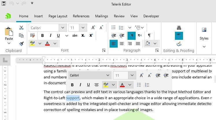
Many of you shared with us that you prefer the mini toolbar to appear not transparent. You can now easily disable that behavior and fully show the SelectionMiniToolBar by setting a single property. Just set the IsTransparencyEnabled property to false as shown below:
var miniToolbar = this.radRichTextBox.SelectionMiniToolBar as Telerik.Windows.Controls.RichTextBoxUI.SelectionMiniToolBar;miniToolbar.IsTransparencyEnabled = false;And here is the result:

PdfProcessing: Documents With Invalid/Empty Annotation Appearance
Previously, when importing documents that contained invalid or empty annotation appearance set, an exception was thrown. Now importing such documents is supported by PdfProcessing out of the box—just do it! 😊
PdfProcessing: Handling Stream Exceptions
Some documents contain streams that are marked as compressed with a FlateDecode filter for reserved by PKWARE Inc. methods. However, these methods are actually still not implemented in the .ZIP File Format and such compression is not applied, so when such stream is imported with PdfProcessing a NotSupportedReservedMethodException is thrown. You can now handle such exceptions using the Handling Exceptions mechanism.
Check Out the Detailed Release Notes
And that is not all—we have a lot more! To get an overview of all the latest features and improvements we’ve made, check out the release notes for the products below:
- Telerik UI for WinUI (Release Notes)—check 0.3.0
- Telerik UI for WPF (Release Notes)—check R2 2021 SP1
- Telerik UI for Silverlight (Release Notes)—check R2 2021 SP1
Share Your Feedback
Feel free to drop us a comment below sharing your thoughts. Or visit our Feedback Portals about UI for WPF, WinUI and Document Processing Libraries and let us know if you have any suggestions or if you need any particular features/controls.
Don’t wait—try out the latest:
UI for WPF UI for WinUI
In case you missed it, here are some of the updates from our last release:
🎯WPF | 🎯WinUI

