Telerik UI for WinUI R2 2021: Scheduler, ListView, Latest Project Reunion Support and More

Summarize with AI:
Our latest WinUI release is live now—announcing Telerik UI for WinUI R2 2021.
Telerik UI for WinUI R2 2021 is fully packed with fresh new components and features for your WinUI apps. Some of the new goodies are Scheduler, ListView, Shadow, RangeSlider, Swiss QR Barcode as well as many Document Processing features. In addition to all that, we are introducing Project Reunion 0.5.6 support.
Let’s see what is new this release.
Project Reunion 0.5.6 Support
First things first. A month or so ago with the official WinUI 3 release (with Project Reunion 0.5), we released our first official version of Telerik UI for WinUI (blog post here). Project Reunion 0.5.6 was announced recently, and we are releasing today our desktop components built on top of it. If you want to see the latest update in action, you can play with the desktop version of our demo application—you can find it in the installation directory of Telerik UI for WinUI. Let me know if you have any feedback.
Scheduler
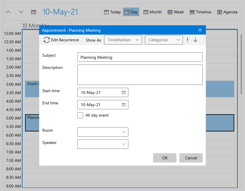
Announcing the brightest star of this release—RadScheduler. 🌟 I know some of you guys have been waiting for the mighty RadScheduler, and I’m happy to say it is now part of Telerik UI for WinUI.
RadScheduler is a radically different scheduling component, going beyond the standard Microsoft Outlook-style control. The control empowers the end user with unprecedented precision and flexibility when handling their appointments. This is achieved through features such as multi-level grouping, powerful zoom for smart navigation through a large number of appointments and blazing-fast scrolling.
See what RadScheduler brings to the table when it comes to scheduling:
- Rich user experience
- Performance
- Inline and dialog editing of appointments
- Built-in and custom views
- Multi-level grouping
- Orientation
- Dragging multiple appointments
- Zooming
- Exact rendering of appointments
- Snap appointments
- Flexible recurring appointments support
- iCal export/import support
- Time indicators
For more details about RadScheduler, please check this section of our help documentation.
ListView
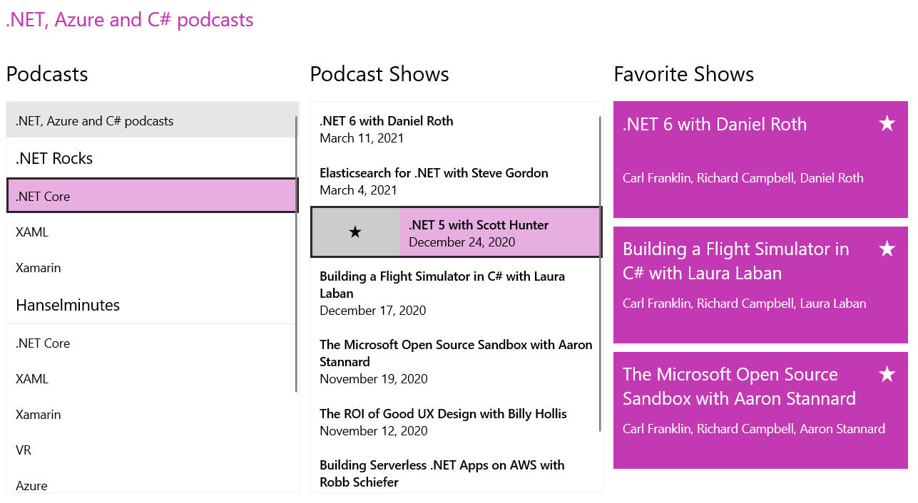
RadListView is a great new virtualizing list component that provides the all the most popular features associated with scenarios where a list of items is used. The control provides built-in item animations, different layouts and orientations, and smart defaults for many gestures—execution of special action on swipe, option to refresh the list on swipe and more.
RadListView can also be used to easily visualize your items in groups, sorted and filtered in accordance with your criteria. Check out the major features below:
- Layouts: The control provides several different layouts (like grid and stack)
- Header and footer
- Selection mode
- Grouping
- Filtering
- Sorting
- Incremental loading: This feature allows you to use data virtualization by loading only portions of the data after an action like scroll-down or button click is executed
- Swipe and reorder: The control provides a mechanism for dragging its items; based on the input gesture, the items can be reordered or additional visual element can be shown
- Commands
- Item animations
- Customizable appearance
For additional information and sample code—check out the ListVew section in our documentation.
Shadow
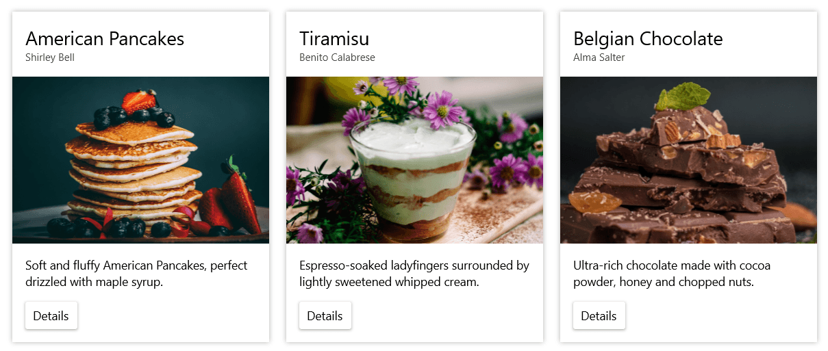
As Microsoft says about the Fluent Design System, “The physical world is our vocabulary. Fluent speaks in light and shadow.” The shadows are main component of the modern look and feel. RadShadow for WinUI component gives you the option to put a highly customizable shadow effect around any UI you have. With the help of RadShadow, you can elevate some elements and be able to achieve the desired modern appearance.
Some of key features of the control are:
- Shadow color
- Shadow transparency
- Position
- Shadow corner radius
- Blur radius
You can find the Shadow control documentation here.
Swiss QR Barcode
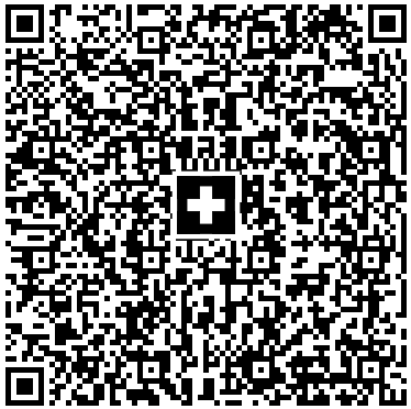
The QR-bill makes issuing and paying invoices simpler and is being introduced throughout Switzerland to modernize payment transactions. Its most striking feature is the Swiss QR code, which contains all the payment information in a digital format that can be read using a smartphone or a slip scanner.
Now with the help of RadBarcode you can easily generate such code within your WinUI application. To do so, simply set the Symbology of the barcode to SwissQRCode:
<telerikDataViz:RadBarcode x:Name="Barcode" Width="200" Height="200"> <telerikDataViz:RadBarcode.Symbology> <telerikDataViz:SwissQRCode Module="4" SizingMode="Manual" /> </telerikDataViz:RadBarcode.Symbology> </telerikDataViz:RadBarcode> For more information, please refer to the Swiss QR section in our Barcode documentation.
RangeSlider

Have you ever needed to allow a value range selection in an application? This is where RadRangeSlider comes in handy. The control provides simple native UI that is completely customizable in terms of appearance and offers numerous configuration options. Here are some of the major features of the control:
- Orientation
- Deferred dragging
- Snapping
- Tooltips
- Formatting
- Tick customization
For more detailed information, check the RangeSlider section in our online docs.
LayoutTransform Control
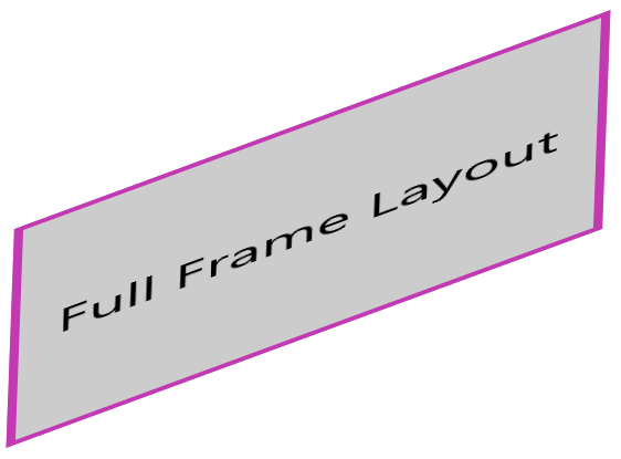
The new LayoutTransformControl is a content control that allows you to easily apply transformations on any FrameworkElement of your application. Here’s a list of possible transformations:
- RotateTransform
- ScaleTransform
- SkewTransform
- MatrixTransform
- TransformGroup
Using the TransformGroup you can combine as many transforms as needed. Hope it will be useful control. Check out the documentation here.
HubTile
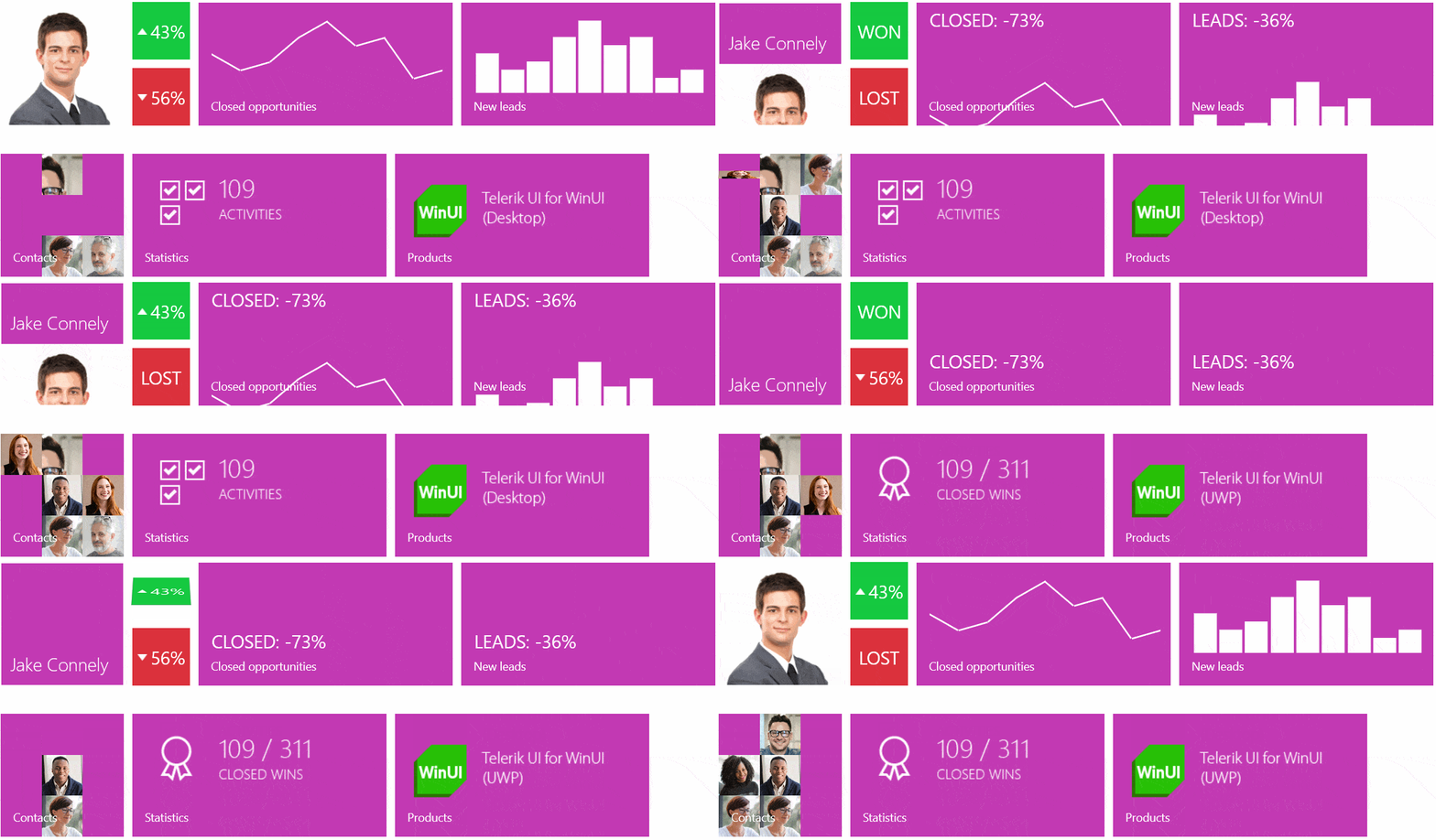
HubTile is a rectangular UI element designed specifically to update itself dynamically and show the latest up to date information from different services or apps.
Currently there are six built-in HubTile variations that can display different types of information with different effects and many customization options. Combining them will allow you to achieve an effective dynamic look and feel of the information you need to display to your app users. Here is a list with the available Tiles:
- RadHubTile: A tile used to display information such as how many notifications you have in your inbox, or how many tasks are left in your to-do list, etc.
- RadIconHubTile: A tile that allows for an IconSource to be displayed as its content.
- RadSlideHubTile: Contains two pieces of content where you can put text or pictures. The visual effect supported by this tile includes three states:
- RadPictureRotatorHubTile: Displays one picture at a time and rotates random pictures of a collection of image URIs.
- RadMosaicHubTile: Consists of smaller tiles, which flip randomly to show pictures from a collection of image URIs.
- RadCustomHubTile: Is a custom HubTile that allows you to put anything from text to a dynamically updating mini-UI in it.
SideDrawer
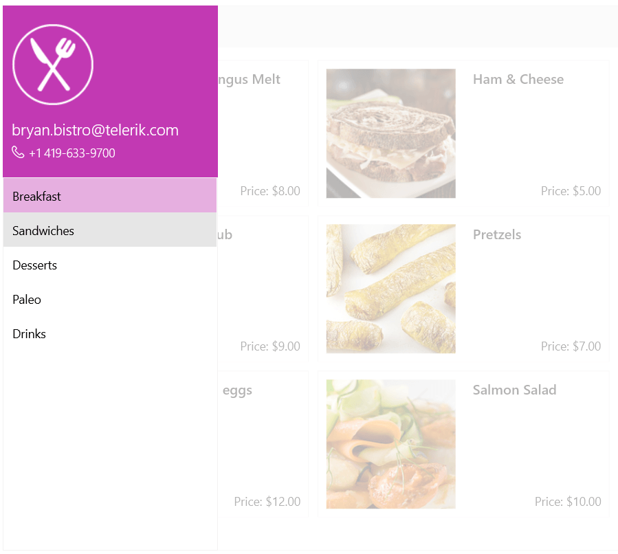
Another new component is the SideDrawer control—it enables quick navigation across all levels of your app. It can be placed on every side of the application as it provides four built-in opening directions. It provides a list of a few built-in open/close animations that will help you achieve unique and at the same time modern look and feel of your applications.
See the SideDrawer documentation for more information and code snippets.
NumericBox

NumericBox control is a small but at the same time very useful component. It provides functionality for selecting numeric values within a predefined range. The control exposes a convenient API to customize its behavior to best fit the business requirements. Here are some of the key feature of the control:
- Minimum and maximum
- Different increment options
- Value format
- Visibility of increase/decrease buttons
- Read-only mode
- Watermark support
- Culture aware
For more details, check out the NumericUpDown section in the documentation.
WordsProcessing: Doc and Dot Formats Import
While these are old formats, there are still plenty of documents that are saved as .doc and .dot files and need to be edited by our users. Therefore, this was one of the most demanded features for the suite. With R2 2021 these formats are supported, and the documents can be imported and converted to the widely used DOCX format. You can find more information here.
WordsProcessing: Find Functionality
WordsProcessing allows you to search for specific text and find all occurrences in the document. You can search for part of the text or whole words with or without matching casing. It is possible to search with a regular expression as well. The Replace Text and Style article describes this functionality.
SpreadProcessing: DataTableFormatProvider
The new DataTableFormatProvider allows you to easily convert your tables to worksheets or create a new data table from an existing worksheet. This way, you can easily show your data in a spreadsheet and visualize it for the end user. More information about this tool is available in this article from our online help documentation.
PdfProcessing: Flatten Form Fields
Although form flattening can be done manually, it is now part of the library and you can achieve it by calling a single method. This functionality allows you to easily remove all fields and preserve their values. This way, you can make the document read-only after the user has filled it. Detailed information about this feature is available here.
SpreadStreamProcessing: Text Measuring
One of the limitations in the SpreadStreamProcessing library was that you were unable to set the column width after the columns were exported because the library was directly writing in the file stream. This is no longer a limitation, and now you can use the CellContentSizeHelper class to measure the cells and set the column width. For more details, check this article.
Telerik and Kendo UI Community Forums Revamp
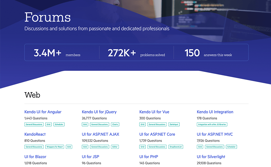
And last but not least, we revamped one of the favorite places that developers love hanging out—the Telerik and Kendo UI Community Forums. Check out the complete story of why and what in the dedicated blog post.
Check Out the Detailed Release Notes
We have a lot more. To get an overview of all the latest features and improvements we’ve made, check out the release notes for the products below:
Telerik UI for WinUI (Release Notes)
Sign Up for the Webinar
To see the new release in action, please join us on the Telerik R2 2021 webinar, on Tuesday, May 18, from 11 am – 1 pm ET.
The webinars will be complemented with live demo sessions on Twitch on Wednesday, May 19, from 9 – 10:30 am ET and Thursday, May 20, from 1:30 – 3 pm ET.
Share Your Feedback
- Get in touch by email – drop us a line, for anything related to product or just to say hi, at TelerikWinUI@progress.com
- Feedback Portal – share any feature request (or bug reports) that you might have
- Telerik Forums – if you need any technical assistance with our products, let us know and we’ll help
Get the Bits
Don’t wait—try out the latest:
In case you missed it, here are some of the updates from our previousmajor release.

