Introducing the New and Amazing Office2019 High-Contrast Variation for WPF

Summarize with AI:
The brand new high-contrast variation of the Office2019 theme has been shipped to help with less eye strain and more productivity for your users. This article will cover the new variation as well as some new features of the Office2019 theme.
The R3 2021 release of Telerik UI for WPF came out a couple months ago. Have you had a chance to test our brand-new built-in HighContrast color variation of the Office2019 theme (inspired by the black high contrast mode in Windows 10)? This article will go through the new variation along with some of the new features of the theme.
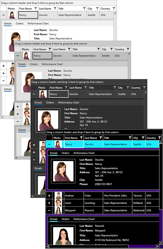
You can check out how it looks directly in your WPF application. Simply add the following line before the InitializeComponent method:
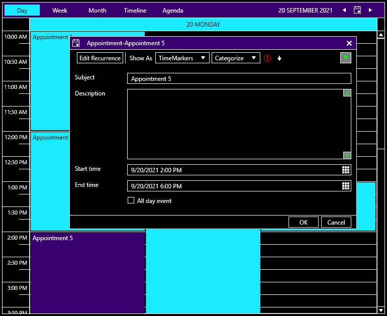
Office2019Palette.LoadPreset(Office2019Palette.ColorVariation.HighContrast);And here is the result:
Why High Contrast?
The main purpose of high contrast is to increase text legibility and improve readability. Low-contrast text can be difficult to read for some people and even impossible for those with vision disabilities. If you target a big audience with your application, your users can benefit from having a high-contrast theme.
There are many other reasons to use a high-contrast theme in your applications, from increased readability of elements on screen to reduced visual noise, migraines, eye strain—or, simply because you like it.
Our high-contrast theme has a simplified UI that uses a small set of colors compared to other dark themes:
- Contrasting colors for text and background
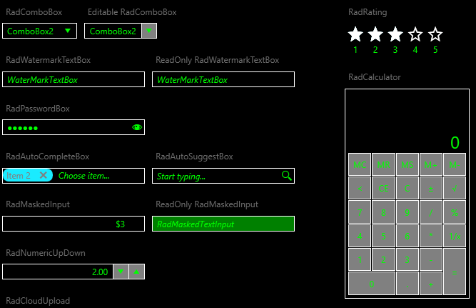
- Disabled text is green
- Reduced set of gray colors
What’s New in the Office2019 Theme?
-
For the very first time in this theme, we exposed theme palette brushes that can be used to customize the foreground when an element is disabled—DisabledForegroundBrush, DisabledIconBrush and DisabledCheckedForegroundBrush. This way you can easily change the components’ disabled style.
-
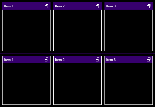
Since the Office2019 theme uses a background for its headers, adding borders around them is time-consuming. But not anymore! With the new HeaderBorderThickness property from the palette, you can wrap all header elements extremely easily. You can modify HeaderBorderThickness with the setting below:
Office2019Palette.Palette. HeaderBorderThickness = new Thickness(1);See what it looks like:
-
Last but not least, we have expanded the palette with SelectedUnfocusedBackgroundBrush which is responsible for the background color of the unfocused elements (e.g., the GridViewRow, TreeListViewRow and the TreeViewItem).
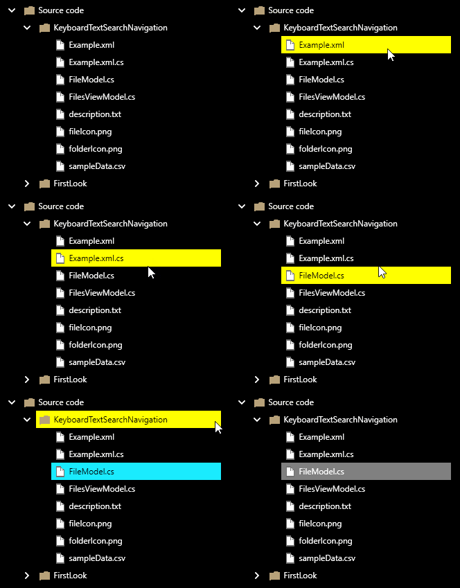
If you want to find more information about new features, check out our help article of the Office2019 theme.
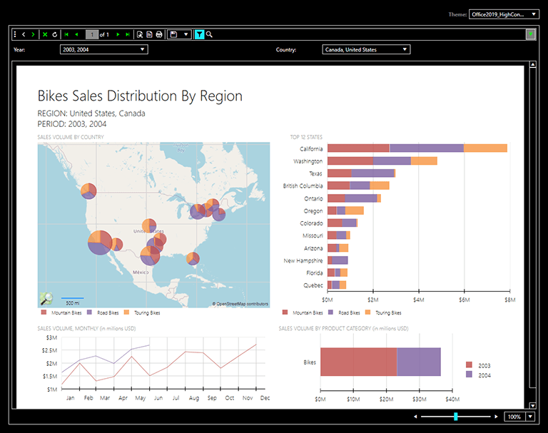
Deliver Reports With the Office2019 High-Contrast Theme and the Telerik Report Viewer
As you already know, we have Telerik .NET ReportViewer Controls that help create great interactive reports for your desktop applications. You can find all reports with the latest HighContrast color variation. Take a sneak peek:
Try it Out and Share Your Feedback
We would love to hear what you think about the new HighContrast color variation in Telerik UI for WPF, so make sure to get the latest version and try it out.
You can also take a look at it with our WPF Color Theme Generator tool or in our Demo App on the Windows Store.
Maria Hadzhieva
Maria Hadzhieva is a front-end developer on the Progress Telerik team.
